How to Resize Banner Ads to Every Size From One PSD (Without Rebuilding Each One)
· Coloracci Team
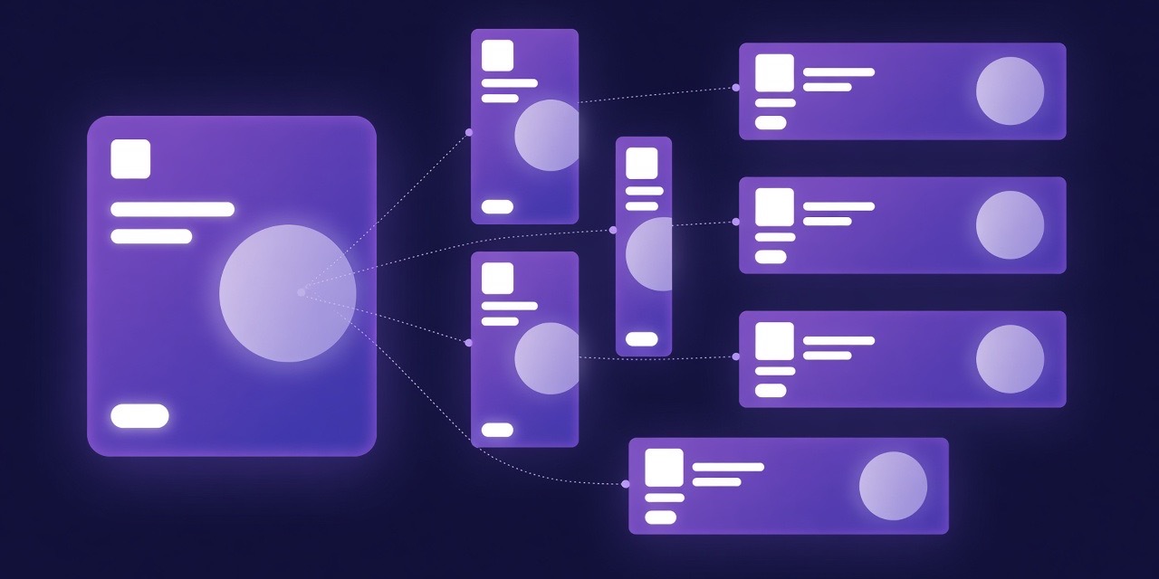
A display campaign is never one banner. It is one idea that has to survive a 300 × 250 rectangle, a 728 × 90 leaderboard, a 160 × 600 skyscraper, a 1080 × 1920 story, a 1920 × 1080 screen in a shopping mall and whatever odd pixel dimension the last publisher on the media plan invented. The idea is designed once. The sizes are built eight, twelve, twenty times. That second step is where design teams quietly lose days, and it is the step this guide is about: how to resize banner ads to every size from one layered PSD without rebuilding the creative by hand each time.
We will cover why a campaign needs so many formats, why resizing is genuinely harder than it looks, how the four common approaches compare, how to build a master file that adapts well, and how to check each output before it ships. Where it fits, we point to Resize Studio, the free layer-aware resizer we built at Coloracci, and we are specific about what it does and does not do.
Why one campaign needs so many sizes
The IAB standard ad units still anchor most display buys: the medium rectangle (300 × 250), the leaderboard (728 × 90), the half page (300 × 600), the wide skyscraper (160 × 600), the billboard (970 × 250) and the mobile leaderboards (320 × 50 and 320 × 100). The IAB's flexible ad portfolio then adds aspect-ratio based units, so a single "landscape" placement might be requested at several pixel dimensions that share a shape but not a size.
Layer on the channels outside programmatic display. Social needs a 1:1 feed post, a 4:5 portrait and a 9:16 story. Digital out-of-home (the screens in malls, transit hubs and retail) works almost entirely in 1920 × 1080 and 1080 × 1920, plus network-specific strips such as 1400 × 400 or 720 × 208 for shelf-edge and ticker displays. A retail media network may add its own set on top.
A modest campaign lands at eight to twelve deliverables. A national one with DOOH and social easily passes twenty. Every one of those needs the logo, the headline, the offer, the call to action and the legal line placed so they read at that specific size, and most need both a flattened JPG for trafficking and a layered file for later edits.
Done by hand in Photoshop, a competent designer spends somewhere between fifteen and forty-five minutes per size once the master exists, depending on how different the aspect ratio is. Multiply by twelve sizes and two or three creative variants and the arithmetic explains why "just the resizes" is the line item nobody wants to own.
Why resizing is harder than it looks
Scaling an image is trivial. Resizing a layout is not, because a banner is a small composition with competing constraints, and changing the canvas changes which constraints bind.
Aspect-ratio families
Sizes cluster into three families. Landscape (roughly 1.2:1 to 2:1) gives you room for a hero image beside the copy. Portrait (narrower than about 0.9:1) stacks everything vertically and pushes the hero up or down. Strips (wider than about 2.2:1, the 728 × 90 and 1400 × 400 kind) leave no vertical room at all; the hero often disappears and logo, headline and CTA line up in a single row.
Moving within a family is a scale-and-nudge job. Crossing families is a re-layout. This is the single most useful mental model for planning resizes: build one master per family, not one master per campaign.
Text reflow
Type does not scale like a photograph. A headline set on two lines at 300 × 250 wants one line at 728 × 90 and three at 160 × 600. Minimum legible sizes are hard floors: on a desktop banner, body copy under about 11 px and a CTA label under about 12 px will not be read, and on a DOOH screen viewed from three metres the floor is far higher. A resizer that shrinks type proportionally with the canvas produces banners that are technically complete and practically unreadable.
Safe zones and platform chrome
Stories and vertical screens reserve margins for interface elements; DOOH networks specify safe zones inside which all essential content must sit; some retail networks add a polygon safe zone around a fixed shelf-label overlay. Content that drifts into those areas gets rejected at trafficking, usually a day before launch.
Logo minimums and brand rules
Most brand guidelines define a minimum logo width and a clear-space rule. Both are absolute pixel values that do not scale with the canvas. The 320 × 50 banner needs the same minimum logo as the billboard, which means the logo takes up a far larger proportion of the small unit, and everything else has to yield.
CTA legibility and color
The call to action is the one element that has to work in every size. On a strip it sits next to the headline; on a portrait it drops to the bottom; on a dark hero image it needs a light button, on a pale one a dark button. Contrast that passed at 970 × 250 can fail at 300 × 250 because the button shrank onto a busier part of the image. This is where a quick pass through a contrast checker earns its keep.
Four ways to make the sizes, compared
1. Manual rebuild
The designer opens the master, changes the canvas size, moves and rescales groups, re-flows the text and exports. Quality is as good as the designer; consistency depends on their patience on the eleventh size. Cost is linear in the number of sizes and variants, and a copy change late in the process means doing it all again. This is still the default in most studios, and it is the benchmark every other method has to beat.
2. Photoshop actions, artboards and templates
Actions and scripted artboards remove the repetitive clicks. They work well when all sizes are in the same family and the master was built specifically for the template. They fall apart when a size crosses families, when a headline changes length, or when a client sends a new master that does not match the template's layer structure. Templates also age: the campaign in March never quite matches the template built in January.
3. Generative "extend" and outpainting
AI-based canvas extension fills new area with plausible imagery. It is excellent at one specific job: turning a landscape hero photo into a portrait one without a visible seam. It is the wrong tool for the layout problem. It does not know that the logo has a minimum size, that the CTA has to stay inside the safe zone or that the headline should reflow rather than stretch. Used well, it is a step inside a resize workflow, not the workflow.
4. Layer-aware relayout
The fourth approach reads the structure of the master, not just its pixels. Each top-level group is a role (background, hero, logo, headline, subhead, CTA, legal), and each target size gets a layout plan for that family: where the logo leads, where the headline sits, where the CTA closes. The engine then renders the plan, measures the result against it, corrects what drifted, and returns a layered file per size with text still live.
This is the approach Resize Studio takes. The interesting property is not that it is faster than a designer on one size (it is), but that it is consistent across all of them, and that the result of a copy change is a re-run, not a rebuild. Its honest limitation is the same as every method above: an unusual hero crop, an awkward legal line or a headline that simply does not fit a 728 × 90 strip will still need a human decision. The tool's job is to make that decision take two minutes on a layered file, not thirty on a blank canvas.
How to build a master PSD that resizes well
Whichever method you use, the master decides how much of the work is automatic. The same rules that make a file behave in a layer-aware tool make it easier for a colleague to pick up.
One top-level group per element. Background, hero image, logo, headline, subhead, CTA, legal line. Nothing loose at the root. If the CTA is a shape plus a text layer, both live inside the CTA group.
Name the groups by role. bg, hero, logo, headline, subhead, cta, legal. Layer-aware tools recognise structure even without names, and a designer certainly does, but names remove ambiguity on the size where the hero and the background are both photographs.
Keep text live. Rasterised type cannot reflow. Live text can be re-set to one line on the strip and three on the skyscraper, and it lets the person doing the final review change a word without asking for the source. Keep the brand fonts installed on the machine that will do the work.
Build one master per aspect family. A landscape master (1920 × 1080 is a comfortable choice) and a portrait master (1080 × 1920). Every landscape and strip size is derived from the first, every portrait size from the second, and the two share layer names so the tool can map them. A strip-only campaign can skip the portrait master; a story-heavy one cannot.
Decide the hero's focal point. Whatever you use to crop, the crop needs to know where the face, the product or the logo-in-the-photo is. Put the important part of the hero away from the edges so a portrait crop of a landscape image still contains it.
Keep the legal line separate and small. It is the element most likely to break a strip. Isolating it lets it be scaled, wrapped or moved independently of the headline.
Check hierarchy once, on the master. If the headline, subhead and CTA do not have a clear visual order at full size, resizing will not create one. A color hierarchy pass on the master's palette is cheaper than fixing eleven outputs.
A per-size QA checklist
Every size, before it ships:
- Read it at real size. Not zoomed to fit. A 300 × 250 is small; view it at 100% on a normal display, and a DOOH screen at the distance it will be seen from.
- Logo: at or above the brand minimum width, clear space intact, not clipped.
- Headline: every word present, no orphan line, no hyphenation the brand would not use, not overlapping the hero's focal point.
- CTA: inside the safe zone, label legible, contrast against its actual background passing (check it with the contrast checker, not by eye).
- Legal line: present where required, legible, not covering anything.
- Brand colors: the same hex values as the master. Compression, colour profiles and re-exports drift; the color consistency auditor catches a CTA that turned from #7241FF into something close but wrong.
- File spec: correct dimensions, correct format, under the publisher's weight limit, correct colour profile policy for the network.
- Naming: the delivery convention the trafficker asked for, applied to every file, no exceptions on size seven.
Sort outputs into two folders as you go: approved, and needs work. A trafficker who receives a clean approved folder and a short needs-work list moves faster than one who receives twenty files and a note saying "check these".
Where Resize Studio fits, and where it stops
Resize Studio is built for the layer-aware approach above and for nothing else. You drop a layered PSD master (one per family if you have both), pick the target sizes, and it lays out, renders and measures each one in your browser tab. Files are parsed and rendered locally; nothing is uploaded. Each size comes back as a JPG for trafficking and a layered PSD with live text for edits, already sorted into approved and needs-work folders, and every size that fails its own measurement is flagged rather than quietly shipped.
What it does not do: it does not invent a layout for a master that has no structure, it will not resize a flattened JPG or PNG (it stops and says so), and it will not make the call on the strip where the headline is genuinely too long. That last ten percent is still design work, and it is meant to be.
It is free, it runs in Chrome on desktop, and the first campaign takes about as long as reading this article. Try it on your next set of sizes, and if a size comes back in needs-work, that folder is the tool doing its job.