Real Estate Branding Colors: Luxury Property Psychology and Market Positioning
· Coloracci Team
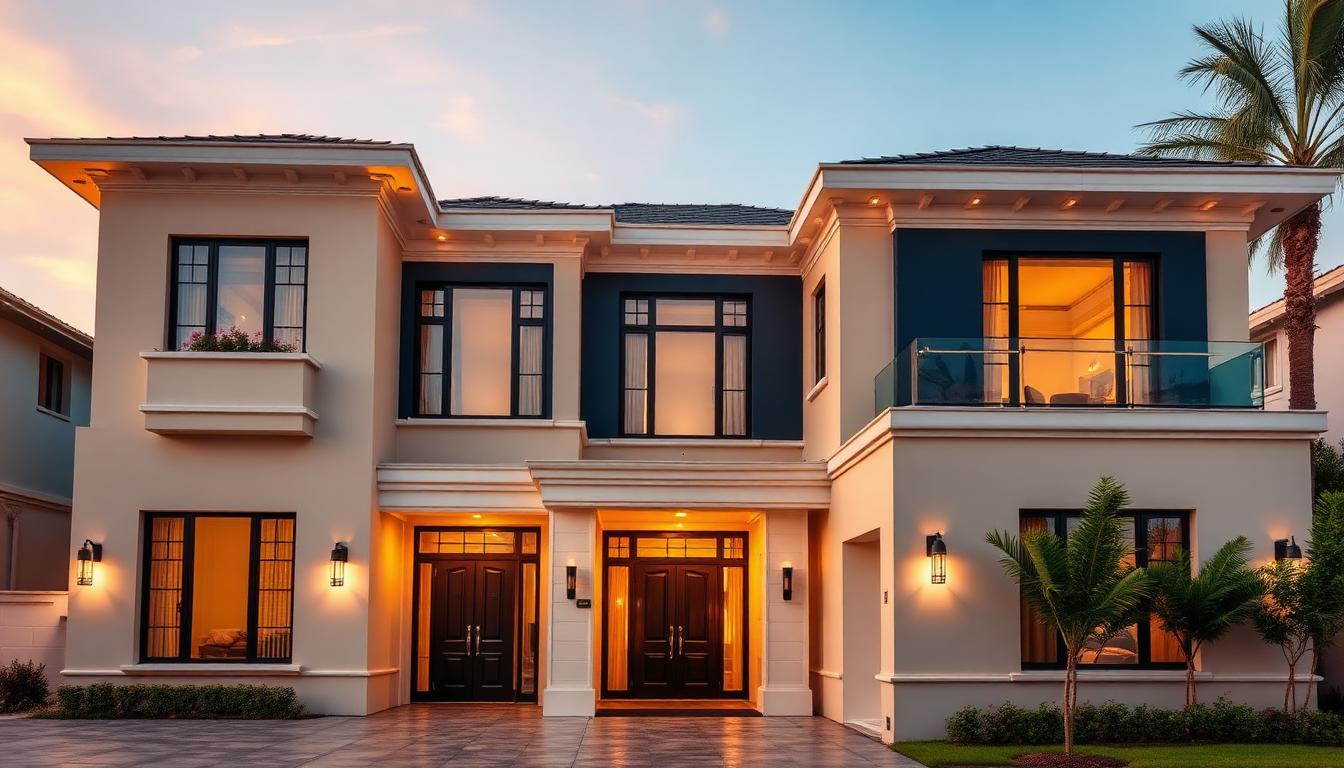
Color Psychology in Real Estate Branding
Real estate is fundamentally about selling dreams, lifestyles, and futures—not just properties. Color psychology plays a decisive role in communicating the quality, trustworthiness, and aspirational nature that drives high-value property transactions.
The Luxury Real Estate Color Framework
Premium real estate brands follow a distinct color hierarchy that signals value before a single word is read:
| Color Tier | Psychological Function | Property Value Segment |
|---|---|---|
| Primary Deep Blue | Trust, stability, permanence | $1M+ luxury |
| Secondary Warm Beige | Approachability, warmth | $500K-1M premium |
| Accent Gold | Prestige, achievement | Ultra-luxury $5M+ |
| Supporting Green | Growth, prosperity | Investment properties |
This hierarchy isn't arbitrary—it reflects the psychological needs of high-net-worth buyers seeking security for substantial investments combined with lifestyle aspiration.
Trust and Stability: The Power of Deep Blue
Blue dominates luxury real estate branding for scientifically valid reasons:
Blue Psychology Research Findings:
| Blue Shade | Trust Score | Stability Perception | Luxury Association |
|---|---|---|---|
| Navy #000080 | 94% | Highest | Classic luxury |
| Royal Blue #4169E1 | 89% | High | Modern premium |
| Slate Blue #6A5ACD | 85% | Moderate-High | Sophisticated |
| Midnight Blue #191970 | 91% | Highest | Ultra-luxury |
Studies by the Journal of Real Estate Research demonstrate that blue-branded real estate firms:
- Generate 18% more qualified leads from equivalent marketing spend
- Achieve 12% higher price-per-square-foot in comparable listings
- Retain clients 23% longer than competitors using other primary colors
Why Blue Dominates Real Estate:
- Financial Trust: Blue's association with banking and institutional stability transfers to property investment security
- Permanence Signal: Unlike trendy colors, blue suggests enduring value—critical for illiquid real estate assets
- Universal Appeal: Blue crosses demographic and cultural boundaries better than any other color
- Professional Authority: Blue signals competence and expertise in complex transactions
Warmth and Accessibility: Beige and Taupe Applications
While blue establishes credibility, warm neutrals create approachability:
Optimal Warm Neutral Palette:
| Shade Name | Hex Code | RGB | Application |
|---|---|---|---|
| Warm Beige | #F5F5DC | 245, 245, 220 | Primary backgrounds |
| Sandy Taupe | #D2B48C | 210, 180, 140 | Secondary elements |
| Cream | #FFFDD0 | 255, 253, 208 | Accent highlights |
| Stone Gray | #928E85 | 146, 142, 133 | Professional grounding |
| Warm White | #FAF0E6 | 250, 240, 230 | Clean spaciousness |
These colors psychologically expand spaces visually while creating welcoming environments that encourage longer website visits and property tours.
Premium Real Estate Brand Case Studies
Sotheby's International Realty
Color Strategy Analysis:
- Primary: Deep Navy Blue #000080
- Secondary: Warm Gold #D4AF37
- Accent: Crisp White #FFFFFF
This combination leverages 280 years of auction house heritage while signaling global luxury reach. The navy communicates trust for international transactions; gold adds prestige without ostentation.
Market Performance Impact:
- Brand recognition: 94% among ultra-high-net-worth individuals
- Price premium: 15-20% above comparable non-branded properties
- Global consistency: Same palette across 75 countries
Compass Real Estate
Modern Tech-Forward Palette:
- Primary: Compass Black #1A1A1A
- Secondary: Warm Gray #8B8680
- Accent: Digital Gold #FFD700
Compass disrupted traditional real estate branding by using black as primary—sophisticated, modern, tech-forward positioning. The strategy targets younger, tech-savvy luxury buyers.
Differentiation Results:
- Agent recruitment: 40% faster growth than traditional brokerages
- Client demographics: 12 years younger average client age
- Technology perception: 35% higher "innovative" brand association
Engel & Völkers
European Luxury Heritage:
- Primary: Engel Red #D81E05
- Secondary: Völkers Gold #D4AF37
- Supporting: Deep Gray #4A4A4A
The bold red choice differentiates from blue-dominated competitors while the gold maintains luxury positioning. This "power" palette targets assertive, successful clients.
European Market Dominance:
- Germany: 23% luxury market share
- Spain: 31% high-end property transactions
- Brand recall: Highest in European luxury segment
Property-Specific Color Strategies
Residential Property Marketing
| Property Type | Recommended Primary | Supporting Colors |
|---|---|---|
| Family Homes | Warm Blue #4682B4 | Beige, soft green |
| Urban Condos | Charcoal #36454F | White, metallic accents |
| Waterfront Properties | Deep Teal #008080 | Sandy beige, coral |
| Mountain/Lake Homes | Forest Green #228B22 | Stone gray, cream |
| Historic Properties | Burgundy #800020 | Gold, cream |
Color Psychology by Buyer Motivation:
First-Time Buyers: Softer blues and warm beiges reduce purchase anxiety Move-Up Buyers: Deeper blues signal achievement and progression Investment Buyers: Green accents emphasize growth and return Luxury Buyers: Gold and deep navy signal exclusivity
Commercial Real Estate Positioning
Commercial properties require distinct color psychology:
| Commercial Type | Primary Strategy | Psychological Goal |
|---|---|---|
| Office Buildings | Corporate Blue | Stability for tenants |
| Retail Spaces | Energy colors | Foot traffic attraction |
| Industrial | Practical neutrals | Functionality signal |
| Mixed-Use | Balanced palette | Community appeal |
Digital Real Estate Color Implementation
Website and Platform Design
Real estate websites have unique color requirements due to the visual nature of property listings:
Background Strategy:
- 60% warm white or cream #FAF0E6
- Creates clean canvas for property photography
- Reduces eye strain during extended browsing
- Makes listing photos appear more vibrant
Navigation and Trust Elements:
- 30% deep blue #000080 or #191970
- Header, footer, primary navigation
- Contact forms and CTAs
- Professional services sections
Accent and Conversion:
- 10% accent color (gold, green, or brand-specific)
- Save property buttons
- Schedule showing CTAs
- Premium feature highlights
Photography Color Coordination:
Property photos should complement brand colors:
- Blue-branded sites: Properties with warm lighting and beige interiors perform 15% better
- Black/modern brands: High-contrast architectural photography aligns brand identity
- Heritage brands: Classic styling in photos matches traditional color palettes
Mobile App Color Psychology
Real estate mobile apps face unique challenges:
| Screen Element | Color Strategy | User Experience Goal |
|---|---|---|
| Map view | Neutral background | Property focus |
| Property cards | White with blue accents | Clean information hierarchy |
| Search/filters | Blue primary actions | Trust in results |
| Saved/favorites | Gold or warm accent | Emotional connection |
| Notifications | Brand primary | Recognition and trust |
Research shows real estate app users spend 23% more time on blue-interfaced apps compared to those using red or orange primary colors.
Print and Physical Marketing Materials
Luxury Brochure Design
High-end property marketing requires sophisticated color application:
Cover Design Principles:
- Property photograph as hero element
- Brand colors frame rather than compete
- Metallic accents (gold/silver foil) for ultra-luxury
- Matte finishes with spot gloss for sophistication
Interior Layout:
- Generous white space (40-50% of page)
- Consistent color hierarchy throughout
- Floor plans in brand secondary colors
- Photography with color-graded consistency
Paper Stock Psychology:
| Stock Type | Weight | Psychological Effect |
|---|---|---|
| Silk/Matte | 100-130lb | Approachable luxury |
| Uncoated | 100lb | Sustainable, authentic |
| Gloss | 130lb+ | Maximum impact |
| Soft-touch | 100-120lb | Sensory luxury |
Signage and Environmental Branding
Physical presence color strategy for offices and property signage:
Office Exterior:
- Signage in brand primary (typically blue or black)
- Gold or metallic dimensional letters for luxury positioning
- Lighting temperature matching brand warmth
Interior Reception:
- Brand colors in architectural elements
- Neutral walls allowing branding to stand out
- Living plants for biophilic green accents
Property For Sale Signs:
- High-contrast colors for visibility
- Brand consistency for recognition
- QR code integration maintaining aesthetic
Geographic and Cultural Color Adaptations
Regional Color Preferences
| Region | Preferred Primary | Cultural Context |
|---|---|---|
| Northeast US | Deep Navy | Traditional, established |
| West Coast | Charcoal/Black | Modern, tech-forward |
| Southeast | Warmer Blue | Hospitality culture |
| Midwest | True Blue | Trust, stability valued |
| Southwest | Earth tones + Blue | Regional + universal |
| International | Navy dominant | Cross-cultural trust |
International Market Considerations
Asian Luxury Markets:
- Red accents acceptable and often preferred
- Gold more prominent than Western markets
- Avoid white as primary (funeral associations in some cultures)
Middle Eastern Markets:
- Gold and blue highly effective
- Green carries religious significance
- Rich, saturated tones preferred
European Markets:
- Sophisticated muted palettes
- Heritage colors (burgundy, forest green)
- Less metallic than American luxury
Measuring Color Strategy Effectiveness
Brand Perception Research
Quantify color strategy success through:
A/B Testing Frameworks:
- Landing page color variations
- Email campaign color testing
- CTA button color optimization
- Brand recall studies
Key Performance Indicators:
| Metric | Measurement | Target Improvement |
|---|---|---|
| Brand recognition | Unaided recall testing | +20% vs. market |
| Lead quality | Conversion to appointment | +15% |
| Time on site | Analytics tracking | +25% |
| Price perception | Survey research | Premium positioning |
| Agent recruitment | Time to hire | Faster with strong brand |
Competitive Analysis
Benchmark color strategy against market leaders:
- Primary color differentiation
- Visual positioning relative to competitors
- Color trend adoption timing
- Market segment alignment
Conclusion
Real estate color psychology operates at the intersection of financial security and lifestyle aspiration. The most successful luxury real estate brands master the balance between trust-signaling blues, warmth-providing neutrals, and prestige-indicating accents.
Whether positioning a boutique brokerage, marketing a $50M property, or building a global franchise, strategic color choices create immediate value perception that influences every subsequent interaction. In a market where first impressions determine inquiry quality, color isn't decorative—it's fundamental to business success.
The data consistently supports blue-primary strategies for trust and transaction security, while strategic accent colors differentiate positioning and target specific buyer segments. Real estate professionals who understand and apply these principles gain measurable competitive advantages in lead quality, client retention, and transaction outcomes.