The Psychology Behind Yellow in Food Industry Logos
· Coloracci Team
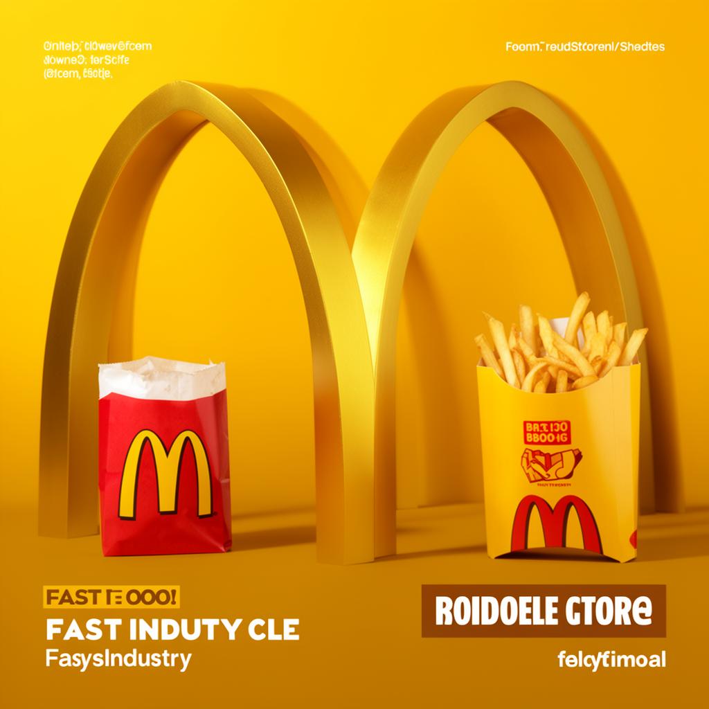
Yellow is the most visible color in the human spectrum. It is the first color the eye notices, the fastest to process, and the one most reliably associated with warmth, energy, and appetite. None of this is accidental. The food industry discovered yellow's psychological power decades ago, and it has been deploying it with ruthless precision ever since. From the golden arches of McDonald's to the sunlit branding of Lay's, yellow is the color that makes you hungry — and the science behind why is as fascinating as the business results it produces.
In this article, we explore the psychology of yellow in food branding, examine how the world's most successful food companies use it, and provide practical guidance for designers working in the food and hospitality space.
Why Yellow Grabs Attention
Yellow occupies a unique position in human visual perception. It reflects more light than any other color, which is why it appears brighter and more prominent than surrounding hues. Traffic signs, hazard warnings, and taxi cabs are yellow for precisely this reason — it commands immediate attention.
But yellow's impact goes beyond mere visibility. Research in color psychology consistently shows that yellow stimulates the nervous system, increases mental activity, and generates feelings of optimism and warmth. A 2019 study published in the journal Color Research & Application found that exposure to yellow environments increased participants' reported energy levels by 12% compared to neutral surroundings.
For food brands, this combination of attention-grabbing visibility and emotional warmth is invaluable. In a crowded supermarket aisle or a highway lined with fast-food signs, yellow cuts through the visual noise. It does not ask to be noticed — it insists.
The specific shade matters enormously. Pure yellow (#FFFF00) is almost never used in professional branding because it is too harsh and difficult to read against white backgrounds. Instead, food brands gravitate toward warmer, deeper yellows that blend golden and amber tones.
Golden Yellow (#FFC107) is the most popular choice — warm, appetizing, and reminiscent of cooked food, ripe fruit, and sunlight. Amber Yellow (#FFB300) adds depth and richness, suggesting caramelization and baked goods. Mustard Yellow (#E6A800) works for artisanal and premium food brands seeking a more sophisticated, less playful tone.
Yellow in Food Branding: The Giants
McDonald's
No discussion of yellow in food branding can begin anywhere other than the Golden Arches. McDonald's iconic yellow "M" — rendered in a warm golden yellow close to #FFC72C — is one of the most recognized symbols on Earth. The choice was not aesthetic whimsy. Ray Kroc and his design team understood that yellow's visibility made it perfect for roadside signage, where drivers needed to spot the restaurant from a distance at highway speeds.
But the golden arches do more than attract attention. The warm yellow triggers associations with sunshine, happiness, and comfort — exactly the emotional territory McDonald's wants to own. Combined with red, which stimulates appetite and creates urgency, the yellow-and-red pairing is perhaps the most psychologically potent color combination in commercial history.
McDonald's has refined its yellow over decades, shifting from a bright, almost fluorescent yellow to a warmer, more golden tone that feels less aggressive and more premium. This evolution mirrors the brand's broader repositioning from cheap fast food to a more quality-conscious experience.
Subway
Subway's rebrand in recent years doubled down on yellow, making a vibrant golden-green combination its primary identity. The yellow in Subway's palette (#FFC600) communicates freshness and energy, differentiating the brand from the heavy reds and browns of burger-focused competitors. Subway's yellow says, "This is lighter, brighter, healthier" — even before you read the menu.
The pairing of yellow with green reinforces the health-conscious positioning. Yellow provides the energy and appetite stimulation, while green adds associations with freshness and natural ingredients. It is a masterful color strategy that aligns perfectly with Subway's brand promise.
Lay's
Lay's potato chips uses a bright, saturated yellow (#FFD700) as its primary packaging color, and it is one of the best examples of yellow's shelf impact. In a snack aisle crowded with blues (Doritos), reds (Pringles), and greens (various brands), Lay's yellow packaging literally glows. It is the first thing your eye lands on, and in retail, first attention often means first purchase.
Lay's yellow also carries associations with the product itself — golden, crispy, sun-kissed potatoes. The color tells the product story before you read a single word. This is yellow working at its most efficient: attracting attention, stimulating appetite, and communicating product qualities simultaneously.
Denny's
Denny's uses a warm, inviting yellow (#FFC107) that perfectly captures the brand's positioning as America's diner. The yellow communicates warmth, welcome, and all-day brightness — you can almost feel the morning sunlight streaming through diner windows. Combined with the brand's casual, approachable tone, the yellow creates an emotional association with comfort food and hometown hospitality.
Yellow and Happiness: The Emotional Connection
Yellow's association with happiness is not cultural convention — it is deeply rooted in human biology. Sunlight is yellow. Ripe fruit is yellow. Fire, which provided warmth and cooked food for our ancestors, glows yellow. These primal associations are hardwired into our emotional responses.
Research from the University of Amsterdam found that yellow was the color most consistently associated with joy across 55 different countries, making it one of the few color-emotion associations that transcends cultural boundaries. This near-universal positivity makes yellow a remarkably safe choice for food brands operating in global markets.
For food brands specifically, the happiness connection serves a dual purpose. First, it creates positive emotional associations with the brand itself — you feel good when you see the yellow packaging, and you transfer that feeling to the product. Second, it lowers psychological resistance to impulse purchases. Happy people spend more freely, and yellow subtly nudges consumers into that happier, more open state.
This is why fast-food restaurants overwhelmingly feature yellow in their interiors, not just their logos. The yellow walls, yellow tray liners, and yellow accent lighting create an environment of warmth and positivity that encourages customers to relax, enjoy their meal, and — critically — come back.
Bright Yellow (#FFEB3B) maximizes the happiness association but can feel childish in premium contexts. Warm Gold (#FFB300) balances joy with sophistication. Soft Yellow (#FFF9C4) works for background applications where you want warmth without intensity — menus, website backgrounds, and packaging interiors.
Caution When Using Yellow
Despite its power, yellow is one of the most dangerous colors for designers who do not understand its limitations. Misused yellow creates visual fatigue, communicates cheapness, or simply fails to deliver its promised impact.
Legibility is yellow's greatest weakness. Yellow text on white backgrounds is virtually unreadable. Yellow text on light backgrounds of any color struggles for contrast. The WCAG (Web Content Accessibility Guidelines) color contrast requirements are extremely difficult to meet with yellow as a text color. Always pair yellow text with dark backgrounds — black (#000000), dark gray (#333333), or deep brown (#3E2723).
Too much yellow creates anxiety. While small amounts of yellow stimulate positive energy, environments saturated with bright yellow can trigger feelings of agitation, frustration, and even nausea. Studies have shown that babies cry more in intensely yellow rooms. For food brands, this means yellow should dominate the logo and key brand elements but should be balanced with neutral tones in the overall design system.
Yellow can signal cheapness. Discount retailers, clearance sales, and budget brands heavily use yellow. If your food brand is positioning itself as premium or artisanal, use yellow sparingly — as an accent rather than a dominant color. Deep golds (#C8A200) and amber tones communicate warmth without the budget associations of bright yellow.
Cultural considerations matter. In most Western markets, yellow is positive — sunshine, happiness, energy. But in some East Asian contexts, yellow carries imperial associations, and in parts of Latin America, yellow can be associated with death and mourning. Always research your specific target markets.
Practical Design Tips for Food Brands
Yellow and red is the appetite powerhouse. McDonald's, In-N-Out, Wendy's — the combination stimulates hunger and creates urgency. Use it when you want maximum appetite appeal and fast-paced energy.
Yellow and green signals healthy eating. Subway, Whole Foods (accent use), and juice bars pair yellow with green to communicate fresh, natural, and energizing. Choose
#FFC107yellow with#4CAF50green for a clean, health-forward palette.Yellow and brown grounds the brand. For bakeries, coffee shops, and artisanal food brands, pairing warm yellow (
#FFB300) with rich brown (#5D4037) creates associations with baked goods, roasted coffee, and handcrafted quality.Use yellow for CTAs and key elements. On food-related websites and apps, yellow call-to-action buttons (
#FFC107on dark backgrounds) consistently outperform other colors for order buttons and "Add to Cart" prompts.Build a yellow system with hierarchy. Primary: Golden Yellow
#FFC107for logos and hero elements. Secondary: Amber#FFB300for supporting graphics. Accent: Soft Yellow#FFF9C4for backgrounds. Dark: Deep Gold#F57F17for text on light backgrounds.Test your yellow on screens and in print. Yellow is notoriously inconsistent across different displays and printing processes. What looks warm and appetizing on your calibrated monitor may look sickly green on a customer's phone or washed out on a printed menu. Always proof across multiple media.
Yellow's dominance in food branding is not a trend — it is a fundamental application of color psychology backed by decades of research and billions of dollars in proven results. For food industry designers, understanding yellow is not optional. It is the color that opens wallets, stimulates appetites, and builds the warm emotional connections that turn first-time customers into lifelong brand advocates.