Pepsi Blue Color: Hex #004B93, RGB & the Full Pepsi Palette
· Coloracci Team
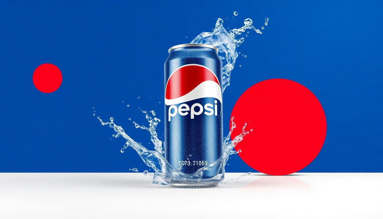
Pepsi Brand Colors: Hex Codes — Pepsi Blue #004B93 & Full Palette
Pepsi's official brand colors are Pepsi Blue #004B93, red #E32934 and white #FFFFFF. The blue was chosen to be everything Coca-Cola's red is not — cool, refreshing and unmistakable on a shelf. Below: the complete palette with RGB and CMYK values, plus the psychology behind the rivalry.
The Pepsi vs. Coca-Cola color war is the most famous brand color rivalry in history. While Coca-Cola owns red, Pepsi strategically claimed blue — and this single color decision has shaped over 60 years of marketing, packaging, and brand psychology. Understanding Pepsi's color strategy reveals how a challenger brand can use color to differentiate, compete, and occasionally outmaneuver the market leader.
Pepsi's Primary Brand Color Palette
| Color Name | Hex Code | RGB | Usage |
|---|---|---|---|
| Pepsi Blue | #004B93 | 0, 75, 147 | Primary brand, logo globe |
| Pepsi Red | #E32934 | 227, 41, 52 | Logo accent, energy |
| Pure White | #FFFFFF | 255, 255, 255 | Logo stripe, backgrounds |
| Electric Blue | #005CB4 | 0, 92, 180 | Digital, packaging |
| Dark Navy | #00234B | 0, 35, 75 | Premium applications |
| Silver | #C0C0C0 | 192, 192, 192 | Diet/Zero products |
The Pepsi vs. Coca-Cola Color War
| Factor | Pepsi (Blue) | Coca-Cola (Red) |
|---|---|---|
| Temperature | Cool, refreshing | Warm, energizing |
| Emotion | Calm confidence | Passionate excitement |
| Taste Perception | Crisp, clean | Sweet, bold |
| Generation Appeal | Youthful, modern | Classic, timeless |
| Cultural Read | Progressive | Traditional |
Research in color psychology reveals that blue actually suppresses appetite — a counterintuitive choice for a beverage brand. But Pepsi turned this apparent weakness into a strength by positioning blue as "refreshing" and "cool" rather than "appetizing."
The famous "Pepsi Paradox": In blind taste tests, Pepsi often wins. But when consumers see the branding, Coca-Cola's red triggers stronger emotional preference. This demonstrates that color can override taste perception.
Pepsi's Logo Color Evolution
| Era | Blue | Red | White | Design Philosophy |
|---|---|---|---|---|
| 1898 | — | Red script | White | Copying Coca-Cola |
| 1950 | Blue cap | Red | White | Differentiation begins |
| 1973 | Bold blue | Bold red | White stripe | "Pepsi Generation" |
| 1991 | Deeper blue | Smaller red | Refined | Modern simplification |
| 2008 | Electric blue | Minimal red | Asymmetric globe | "Smile" rebrand |
| 2023 | Classic blue | Classic red | Balanced | Heritage return |
Pepsi's 2023 rebrand is notable — after years of minimizing red in favor of blue dominance, the brand returned to a more balanced red-white-blue palette, acknowledging that the tricolor combination is more memorable than blue alone.
Sub-Brand Color Strategy
| Product | Dominant Color | Hex | Strategy |
|---|---|---|---|
| Pepsi Classic | Blue | #004B93 | Core brand identity |
| Pepsi Zero Sugar | Black | #000000 | Zero/bold/masculine |
| Diet Pepsi | Silver + Blue | #C0C0C0 | Light, diet association |
| Pepsi Wild Cherry | Red-Pink | #C41E3A | Flavor differentiation |
| Mountain Dew | Neon Green | #87C232 | Extreme energy |
| Gatorade | Orange + Green | #F47920 | Sports performance |
| 7UP | Green | #006F44 | Fresh, clean, natural |
PepsiCo uses color as a portfolio navigation tool — each brand in the family has a distinct color identity that prevents consumer confusion while maintaining corporate coherence.
Why Blue Works for Beverages
Despite blue's appetite-suppressing reputation, it works brilliantly for Pepsi because:
- Refreshment association: Blue = water = cold = refreshing
- Cooler temperature: Consumers perceive blue packaging as keeping drinks colder
- Differentiation: In a sea of red (Coke), orange (Fanta), and green (Sprite), blue stands out on shelves
- Trust: Blue communicates reliability — you know what you're getting with Pepsi
- Digital advantage: Blue is the dominant color on social media — Pepsi's blue content performs well on Facebook, Twitter, and Instagram
Design Lessons from Pepsi
- Color is competitive strategy: If your competitor owns red, own blue — find your complementary differentiation
- Consistency with evolution: Pepsi's blue has evolved but never disappeared — brand color commitment matters
- Sub-brands need color autonomy: Mountain Dew and Gatorade succeed because they're NOT blue
- Cool colors sell refreshment: Blue makes beverages feel colder before you even taste them
- Heritage has value: Pepsi's 2023 return to balanced tricolor shows that evolution shouldn't abandon origins
Build a Competitive Brand Palette
- Analyze your competitor's colors, then find the complementary opposite with our tools
- Generate differentiated palettes using the AI Color Palette Generator
- See how your blue competes with red using the Color Contrast Checker
- Compare your brand colors with the Pantone Color Finder for print accuracy
Pepsi's color story proves that choosing the right color is a strategic weapon, not just a design decision. In the cola wars, blue didn't just differentiate Pepsi — it defined an entirely different brand personality.
Related: Coca-Cola Brand Colors, McDonald's Brand Colors, food branding color psychology.