Pastel Colors in Modern UI Design
· Coloracci Team
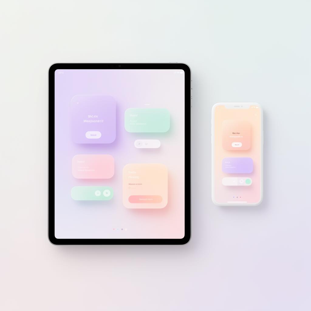
Pastel colors have undergone a dramatic rehabilitation in digital design. Once dismissed as childish or unsophisticated, soft muted tones now define some of the most polished interfaces on the web. From fintech dashboards to productivity tools, pastels are proving that gentleness and professionalism aren't mutually exclusive — and that the right pale lavender can communicate trust just as effectively as corporate navy.
But pastels are deceptively difficult to use well. Their low contrast creates accessibility landmines, their softness can blur visual hierarchy, and poorly chosen pastels make interfaces look washed out rather than refined. This guide covers the principles that separate elegant pastel UI from pale mediocrity.
Why Pastels Work in Digital Design
The resurgence of pastels in UI isn't arbitrary. Several convergent factors have made soft color palettes more effective — and more desirable — than ever.
Screen Technology Has Caught Up
Modern OLED and high-DPI displays render subtle color differences with precision that older LCD screens couldn't achieve. A decade ago, the difference between #F0E6FF (soft lavender) and #F5F0FF (near-white lavender) would be invisible on most monitors. Today, these subtle distinctions create perceptible depth and layering, making pastel-based elevation systems viable.
Reducing Cognitive Load
Saturated, high-contrast interfaces demand attention at every point. Pastels do the opposite — they create a calm visual environment where content takes priority over chrome. Apps like Notion, Linear, and Calm use pastel accents precisely because they reduce the perceived complexity of information-dense screens.
Research in human-computer interaction suggests that lower-saturation environments reduce eye fatigue during extended sessions. For tools people use eight hours a day, this isn't a stylistic preference — it's a usability feature.
Emotional Warmth in Cold Categories
Fintech, healthcare, and enterprise software — categories historically dominated by cold blues and sterile whites — are adopting pastels to feel more human. A budget tracking app in soft peach and mint feels less intimidating than one in navy and gray, potentially increasing user engagement with uncomfortable tasks like reviewing spending habits.
Pastel Color Palettes for UI
Building a pastel palette requires more discipline than assembling saturated colors. When everything is soft, the differences between colors must be carefully calibrated to maintain distinction and hierarchy.
The Foundation Palette
A versatile pastel UI palette needs at least six colors with clearly defined roles:
- Lavender Mist — #E8DEFF — Primary accent, selected states, active elements
- Rose Quartz — #FFE0E6 — Secondary accent, notifications, badges
- Mint Cream — #D4F5E9 — Success states, confirmations, progress indicators
- Peach Silk — #FFE5D4 — Warnings, attention states, promotional highlights
- Ice Blue — #D6EEFF — Informational states, tooltips, help content
- Lemon Chiffon — #FFF8DC — Highlights, search results, new item indicators
Each color must be distinguishable from the others even at small sizes. Test your palette by placing small (8x8px) swatches of each color side by side. If any two are hard to tell apart, increase the hue separation.
Surface and Background System
Pastels excel as background and surface colors, but they need a structured system to avoid the "everything is the same color" problem:
| Level | Color | Hex | Usage |
|---|---|---|---|
| Base | Snow | #FAFAFA | Page background |
| Surface 1 | Soft Lilac | #F8F4FF | Cards, panels |
| Surface 2 | Pale Rose | #FFF5F7 | Nested cards, sidebar |
| Surface 3 | Whisper Blue | #F0F7FF | Modals, overlays |
| Hover | Lavender Touch | #EDE4FF | Interactive hover states |
| Selected | Lavender Mist | #E8DEFF | Active/selected items |
The progression from #FAFAFA to #E8DEFF creates four visible elevation steps using only pastel tones — no shadows required. Each step increases saturation slightly while shifting hue, creating both depth and visual interest.
Dark Mode Pastels
Pastels don't have to disappear in dark mode. The technique is to dramatically reduce lightness while preserving the hue:
- Light mode: Lavender Mist #E8DEFF → Dark mode: #2D2640
- Light mode: Mint Cream #D4F5E9 → Dark mode: #1A2E25
- Light mode: Rose Quartz #FFE0E6 → Dark mode: #2E1F23
These dark pastels maintain the warmth and personality of the light palette without the washed-out appearance that simply dimming pastels produces.
Accessibility Concerns with Pastels
Pastels and accessibility are inherently at tension. The same low saturation and high lightness that make pastels calming also make them dangerous for readability. This section covers how to use pastels without excluding users.
The Contrast Problem
The fundamental issue: pastel colors on white backgrounds produce extremely low contrast ratios. Some examples:
- Lavender #E8DEFF on White #FFFFFF — 1.15:1 ❌ (invisible to many users)
- Mint #D4F5E9 on White #FFFFFF — 1.1:1 ❌ (barely perceptible)
- Peach #FFE5D4 on White #FFFFFF — 1.12:1 ❌ (fails everything)
None of these pass any WCAG threshold. This means pastels should never be used for text, icons that convey meaning, or interactive element borders on white backgrounds.
Where Pastels Are Safe
Pastels work well in roles where they don't carry critical information:
- Background fills — A card with a #F8F4FF background and #1A1A2E text achieves 15.2:1 contrast. The pastel sets the mood; the dark text carries the information.
- Decorative elements — Illustrations, dividers, and ornamental shapes in pastel tones add warmth without accessibility risk.
- Large surface areas — Status badges and tags where the pastel background is paired with dark text (#2D2640 on #E8DEFF = 11.8:1).
- Progress indicators — Pastel fill colors in progress bars, where the percentage is also displayed as text.
Making Pastel Borders Visible
Borders are a common failure point. A #E8DEFF border on a #FFFFFF background has insufficient contrast for UI components (WCAG requires 3:1 for non-text elements). Solutions:
- Darken the border — Use #C4B5E0 instead of #E8DEFF (3.2:1 against white) ✅
- Use the pastel as fill, not stroke — A filled card in #F8F4FF with no border is more visible than a white card with a pastel border
- Add a subtle shadow — A 1px shadow at 8% opacity provides separation without requiring a visible border color
Text on Pastel Backgrounds
When placing text on pastel surfaces, use dark colors from the same hue family for visual cohesion:
- On Lavender #E8DEFF → use Deep Purple #2D2640 (11.8:1) ✅
- On Mint #D4F5E9 → use Forest #1A3329 (10.6:1) ✅
- On Peach #FFE5D4 → use Espresso #3D2416 (9.8:1) ✅
- On Ice Blue #D6EEFF → use Midnight #152A3D (10.2:1) ✅
This approach maintains the pastel aesthetic while ensuring every text element is fully readable.
Combining Pastels with Bold Accents
Pure pastel interfaces risk feeling flat and indecisive. The solution is strategic contrast — using bold, saturated accent colors at key interaction points to create visual anchors within the soft environment.
The 95/5 Rule
In a pastel-dominant UI, limit bold accents to approximately 5% of the visual surface area. This creates maximum impact:
- 95% pastel — backgrounds, cards, secondary buttons, illustrations, borders
- 5% bold — primary CTA buttons, critical icons, active navigation indicators, error states
A single saturated button on a pastel page draws the eye immediately. This is the power of contrast — the bold element doesn't need to be large to dominate attention.
Choosing Your Bold Accent
Select an accent that shares the undertone of your pastel palette but at full saturation:
- Lavender palette → Electric Purple #7C3AED as primary accent
- Mint palette → Emerald #059669 as primary accent
- Rose palette → Ruby #E11D48 as primary accent
- Peach palette → Burnt Orange #EA580C as primary accent
The shared undertone creates harmony; the saturation gap creates hierarchy. A #7C3AED button on a #F8F4FF surface is both visually striking and aesthetically cohesive.
Practical Implementation
Here's how a pastel-with-bold-accent system works in practice:
Primary CTA buttons: The only elements using the full-saturation accent. White text on the bold background ensures readability:
- #7C3AED background + #FFFFFF text = 6.4:1 contrast ✅
Secondary buttons: Use the pastel version of the accent with dark text:
- #E8DEFF background + #7C3AED text = 5.2:1 contrast ✅
Ghost buttons: Transparent background with a darkened pastel border:
- #C4B5E0 border + #7C3AED text on white = passes both border (3.2:1) and text (4.6:1) requirements ✅
Status indicators: Bold accents for critical states, pastels for informational ones:
- Error: #E11D48 icon + #FFF1F2 background
- Success: #059669 icon + #ECFDF5 background
- Info: #D6EEFF background with #152A3D text (no bold accent needed)
Avoiding the "Candy Store" Effect
The biggest risk with pastel palettes is using too many hues. When every section of the page uses a different pastel — pink cards here, blue ones there, green badges beside yellow tags — the interface feels chaotic despite the softness of each individual color.
Limit your palette to three pastel hues maximum for functional color coding, plus one neutral pastel for surfaces. If you need more distinction, vary lightness within a single hue rather than adding new hues:
- Tag category A: #E8DEFF (standard lavender)
- Tag category B: #D4C4FF (deeper lavender)
- Tag category C: #C0AAFF (rich lavender)
Three shades of one hue are always more cohesive than three different pastel colors.
Pastel UI design is a discipline of restraint. The palette must be soft enough to feel calming, distinct enough to maintain hierarchy, accessible enough to serve all users, and punctuated with enough boldness to drive action. Get the balance right, and you'll create interfaces that feel both gentle and purposeful — the visual equivalent of a confident whisper.