Pantone Color of the Year 2026: Complete Analysis
· Coloracci Team
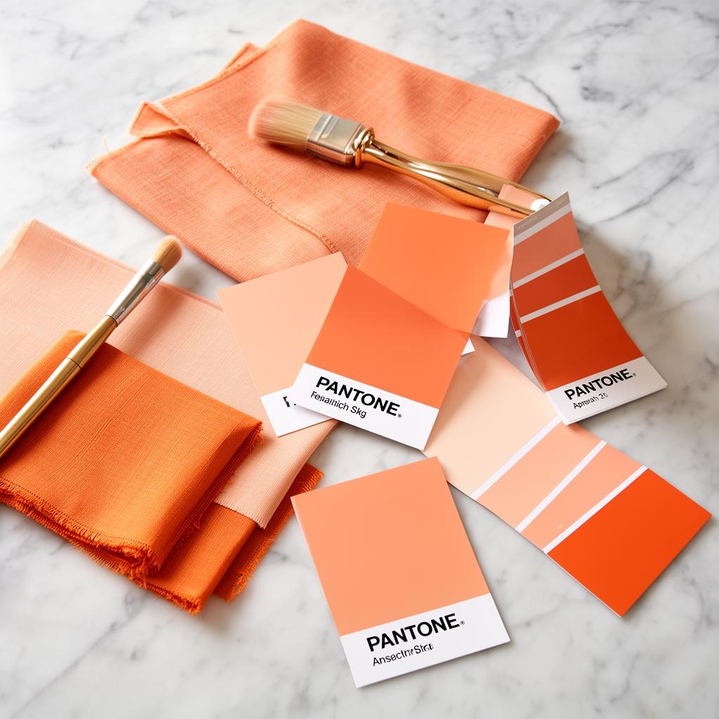
Every December, the Pantone Color Institute announces a single shade that will define the visual language of the coming year. The selection shapes product design, fashion collections, interior décor, and digital interfaces worldwide. For 2026, Pantone chose Joyful Apricot (PANTONE 14-1230), a warm, luminous hue that sits at the intersection of orange and peach — radiating optimism, warmth, and approachable energy.
This article provides a complete analysis: the color itself, the historical arc that led to its selection, practical ways to integrate it into design work, and the ripple effects already visible across industries.
The Selected Color: Joyful Apricot
Joyful Apricot is a medium-saturation warm tone that Pantone describes as "a nurturing hue that bridges comfort and confidence." It avoids the intensity of pure orange while carrying more warmth than blush or peach.
Technical Specifications
Here are the precise values for accurate reproduction across media:
- Pantone — 14-1230 Joyful Apricot
- Hex —
#E8956A - RGB — 232, 149, 106
- HSL — 20°, 74%, 66%
- CMYK — 0, 40, 55, 5
The color occupies a psychologically interesting space. It's warm enough to evoke comfort and nourishment — think ripe fruit, sunset light, terracotta — without the aggressive energy that saturated oranges carry. This balance is deliberate. Pantone's executive director, Leatrice Eiseman, described it as "a color that wraps around you like golden hour light."
Companion Palette
Pantone also released a curated palette of complementary colors designed to work alongside Joyful Apricot:
- Warm Sand —
#D4C4A8— A neutral base that grounds the warmth - Deep Terracotta —
#A0522D— An earthy anchor for rich, layered compositions - Soft Sage —
#A3B18A— A muted green that provides natural contrast - Twilight Blue —
#4A6670— A cool complement that prevents palettes from feeling overly warm - Ivory Cream —
#F5F0E8— A warm white for backgrounds and negative space - Charcoal Plum —
#3D2B3D— A dark tone for text and structural elements
This palette demonstrates Pantone's understanding that no color exists in isolation. Joyful Apricot needs cooler counterpoints — the sage and twilight blue — to avoid cloying sweetness, and darker tones to maintain visual hierarchy.
Historical Context: How We Got Here
Pantone's Color of the Year selections follow cultural currents. Looking at the trajectory of recent choices reveals why Joyful Apricot makes sense for 2026.
The Post-Pandemic Arc
The selections from 2020 onward tell a clear story:
- 2020 — Classic Blue
#0F4C81— Stability and calm during the onset of global uncertainty - 2021 — Ultimate Gray
#939597+ Illuminating#F5DF4D— Resilience paired with hope (the first dual selection) - 2022 — Very Peri
#6667AB— Creative courage and imaginative exploration - 2023 — Viva Magenta
#BB2649— Bold self-expression and unconventional confidence - 2024 — Peach Fuzz
#FFBE98— Gentleness, community, and tactile warmth - 2025 — Mocha Mousse
#A47764— Grounded indulgence and sensory comfort - 2026 — Joyful Apricot
#E8956A— Optimistic warmth with active energy
The pattern is unmistakable. After years of seeking calm (blue, gray), then rediscovering boldness (magenta, peri), the palette has settled into warm, nurturing territory — but with increasing energy. Peach Fuzz was soft and passive. Mocha Mousse was grounded and still. Joyful Apricot retains the warmth but adds vibrancy, signaling a cultural mood that has moved from recovery to active optimism.
The Warm Color Cycle
Historically, Pantone's selections oscillate between warm and cool dominance in roughly 3–5 year cycles. The current warm phase began with Peach Fuzz in 2024 and appears set to continue. Designers should expect warm neutrals, terracottas, and sunset-adjacent hues to dominate trend forecasts through at least 2027.
How to Use Joyful Apricot in Design
Translating a trend color into practical design work requires more than dropping a hex code into your stylesheet. Here's how to apply Joyful Apricot effectively across different contexts.
Web and Digital Design
In digital interfaces, Joyful Apricot works best as an accent color rather than a dominant surface color. Its moderate saturation makes it effective for:
Call-to-Action Buttons. Joyful Apricot #E8956A provides strong visibility without the urgency of red. On a white background, it achieves a contrast ratio of 2.6:1 — insufficient for text, but effective for large interactive elements when paired with dark text:
.cta-button {
  background-color: #E8956A;
  color: #3D2B3D; /* Charcoal Plum — 7.2:1 contrast */
  border-radius: 8px;
  padding: 12px 24px;
}
Illustration and Iconography. The color excels in flat illustrations, hero graphics, and icon systems where warmth and approachability are desired. Pair with the Soft Sage #A3B18A and Twilight Blue #4A6670 for balanced compositions.
Gradient Backgrounds. A subtle gradient from Ivory Cream #F5F0E8 to a very light tint of Joyful Apricot #F5DDD0 creates a warm, inviting canvas without overwhelming content:
.hero-section {
  background: linear-gradient(135deg, #F5F0E8 0%, #F5DDD0 100%);
}
Dark Mode Application. In dark mode, desaturate and deepen the color. Use #C47A55 as a dark mode accent — it maintains the apricot character while providing better contrast against dark surfaces (#1A1A1A background yields a contrast ratio of 4.1:1).
Brand Identity
For brands considering Joyful Apricot as a primary brand color, consider these guidelines:
- Food and wellness brands — natural fit. The color evokes ripe fruit, natural ingredients, and warmth.
- Technology brands — use sparingly as an accent. Full apricot branding in tech can read as informal. Pair with Charcoal Plum
#3D2B3Dfor sophistication. - Luxury brands — combine with metallic gold accents and Warm Sand
#D4C4A8for an elevated, resort-inspired palette. - Children's brands — the color's cheerful warmth works well, but lighten to
#F0B898to avoid competing with typical toy-bright palettes.
Interior and Product Design
In physical spaces and products, Joyful Apricot translates beautifully to:
- Textiles — upholstery, cushions, and throws in the apricot tone add warmth to neutral interiors
- Ceramics — tableware and decorative objects in glazed apricot create focal points
- Wall accents — a single accent wall in Joyful Apricot paired with Ivory Cream walls produces a sun-drenched effect
- Packaging — the color performs exceptionally in matte finishes on kraft or cream substrates
Industry Impact
Pantone's announcement triggers a cascade of decisions across global industries. Here's how Joyful Apricot is already reshaping 2026 design.
Fashion
Major fashion houses had advance access to the selection (Pantone briefs key industry partners months before the public announcement). Spring/Summer 2026 collections from multiple designers feature apricot-adjacent tones in flowing fabrics — linen dresses, silk scarves, and lightweight knits. The color bridges the gap between casual warmth and elevated dressing, making it versatile across price points.
Streetwear brands are adopting the tone in unexpected ways — apricot sneaker accents, tonal tracksuits, and dyed denim washes. The color's gender-neutral quality makes it appealing for unisex collections.
Technology and Digital Products
App redesigns and seasonal UI updates are incorporating apricot tones into onboarding flows, notification badges, and promotional banners. Notable early adopters include:
- Meditation and wellness apps using apricot as a calming accent color
- E-commerce platforms featuring apricot-toned seasonal campaigns
- Social media platforms testing apricot highlight colors for creator tools
The color's warmth makes it particularly effective in apps focused on human connection — dating apps, community platforms, and communication tools.
Graphic Design and Marketing
Marketing campaigns for Q1–Q2 2026 are heavily leveraging the apricot palette. The color photographs exceptionally well, maintaining its warmth under studio lighting and outdoor conditions. It pairs naturally with lifestyle photography — food, travel, and wellness imagery gains an immediate trend-forward quality when color-graded toward apricot tones.
Email marketing templates, social media graphics, and presentation decks are adopting apricot accent colors at scale. For designers, this means understanding how to use the color effectively before clients inevitably request it.
Print and Packaging
Consumer packaged goods (CPG) brands are reformulating packaging to incorporate apricot tones, particularly in:
- Skincare and beauty — the warm, skin-adjacent color suggests natural ingredients
- Food and beverage — apricot tones evoke flavor and freshness
- Home goods — candles, diffusers, and bath products in apricot packaging align with the broader wellness trend
Building Lasting Palettes Beyond the Trend
While Pantone's Color of the Year drives immediate trend adoption, smart designers build palettes that outlast the annual cycle. Joyful Apricot #E8956A belongs to a family of warm earth tones that have enduring appeal regardless of trend status.
To build a palette that feels current in 2026 but ages gracefully:
- Use Joyful Apricot as a 10% accent, not a 60% dominant color
- Pair with timeless neutrals — Warm Sand
#D4C4A8, charcoals, and warm whites - Include one cool contrast — Twilight Blue
#4A6670or Soft Sage#A3B18Aprevents the palette from feeling dated when the trend passes - Define tints and shades now —
#F5DDD0(light tint) and#C47A55(dark shade) extend the color's utility - Document your intent — note in your style guide that the apricot accent was chosen for its warmth and optimism, not just because it was trending. This helps future designers maintain the palette's purpose even if the specific hex evolves.
Pantone's Color of the Year is a compass, not a mandate. Use Joyful Apricot to inform your direction, then build a color system robust enough to navigate beyond any single trend cycle.