Military Uniform Colors: Inside the OCP Camouflage Palette (Hex Codes & Psychology)
· Coloracci Team
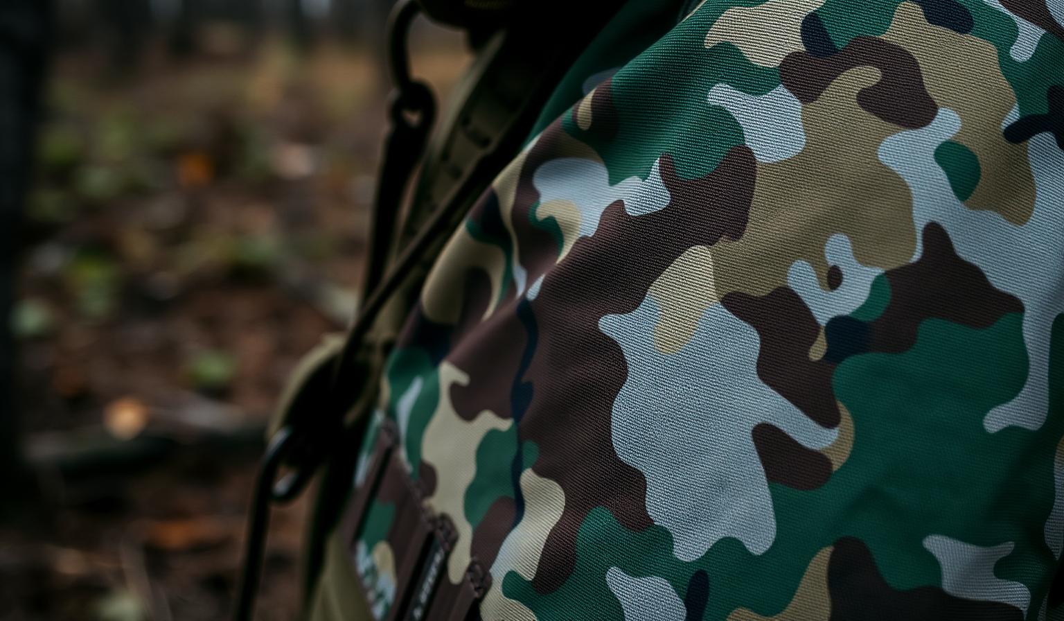
Military Uniform Colors: Inside the OCP Camouflage Palette (Hex Codes & Psychology)
The most ruthlessly tested palette on earth isn't a luxury brand guideline — it's a combat uniform. Military uniform colors are engineered, not styled: every hue is selected to defeat the human visual system at distance, in motion, under stress. The US Army's Operational Camouflage Pattern (OCP) is the cleanest modern case study, a tight six-color system of muted greens, browns, and greys built to break up silhouettes across woodland, transitional, and urban terrain.
For designers and color enthusiasts, that makes OCP a goldmine. It's a low-saturation, value-driven palette signed off by spectrophotometers and field trials — exactly the kind of restraint most interfaces, brands, and editorial systems are quietly missing. This guide unpacks the exact hex codes behind OCP, the patterns hidden inside the choices, and how to translate battlefield logic into civilian design.
Why Military Uniform Colors Matter to Designers
Camouflage solves two contradictory problems at once: disappear into the environment, but stay readable to your own team. That's the same tension behind every well-designed product — recede where attention isn't earned, dominate where it is. Three reasons OCP belongs in your reference library:
- Empirical, not aesthetic. OCP's color set was derived from terrain spectroscopy, not Pinterest moodboards.
- Multi-environment by design. The palette is engineered to perform across woodland, desert transition, and urban shadow — analogous to light mode, dark mode, and brand contexts.
- Symbolically dense. Beyond function, military colors carry inherited meaning: discipline, service, authority, calm.
If you want the long-form historical arc of military color, our companion post on military uniform colors and tactical camouflage psychology pairs perfectly with this hex-first guide.
The Complete OCP Color Breakdown (with Exact Hex Codes)
OCP runs on six engineered colors. Each is desaturated, value-shifted, and tuned to sit inside a narrow luminance band. Here's the full system.
1. Special Grey — #7C887E
A cool, slightly green-shifted grey that anchors the mid-tone of the pattern. It blends with overcast lighting, weathered concrete, and the muted greens of late-season foliage. In design terms: a perfect neutral that reads warm next to true greys and cool next to greens.
2. Artichoke — #91967F
A desaturated green-grey — the workhorse of the palette. Artichoke is the bridge color that lets OCP read as "vegetation" without ever committing to actual green. It's the same logic Apple uses for its sage hardware finishes: ambient, organic, never loud.
3. Muted Sage — #BAB79F
A light, subdued sage that mimics dry grass, pale foliage, and sun-bleached canvas. This is the highlight color of the system — bright enough to break up dark shapes, quiet enough to never call attention to itself.
4. Soft Grey — #D3D2CD
The lightest tone in the palette. Soft Grey functions as a "dust and highlight" color — the visual equivalent of light hitting a dusty boot or a sand-dusted plate carrier. In a UI, it's the surface color you'd use for raised cards on a near-white background.
5. Dusty Brown — #A08D83
A warm, desaturated brown that ties the cooler greys back to earth tones. It mirrors bark, dry soil, and weathered leather. Crucially, it sits at almost the same luminance as Special Grey — proving OCP is built on value harmony, not hue harmony.
6. Modern Gray — #726870
The darkest tone — a cool, slightly purple-leaning grey used for shadow shapes and disruptive deep tones. It's never pure black; OCP intentionally avoids #000000 because true black doesn't exist in natural environments and reads as artificial at distance.
Six colors. Two greys, one warm brown, two greens, one near-white. No reds, no blues, no jewel tones — and yet the system reads as visually rich because the value spread does the work.
Patterns & Analysis: What the OCP Color Choices Reveal
Lay the six hex codes side by side and the design discipline becomes obvious.
The luminance ladder. Convert the palette to grayscale and you get a clean staircase: Modern Gray (~42%) → Dusty Brown (~57%) → Special Grey (~53%) → Artichoke (~59%) → Muted Sage (~73%) → Soft Grey (~83%). Every color sits at a distinct value step. That's why OCP works in low light, high light, and even when partially desaturated by haze — the value hierarchy survives even when the hues collapse.
Saturation capped under 15%. None of the six colors exceed roughly 15% HSL saturation. That's an extreme ceiling — most "muted" brand palettes still run 25–40%. The lesson for designers: if you want a palette that ages well across screens, print, and photography, drop your saturation ceiling far lower than you think you need to.
Hue compression around a 60° arc. All six colors live between yellow-green (~80°) and red-orange (~20°) on the hue wheel. That tight hue range is why the palette feels cohesive even with six distinct colors. Designers obsessing over "the right blue" should try the inverse experiment: pick six colors within a single 60° arc and watch how much more sophisticated the result feels.
Warm/cool pairing within each value step. Special Grey (cool) is paired with Dusty Brown (warm) at nearly identical luminance. That subtle warm/cool tension is what makes OCP feel alive instead of flat — and it's the same trick that separates premium UI palettes from generic ones.
Near-black is engineered, not defaulted. Modern Gray (#726870) is the floor of the system, not #000. Pure black is a tell in natural environments; in interfaces, it's a tell of an under-considered palette. Always design your darkest color intentionally.
Color Psychology: What These Military Uniform Colors Communicate
OCP is engineered for function, but every color in it carries inherited meaning. Borrowing them in civilian work imports that meaning whether you intend it or not.
Greys (Special Grey, Soft Grey, Modern Gray) — authority, neutrality, control. Greys are the diplomats of the color world. They commit to nothing, support everything, and project calm competence. In branding, a grey-dominant palette signals premium restraint (think Tesla, Apple, A24).
Artichoke and Muted Sage — endurance, growth, adaptability. Desaturated greens read as natural, sustainable, and grounded. They're the color story of brands that want to communicate longevity over hype — heritage workwear, slow fashion, wellness, outdoor gear.
Dusty Brown — heritage, craft, dependability. Brown is the most under-used neutral in digital design. It carries warmth that grey can't, history that black can't, and approachability that blue can't. Used as a small accent, it makes any palette feel more human.
Soft Grey — clarity, peace, breathing room. The lightest tone in OCP plays the same role as whitespace in editorial design — it signals quiet confidence. The brands that use this kind of off-white well (Aesop, Muji) feel expensive without trying.
Modern Gray — gravitas, control, considered authority. Reserved for shadow and depth in OCP, this near-black brings the same weight to civilian work. Use it for primary text, hero backgrounds, and any moment where you want the user to slow down and pay attention.
Taken together, OCP communicates calm capability under pressure — exactly the emotional register most modern B2B and premium consumer brands are aiming for.
Designer Takeaways: How to Use OCP-Style Palettes in Real Projects
Five concrete moves to translate this military-grade discipline into your next project.
1. Build palettes on a value ladder first, hue second
Pick your six values (roughly 15%, 30%, 45%, 60%, 75%, 90% luminance), then assign hues. The result is automatically cohesive because the luminance hierarchy is doing the heavy lifting. Every color earns its place by occupying a distinct value step.
2. Cap saturation aggressively
Set a project-wide saturation ceiling around 20% for everything except true accent moments. Reserve high-chroma colors (your CTA red, your alert yellow) for the 5% of your interface that genuinely needs to grab the eye. This single rule will sharpen any palette overnight.
3. Pair warm and cool at the same luminance
Pull Special Grey (#7C887E) and Dusty Brown (#A08D83) into a mood board side by side. The warm/cool tension at near-identical value is the secret sauce. Apply it: every neutral in your palette should have a same-value counterpart on the opposite temperature.
4. Design your near-black on purpose
Borrow Modern Gray (#726870) for your darkest UI surface, or shift it warmer (#1C1A18) or cooler (#1A1C20) to match your brand temperature. Either way, never default to #000000. Pick a near-black and use it everywhere.
5. Use Muted Sage as your "natural neutral"
#BAB79F is one of the most universally flattering background colors in existence — warm enough for skin tones, cool enough to read as neutral, light enough to support legible text. Try it as a body background on your next portfolio or editorial site instead of the default white. You'll be surprised how much warmer the entire experience feels.
For palette pairings that build on these foundations, our popular gradients gallery has dozens of two- and three-stop combinations that extend naturally from earth-tone bases like OCP.
Quick-Reference Data Table
| Item | Primary Color | Hex Code | Color Name | Psychological Meaning |
|---|---|---|---|---|
| OCP mid-tone neutral | Cool green-grey | #7C887E | Special Grey | Authority, calm, neutrality |
| OCP vegetation tone | Desaturated green-grey | #91967F | Artichoke | Endurance, adaptability, organic stability |
| OCP highlight foliage | Light desaturated sage | #BAB79F | Muted Sage | Growth, calm, ambient warmth |
| OCP dust & highlight | Very light warm grey | #D3D2CD | Soft Grey | Clarity, peace, breathing room |
| OCP earth & bark | Warm desaturated brown | #A08D83 | Dusty Brown | Heritage, craft, dependability |
| OCP shadow & depth | Cool near-black | #726870 | Modern Gray | Gravitas, control, considered authority |
Notice how every row carries a distinct functional role and a distinct emotional payload. That's the mark of a designed palette versus a chosen one.
Conclusion: Borrow the Discipline, Skip the Camo Print
You don't have to design tactical gear to learn from military uniform colors. The transferable insight from OCP is disciplined restraint — a narrow hue arc, an aggressive saturation ceiling, an intentional near-black, and a value ladder that does the work high chroma usually tries (and fails) to do. The same logic that lets a soldier dissolve into a treeline at 100 meters will help your product dissolve into a user's daily workflow at zero meters: by being calm, legible, and unmistakably purposeful.
Pick one of the six OCP hex codes above, drop it into your next mood board, and build outward from there. You'll be surprised how quickly a single earth tone forces every other decision in your palette to get sharper.
Ready to put these palettes to work? Open the Coloracci AI palette generator to remix any of the OCP hex codes above into a complete project system, or explore our popular gradients library for pre-built combinations that extend naturally from earth-tone foundations. The discipline is universal — the canvas is yours.