Nursery Color Psychology: Baby Room Design for Development and Calm
· Coloracci Team
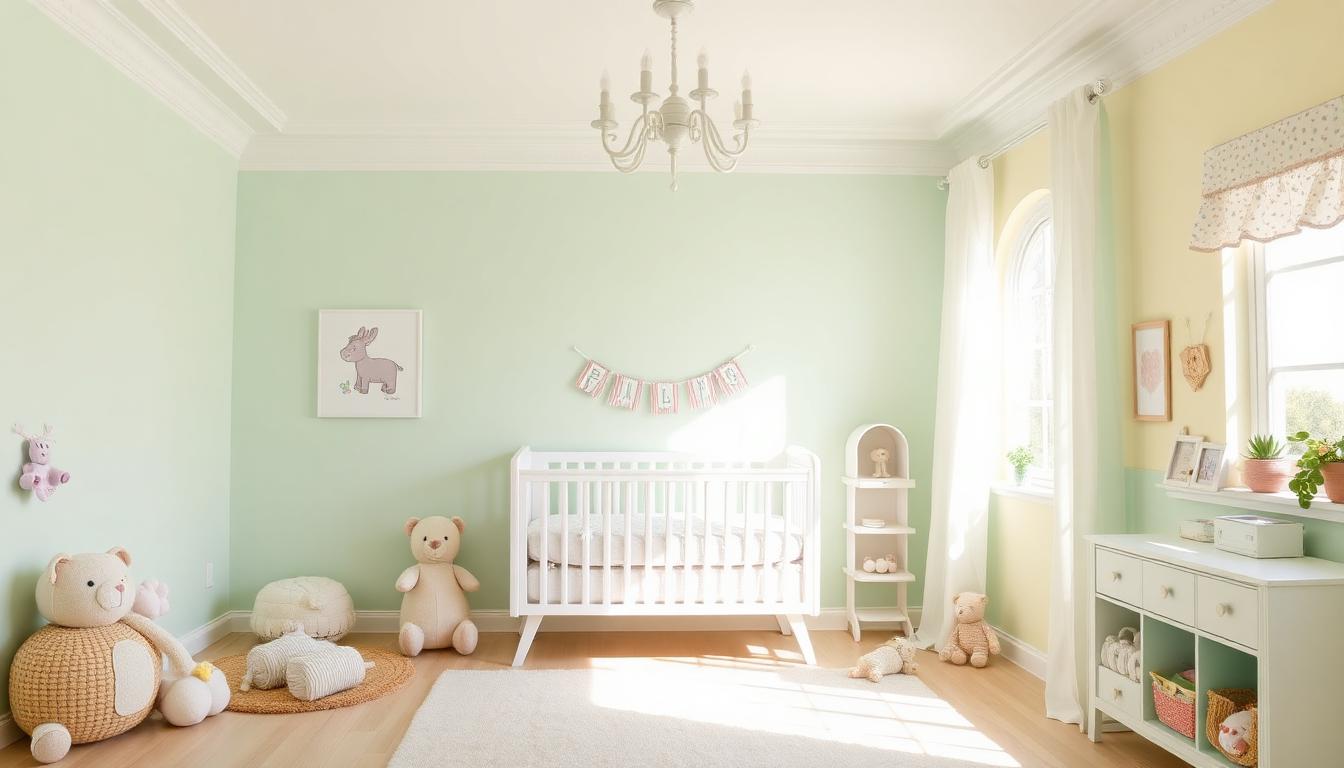
The Science of Nursery Color Psychology
Nursery design operates at a unique intersection of infant development, parental psychology, and practical functionality. Unlike other interior spaces, nursery colors must simultaneously support neurological development in preverbal infants while creating calming environments for exhausted parents.
Why Nursery Colors Matter for Development
Research in developmental psychology and environmental design reveals significant impacts from nursery color choices:
| Color | Developmental Impact | Age Appropriateness | Parental Effect |
|---|---|---|---|
| Soft Green | Visual tracking improvement | 0-6 months optimal | Stress reduction |
| Pale Yellow | Alertness without overstimulation | 3-12 months | Mood elevation |
| Light Blue | Sleep quality enhancement | All ages | Calm atmosphere |
| Soft Pink | Gentle stimulation | 0-12 months | Nurturing response |
| Lavender | Sleep association | 6+ months | Relaxation |
| Cream/Neutral | Visual rest | All ages | Sophisticated calm |
These effects aren't merely aesthetic—colors directly impact infant visual development, sleep patterns, and emotional regulation foundations.
Infant Visual Development and Color
Understanding how babies see colors transforms nursery design:
Visual Development Timeline:
| Age | Color Vision Capability | Optimal Nursery Colors |
|---|---|---|
| 0-1 month | Black, white, high contrast | Monochrome patterns |
| 1-3 months | Red, orange, yellow (warm spectrum) | Soft warm accents |
| 3-6 months | Full color spectrum emerging | Pastel primaries |
| 6-12 months | Near-adult color vision | Full range, soft saturation |
Key Research Findings:
| Study | Finding | Design Application |
|---|---|---|
| Infant Vision Research | Babies prefer saturated colors | Soft versions of bold hues |
| Developmental Psychology | High contrast aids visual development | Pattern mixing essential |
| Sleep Studies | Blue wavelengths suppress melatonin | Avoid bright blue near sleep |
| Color Psychology | Green reduces cortisol in infants | Primary nursery color |
Soft Green: The Optimal Nursery Foundation
Green emerges as the most developmentally appropriate nursery color:
Green Developmental Benefits:
- Mid-spectrum visibility (easiest for developing eyes)
- Association with natural growth and safety
- Calming without sedating
- Gender-neutral for sibling sharing
Optimal Nursery Green Spectrum:
| Shade Name | Hex Code | RGB | Developmental Use |
|---|---|---|---|
| Mint Green | #B2E0D4 | 178, 224, 212 | Newborn calming |
| Soft Sage | #9DC183 | 157, 193, 131 | Visual development |
| Seafoam | #9FE2BF | 159, 226, 191 | Gender-neutral nursery |
| Celadon | #ACE1AF | 172, 225, 175 | Sophisticated nursery |
| Pistachio | #93C572 | 147, 197, 114 | Playful energy |
Green Implementation Strategy:
- 50-60% of wall surface for primary calming effect
- Vary shades for visual interest without overstimulation
- Combine with natural wood tones for biophilic benefits
Calming Blues for Sleep Support
Blue's sleep implications require strategic nursery application:
Blue Sleep Science:
- Blue light suppresses melatonin production
- Soft, muted blues support circadian rhythm
- Blue-green combinations optimal for sleep spaces
Nursery-Appropriate Blues:
| Shade Name | Hex Code | RGB | Sleep Impact |
|---|---|---|---|
| Powder Blue | #B0E0E6 | 176, 224, 230 | Gentle calm |
| Baby Blue | #89CFF0 | 137, 207, 240 | Daytime alertness |
| Robin's Egg | #96DED1 | 150, 222, 209 | Balanced energy |
| Pale Sky | #AFEEEE | 175, 238, 238 | Soft tranquility |
| Dusty Blue | #A6B8C7 | 166, 184, 199 | Sophisticated calm |
Blue Timing Strategy:
- Use brighter blues for play/activity areas
- Reserve soft blues for sleep spaces
- Avoid screens emitting blue light near sleep
Warm Accents: Yellow and Pink
Gentle Yellow: Optimism and Development
Yellow supports infant alertness and visual tracking:
Yellow Developmental Benefits:
- High visibility for developing eyes
- Mood elevation for parents
- Sunshine association for positive environment
- Moderate stimulation without overwhelm
Nursery Yellow Spectrum:
| Shade Name | Hex Code | RGB | Best Application |
|---|---|---|---|
| Buttercream | #FFFACD | 255, 250, 205 | Ceiling, soft surfaces |
| Pale Yellow | #FFFFE0 | 255, 255, 224 | Accent walls |
| Custard | #FDE992 | 253, 233, 146 | Play area accents |
| Lemon Chiffon | #FFFACD | 255, 250, 205 | Curtains, textiles |
| Cream Yellow | #F3E5AB | 243, 229, 171 | Warmth without intensity |
Soft Pink: Nurturing Associations
Pink nursery psychology extends beyond gender:
Pink Developmental Research:
- Baker-Miller Pink (#E8C4C8) shown to reduce aggressive behavior
- Soft pink supports emotional regulation
- Nurturing associations benefit all infants
Modern Pink Spectrum:
| Shade Name | Hex Code | RGB | Contemporary Use |
|---|---|---|---|
| Blush | #F4C2C2 | 244, 194, 194 | Gender-neutral soft |
| Rose Quartz | #F7CAC9 | 247, 202, 201 | 2016 Pantone influence |
| Dusty Rose | #DCAE96 | 220, 174, 150 | Sophisticated vintage |
| Peach | #FFDAB9 | 255, 218, 185 | Warm alternative |
| Ballet Pink | #F8C8DC | 248, 200, 220 | Gentle traditional |
Neutral Foundations: Cream and Gray
Cream and White: Visual Rest
Neutral nurseries provide developmental benefits:
Neutral Advantages:
- Visual rest for developing eyes
- Easy color adaptation as child grows
- Sophisticated aesthetic for parents
- Maximum light reflection for brightness
Neutral Spectrum:
| Shade Name | Hex Code | RGB | Psychological Effect |
|---|---|---|---|
| Pure White | #FFFFFF | 255, 255, 255 | Maximum brightness |
| Warm White | #FAF9F6 | 250, 249, 246 | Soft welcoming |
| Cream | #FFFDD0 | 255, 253, 208 | Gentle warmth |
| Ivory | #FFFFF0 | 255, 255, 240 | Classic elegance |
| Linen | #FAF0E6 | 250, 240, 230 | Textural warmth |
Gray: Modern Sophistication
Gray nurseries require careful color psychology application:
| Gray Shade | Hex Code | RGB | Nursery Application |
|---|---|---|---|
| Dove Gray | #D3D3D3 | 211, 211, 211 | Soft background |
| Warm Gray | #A9A9A9 | 169, 169, 169 | Accent balance |
| Greige | #BEBEBE | 190, 190, 190 | Contemporary neutral |
| Charcoal | #36454F | 54, 69, 79 | Sophisticated accents |
Gray Caution:
- Avoid cool grays that feel institutional
- Warm undertones essential for nurseries
- Maximum 30% of visual field to prevent coldness
Complete Nursery Color Systems
Developmentally Optimal: Sage + Cream + Soft Yellow
| Role | Color | Hex Code | Percentage |
|---|---|---|---|
| Primary | Soft Sage | #9DC183 | 50% |
| Secondary | Warm Cream | #FFFDD0 | 30% |
| Accent | Butter Yellow | #FFFACD | 15% |
| Detail | Natural Wood | - | 5% |
Developmental Benefits:
- Green supports visual tracking
- Cream provides rest
- Yellow offers gentle stimulation
- Gender-neutral for flexibility
Calm and Serene: Powder Blue + White + Lavender
| Role | Color | Hex Code | Purpose |
|---|---|---|---|
| Primary | Powder Blue | #B0E0E6 | Calm foundation |
| Secondary | White | #FFFFFF | Brightness |
| Accent | Soft Lavender | #E6E6FA | Sleep association |
| Detail | Silver | #C0C0C0 | Modern touch |
Sleep Support:
- Blue spectrum without sleep disruption
- Lavender promotes relaxation
- High brightness for daytime alertness
Warm and Nurturing: Peach + Cream + Soft Green
| Role | Color | Hex Code | Atmosphere |
|---|---|---|---|
| Primary | Peach | #FFDAB9 | Warmth |
| Secondary | Cream | #FFFDD0 | Softness |
| Accent | Mint Green | #B2E0D4 | Freshness |
| Detail | Rose Gold | #B76E79 | Gentle luxury |
Emotional Impact:
- Peach creates nurturing environment
- Balanced warmth without overwhelm
- Sophisticated for parents
- Welcoming for all visitors
Age-Appropriate Color Evolution
Newborn to 3 Months
Color Priorities:
- High contrast patterns (black/white)
- Soft green for calming
- Avoid bright primary colors
- Maximum 3-color palette
Recommended Palette:
- 60% soft cream/white
- 30% sage green
- 10% high contrast patterns
3-6 Months
Color Development:
- Introduce pastel primaries
- Maintain green foundation
- Add soft yellow for stimulation
- Visual tracking practice colors
Recommended Palette:
- 40% soft green
- 30% cream
- 20% pale yellow
- 10% soft blue accents
6-12 Months
Color Expansion:
- Full pastel range appropriate
- Maintain color harmony
- Add playful accent colors
- Prepare for toddler transition
Recommended Palette:
- 30% primary neutral
- 25% soft green
- 20% pastel accents
- 15% warm secondary
- 10% playful brights
Gender Considerations in Modern Nurseries
Beyond Traditional Pink and Blue
Modern nursery design increasingly abandons strict gender color coding:
| Approach | Color Strategy | Benefits |
|---|---|---|
| Gender-neutral | Green, yellow, cream | Sibling sharing, flexibility |
| Modern pink | Dusty rose, coral | Sophisticated femininity |
| Modern blue | Teal, seafoam | Contemporary masculinity |
| Mixed approach | All colors welcome | Self-expression support |
Research on Gender and Color:
- No innate color preferences by gender before age 2
- Socialization creates preferences
- Color-coding limits development
- Neutral nurseries support individuality
Practical Nursery Color Implementation
Paint and Finish Selection
| Finish Type | Color Effect | Practical Considerations |
|---|---|---|
| Matte | Soft, calm appearance | Harder to clean |
| Eggshell | Balanced sheen | Best for nurseries |
| Satin | Slight reflectivity | Easy cleaning |
| Semi-gloss | High shine | Use only for trim |
Paint Color Psychology:
- Test colors at different times of day
- Consider lighting temperature (2700K-3000K optimal)
- Factor in natural light changes
- Plan for color consistency across sight lines
Textile and Soft Goods
| Item | Color Strategy | Developmental Impact |
|---|---|---|
| Crib bedding | Soft green or cream | Sleep support |
| Play mat | High contrast patterns | Visual development |
| Curtains | Room-darkening neutral | Sleep environment |
| Rug | Soft pattern or solid | Comfort, visual interest |
| Mobile | Primary color spectrum | Tracking development |
Lighting and Color Interaction
Nursery Lighting Psychology
| Light Type | Color Temperature | Nursery Application |
|---|---|---|
| Daylight | 5000-6500K | Play, alertness |
| Warm white | 2700-3000K | Evening, sleep prep |
| Night light | 2000K amber | Sleep maintenance |
| Blackout | - | Sleep quality |
Color Temperature Effects:
- Cool light: Alertness, daytime activity
- Warm light: Relaxation, sleep preparation
- Red/amber: Minimal melatonin disruption
Circadian Rhythm Support
Color and light work together for infant sleep:
| Time of Day | Color Environment | Light Strategy |
|---|---|---|
| Morning | Bright, warm colors | Full spectrum exposure |
| Afternoon | Playful, varied colors | Natural light |
| Evening | Soft, muted colors | Dim warm lighting |
| Night | Darkness preferred | Red-spectrum night light |
Measuring Nursery Color Success
Developmental Tracking
| Metric | Color Impact | Assessment Method |
|---|---|---|
| Visual tracking | Green/ high contrast improvement | Pediatric evaluation |
| Sleep quality | Blue avoidance benefit | Parent logging |
| Calm behavior | Soft colors association | Observation |
| Alertness | Yellow exposure timing | Activity patterns |
Parental Experience Metrics
| Metric | Color Influence | Measurement |
|---|---|---|
| Stress levels | Calm colors reduction | Self-report surveys |
| Room satisfaction | Cohesive palette | Post-occupancy interviews |
| Photo satisfaction | Color photo quality | Social media analysis |
| Longevity satisfaction | Neutral base + accents | 1-year follow-up |
Conclusion
Nursery color psychology represents one of the most impactful applications of color science, affecting not just aesthetics but actual infant development and family wellbeing. The evidence overwhelmingly supports soft greens as foundational colors, with strategic use of yellows for development and blues for calm.
Modern nursery design increasingly recognizes that these spaces serve dual purposes: supporting infant neurological development while creating nurturing environments for exhausted parents. The most successful nursery palettes achieve this balance through thoughtful color selection, appropriate saturation levels, and strategic implementation across surfaces and lighting.
Whether choosing a sage green foundation with cream accents or a powder blue sleep-optimized environment, understanding the developmental and psychological science behind nursery colors ensures spaces that genuinely support the incredible journey of early childhood. Mastering nursery color psychology means creating not just beautiful rooms, but optimal developmental environments for the next generation.