Military Uniform Colors: How Tactical Camouflage Shapes Morale, Authority, and Design
· Coloracci
Why Military Uniform Colors Matter Beyond the Battlefield
Every military uniform color carries the weight of life-or-death decisions. These are not aesthetic choices — they are functional, psychological, and strategic instruments refined across centuries of combat, diplomacy, and leadership. For designers, color enthusiasts, and brand strategists, understanding military uniform colors and camouflage patterns unlocks a reference library unlike any other: a palette system tested under the most extreme visual and emotional conditions imaginable.
Research consistently shows that color influences 62–90% of subconscious first impressions. In military contexts, this influence is deliberately engineered. A soldier's uniform must simultaneously conceal them from enemy observation, identify them as friendly to allies, project authority in diplomatic settings, and reinforce unit cohesion among peers. That same color must also shape public perception during peacekeeping missions, signal rank and experience to subordinates, and withstand scrutiny across desert sun, jungle humidity, arctic snow, and urban shadows.
This article examines military uniform colors through a lens rarely explored in design writing: the intersection of concealment, command, and morale. We break down the exact hex codes of iconic camouflage palettes, analyze how desert, woodland, and urban patterns solve distinct visual problems, decode the psychological impact of red, blue, green, black, and gray in tactical environments, and extract actionable design principles from centuries of battlefield-tested color science. For a deeper dive into the historical evolution of military patterns, our companion guide on military uniform camouflage hex codes provides the complete pattern atlas.
The Complete Military Camouflage Color Breakdown: Exact Hex Codes
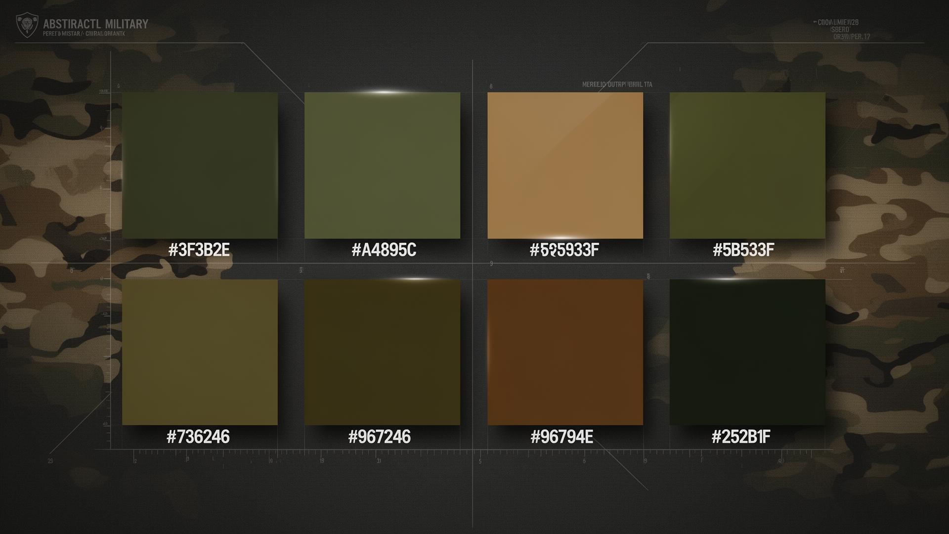
Military camouflage operates on a deceptively simple principle: mimic the environment so precisely that the human eye cannot separate the soldier from the terrain. Below is the core palette distilled from standardized military color specifications, including the canonical six-tone system used across modern tactical design.
The Six Core Tactical Colors
These six colors form the backbone of modern military camouflage systems. Each was selected not for visual appeal but for empirical performance across multiple terrain types.
| Color Name | Hex Code | RGB | Role in Camouflage |
|---|---|---|---|
| Cluster | #3F3B2E | (63, 59, 46) | Dark shadow base — deep woodland concealment, rock crevices, low-light terrain |
| Barley Corn | #A4895C | (164, 137, 92) | Mid-tone highlight — dried grass, sun-bleached terrain, transitional zones |
| Manhattan Green | #5B533F | (91, 83, 63) | Olive-brown mid-layer — temperate forest dapple, mixed foliage undergrowth |
| Army Camo | #736246 | (115, 98, 70) | Medium brown-green — universal earth tone, woodland floor, bark transition |
| Dirt | #96794E | (150, 121, 78) | Warm earth highlight — exposed soil, dry mud, limestone dust, desert scrub |
| Log Cabin | #252B1F | (37, 43, 31) | Deepest shadow anchor — canopy voids, cave mouths, night operations |
Cluster (#3F3B2E) sits at the dark end of the military palette spectrum. With an RGB value of (63, 59, 46), it is technically a desaturated dark olive-brown rather than a true black. This subtle warmth prevents the "dead" appearance that pure black (#000000) produces against natural environments, where true black almost never occurs. In design applications, Cluster functions as a sophisticated near-black that retains organic warmth — ideal for luxury packaging, editorial headers, and premium UI dark modes.
Barley Corn (#A4895C) carries an RGB of (164, 137, 92) and serves as the palette's primary light-element. It reads as warm sand or dried grass — the color of terrain that has been baked by sun and wind. Its relatively high lightness value (L* ≈ 58 in LAB space) makes it the pattern's highlight workhorse, reflecting ambient light in arid conditions while retaining enough yellow-green to function in transitional woodland. For civilian designers, Barley Corn is an exceptional alternative to sterile beige; it communicates warmth, resilience, and timeless utility.
Manhattan Green (#5B533F) at RGB (91, 83, 63) represents the palette's tonal center. It is neither fully green nor fully brown — it occupies the precise chromatic midpoint where foliage meets earth. This ambiguity is intentional: a color that cannot be easily categorized by the human eye is harder to detect against complex natural backgrounds. In brand design, this quality translates to versatility — Manhattan Green reads as "natural" in outdoor contexts and "sophisticated" in urban ones.
Army Camo (#736246) with RGB (115, 98, 70) is the palette's most recognizable tone. It is the color most civilians picture when they hear the word "camouflage" — a balanced brown-green that signals ruggedness, preparedness, and field-tested reliability. This hue carries powerful semantic associations in Western markets: outdoor adventure, tactical competence, and heritage craftsmanship.
Dirt (#96794E) at RGB (150, 121, 78) brings necessary warmth to the palette. Without this earthy orange-brown, the other five colors would feel cold and synthetic. Dirt mimics the exposed clay, sandstone, and sun-baked mud found across the world's conflict zones. In design, it functions as an anchor warmth — a single touch of Dirt can prevent an entire earth-tone palette from feeling lifeless.
Log Cabin (#252B1F) with RGB (37, 43, 31) is the deepest tone, a near-black with a distinct green shift. It represents the void-like darkness of dense forest canopy, cave systems, and night operations. Its green undertone (notice the G value of 43 exceeds the R value of 37) prevents it from reading as pure void, instead suggesting depth within a living environment. This makes it superior to pure black for most design applications where "black" is requested.
Desert Camouflage: Arid Theater Optimization
Desert camouflage palettes are engineered for environments where vegetation is sparse and the dominant visual elements are sand, rock, and shadow. The palette is deliberately narrower than woodland systems because desert terrain offers less chromatic variation.
| Color Name | Hex Code | Terrain Function |
|---|---|---|
| Sand Base | #C2B280 | Sun-bleached dunes, limestone surfaces, dry lake beds |
| Desert Shadow | #A4895C | Rocky outcrops, shaded sand, dried riverbed edges |
| Coyote Brown | #96794E | Exposed soil, mudbrick structures, weathered wood |
| Dust Tan | #D4C5A9 | Highlight elements, salt flat reflections, haze |
| Arid Umber | #8B7355 | Deep shadow in rock formations, cave entrances |
Desert palettes demonstrate chromatic restraint at its most extreme. With saturation levels rarely exceeding 25%, these colors rely entirely on value contrast to disrupt the human silhouette. The lesson for designers: when your environment (or canvas) is visually quiet, restraint becomes the loudest statement.
Flecktarn: The German Woodland Innovation
Flecktarn (German for "spotted camouflage") represents one of the most influential woodland patterns ever developed. Its five-color spot system uses smaller, more numerous color patches than American woodland patterns, creating superior disruption at medium distances.
| Color Name | Hex Code | Pattern Role |
|---|---|---|
| Dark Forest | #3A3F2E | Primary base — dense conifer canopy, shadow masses |
| Olive Branch | #4A4F38 | Secondary fill — mixed deciduous foliage, mid-tones |
| Rust Spot | #5C3A26 | Disruptor element — fallen leaves, exposed earth patches |
| Bark Brown | #3D3025 | Shadow accent — tree trunks, rocky fractures |
| Lichen Green | #6B7356 | Highlight spot — sun-dappled leaves, mossy surfaces |
Flecktarn's genius lies in its scale variation. The smallest spots (roughly 2–3 cm) disrupt close-range shape recognition, while larger blotches (8–12 cm) break up the silhouette at 50+ meters. For interface designers, this principle translates directly: use small, high-frequency color variation for detailed elements (icons, labels) and large, low-frequency blocks for structural areas (sidebars, hero sections).
Urban Camouflage: The Gray Spectrum
Urban camouflage is the newest major pattern family, developed for operations in concrete, steel, and rubble environments. Unlike natural-world camouflage, urban patterns must account for flat planes, sharp edges, and artificial lighting.
| Color Name | Hex Code | Urban Function |
|---|---|---|
| Concrete Gray | #8C8C8C | Unpoured concrete, dust-covered surfaces, weathered stone |
| Slate Shadow | #4A4A4A | Deep building shadows, asphalt, steel understructure |
| Ash White | #B8B8B8 | Sunlit concrete, marble dust, plaster debris |
| Charcoal Black | #1F1F1F | Burn patterns, tire marks, industrial oxidation |
| Rust Orange | #8B4513 | Exposed rebar, weathered shipping containers, oxidized metal |
Urban camouflage introduces a critical new variable: reflectivity management. City environments contain hard, flat surfaces that create specular highlights unlike anything in nature. Urban palette colors are therefore selected for their matte, non-reflective qualities — a lesson applicable to any design intended for screen-based consumption where glare and backlighting are concerns.
Patterns & Analysis: What Military Color Choices Reveal
When you lay all three camouflage families — woodland, desert, and urban — side by side, several structural patterns emerge that have direct application in civilian design.
The 5-Color Ceiling
No effective military camouflage system uses more than five to six distinct colors. MultiCam (Operational Camouflage Pattern) uses exactly seven, but two are so close in value that they function as a single perceptual layer. Flecktarn uses five. Early woodland patterns used four. This isn't budget constraint — it's perceptual science. The human visual system can hold roughly four to five distinct color categories in working memory simultaneously. Beyond that, additional colors cease to contribute to disruption and instead create detectable pattern regularity.
For designers, this validates the 4±1 color rule that underlies most successful UI palettes: a primary, a secondary, a neutral, and an accent. Military camouflage proves that complexity does not equal effectiveness. Restraint is sophistication.
Saturation Never Exceeds 35%
Across every military palette — desert, woodland, urban, and ceremonial — no textile color exceeds approximately 35% HSL saturation. Camouflage research consistently demonstrates that high-chroma colors "pop" against natural backgrounds at distances exceeding 50 meters, even when their hue matches the environment. The human visual system is optimized to detect chromatic novelty as a survival mechanism.
This principle extends directly to digital design. Interfaces with too many saturated colors create visual fatigue and reduce task completion rates. The most usable applications — think government portals, banking interfaces, medical systems — employ palettes that would not look out of place in a desert camouflage pattern. Low saturation is not boring; it is legible.
Value Contrast Does the Heavy Lifting
Look at the six core tactical colors: Cluster (#3F3B2E, L* ≈ 22), Army Camo (#736246, L* ≈ 42), Barley Corn (#A4895C, L* ≈ 58), and Dirt (#96794E, L* ≈ 52). The hues are nearly identical — all sit between yellow-green and red-brown on the color wheel — but the luminance values span roughly 22–58%. Disruption comes from light-dark contrast, not from hue variety.
This is perhaps the most underappreciated principle in civilian color design. Designers obsess over finding "the perfect blue" when the more impactful decision is often how light or dark that blue should be. Value hierarchy — the relationship between light and dark — drives comprehension faster than hue selection.
Environment Dictates Palette, Not Vice Versa
Military color selection always begins with terrain analysis. The U.S. Army's transition from woodland BDUs to desert DCUs in 1990, then to universal MultiCam in 2010, then to OCP in 2015, demonstrates a ruthless commitment to environment-matching. No color is sacred; every hue is expendable if the terrain changes.
Apply this discipline to your own work. Before selecting a single color, define the "visual terrain" your design will inhabit. A fintech app competing against dozens of blue-and-white competitors on a smartphone screen requires a different palette strategy than a luxury brand displayed in dimly lit retail environments. Context is not an afterthought — it is the primary variable.
Color Psychology: What Military Uniform Colors Communicate
Military uniform colors are dense symbolic systems. Each carries inherited meaning that shapes morale, leadership perception, and team dynamics.
Red — Authority, Aggression, and Urgency
Red is the most emotionally charged color in the military spectrum. Despite being nearly absent from actual combat camouflage (it is functionally useless for concealment), red persists in military iconography because of its psychological dominance.
- Courage and sacrifice — Red medals, insignia, and ceremonial elements honor bravery under fire. The U.S. Marine Corps "Blood Stripe" uses scarlet (#CE1126) to commemorate the heavy casualties at Chapultepec.
- Command and urgency — Red is the universal color of alerts, danger warnings, and high-priority signals. In tactical environments, red demands immediate attention and action.
- Aggression and intimidation — Historical armies from Roman legions to British Redcoats used red to project fearsome visibility. Modern special forces use red in unit insignia to signal elite lethality.
For civilian designers, a single saturated red against an earth-tone field reads as conviction and decisive energy. Use it sparingly — the military reserves red for the 1% of signals that genuinely require instant response.
Blue — Trust, Reliability, and Security
Blue dominates naval and air force identities worldwide for deeply rooted psychological reasons. It is the most "institutional" color in the spectrum.
- Trust and professionalism — Studies consistently show that individuals in blue uniforms are rated as more competent and trustworthy than those in other colors. Naval dress blues communicate mastery and discipline.
- Loyalty and constancy — Blue's association with the sky and sea evokes dependability and unwavering commitment. Air Force blue (#4A6FA5) specifically signals technological precision and forward-thinking capability.
- Security and calm under pressure — Blue suppresses physiological stress responses. In medical and peacekeeping contexts, light blue communicates non-threatening intent.
The spectrum matters: navy blue communicates tradition and gravitas, while lighter Air Force blue suggests innovation. This gradient mirrors how tech companies use blue — darker for enterprise trust, lighter for consumer accessibility.
Green — Stealth, Harmony, and Growth
Green is the most psychologically complex military color, functioning simultaneously as a concealment tool and a morale instrument.
- Stealth and concealment — Green's primary tactical function is environmental blending. The muted olives and forest greens of military palettes (#41533B, Manhattan Green #5B533F) feel organic and trustworthy because they mimic the natural world.
- Harmony and balance — Green triggers parasympathetic nervous system responses, reducing stress and promoting calm. In high-pressure military environments, green surroundings measurably improve decision-making and reduce cortisol levels.
- Growth and toughness — As the color of vegetation, green communicates resilience and the ability to endure. It tells the viewer "I can survive here."
- Unit cohesion — Wearing identical green creates powerful tribal identity. Studies of unit morale consistently show that shared visual identity (uniform color, insignia, patches) correlates with higher group cohesion and mission commitment.
Black — Power, Intimidation, and Refinement
Black is the most symbolically loaded color in military design, carrying contradictory meanings that shift with context.
- Authority and dominance — Special operations forces, honor guards, and ceremonial units employ black to project elite status and uncompromising command presence.
- Stealth and mystery — Black implies the ability to operate unseen and unobserved. It carries an almost supernatural quality — the void, the unknown, the untraceable.
- Psychological intimidation — The absence of color creates a visual void that demands attention. Facing an all-black uniform triggers subconscious threat-assessment responses.
- Refinement and discipline — Ceremonial black is the most formal dress standard. It communicates that the wearer has submitted individuality to institutional identity.
Critically, military black is almost never pure #000000. Log Cabin (#252B1F) and similar near-blacks retain subtle undertones that prevent the artificial flatness of absolute black. This is why designs using "rich black" (with added cyan or warm undertones) feel more sophisticated than designs using default #000000.
Gray — Neutrality, Professionalism, and Low-Key Presence
Gray is the underrated workhorse of military color psychology.
- Neutrality and balance — Gray communicates objectivity, rationality, and the absence of bias. UN peacekeeping forces employ gray in vehicles and equipment to signal non-partisan intent.
- Professionalism without ego — Unlike black's dominance or red's aggression, gray suggests competence without the need to assert it. It is the color of confident restraint.
- Low-key presence — In tactical contexts, gray reduces visual signature without the menacing associations of black. Urban camouflage relies heavily on gray precisely because cities are gray environments.
- Adaptability — Gray shifts its character based on surrounding colors. Next to blue it feels cool and technical; next to brown it feels warm and grounded. This chameleon quality makes gray indispensable in multi-environment design systems.
Designer Takeaways: Translating Military Color Science Into Real Projects
These five principles extract the discipline of military color systems into actionable design strategies.
1. Build Palettes Around Luminance, Not Hue
Select three to four colors that share a narrow hue family (warm earth, cool forest, neutral urban) and spread them across the value scale from deep shadow to bright highlight. The resulting palette will feel cohesive and intentional. Apply Cluster (#3F3B2E) as your near-black, Army Camo (#736246) as your mid-tone, and Barley Corn (#A4895C) as your light anchor — you already have a functional three-color system.
2. Cap Saturation at 35% for System Colors
Set a project-wide saturation ceiling around 35% for all structural colors — backgrounds, text, borders, and inactive states. Reserve high-chroma moments for true alerts, CTAs, and status indicators. This single constraint will make any interface feel more professional overnight. The military does not use desaturated colors because they are boring; they use them because desaturation is the fastest route to perceived credibility.
3. Treat Near-Black as a Designed Color
Never reach for #000000 by default. Log Cabin (#252B1F) demonstrates how a green-shifted near-black feels organic and grounded. A warm near-black (#1C1A18) feels luxurious; a cool near-black (#1A1C20) feels technical. Pick one intentionally and use it consistently. The difference between default black and designed near-black is the difference between a template and a crafted experience.
4. Use Disruptive Contrast for Visual Hierarchy
Camouflage's core principle — breaking up recognizable shapes through contrasting adjacent colors — translates directly to UI design. Place Manhattan Green (#5B533F) against Barley Corn (#A4895C) and you create a boundary that guides the eye without requiring saturated accent colors. Disruptive contrast is about value difference, not chromatic drama.
5. Design for Morale, Not Just Aesthetics
The most overlooked lesson from military color science is that palettes influence team psychology. Green uniforms measurably improve unit cohesion. Blue dress uniforms increase perceived leadership competence. Red insignia boost willingness to engage in high-risk tasks. In civilian terms: your color choices shape how teams feel about the products they build and the brands they represent. Choose colors that reinforce the emotional state you want your users and colleagues to inhabit.
Complete Data Table: Military Colors, Hex Codes, and Psychological Meanings
| Item | Primary Color | Hex Code | Color Name | Psychological Meaning |
|---|---|---|---|---|
| Core tactical base | Dark olive-brown | #3F3B2E | Cluster | Concealment, depth, organic authority |
| Core tactical highlight | Warm tan | #A4895C | Barley Corn | Resilience, sun-baked endurance, adaptability |
| Core tactical mid-tone | Olive-brown | #5B533F | Manhattan Green | Versatility, environmental ambiguity, balance |
| Core tactical earth | Brown-green | #736246 | Army Camo | Ruggedness, field-tested reliability, preparedness |
| Core tactical warmth | Earthy brown | #96794E | Dirt | Grounding, terrain mastery, organic warmth |
| Core tactical shadow | Near-black green | #252B1F | Log Cabin | Void depth, night capability, elite presence |
| Desert camouflage | Sand tan | #C2B280 | Sand Base | Arid mastery, patience, environmental adaptation |
| Desert camouflage | Warm tan | #A4895C | Desert Shadow | Rocky resilience, shaded endurance |
| Desert camouflage | Earth brown | #96794E | Coyote Brown | Universal utility, tactical gear reliability |
| Desert camouflage | Pale sand | #D4C5A9 | Dust Tan | Bleached neutrality, haze camouflage |
| Flecktarn woodland | Dark green | #3A3F2E | Dark Forest | Canopy depth, conifer dominance, shadow mass |
| Flecktarn woodland | Muted olive | #4A4F38 | Olive Branch | Deciduous transition, mid-tone harmony |
| Flecktarn woodland | Rust brown | #5C3A26 | Rust Spot | Disruption, fallen leaf mimicry, organic decay |
| Urban camouflage | Medium gray | #8C8C8C | Concrete Gray | Industrial neutrality, urban adaptation |
| Urban camouflage | Dark gray | #4A4A4A | Slate Shadow | Building void, asphalt depth, structural weight |
| Ceremonial/branch | Deep blue | #1C222E | Navy Blue | Institutional trust, maritime mastery, tradition |
| Ceremonial/branch | Sky blue | #4A6FA5 | Air Force Blue | Precision, freedom, technological advancement |
| Ceremonial/branch | Scarlet red | #CE1126 | Marine Scarlet | Sacrifice, courage, historical valor |
| Psychological accent | Absolute black | #0A0A0A | Ceremonial Black | Elite status, uncompromising authority |
| Psychological accent | Neutral gray | #808080 | Tactical Gray | Balance, non-partisan professionalism |
Conclusion: Battle-Tested Color Wisdom for the Modern Designer
Military uniform colors represent the most disciplined color-selection methodology ever developed. Every hue — from Cluster's deep olive-brown to Barley Corn's warm tan — exists because it solved a specific problem: concealment in woodland canopy, survival in desert heat, authority in diplomatic chambers, cohesion among peers under fire. These colors were not chosen by committees seeking consensus; they were selected by survival pressures that punished poor choices with lethal consequences.
The transferable insight is purposeful restraint. Military palettes do not chase trends. They do not add colors for visual interest. They select the minimum number of hues necessary to solve the problem at hand, cap saturation at empirically tested ceilings, and rely on value contrast rather than chromatic variety to create structure. That discipline produces palettes that feel timeless, authoritative, and unmistakably functional.
For designers, the invitation is clear: borrow the rigor without borrowing the camouflage. Drop any single hex code from the tables above into your next mood board — Cluster as a near-black, Dirt as a warm anchor, Manhattan Green as a versatile mid-tone — and watch how quickly a single military-derived color forces every other palette decision to become sharper, more intentional, and more confident.
Ready to build your own battle-tested palette? Use the Coloracci palette generator to remix any of these military hex codes into a complete project system, or explore our popular gradients collection to see how tactical earth tones translate into modern digital design. For the complete historical and technical breakdown of military camouflage patterns, don't miss our deep dive on military uniform colors and camouflage patterns.