McLaren Papaya Orange: The Story of an F1 Icon
· Coloracci Editorial
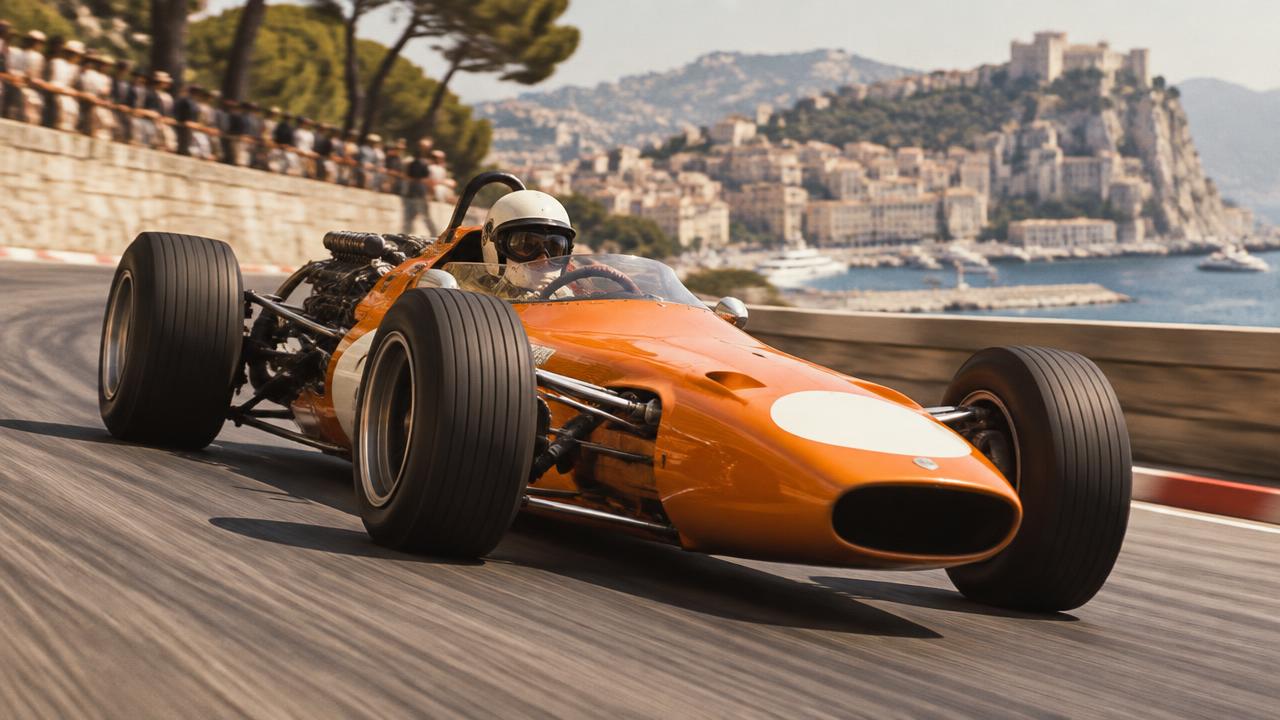
In 1967, the McLaren M6A arrived in a color loud enough to survive speed: a hot orange that stayed recognizable through spray, distance, newsprint, and the visual clutter of a Can-Am grid. The surprising part is that the most repeated explanation for McLaren Papaya Orange—that Bruce McLaren chose it as New Zealand’s national racing color—is wrong. New Zealand’s traditional racing colors were silver and black. Orange was a practical act of distinction that became something far more valuable: a piece of identity no sponsor era could permanently erase.
That distinction matters because papaya is often treated as a fixed paint chip. It is not. Historic film stocks, restorations, changing substrates, television cameras, fluorescent pigments, and modern digital displays all shift its appearance. McLaren itself has used different orange expressions across decades. The HEX values in this guide are therefore analytical approximations for designers, not official paint formulas for historic cars.
The deeper story is about brand memory. Papaya occupied McLaren’s Formula 1 cars for only a short early period, then largely disappeared behind Yardley white, Marlboro red, West-era graphite, and Vodafone silver. Yet when the color returned, audiences recognized it as heritage. Few brands can leave a defining color dormant for decades and still retrieve it with that much emotional equity.
The 1967 Origin of McLaren Papaya Orange
The orange story begins most clearly with the M6A, the Group 7 sports racer created for the 1967 Can-Am season. Bruce McLaren and Denny Hulme drove the team to five victories in six races, giving the new color an immediate association with technical dominance. It was not yet a heritage cue; it was the visible skin of a fast, young organization competing against larger and better-funded rivals.
McLaren’s own historical accounts are careful about the exact reason orange was selected. The popular visibility theory is plausible: a saturated warm hue separated the cars from surrounding fields of red, white, green, and blue, and it reproduced with unusual force in photography. But there is no single surviving statement from Bruce McLaren that closes the case. Good design history should preserve that uncertainty rather than turn a useful hypothesis into fact.
Before orange: white, green, and a car built for cinema
McLaren’s Formula 1 debut in 1966 did not use papaya. The M2B appeared in white with a green stripe because the production of John Frankenheimer’s film Grand Prix paid for the cars to represent the fictional Japanese Yamura team. Artist Michael Turner had proposed another scheme—green upper surfaces, silver lower sides, and a warm yellow band—but the design was seen on promotional material rather than raced as the team’s defining livery. A red car followed in 1967.
This prehistory makes the orange decision more instructive. McLaren did not begin with a perfectly codified identity manual. Its visual language emerged from commercial opportunity, available technology, competitive need, and repeated exposure. That is how many enduring brand assets develop: not from a single workshop presentation, but from a choice that proves useful enough to be repeated.
The M7A turns visibility into Formula 1 meaning
In 1968, the M7A brought orange into Formula 1 and gave it the result that transformed a color into a symbol. Bruce McLaren won the Belgian Grand Prix at Spa, the team’s first championship Grand Prix victory in a car bearing its own name. Papaya also spread through the organization’s Can-Am, Indianapolis, Formula 5000, and Formula 2 programs. The same chromatic signal connected different machines and championships before modern identity systems made that practice routine.
Calling every historic orange “papaya” can be misleading. Period photographs move from yellow-orange to red-orange depending on film and processing. Restored cars can vary. For a contemporary screen palette, Heritage Papaya #FF8700 is a useful center: warmer than safety orange, more energized than conventional automotive orange, and bright enough to hold its character beside black. The neighboring Broadcast Orange #FF8000 reflects another widely used digital reading. Neither value should be presented as a definitive match to every 1960s panel.
| Item | Color | Hex | Name | Meaning |
|---|---|---|---|---|
| 1 | Saturated yellow-orange | #FF8700 | Heritage Papaya | Origin, competitive independence, and instant recognition |
| 2 | Vivid screen orange | #FF8000 | Broadcast Orange | Speed, visibility, and modern digital consistency |
| 3 | Near-black | #111111 | Carbon Black | Engineering precision, structure, and maximum orange contrast |
| 4 | Cool electric blue | #47C7FC | Speedmark Blue | Digital energy and a cool counterpoint to papaya |
| 5 | Racing red | #D71920 | Sponsor Red | The commercially dominant Marlboro-era identity |
| 6 | Metallic silver | #B7BCC2 | Titanium Silver | Technology, restraint, and the Mercedes/Vodafone period |
| 7 | Warm off-white | #F3EFE3 | Archive White | Historic bodywork, editorial space, and visual relief |
| 8 | Graphite | #4A4D50 | West Graphite | The dark, technical identity of the late 1990s and early 2000s |
How McLaren Papaya Orange Disappeared—and Survived
By 1971, papaya had already become secondary on McLaren’s Formula 1 cars. The Yardley-sponsored livery used a predominantly white body with ochre and brown elements; orange survived only as a narrow trace. In 1974, the Marlboro partnership established the red-and-white geometric identity that would define McLaren for two decades. Its diagonal blocks were exceptionally effective on television and became inseparable from championships won by Emerson Fittipaldi, James Hunt, Niki Lauda, Alain Prost, and Ayrton Senna.
From a commercial perspective, this was not a failure of papaya. Formula 1 liveries are negotiated surfaces. Sponsors bring colors with enormous media investment behind them, and the team’s own identity must share or surrender space. The Sponsor Red #D71920 approximation signals a different era of category recognition—one built around a partner’s equity rather than the constructor’s founding color.
The graphite and silver intervals
When tobacco branding changed, McLaren’s visual identity changed again. The West-sponsored cars introduced a black, gray, and silver system from 1997, making West Graphite #4A4D50 and metallic surfaces feel technologically advanced. The Vodafone era later emphasized bright silver, red, and black. A digital Titanium Silver #B7BCC2 captures the cool value structure, although metallic paint cannot be represented by one flat HEX code; its identity depends on flakes, highlights, curvature, and moving reflections.
These liveries were successful and memorable, but they created an interesting brand problem. A viewer could identify an era instantly while struggling to name a permanent McLaren color. Red belonged strongly to Marlboro and later Vodafone. Silver carried Mercedes associations. Black and graphite communicated engineering but offered little category ownership. Papaya, though absent, remained the one warm hue that competitors had not claimed with equal authority.
This is the difference between exposure and ownership. A color seen for twenty consecutive seasons may remain attached to a sponsor. A color used for fewer seasons can belong more deeply to the team if its story begins before commercial overlays. Papaya survived as archival memory, in historic cars, merchandise, fan knowledge, and the mythology of Bruce McLaren’s original organization.
Color memory does not require exact color matching
Fans remembering papaya were not all remembering the same measured orange. Some knew restored M7As; others knew Can-Am photography, anniversary displays, or merchandise. Collective color memory works categorically. People retain “that intense McLaren orange” more reliably than a spectral reading. That flexibility gave the team room to modernize the hue without breaking recognition.
For designers, this is an essential lesson. Heritage is not always protected by reproducing an old formula exactly. Materials, media, and viewing conditions change. The objective is to preserve the color’s relational behavior: papaya should advance against dark engineering surfaces, feel warmer than a generic red-orange, and remain unmistakable at speed. Fidelity to function can matter more than numerical sameness.
The Return of McLaren Papaya Orange
The MCL32 of 2017 marked the visible turn back toward orange, combining it with black after years of silver-dominant liveries. The color was sometimes described as “papaya” in public discussion, although the 2017 expression leaned toward a vivid fluorescent orange. In 2018—the fiftieth anniversary of the M7A’s first Formula 1 victory—McLaren committed much more fully to papaya. The return connected the contemporary team to Bruce McLaren’s era without recreating a vintage car.
That distinction is why the revival worked. It was not nostalgia pasted onto an old silhouette. Modern papaya appeared on complex aerodynamic surfaces, paired with carbon black, calibrated for broadcast cameras, social media, apparel, hospitality spaces, and digital interfaces. The brand restored an old asset by rebuilding its system around present-day channels.
Why orange now belongs to McLaren
Formula 1 is a field of moving color blocks. Ferrari owns red at category scale; British racing green carries broad national and marque associations; blues are common; black and silver circulate across technical brands. Saturated orange occupies a smaller competitive territory. That relative scarcity gives papaya enormous “share of color.” A distant orange car can register as McLaren before details, numbers, or sponsor marks become legible.
Papaya also bridges apparently opposing messages. Yellow content makes it optimistic and youthful; red content contributes urgency and physical energy. Against Carbon Black #111111, it gains precision and aggression. Beside Speedmark Blue #47C7FC, a cool accent used in recent McLaren visual language, it becomes more digital and contemporary. The system can flex from historic warmth to esports intensity without abandoning the core cue.
The F1 team colors and livery psychology guide shows why this matters across the full grid: every team is competing for recognition under the same light, on the same broadcasts, at the same speed. Color is not decoration after engineering. It is the first layer of identification available to the viewer.
A note on fluorescent color and screens
Contemporary racing oranges may use fluorescent or highly luminous coatings that exceed what standard sRGB values can reproduce. Cameras apply color science; broadcasters compress footage; phone displays boost saturation; night races introduce artificial lighting. #FF8700 and #FF8000 are useful web anchors, but neither can simulate fluorescence. A digital team should select one stable reference, then create controlled variants for dark backgrounds, video graphics, print, embroidery, and environmental signage.
A nearby production ink can be explored with Coloracci’s Pantone Finder, but physical matching still requires a current swatch book and proof on the intended material. Orange is particularly sensitive to substrate: coated paper, matte vinyl, fabric, and painted carbon fiber return very different levels of light.
Practical Design Lessons From a Papaya-Led Identity
McLaren’s history offers more than an attractive palette. It demonstrates how a color asset can be interrupted, diluted, and later recovered. The following principles apply to sports teams, mobility brands, technology companies, and any identity that must remain recognizable across partnerships.
1. Choose color for separation, not fashion
Papaya succeeded because it differed from its competitive environment. Before selecting a signature hue, map the colors your audience sees at the same moment. A beautiful blue may be strategically weak in a blue-heavy category. An unusual orange can create more memory even before the logo earns recognition.
2. Define a family, not a mythical single swatch
Use #FF8700 as the primary digital anchor, then document acceptable brighter, darker, and production-specific variants. The goal is controlled adaptation. For example, #FF8000 can support broadcast graphics; a darker orange may be needed for text on pale backgrounds; fluorescent print requires a spot ink rather than a process approximation. Record the reason for each variant so flexibility does not become drift.
3. Make contrast part of ownership
Papaya alone is energetic; papaya against #111111 becomes McLaren-like because the dark field sharpens its silhouette. Warm Archive White #F3EFE3 can introduce historical restraint in editorial work. Blue #47C7FC should remain an accent, not an equal partner, when papaya recognition is the objective. A useful proportion is 55 percent dark neutral, 30 percent papaya, 10 percent warm white, and 5 percent cool blue—then adjust for the medium.
4. Let partnerships enter without erasing the core
Sponsor-heavy brands need protected zones where their own identity remains dominant: nose, sidepod, teamwear panel, social template, or wayfinding band. Partners can add red, blue, or white, but the signature color should appear in a consistent structural role. The history of papaya shows the cost of allowing the team cue to disappear completely—and the value still available when it is restored.
5. Test color in motion and at thumbnail scale
A livery is rarely examined like a poster. It flashes past, appears through spray, occupies a tiny streaming window, or becomes a blurred shape in a photograph. Test designs at five percent size, in grayscale, under motion blur, and against likely competitors. If the signature block disappears, adding more logos will not solve the problem.
6. Separate heritage from imitation
Heritage design should retrieve a principle, not merely copy a surface. McLaren’s modern use of papaya preserves differentiation, warmth, and continuity while accepting contemporary aerodynamics and media. The same approach works in a brand refresh: identify what the historic color did, then engineer that behavior for the present.
7. Build the complete identity around the color
Color ownership grows through repetition across cars, clothing, garages, digital products, content, and fan objects. Typography, spacing, photography, and motion should support the hue rather than compete with it. The logo color palette design guide provides a framework for assigning primary, secondary, neutral, and functional roles so a famous color becomes a usable system.
Conclusion: A Color Faster Than a Logo
McLaren Papaya Orange is iconic not because it remained unchanged, but because its essential idea survived change. The M6A made orange visible in 1967. The M7A attached it to McLaren’s first Formula 1 victory in 1968. Sponsor identities then covered it for decades, yet none acquired the same permanent relationship to the team. Its return in 2017 and full revival in 2018 converted archive into current brand equity.
For color strategists, the story is a compact masterclass: select a hue that separates the brand, connect it to meaningful performance, allow production variants without losing relational behavior, and repeat it across every audience touchpoint. #FF8700 is only a digital coordinate. The real asset is the recognition created when that orange meets speed, carbon black, and the McLaren name.
Start with Heritage Papaya #FF8700, Carbon Black #111111, Archive White #F3EFE3, and Speedmark Blue #47C7FC. Then use the Pantone Finder to shortlist a physical match and test it on the material where your own color story must perform.