Material Design 3 Color System: Dynamic Color and Theme Builder Guide
· Coloracci Team
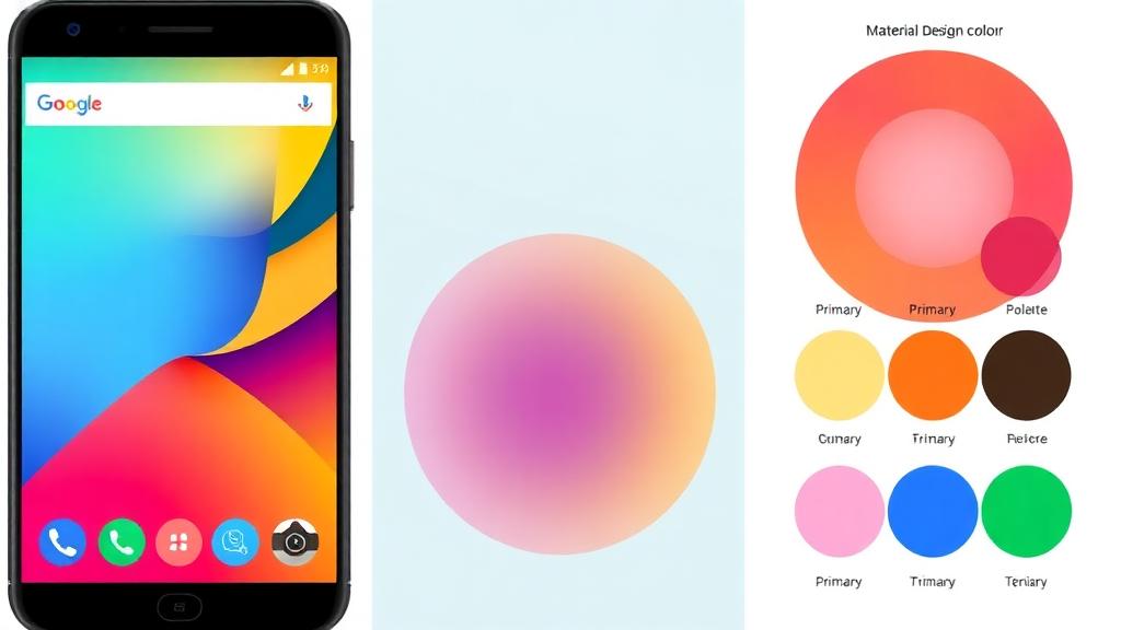
What Changed in Material Design 3
Material Design 3 (also called Material You) represents a fundamental shift in how Google approaches color in UI design. Instead of prescribing fixed palettes, M3 generates entire color schemes dynamically from a single source color—or even from a user's wallpaper.
This guide covers the M3 color system in depth: how it works, how to build with it, and how it compares to its predecessor.
Dynamic Color: The Core Innovation
Dynamic color is M3's signature feature. On Android 12+, the system extracts colors from the user's wallpaper and generates a complete theme.
How It Works
- Source color extraction: The system identifies a dominant color from the wallpaper
- Tonal palette generation: That source color generates five tonal palettes (Primary, Secondary, Tertiary, Neutral, Neutral Variant)
- Color role mapping: Each palette shade maps to specific UI roles
- Theme application: The entire system UI and compatible apps update automatically
The result? Every user's device feels personally theirs, while maintaining accessibility and harmony.
The Tonal Palette System
Each tonal palette contains 13 tones: 0, 10, 20, 30, 40, 50, 60, 70, 80, 90, 95, 99, 100.
For a source color of #6750A4 (M3's default purple):
| Tone | Primary Palette | Usage |
|---|---|---|
| 0 | #000000 |
— |
| 10 | #21005D |
Primary (dark theme) container |
| 20 | #381E72 |
— |
| 30 | #4F378B |
— |
| 40 | #6750A4 |
Primary (light theme) |
| 50 | #7F67BE |
— |
| 60 | #9A82DB |
— |
| 70 | #B69DF8 |
— |
| 80 | #D0BCFF |
Primary (dark theme) |
| 90 | #EADDFF |
Primary Container (light) |
| 95 | #F6EDFF |
— |
| 99 | #FFFBFE |
Background/Surface |
| 100 | #FFFFFF |
— |
Understanding M3 Color Roles
M3 defines specific roles for colors, ensuring consistent application across components.
Primary Colors
- Primary (
#6750A4): FABs, prominent buttons, active states - On Primary (
#FFFFFF): Text/icons on primary color - Primary Container (
#EADDFF): Less prominent elements like chips, cards - On Primary Container (
#21005D): Text on primary container
Secondary Colors
- Secondary (
#625B71): Filter chips, less prominent actions - Secondary Container (
#E8DEF8): Navigation bars, tonal buttons - Derived from the source color but with lower saturation
Tertiary Colors
- Tertiary (
#7D5260): Accents to balance primary/secondary - Tertiary Container (
#FFD8E4): Complementary accent areas - Typically a hue-shifted version of the primary
Error Colors
- Error (
#B3261E): Error states, destructive actions - Error Container (
#F9DEDC): Error background areas - Fixed values for consistency across themes
Surface Colors
- Surface (
#FFFBFE): Page backgrounds, cards - Surface Variant (
#E7E0EC): Differentiated surfaces - On Surface (
#1C1B1F): Primary text color - On Surface Variant (
#49454F): Secondary text, icons
Outline Colors
- Outline (
#79747E): Borders, dividers at emphasis - Outline Variant (
#CAC4D0): Lower-emphasis borders
Using Material Theme Builder
Google's Material Theme Builder is the official tool for generating M3 color schemes.
Step-by-Step
- Open the Theme Builder
- Choose a source color — enter a hex value or use the color picker
- Review the generated scheme—all roles are automatically populated
- Customize individual roles if needed (though the generated values are already accessible)
- Preview on sample components
- Export for your platform:
- Android: Kotlin/XML theme files
- Flutter: Dart theme file
- Web: CSS/DSP tokens
- Figma: Plugin integration
Custom Colors
M3 allows adding custom color roles beyond the three defaults:
- Click Custom colors in Theme Builder
- Add a color with a name (e.g., "Success" →
#16A34A) - The system generates tonal palettes and light/dark variants automatically
- Use these in your app alongside the standard roles
Accessibility Built Into M3
One of M3's strongest features is built-in accessibility:
Automatic Contrast
The tonal system ensures that "On" colors always meet WCAG AA contrast requirements against their background. For example:
On Primary(#FFFFFF) onPrimary(#6750A4) = 7.14:1 ratio ✅On Primary Container(#21005D) onPrimary Container(#EADDFF) = 14.2:1 ratio ✅
Dark Theme Accessibility
In dark themes, M3 flips the tone mapping:
- Backgrounds use darker tones (6, 12, 17)
- Content colors use lighter tones (80, 90)
- Contrast ratios are maintained automatically
This is a significant improvement over manually managing dark mode colors. For more on accessibility standards, see our WCAG color accessibility guide.
Implementing M3 Colors
Android (Jetpack Compose)
@Composable
fun MyAppTheme(
    darkTheme: Boolean = isSystemInDarkTheme(),
    dynamicColor: Boolean = true,
    content: @Composable () -> Unit
) {
    val colorScheme = when {
        dynamicColor && Build.VERSION.SDK_INT >= Build.VERSION_CODES.S -> {
            val context = LocalContext.current
            if (darkTheme) dynamicDarkColorScheme(context)
            else dynamicLightColorScheme(context)
        }
        darkTheme -> darkColorScheme(
            primary = Color(0xFFD0BCFF),
            secondary = Color(0xFFCCC2DC),
            tertiary = Color(0xFFEFB8C8)
        )
        else -> lightColorScheme(
            primary = Color(0xFF6750A4),
            secondary = Color(0xFF625B71),
            tertiary = Color(0xFF7D5260)
        )
    }
    MaterialTheme(colorScheme = colorScheme, content = content)
}
Web (CSS)
:root {
  --md-sys-color-primary: #6750A4;
  --md-sys-color-on-primary: #FFFFFF;
  --md-sys-color-primary-container: #EADDFF;
  --md-sys-color-surface: #FFFBFE;
  --md-sys-color-on-surface: #1C1B1F;
  --md-sys-color-outline: #79747E;
}

@media (prefers-color-scheme: dark) {
  :root {
    --md-sys-color-primary: #D0BCFF;
    --md-sys-color-on-primary: #381E72;
    --md-sys-color-primary-container: #4F378B;
    --md-sys-color-surface: #1C1B1F;
    --md-sys-color-on-surface: #E6E1E5;
    --md-sys-color-outline: #938F99;
  }
}
Flutter
final lightColorScheme = ColorScheme.fromSeed(
  seedColor: const Color(0xFF6750A4),
  brightness: Brightness.light,
);

final darkColorScheme = ColorScheme.fromSeed(
  seedColor: const Color(0xFF6750A4),
  brightness: Brightness.dark,
);
M3 vs M2 Color Changes
| Feature | Material Design 2 | Material Design 3 |
|---|---|---|
| Color source | Fixed palette | Dynamic/seed-based |
| Palette size | Primary + Accent | Primary + Secondary + Tertiary |
| Shading system | 100-900 | Tonal (0-100) |
| Dark mode | Manual inversion | Automatic tone shifting |
| Personalization | None | Wallpaper-based |
| Accessibility | Manual checking | Built-in contrast |
| Container concept | Not explicit | Primary/Secondary/Tertiary containers |
Tips for Designing with M3
- Start with one source color — the system generates everything else
- Trust the generated palette — it's mathematically optimized for harmony and accessibility
- Use containers for secondary emphasis rather than primary colors everywhere
- Test with dynamic color on real Android devices—wallpaper-derived themes can surprise you
- Don't fight the system — if you need 10 custom colors, M3 might not be the right fit
Generate Your M3 Source Color
The entire M3 system starts with one well-chosen color. Use Coloracci's AI palette generator to explore options, find your perfect brand color, and then feed it into Material Theme Builder.
For the best results, choose a source color that's neither too saturated nor too muted—M3 works best in the mid-saturation range. Then let the system do what it does best: generate a complete, accessible, harmonious color scheme from that single seed.