Luxury Metallic Colors: Complete Guide to Gold, Silver & Copper in Design
· Coloracci Team
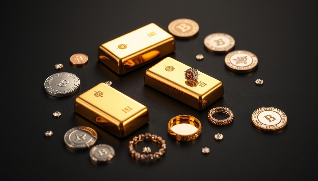
The Psychology of Metallic Colors in Luxury Design
Metallic colors carry inherent value perception. Gold communicates wealth and achievement. Silver suggests modern sophistication. Copper implies craftsmanship and warmth. Understanding these psychological associations helps designers strategically deploy metallics for maximum impact.
Gold: The Color of Excellence and Prestige
Gold holds unique psychological power as humanity's oldest symbol of value.
Why Gold Works in Branding:
| Gold Shade | Hex Code | RGB | Luxury Perception |
|---|---|---|---|
| Rich Gold | #D4AF37 | 212, 175, 55 | Premium elegance |
| Champagne Gold | #F7E7CE | 247, 231, 206 | Subtle sophistication |
| Rose Gold | #B76E79 | 183, 110, 121 | Modern luxury |
| Antique Gold | #C59D5F | 197, 157, 95 | Heritage quality |
Gold activates the brain's reward centers, triggering dopamine release similar to actual wealth perception. Studies show gold-accented packaging increases perceived product value by 15-25% regardless of actual quality differences.
Strategic Gold Applications:
- Primary brand colors: Premium cosmetics, jewelry, financial services
- Accent elements: Awards, badges, certification seals
- Packaging highlights: Luxury goods, gift editions, limited releases
Silver: Technology and Modern Sophistication
Silver bridges traditional precious metals with contemporary aesthetics.
Silver Psychology Factors:
- Cleanliness association from medical instruments
- Technology connection through electronics
- Neutral sophistication that complements any palette
- Future-forward positioning
Optimal Silver Shades:
| Silver Type | Hex Code | RGB | Best Applications |
|---|---|---|---|
| Bright Silver | #C0C0C0 | 192, 192, 192 | Technology branding |
| Platinum | #E5E4E2 | 229, 228, 226 | Ultra-premium positioning |
| Gunmetal | #2A3439 | 42, 52, 57 | Masculine luxury |
| Metallic Gray | #A8A9AD | 168, 169, 173 | Automotive, electronics |
Silver works particularly well for technology companies positioning premium products. Apple uses silver extensively in product photography to communicate precision engineering and modern aesthetics.
Copper: Artisanal Craftsmanship and Warmth
Copper offers an alternative luxury narrative emphasizing human touch and tradition.
Copper Color Applications:
| Copper Shade | Hex Code | RGB | Emotional Effect |
|---|---|---|---|
| Bright Copper | #B87333 | 184, 115, 51 | Warm craftsmanship |
| Rose Copper | #C48A69 | 196, 138, 105 | Romantic artisanal |
| Aged Copper | #A0522D | 160, 82, 45 | Heritage authenticity |
| Copper Orange | #D4915D | 212, 145, 93 | Energetic warmth |
Copper resonates with sustainability-conscious consumers who value handcrafted quality over mass production. Artisanal food brands, craft beverage companies, and heritage manufacturers benefit from copper's authentic warmth.
Technical Implementation of Metallic Effects
Digital Design Approaches
True metallic effects require understanding light interaction with metal surfaces.
CSS Metallic Gradients:
Gold metallic gradient:
.gold-metallic {
  background: linear-gradient(
    135deg,
    #B8860B 0%,
    #FFD700 25%,
    #FFF8DC 45%,
    #FFD700 55%,
    #DAA520 75%,
    #B8860B 100%
  );
}
Silver metallic gradient:
.silver-metallic {
  background: linear-gradient(
    135deg,
    #A8A9AD 0%,
    #C0C0C0 25%,
    #F5F5F5 45%,
    #C0C0C0 55%,
    #A8A9AD 75%,
    #808080 100%
  );
}
These gradients simulate light reflecting across curved metallic surfaces. The key is the highlight band (lighter tone) contrasting with base metal colors.
Print Production Considerations
Physical metallic reproduction requires specialized printing techniques:
Offset Printing Options:
- Metallic inks: Pantone 871-877 series for consistent metallic reproduction
- Spot UV: Glossy coating over specific areas for metallic sheen
- Foil stamping: Actual metal foil application for premium results
- Metallic paper stocks: Substrate with embedded metallic particles
Digital Printing Limitations:
- Standard CMYK cannot reproduce metallic effects
- Metallic appears as flat brown, gray, or orange tones
- Workarounds include metallic substrates or spot coatings
Industry-Specific Metallic Color Strategies
Luxury Fashion and Beauty
| Brand | Metallic Strategy | Target Perception |
|---|---|---|
| Tiffany & Co. | Silver + Robin's Egg | Timeless elegance |
| Burberry | Gold + Camel | British heritage |
| Chanel | Silver + Black | Modern sophistication |
| Dior | Gold + Navy | Classic luxury |
Metallic ratios in fashion typically follow the 70-20-10 rule: 70% primary color, 20% secondary, 10% metallic accents for maximum impact without overwhelming.
Technology and Electronics
Technology brands use metallics to communicate premium engineering:
| Company | Metallic Approach | Product Positioning |
|---|---|---|
| Apple | Silver, Space Gray, Gold | Premium materials |
| Samsung | Phantom Silver, Phantom Black | Futuristic design |
| Sony | Silver accents on black | Professional quality |
| Dell XPS | Platinum Silver | Business elegance |
Metallic finishes in technology suggest durability, precision manufacturing, and premium materials justifying higher price points.
Food and Beverage Packaging
Premium food brands leverage metallics for shelf differentiation:
Effective Metallic Applications:
- Gold foil on dark chocolate packaging
- Copper accents on craft beer labels
- Silver for premium water brands
- Rose gold for feminine-targeted products
Packaging Psychology Data:
- Metallic packaging increases purchase intent by 12-18%
- Gold signals higher quality to 73% of consumers
- Silver suggests modern/health-conscious positioning
Advanced Metallic Color Combinations
Classic Luxury Palettes
Gold + Black: Maximum contrast luxury
- Gold: #D4AF37
- Black: #0A0A0A
- Cream accent: #FFFDD0
This combination creates immediate premium perception. The darkness makes gold appear more luminous through contrast amplification.
Silver + Navy: Modern executive aesthetic
- Silver: #C0C0C0
- Navy: #000080
- White: #FFFFFF
Professional and trustworthy while maintaining sophistication. Common in corporate branding for professional services.
Copper + Cream: Artisanal warmth
- Copper: #B87333
- Cream: #FFFDD0
- Deep Brown: #3D2817
Inviting and handcrafted-feeling without appearing cheap. Perfect for organic, sustainable, or craft-positioned brands.
Contemporary Metallic Trends
Rose Gold Dominance: The millennial pink evolution
- Rose Gold: #B76E79
- Blush Pink: #F4C2C2
- Warm Gray: #A9A9A9
Rose gold exploded in popularity for smartphones, jewelry, and beauty products. It offers feminine appeal without traditional pink's youth associations.
Gunmetal Modern: Masculine sophistication
- Gunmetal: #2A3439
- Charcoal: #36454F
- Silver highlight: #C0C0C0
Dark metallic appeals to male demographics seeking luxury without ostentation. Common in automotive, men's grooming, and tech accessories.
Measuring Metallic Color Impact
Consumer Perception Testing
Quantify metallic color effectiveness through:
A/B Testing Frameworks:
- Packaging preference tests with identical products
- Price perception surveys (would pay X% more)
- Quality rating comparisons
- Brand personality attribute mapping
Key Metrics to Track:
- Purchase intent scores
- Premium pricing acceptance
- Brand recall rates
- Social media engagement on metallic content
Brand Equity Impact
Metallic colors contribute to brand equity through:
- Distinctiveness: Unique metallic recognition
- Premium associations: Automatic quality signals
- Memorability: Metallic elements improve recall by 23%
- Social currency: Metallic packaging increases shareability
Practical Implementation Guidelines
When to Use Metallic Colors
✅ Appropriate Applications:
- Premium product lines
- Limited editions and special releases
- Award and recognition materials
- High-value service positioning
- Heritage brand storytelling
❌ Avoid Metallics When:
- Targeting extreme budget-conscious segments
- Sustainability-focused positioning (mixed signals)
- Minimalist brand aesthetic
- Digital-only brand touchpoints
Accessibility Considerations
Metallic colors present accessibility challenges:
- Low contrast ratios for text readability
- Color blindness incompatibility (metallic appears as brown/gray)
- Screen display variations
Accessibility Solutions:
- Use metallics only for decorative elements, never critical information
- Provide text alternatives for metallic visual cues
- Test designs in grayscale for clarity
- Ensure 4.5:1 contrast ratios for any text on metallic backgrounds
Conclusion
Metallic colors transform ordinary design into luxury experiences. Gold, silver, and copper each carry distinct psychological associations that, when strategically deployed, elevate brand perception and justify premium positioning. The key is understanding your audience's value associations and selecting metallics that authentically align with your brand promise.
Whether through digital gradients that simulate light play or physical foil stamping that catches the eye, metallic colors remain the most direct visual shortcut to communicating quality, prestige, and craftsmanship in design.