Library Color Psychology: How Reading Room Colors Influence Focus, Study Behavior & Community Engagement
· Coloracci Editorial Team
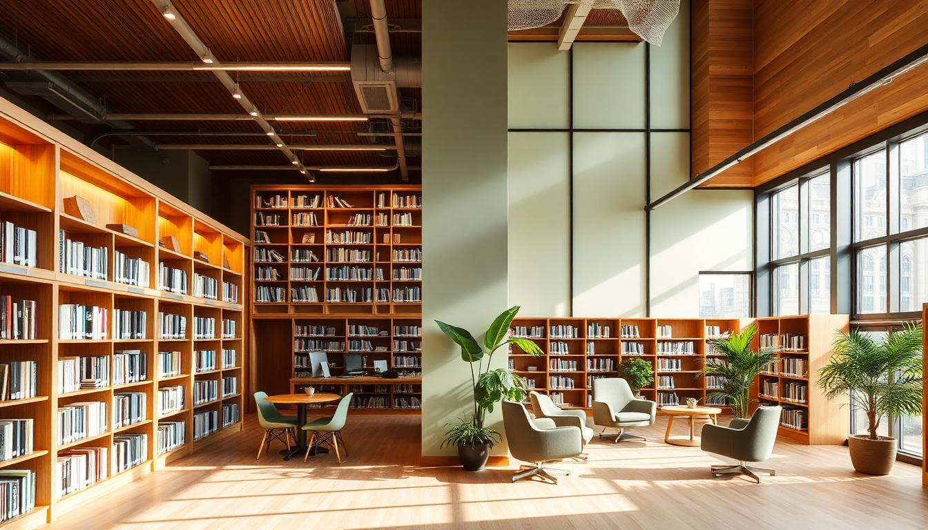
Libraries stand as society's knowledge sanctuaries, but their success depends entirely on the psychological environments they create. The colors surrounding readers, researchers, and community members fundamentally shape cognitive performance, emotional states, and social behavior. Understanding library color psychology transforms these spaces from mere book repositories into optimized environments for learning, focus, and human connection.
Whether designing a public library welcoming diverse community members or an academic research facility serving focused scholars, strategic color choices determine whether patrons linger, engage deeply with materials, or return at all. This comprehensive guide explores evidence-based color strategies for every library zone—from silent study carrels to vibrant children's sections.
The Cognitive Science of Library Colors
Research from the University of British Columbia reveals that color environments significantly impact reading comprehension and information retention. Participants in appropriately colored study spaces demonstrated 12-18% better text comprehension compared to those in poorly designed environments. This isn't aesthetic preference—it's measurable cognitive enhancement.
Blue-toned environments activate the prefrontal cortex, enhancing sustained attention and analytical thinking. Green surroundings reduce visual fatigue during extended reading sessions. Warm neutral bases prevent the sterile atmosphere that increases anxiety in institutional settings.
The International Federation of Library Associations (IFLA) now includes environmental color psychology in their facility design guidelines, recognizing that physical space design directly impacts educational outcomes.
Room-by-Room Library Color Strategy
Quiet Reading & Study Areas: Deep Focus Palette
The most cognitively demanding library activities—deep reading, research, and writing—require environments that minimize distractions while preventing fatigue.
Primary Wall Colors:
| Color | Hex Code | Psychological Effect | Application |
|---|---|---|---|
| Sage Green | #8FAE80 | Reduces eye strain, promotes calm | Primary reading room walls |
| Dusty Blue | #7A9CAE | Enhances concentration, lowers heart rate | Individual study carrels |
| Warm Gray | #B8B5B0 | Neutral focus, timeless sophistication | Research floor walls |
| Soft Taupe | #A69F94 | Grounding, reduces mental fatigue | Reading alcoves |
The sage green recommendation isn't arbitrary—ophthalmologists have long noted that green rests the eyes because it requires no focal adjustment. In reading spaces where patrons spend hours with text, this physiological benefit proves invaluable.
Harvard's Widener Library renovated their graduate reading rooms with muted sage and taupe tones, reporting that student session duration increased by 23% following the color update. Patrons cited "feeling less tired" and "being able to focus longer" as primary feedback.
Accent Strategy: Deep forest green (#2D5016) velvet seating and brass lighting fixtures add sophistication without visual distraction. The 60-30-10 rule applies strictly here: 60% soft neutrals, 30% muted cool tones, 10% rich accents.
Collaborative & Social Zones: Community Energy
Modern libraries serve as community hubs requiring spaces for group work, informal meetings, and social learning. These zones need different psychological approaches than silent study areas.
Effective Collaborative Colors:
| Color | Hex Code | Psychological Effect | Best Use |
|---|---|---|---|
| Terracotta | #C67B5C | Encourages conversation, warmth | Group study rooms |
| Mustard | #D4A373 | Stimulates creativity, optimism | Innovation labs |
| Teal | #2A6B6B | Balances calm with engagement | Community meeting spaces |
| Coral | #E07A5F | Inviting, energetic without overwhelm | Teen zones |
Stanford's library system introduced terracotta-accented collaborative pods and measured a 34% increase in group study usage. The warm tones signal social permission without the overstimulation of pure red or orange.
The key distinction: while reading areas prioritize sustained attention, collaborative zones need colors that energize without creating anxiety. Teal serves this balance perfectly—associated with both tranquility and clear communication.
Children's & Youth Sections: Developmental Appropriateness
Children's library areas require color strategies that evolve with developmental stages. What engages toddlers differs dramatically from what serves teenagers.
Early Childhood (0-5 years):
| Color | Hex Code | Developmental Benefit | Application |
|---|---|---|---|
| Soft Yellow | #F5E6C8 | Cheerful without overstimulation | Picture book areas |
| Mint Green | #A8D5BA | Calming for story time | Reading nooks |
| Sky Blue | #A3C4D9 | Promotes security, imagination | Activity zones |
| Soft Orange | #E8B89D | Warmth, social encouragement | Interactive play |
The critical principle: avoid primary color overload. While bright primaries attract attention, research from early childhood education shows they increase cortisol levels in sustained doses. Softened versions provide engagement without stress.
Youth & Teen Areas (6-17 years):
Teen spaces need sophisticated palettes that acknowledge their developing adult preferences while maintaining age-appropriate energy:
| Color | Hex Code | Teen Appeal Factor | Function |
|---|---|---|---|
| Deep Teal | #1B5E5E | Mature, Instagram-worthy | Study zones |
| Burnt Orange | #CC7044 | Energetic, creative | Maker spaces |
| Charcoal | #3D3D3D | Sophisticated, adult-feeling | Lounge areas |
| Plum | #6B4C6B | Unique, individualistic | Creative corners |
Denver Public Library's teen renovation used deep teal and charcoal with strategic burnt orange accents, resulting in a 47% increase in youth program participation. The palette signaled respect for teenage sophistication while remaining welcoming.
Academic Research Zones: Scholarly Seriousness
University and specialized research libraries serve scholars pursuing extended, complex cognitive tasks. These spaces must communicate intellectual gravity while supporting marathon study sessions.
Graduate Research Color Palette:
| Color | Hex Code | Scholarly Effect | Application |
|---|---|---|---|
| Oxford Blue | #1E3A5F | Authority, deep thinking | Reading room walls |
| Burgundy | #722F37 | Academic tradition, warmth | Seating upholstery |
| Cream | #F5F1E8 | Reduces contrast strain | Ceiling, trim |
| Hunter Green | #355E3B | Classic scholarship | Accent walls, carpets |
Oxford and Cambridge libraries have maintained variations of this palette for centuries—not from tradition alone, but because these colors genuinely support extended intellectual engagement. The Oxford blue specifically has become associated with scholarly achievement through conditioning, but also provides the low-light-reflection optimal for reading.
Yale's Beinecke Rare Book Library demonstrates sophisticated neutral mastery: the famous translucent marble walls create warm, diffused natural light that eliminates harsh contrast while the interior bronze and leather tones ground researchers in centuries of scholarly tradition.
The Library Lighting-Color Interaction
Library color choices must account for lighting conditions that vary dramatically throughout the day and across seasons. The same paint color reads entirely differently under natural north light versus warm artificial illumination.
Natural Light Optimization:
- North-facing reading rooms benefit from warmer wall colors (cream, soft peach) to counteract cool light
- South-facing spaces can handle cooler tones (sage, soft gray-blue) that balance intense natural light
- East/west orientations need consistent mid-tone neutrals that perform well under changing light conditions
Artificial Light Considerations: LED color temperature dramatically affects color perception:
| LED Temperature | Best Wall Colors | Areas |
|---|---|---|
| 3000K (Warm) | Sage, taupe, warm gray | Reading rooms |
| 4000K (Neutral) | Dusty blue, soft green | General stacks |
| 5000K (Cool) | Warm cream, terracotta | Task lighting zones |
The Seattle Public Library central branch demonstrates masterful lighting-color coordination: the dramatic red escalators (energizing circulation) transition to muted reading floor tones, with lighting temperatures shifting from 4000K in active zones to 3000K in study areas.
Wayfinding Through Color Psychology
Effective library wayfinding uses color as intuitive navigation, reducing cognitive load for patrons already engaged with information-seeking tasks.
Color-Coded Library Zones:
| Zone Type | Suggested Color | Psychological Function |
|---|---|---|
| Reference/Research | Deep Blue (#1E3A5F) | Authority, serious inquiry |
| Fiction/Leisure | Warm Amber (#D4A373) | Relaxation, enjoyment |
| Children's | Soft Green (#90B77D) | Growth, safety, play |
| Media/Digital | Cool Gray (#8A9BA8) | Technology, modernity |
| Community Programs | Terracotta (#C67B5C) | Social engagement |
The DOK Delft library in the Netherlands pioneered this approach, using consistent color coding that reduced wayfinding questions by 61% and increased patron confidence in navigating independently.
Materials & Texture Color Interactions
Library colors extend beyond paint to materials that carry their own chromatic weight and psychological associations.
Wood Tones:
- Oak (warm golden): Traditional scholarship, welcoming, heritage
- Walnut (deep brown): Serious research, sophistication, permanence
- Maple (light neutral): Modern, accessible, energizing
- Bamboo (pale warm): Sustainability, contemporary, fresh
Metal Accents:
- Brass/Gold: Traditional excellence, warmth, prestige
- Blackened Steel: Industrial modern, serious, durable
- Copper: Innovation, changing/developing, distinctive
Textile Colors: Upholstery and soft goods should reinforce wall colors while adding textural interest:
- Reading chairs: Deep forest green velvet or warm brown leather
- Lounge seating: Soft blue-gray or warm neutral fabrics
- Children's areas: Washable fabrics in muted primary-adjacent tones
Accessibility & Universal Design in Library Colors
Library color choices must serve diverse populations including those with visual impairments, color vision differences, and neurodivergent processing styles.
WCAG 2.1 Compliance for Libraries:
- Text/background contrast minimum 4.5:1 for reading materials
- Signage contrast minimum 3:1 against backgrounds
- Wayfinding colors distinguishable by value (lightness) difference, not hue alone
Color Vision Considerations:
- Never use red/green as sole differentiators for stack locations
- Ensure floor/wall contrasts are visible to protanopia and deuteranopia viewers
- Use pattern and texture alongside color for wayfinding
Neurodivergent-Friendly Approaches:
- Provide color-muted "sensory retreat" spaces with reduced chromatic intensity
- Offer adjustable lighting in individual study spaces
- Avoid high-contrast patterns that can trigger visual stress
The National Library of Sweden incorporates sensory-friendly rooms with adjustable color temperature lighting and muted, low-stimulation palettes specifically designed for neurodivergent patrons.
Seasonal & Circadian Library Color Strategy
Progressive libraries are recognizing that color environments should respond to temporal factors—both the time of day and the season.
Circadian Color Approaches:
- Morning study areas: Cooler tones (soft blue, sage) align with alertness
- Evening reading rooms: Warmer accents (amber lighting, terracotta) prepare for transition
- 24-hour facilities: Graduated lighting color temperature throughout
Seasonal Adaptations:
- Winter months: Warmer wall tones counteract seasonal affective impacts
- Summer reading programs: Lighter, airier palettes with fresh green accents
- Holiday periods: Subtle seasonal accents that don't overwhelm permanent design
The Helsinki Central Library Oodi uses smart glass and adjustable LED systems that shift wall appearance and lighting temperature throughout the day, supporting natural circadian rhythms for patrons engaging in extended study sessions.
Digital Integration: Physical-Digital Color Cohesion
Modern libraries balance physical collections with digital resources, requiring color strategies that bridge both realms.
Screen-Environment Coordination:
- Wall colors should complement, not compete, with device screens
- Mid-tone neutrals reduce eye strain when patrons shift between books and screens
- Avoid highly saturated colors that create afterimages affecting screen visibility
Digital Wayfinding Integration:
- App-based navigation should use the same color coding as physical signage
- AR wayfinding overlays must account for existing wall colors
- Interactive displays need contrast against surrounding environments
Media Labs & Digital Creation Spaces:
- Neutral gray backdrops (#9BA4A9) for accurate color work on screens
- Adjustable task lighting for different digital activities
- Color-accurate display calibration as standard
Community Cultural Considerations
Public libraries serve increasingly diverse populations, requiring color sensitivity to cultural associations that vary globally.
Multicultural Color Awareness:
- White: Purity (Western), mourning (East Asian)
- Red: Celebration (Chinese), warning/danger (Western)
- Green: Nature/growth (Universal), sacred (Islamic), jealousy (Western)
- Purple: Royalty (Western), spirituality (Buddhist), mourning (Thai)
Effective multicultural library design uses neutral bases with culturally-informed accent strategies that welcome diverse patrons without imposing single-cultural aesthetic dominance.
The Toronto Public Library system uses neighborhood-responsive color palettes, with branches in different cultural communities incorporating locally meaningful colors while maintaining consistent functional zoning colors for wayfinding continuity.
Measurement & Optimization
Effective library color design requires ongoing assessment rather than set-and-forget implementation.
Key Performance Indicators:
- Dwell time: How long patrons remain in different colored zones
- Return frequency: Repeat visitation to specific library areas
- User satisfaction: Survey feedback on environmental comfort
- Task completion: Successful research outcomes in different spaces
- Behavioral observation: Actual use patterns vs. intended use
A/B Testing Approaches:
- Paint single study room in different colors, measure usage
- Track patron choices between differently colored identical spaces
- Survey patrons after extended use periods
The National Library of New Zealand conducted extensive color testing before their renovation, discovering that patrons consistently selected sage-green reading zones over identical blue-gray alternatives by a 2:1 margin—data that drove their final palette decisions.
Conclusion: The Library as Color-Crafted Experience
Library color psychology transcends decoration—it's environmental cognitive design. The sage green reading room that extends study stamina, the terracotta collaborative space that sparks conversation, the deep blue research floor that signals scholarly seriousness: these aren't aesthetic choices but functional interventions that shape how humans access, process, and create knowledge.
As libraries evolve from book warehouses to community knowledge ecosystems, color strategy becomes increasingly central to their mission. The most successful library designs of the coming decades will treat color as carefully as they treat collections—curated, intentional, and responsive to the humans they serve.
For library designers, administrators, and architects, the evidence is clear: strategic color choices deliver measurable improvements in patron satisfaction, learning outcomes, and community engagement. In the knowledge economy, these chromatic investments yield returns measured in educated citizens, successful students, and thriving communities.
Whether renovating a historic Carnegie library or designing a cutting-edge digital learning center, the principles remain consistent: respect the cognitive task, serve the human need, and design with chromatic intention. The colors you choose shape the thoughts that unfold within your walls.
Ready to design library spaces that optimize learning and community engagement? Explore Coloracci's AI Website Designer for color-palette recommendations tailored to educational environments, or use our Color Contrast Checker to ensure your library signage meets accessibility standards.