The Story of Forum Blue and Gold: Lakers Color History — Los Angeles Lakers Purple and Gold Color Story
· Coloracci Team
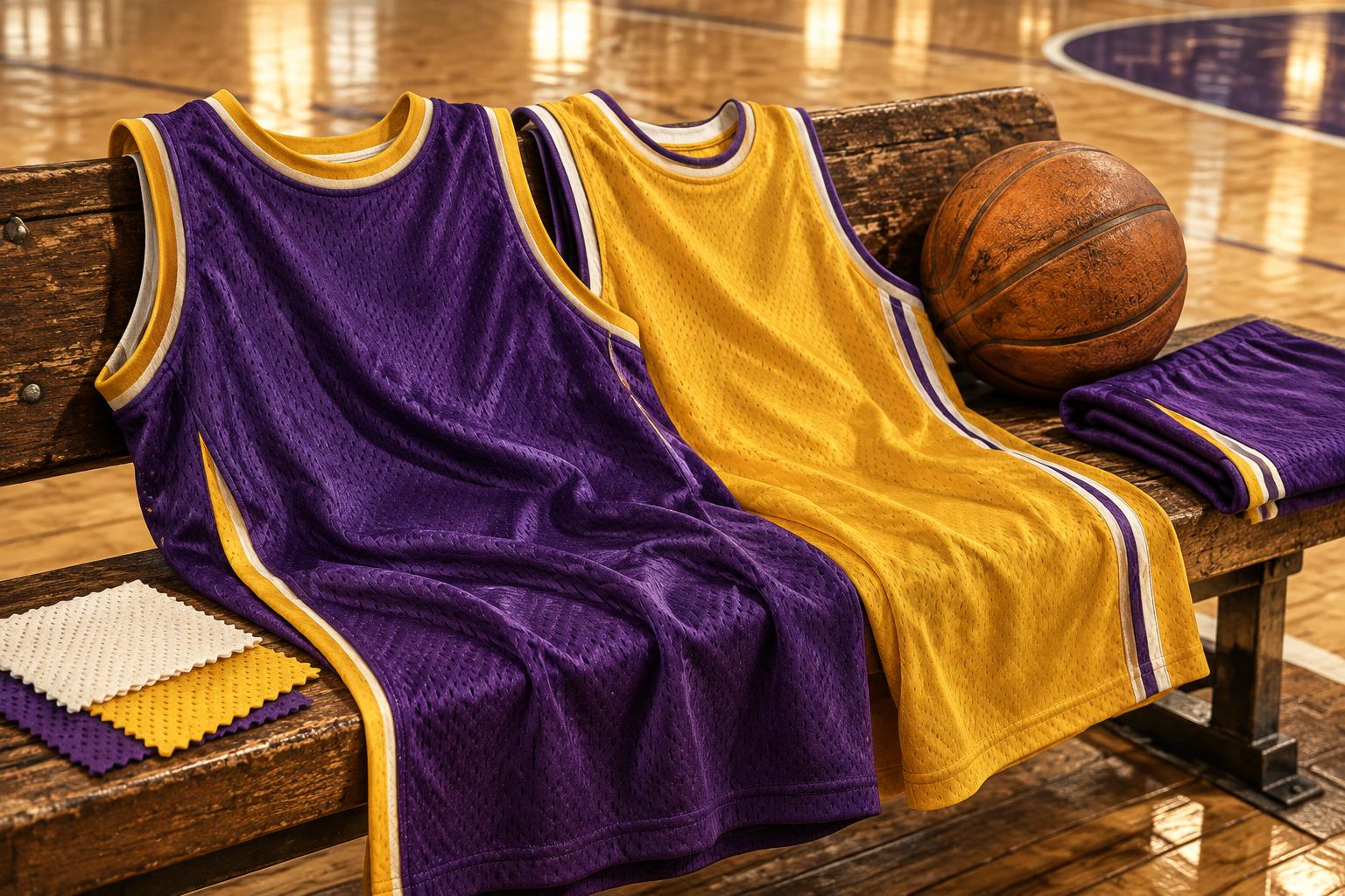
The Forum opened on December 30, 1967, but its most enduring color trick was linguistic: the Lakers' purple became known as “Forum Blue.” A designer could hardly invent a better demonstration that naming changes how a palette is remembered. The Los Angeles Lakers purple and gold color story is not simply a tale of two attractive jersey colors; it is the construction of an identity that connected an arena, a city, and generations of basketball stars.
Magic Johnson's number 32 and Kobe Bryant's number 24 became moving billboards for that identity. Yet the familiar pairing did not arrive with the franchise's 1960 relocation. Purple and gold belonged to a later Los Angeles reinvention, and understanding that distinction makes the branding lesson much sharper.
This guide separates historical evidence from color lore, explains six useful HEX references, and turns the Lakers' visual decisions into practical design principles. The original AI-generated cover is an illustrative textile still life, not an archival jersey photograph. Modern screen codes are references for digital work, not measurements of every uniform ever worn.
Los Angeles Lakers Purple and Gold Color Story: The Rebrand Came After the Move
The Minneapolis Lakers established the franchise's first identity in Minnesota, with blue and gold associated with its early uniforms. Those colors belonged to a different geography and a different chapter of professional basketball. The name itself recalled Minnesota's lakes; it survived the move even as the visual language eventually changed.
In 1960, the team relocated to Los Angeles. It did not immediately become the purple-and-gold team familiar today. Early Los Angeles uniforms retained a blue-and-white identity, including script lettering that distinguished this period from both Minneapolis and the subsequent Forum years.
Jack Kent Cooke purchased the Lakers in 1965. The purple-and-gold change followed in 1967, as the franchise entered its Forum era. This is the chronology worth keeping in a brand presentation: relocation first, new ownership later, then a coordinated visual and venue transformation. Compressing those events into one instant obscures how deliberately a sports identity can be rebuilt.
The Forum's own history dates its opening to December 30, 1967, for a Los Angeles Kings hockey game. The Lakers' arena association helped make the new palette feel like part of an entire entertainment environment, rather than a replacement set of uniforms. Color gained a physical address.
For designers, the insight is strategic. A rebrand becomes more convincing when visual change accompanies a meaningful experience change. New colors alone ask an audience to believe a promise; a new venue, new presentation, and consistent applications give that promise something tangible to attach to.
Why Purple Was Called Forum Blue
“Forum Blue” is a historical nickname for the Lakers' purple, not a separate blue swatch that should replace it. Accounts of Cooke's naming decision commonly describe his dislike of the word “purple,” and broadcaster Chick Hearn helped embed the expression in Lakers culture. That anecdote belongs to the lore of the identity; it should not be mistaken for a technical color specification.
The regal interpretation is easier to understand visually. Purple has a long cultural association with status and expensive display. Gold brings warmth, brightness, and the suggestion of achievement. Together they communicate theatrical prestige without relying on the conventional red-and-blue combinations common in American sports.
However, associations are not universal laws. Purple does not automatically create royalty, and yellow does not automatically create success. The Lakers strengthened those meanings through repetition, championship history, star players, arena presentation, and merchandise. Color psychology supplied a starting vocabulary; the franchise's public life made that vocabulary credible.
The naming lesson is especially useful for brand teams. “Forum Blue” links a visual attribute to a place, giving supporters a phrase with insider significance. A generic label describes a wavelength family; a distinctive name can carry an institution's story. Keep that storytelling name beside an unambiguous technical value so suppliers do not have to interpret poetry.
The Lakers Palette: Six HEX References and Their Roles
Use #552583 for Lakers Purple, #FDB927 for Lakers Gold, #000000 for Black, and #FFFFFF for White as the modern digital reference set in this article. Purple translates to RGB 85, 37, 131; gold translates to RGB 253, 185, 39. Those channel values explain why one feels deep and cool while the other feels bright and warm.
The Minneapolis-inspired pair needs stronger qualification. #00538C and #FFD700 are illustrative Royal Blue and University Gold references supplied for this guide, not verified historical uniform specifications. In particular, #00538C is a relatively dark blue: it must not be labeled an exact match for the powder-blue Minneapolis Classic uniforms described by the NBA.
| Item | Color | Hex | Name | Meaning |
|---|---|---|---|---|
| Modern identity anchor | Purple | #552583 | Lakers Purple / Forum Blue reference | Prestige, distinction, and continuity |
| Modern identity highlight | Gold | #FDB927 | Lakers Gold | Energy, visibility, and championship associations |
| Alternate uniform detail | Black | #000000 | Lakers Black | Graphic emphasis and dramatic contrast |
| Association uniform base | White | #FFFFFF | Association White | Clarity and a neutral stage for brand accents |
| Minneapolis-inspired study | Blue | #00538C | Illustrative Royal Blue | A reference to the franchise's earlier blue identity, not an exact powder-blue jersey match |
| Minneapolis-inspired study | Yellow gold | #FFD700 | Illustrative University Gold | A heritage-study accent, not a verified historic dye formula |
“Gold” here names a flat athletic color. #FDB927 is not metallic gold, and a metallic foil or thread needs a separate material specification. Similarly, a modern HEX cannot retroactively establish the color of a 1967 fabric under arena lighting.
For a broader comparison, the NBA team colors guide places the Lakers beside other franchises. This article instead explains how one team's naming, chronology, and jersey applications built an unusually durable brand.
Los Angeles Lakers Purple and Gold Color Story: Showtime Made the Palette Move
The Showtime era of the 1980s gave purple and gold a distinctive performance context. Fast breaks, a glamorous Los Angeles audience, and Magic Johnson's gold number 32 jersey turned the palette into something kinetic. Viewers did not encounter the colors only in a static logo; they saw them accelerate across a court.
Gold uniforms had particular visual force. Against hardwood and surrounding spectators, their bright warm field made players easy to recognize as a group. Purple lettering, numerals, and trim supplied a darker structure. The hierarchy was legible from a distance: a large color mass first, then the silhouette, then individual identification.
That is an important distinction from filling a composition with equally loud elements. A recognizable sports uniform allocates jobs. The body establishes belonging; the trim defines edges; the number identifies the athlete. When every element competes for attention, recognition slows. The Lakers' strongest applications make the pair complementary in function, not merely decorative in combination.
Showtime also demonstrates that brand meaning is accumulated rather than inserted. The same colors became associated with pace, confidence, and spectacle because the team repeatedly delivered those experiences. An unrelated brand can borrow the visual energy of purple and gold, but it cannot borrow the Lakers' earned history by copying two HEX values.
From Magic's 32 to Kobe's 24: Recognition Across Generations
Magic Johnson's 32 and Kobe Bryant's 24 are useful named examples because they demonstrate continuity without visual sameness. Jersey cuts, lettering details, construction, manufacturers, and supporting treatments changed. The core color relationship remained a powerful shortcut to team recognition.
Kobe's number 24 belongs to the later chapter of his Lakers career; he also famously wore number 8. A historical design board should date its references rather than treating every Bryant jersey as interchangeable. Numbers, uniform editions, and color applications are part of the artifact's identity.
On merchandise, the palette can carry recognition before a viewer finishes reading the name. A gold garment with purple athletic numerals evokes a specific basketball tradition. The silhouette, type treatment, and insignia strengthen the identification, but the large-area color relationship often arrives first.
For a designer creating an independent identity, study that sequencing instead of reproducing protected marks. Ask what people notice at thumbnail size, from across a room, and in a cropped photograph. A palette succeeds when its relationship remains recognizable under those conditions, not only when its presentation slide looks polished.
Association, Statement, and Classic: Same Franchise, Different Color Hierarchies
Uniform edition names are not permanent color formulas. Association jerseys use white as the principal field, allowing purple and gold to operate as identity accents. That arrangement is useful evidence that a strong palette need not cover every available surface. White can make the brand pair more readable, not less present.
The Lakers' 2022–23 Statement Edition offers a correction to a common assumption: the NBA described a purple base with gold details, while the team's presentation highlighted black paneling. It was not simply an all-black jersey with purple-and-gold accents. Black uniforms exist in other Lakers treatments, but “Statement” alone does not justify assigning a black base.
Always identify a season and consult that season's product or team announcement. A supplier's retail color name also is not necessarily the historical identity's naming system. Describing the verified 2022–23 edition is more reliable than making an unsupported claim about every current Nike release.
The 2022–23 Classic Edition revisited Minneapolis' 1950s-era blue, with the NBA describing the throwback in powder-blue terms. This matters when assembling a palette: a deep Royal Blue sample cannot stand in for a light archival-style uniform simply because both belong to the blue family.
A thoughtful identity system can preserve several eras without merging them into one undifferentiated swatch collection. Label primary colors, alternate treatments, and historical references separately. That gives a designer permission to explore heritage while preventing the brand's everyday applications from drifting.
What Designers Can Borrow Without Copying the Lakers
Start with role contrast. Purple is the deep anchor, gold the energetic highlight, white the breathing room, and black a controlled graphic support. Choose one dominant field per composition. A gold poster with purple typography communicates differently from a purple interface with a small gold action; both can preserve the same family relationship.
Next, test real contrast instead of assuming that famous brand colors are accessible. Using the WCAG sRGB relative-luminance calculation, this guide's purple and gold produce approximately 6.5:1 contrast. White against purple is approximately 10.9:1, while white against gold is only about 1.7:1. Gold therefore is a poor background for ordinary white body text despite looking bright and appealing.
These are ratios for the exact flat HEX pairs, not a certification of a photographed jersey or a textured screen. Check every actual text pairing, especially smaller captions, disabled controls, and labels placed over imagery. Contrast depends on the foreground and background together, not on either swatch in isolation.
Then build a recognition test. Reduce a design to a small thumbnail, blur your focus, and remove the logo. Does a distinctive hierarchy remain? If not, clarify the dominant color mass before adding detail. The logo color palette design guide develops that process for an original mark rather than a sports uniform.
Finally, separate inspiration from imitation. The Lakers' combination is valuable study material, but logos, wordmarks, distinctive jersey graphics, and merchandising contexts can raise intellectual-property concerns. A school, startup, or event should develop its own naming, proportion, typography, and supporting colors instead of presenting a near-copy as a new identity.
From Screen Gold to Printed Fabric: Specify the Medium
HEX is an RGB screen notation. A dye, embroidery thread, ink, or foil is a physical material with its own behavior. Mesh reveals shadow through holes; folds darken purple; bright arena light changes apparent gold. A flat digital chip is useful for communication but cannot describe all of those conditions.
For a new project inspired by this contrast, begin with the screen references and use the HEX-to-Pantone converter to explore approximate candidates. A nearest-color result is not an official Lakers manufacturing specification or a guarantee that a fabric will match a screen.
Request the right physical samples: coated or uncoated paper for print, actual yarn or textile standards for clothing, and a finish sample for metallic effects. Review the intended substrate under controlled illumination and, where relevant, the lighting in which the finished object will appear.
Document the reference, the chosen material standard, the supplier, and the approval conditions. This creates a repeatable decision instead of an argument about whether someone's photograph looks “too yellow.” For licensed Lakers production, use the authorized specifications and approvals rather than an editorial palette.
Conclusion: Forum Blue Is a Story, Not Just a Swatch
The Lakers' identity shows how a color relationship becomes cultural shorthand. The 1960 relocation, the 1967 purple-and-gold transformation, Showtime's moving spectacle, and later jersey editions each contributed something different. “Forum Blue” added a memorable name that connected the color to a place.
For designers, the practical lesson is to combine distinctiveness with discipline: assign clear roles, label historical approximations honestly, test contrast, and specify physical materials separately from screens. Purple and gold endure because they belong to a consistent story, not because two codes possess magical branding power.
Build your own color story: choose an anchor and a highlight, test them in an actual composition, then explore approximate Pantone matches before requesting physical samples. Borrow the Lakers' clarity of purpose, not their identity.
Sources and reference boundaries
- The Kia Forum: venue history — opening date and the arena's Lakers/Kings context.
- Los Angeles Lakers: 2022–23 uniform schedule — Forum-era identity and season-specific uniform descriptions.
- NBA: Lakers unveil Classic and Statement uniforms for 2022–23 — Minneapolis-inspired blue and the purple-based Statement edition.
- Sportsnet: Los Angeles Lakers uniform history — secondary reporting on Cooke and the “Forum Blue” naming anecdote.
- University of Washington, Pacific Coast Architecture Database: Forum — venue context and Cooke's 1965 Lakers ownership.
The modern HEX references follow Coloracci's Lakers palette; the two Minneapolis-inspired codes are editorial approximations, not archival dye measurements. Uniform editions are identified by season wherever their specific color construction is discussed.