Obangsaek: Korea's Five Traditional Colors, Meanings & Hex Codes
· Coloracci Team
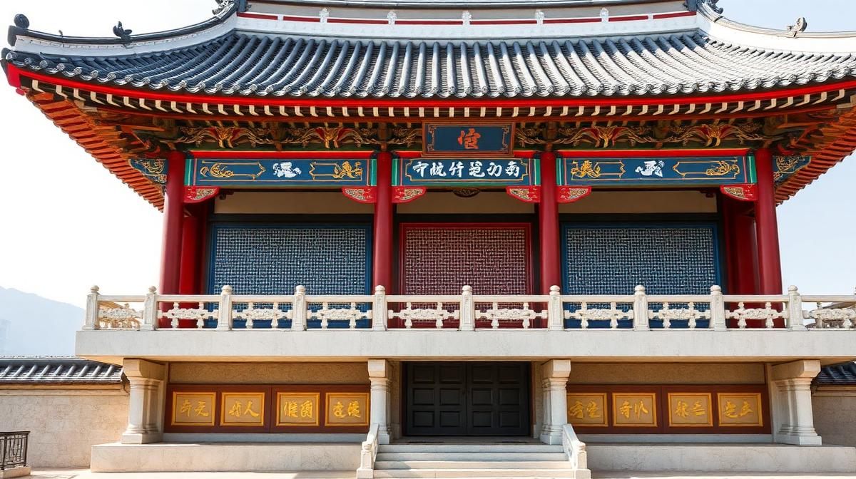
Obangsaek is Korea's traditional five-color system: blue (east), red (south), yellow (center), white (west) and black (north). Each direction, element and virtue carries its color, and the system still shapes Korean design from hanbok to modern branding. Below: meanings, hex approximations and respectful usage.
Korean color tradition is built upon one of the most philosophically sophisticated chromatic systems in world culture. The obangsaek (오방색) — five directional colors — connects color to cosmology, geography, seasons, and human virtue in a framework that has shaped Korean art, architecture, food, and fashion for millennia.
To translate obangsaek hues into production-ready inks, our Pantone color finder matches each traditional shade to its closest Pantone reference.
Obangsaek: The Five Directional Colors
The obangsaek system assigns five primary colors to the five cardinal directions, creating a cosmic color map:
The Five Colors Framework
| Direction | Color | Korean | Hex | Element | Season | Virtue |
|---|---|---|---|---|---|---|
| East | Blue/Green | 청 (Cheong) | #0047AB | Wood | Spring | Benevolence |
| West | White | 백 (Baek) | #FFFFFF | Metal | Autumn | Righteousness |
| South | Red | 적 (Jeok) | #C8102E | Fire | Summer | Propriety |
| North | Black | 흑 (Heuk) | #000000 | Water | Winter | Wisdom |
| Center | Yellow | 황 (Hwang) | #FFD700 | Earth | Late Summer | Trust |
Philosophical Foundations
The obangsaek derives from East Asian cosmology shared with Chinese and Japanese traditions, but Korean application has distinctive characteristics:
- Balance imperative: All five colors must appear in harmony — no single color should dominate
- Directional alignment: Buildings, clothing, and food were arranged according to directional color associations
- Seasonal appropriateness: Colors shifted with seasons, following natural cycles
- Status communication: Specific color combinations indicated social rank and occasion
Dancheong: The Art of Palace Painting
Dancheong (단청) is the traditional multicolored painting applied to Korean wooden buildings, particularly palaces, temples, and government buildings.
The Dancheong Color System
Dancheong uses five primary colors plus their intermediate tones:
- Juhong (주홍, Vermilion red #E34234): Base color for columns and structural elements
- Nokcheongsaek (녹청색, Blue-green #008B8B): Cool contrast to red, applied to brackets
- Hwangsaek (황색, Yellow ochre #CC7722): Warm accent in geometric patterns
- Baeksaek (백색, White #F5F5DC): Background color, also used for highlighting
- Heuksaek (흑색, Black #1C1C1C): Outline color, providing definition and contrast
Dancheong Classification by Complexity
| Level | Name | Description | Color Count |
|---|---|---|---|
| 1 | Gachil Dancheong | Simple paint, minimal decoration | 1-2 colors |
| 2 | Geundan Dancheong | Basic geometric patterns | 3-4 colors |
| 3 | Moeru Dancheong | Elaborate floral and geometric | 5+ colors |
| 4 | Geum Dancheong | Gold leaf with full color | 5+ with gold |
Preservation Psychology
Dancheong serves both aesthetic and practical functions:
- Wood protection: Natural mineral pigments protected timber from insects and weather
- Hierarchy communication: More elaborate dancheong indicated higher-status buildings
- Spiritual signaling: Temple dancheong used specific patterns believed to ward off evil
- Community identity: Regional dancheong styles distinguished different provinces
Hanbok: Color as Social Language
The hanbok (한복), Korea's traditional garment, used color as a sophisticated social communication system.
Hanbok Color Codes
- Royal yellow (#FFD700): Exclusive to the king
- Dragon red (#C8102E): Queen and crown prince
- Pink (#FF69B4): Young unmarried women
- Indigo blue (#3F51B5): Married women of status
- White (#FFFFFF): Common people (giving Korea the historic name "the white-clad nation")
- Gray (#808080): Elderly citizens, mourning
The Saekdong Principle
Saekdong (색동) refers to the multicolored striped fabric used in children's hanbok:
- Rainbow stripes: All five obangsaek colors appeared together
- Protection symbolism: The full color spectrum was believed to protect children from evil spirits
- Joy expression: Bright multicolor patterns expressed parental happiness
- Cosmic balance: Children wearing all five directional colors were symbolically protected from all directions
Wedding Color Psychology
Traditional Korean weddings used color with extreme precision:
- Bride: Red and green — representing yin and yang in balance
- Groom: Blue (navy) — representing the east and new beginnings
- Ceremony table: Five-color fruits and foods arranged by directional association
- Paper decorations: Gold and red for prosperity and joy
Pojagi: The Art of Wrapping Color
Pojagi (보자기) — traditional Korean wrapping cloths — developed one of the most sophisticated color composition systems in textile art.
Pojagi Color Principles
- Complementary harmony: Opposite colors placed adjacent for visual vibration
- Geometric patchwork: Scraps of fabric arranged in harmonious color compositions
- Translucent layering: Silk pojagi allowed colors to blend when overlapped
- Asymmetric balance: Colors distributed unevenly but achieving visual equilibrium
Modern Pojagi Influence
Contemporary Korean designers have translated pojagi principles to:
- Fashion design: Patchwork color blocking in modern K-fashion
- Interior design: Geometric color arrangements in hospitality
- Digital design: Color blocking in Korean app interfaces
- Packaging: Premium Korean product packaging using pojagi-inspired color layouts
Korean Ceramics: The Subtle Palette
Korean ceramic traditions developed distinctly different color values from Chinese and Japanese counterparts.
Celadon Green: Korea's Signature Color
Korean celadon (#ACE1AF, #8FBC8F) achieved a specific jade-green glaze:
- Transparency depth: Multiple thin glaze layers created luminous depth
- Natural reference: The color referenced Korean mountains and rivers
- Imperfection beauty: Subtle variations in color were celebrated, not corrected
- Status material: Celadon was so valued that it became diplomatic currency
Buncheong: The Earthy Palette
Buncheong ware introduced different color values:
- Cream white (#FFFDD0): Slip-covered surfaces
- Iron brown (#4E3524): Painted decorations
- Gray-blue (#6699CC): Subtle blue-tinged glazes
- Natural clay (#CC7722): Exposed clay body as design element
K-Pop and K-Beauty: Modern Color Revolution
Korea's contemporary cultural exports have created a new global color vocabulary.
K-Pop Color Strategy
K-pop groups use color as brand identity systems:
- BTS: Purple (#800080) — "Borahae" (I purple you) became a cultural phenomenon
- BLACKPINK: Hot pink (#FF69B4) and black — femininity meets edge
- EXO: Silver/metallic (#C0C0C0) — futuristic, premium positioning
- Red Velvet: Red (#FF0000) — bold, energetic, passionate
The lightstick culture creates literal color fields:
| Group | Lightstick Color | Hex | Fan Name |
|---|---|---|---|
| BTS | Purple | #800080 | ARMY |
| BLACKPINK | Pink | #FF69B4 | Blink |
| Stray Kids | Yellow-green | #9ACD32 | Stay |
| TWICE | Apricot | #FBCEB1 | Once |
K-Beauty Color Philosophy
Korean beauty has introduced distinct color values to the global cosmetics market:
- Glass skin: Translucent, dewy skin that references celadon's luminosity
- Gradient lips: Soft color fading from center — inspired by traditional aesthetics
- Cushion complexity: Foundation technology emphasizing luminous undertones
- Packaging pastels: Soft pinks, lavenders, and mints in product design
The "Jeong" Color: Emotional Warmth
Korean culture has the concept of "jeong" (정) — a deep emotional bond — which influences color preferences:
- Warm tones: Korean interiors often favor warm, embracing colors
- Soft contrasts: Gentle color transitions reflecting social harmony values
- Natural palettes: Earth tones connecting to Korean landscape appreciation
- Communal warmth: Warm lighting and color in social spaces like restaurants
Korean Food Color: The Five-Color Plate
Korean cuisine explicitly uses the obangsaek in food presentation:
Bibimbap: The Color Bowl
The iconic bibimbap demonstrates five-color thinking:
- Red: Gochujang (red pepper paste), carrots
- Blue/Green: Spinach, zucchini, cucumber
- Yellow: Egg yolk, bean sprouts
- White: Rice, radish, egg white
- Black: Seaweed, shiitake mushrooms
Seasonal Color Eating
Korean food culture adjusts color emphasis by season:
- Spring: Green emphasis — fresh vegetables, mugwort
- Summer: Red emphasis — spicy cooling foods
- Autumn: Yellow/brown emphasis — root vegetables, mushrooms
- Winter: White/black emphasis — radish, seaweed, preserved foods
Korean Architecture: Color in Sacred Spaces
Temple Color Hierarchy
Korean Buddhist temples follow specific color protocols:
- Main hall: Full dancheong with dominant red and green
- Gate structures: Progressively simpler color as distance increases
- Stone elements: Natural gray, unpainted
- Garden elements: Muted tones that blend with nature
Modern Korean Architecture
Contemporary Korean architecture has developed a distinctive color approach:
- Concrete poetry: Exposed concrete with minimal color accents
- Hanok reinterpretation: Traditional colors in modern geometric forms
- Nature integration: Colors that echo the surrounding landscape
- Seasonal responsiveness: Facades that interact with seasonal light changes
Designing with Korean Color Principles
For Brand Design
Korean color principles offer valuable frameworks:
- Balance all five: Ensure your palette addresses the five directions/elements
- Seasonal flexibility: Design systems that shift with seasons or campaigns
- Hierarchy through complexity: More important elements get richer color treatment
- Warm social tones: Prioritize colors that create emotional connection
- Natural sophistication: Prefer nuanced, natural-referenced colors over synthetic brightness
Common Mistakes in Korean-Inspired Design
- Cherry-picking: Using one color without understanding its directional/elemental context
- Oversaturation: Korean traditional colors have specific saturation levels — too bright loses authenticity
- Ignoring white: White is central to Korean identity — not an absence of design
- K-pop confusion: Modern K-pop color is deliberately different from traditional Korean color
- Flat application: Korean color always has depth — layered, translucent, or gradated
Korea's color heritage demonstrates that chromatic choices are never arbitrary. From the cosmic obangsaek to the K-pop lightstick ocean, every Korean color carries centuries of philosophical meaning while continuously evolving to express contemporary identity.