Japanese Wabi-Sabi Color Philosophy: Finding Beauty in Imperfection
· Coloracci Team
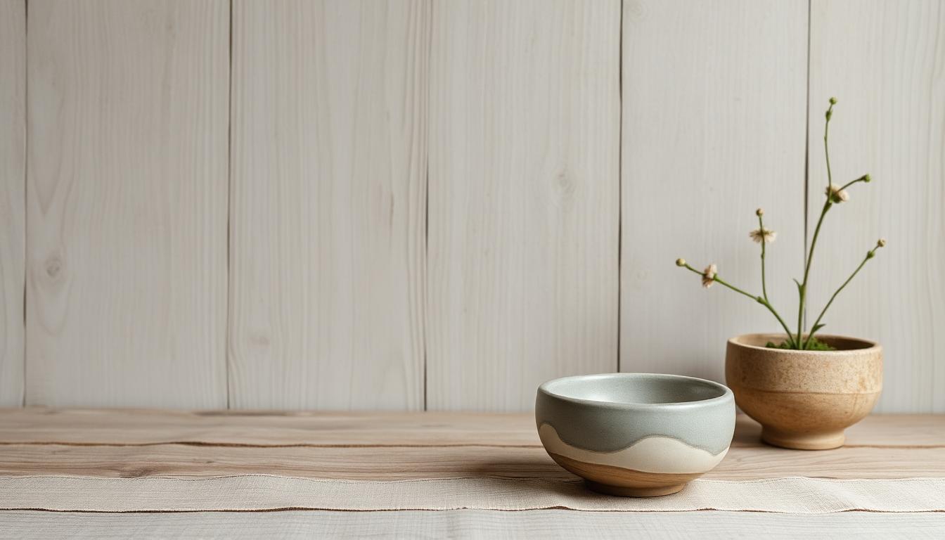
Wabi-sabi represents one of the world's most sophisticated aesthetic philosophies — an approach to beauty that finds profound satisfaction in imperfection, impermanence, and incompleteness. Unlike Western aesthetics that pursue perfection, symmetry, and permanence, wabi-sabi celebrates the weathered, the worn, and the modest. This philosophy fundamentally shapes Japanese color traditions, creating palettes that Western designers increasingly recognize as antidotes to the anxiety of contemporary visual culture.
The Philosophy of Wabi-Sabi
Understanding wabi-sabi colors requires grasping the philosophy behind them. The concept emerged from 15th-century Japanese tea culture, where master Sen no Rikyū revolutionized aesthetic standards by championing rustic simplicity over imported Chinese luxury.
Wabi: Rustic Solitude
Wabi originally conveyed the loneliness of living in nature, away from society. It evolved to mean:
- Rustic simplicity: Unpretentious, humble materials
- Understated elegance: Beauty without ostentation
- Natural objects: Materials as found, not as manufactured
- Contentment with little: Satisfaction in modest circumstances
Sabi: Lonely, Aged Beauty
Sabi carries meanings of:
- Patina and weathering: The beauty that time creates
- Loneliness and solitude: The aesthetic of things left alone
- Ancient and mature: Valuing age over novelty
- Mellowed and softened: The transformation of harshness through time
Combined: The Full Wabi-Sabi
Together, wabi-sabi describes a beauty that:
- Accepts and celebrates imperfection
- Finds value in the passage of time
- Prefers modesty to magnificence
- Discovers profundity in simplicity
- Embraces incompleteness as possibility
The Wabi-Sabi Color Palette
Wabi-sabi colors emerge from natural materials, weathering processes, and the acceptance of variation. The palette is inherently muted, earthy, and changeable.
The Foundation Neutrals
Wabi-sabi builds on a base of neutral colors that carry subtle complexity:
| Color Name | Approximate Hex | Source and Quality |
|---|---|---|
| Shiro (white) | #F5F5DC | Rice paper, snow, not pure white |
| Kuro (black) | #2F4F4F | Sumi ink, aged wood, not absolute black |
| Cha (tea) | #8B7355 | Oxidized wood, dried tea leaves |
| Shibu (persimmon) | #8B4513 | Tannin-dyed cloth, iron rust |
| Kusa (grass) | #9CAF88 | Faded vegetation, moss |
| Tsuchi (earth) | #8B7355 | Unprocessed soil, clay |
These are never pure hues — they always contain subtle variation and undertone.
The Colors of Weathering
Wabi-sabi values the colors that time creates:
- Silvered wood: Cedar and cypress aging to silver-gray (#C0C0C0 mixed with warm undertones)
- Rusted iron: Oxidation creating rich browns and oranges (#8B4513 through #D2691E)
- Patinated copper: Verdigris green from weathered metal (#43B3AE)
- Aged paper: Washi yellowing to warm cream (#F5F5DC)
- Moss greens: Nature's slow colonization in soft emerald (#9CAF88)
These colors cannot be manufactured — they must develop through natural processes.
The Subtraction of Color
Paradoxically, wabi-sabi often achieves color through removal rather than addition:
- Unbleached cloth: The natural color of fiber without chemical processing
- Unpolished stone: Surface color without artificial enhancement
- Unvarnished wood: Grain color without protective coating
- Faded fabric: Color softened by sun and washing
Traditional Japanese Materials and Their Colors
Specific materials carry traditional wabi-sabi color associations.
Wood: The Primary Wabi-Sabi Material
Japanese architecture and design relies on wood that develops wabi-sabi character:
Cypress (hinoki):
- Fresh: Light blonde (#DEB887)
- Aged: Silver-gray with warm undertone (#A9A9A9)
- Character: Aromatic, soft, naturally antimicrobial
Cedar (sugi):
- Fresh: Pinkish-brown (#D2691E)
- Aged: Deep silver-gray (#708090)
- Character: Resistant to rot, develops dramatic weathering
Pine (matsu):
- Fresh: Warm amber (#CD853F)
- Aged: Rich honey-brown (#DAA520)
- Character: Knotty, expressive grain, develops character
The aging process — the transition from fresh-cut to fully weathered — embodies wabi-sabi time-beauty.
Paper: The Color of Light
Washi (Japanese paper) represents wabi-sabi color purity:
- Kozo (mulberry): Warm white with subtle fiber texture
- Mitsumata: Softer, more translucent cream
- Gampi: Slightly glossy, refined surface
- Processed variations: Indigo-dyed, persimmon-tannin treated, charcoal infused
Paper color changes with:
- Light exposure: Gradual yellowing and softening
- Humidity: Dimensional shifts that catch light differently
- Age: Increasing warmth and depth
Ceramics: Earth Transformed
Japanese ceramics embody wabi-sabi through:
- Raku: Rough, imperfect, deliberately cracked surfaces
- Bizen: Unglazed wood-fired, natural ash deposits create color
- Shigaraki: Heavy texture, natural glazing from firing process
- Oribe: Intentionally asymmetrical, dripped and splashed glazes
The colors emerge from:
- Clay body: Local soil chemistry determining base color
- Firing process: Temperature and atmosphere creating variation
- Natural ash: Wood fire deposits creating unpredictable patterns
- Intentional imperfection: Deliberate irregularity as aesthetic choice
Textiles: Fading as Beauty
Traditional Japanese textiles develop wabi-sabi color through use:
Indigo (ai):
- Fresh: Deep blue (#00416A)
- Faded: Soft blue-gray (#5F9EA0)
- Value: The fading process itself is appreciated
Kakishibu (persimmon tannin):
- Fresh: Yellow-brown (#DAA520)
- Aged: Rich rust-brown (#8B4513)
- Character: Water-resistant, develops lustrous patina
Bengara (iron oxide red):
- Color: Warm rust (#B7410E)
- Application: Sealant and colorant for wood and fabric
- Aging: Deepens and enriches over decades
The Seven Traditional Colors of Japan
Japanese traditional color (dento iro) offers insight into wabi-sabi values:
- Red (aka): Not bright red, but faded, oxidized, earth-red
- Blue (ao): Encompassing both blue and green, the color of vegetation and water
- Yellow (ki): From turmeric and gardenia, warm and muted
- White (shiro): The color of rice paper, snow, and purification
- Black (kuro): From sumi ink, representing depth and mystery
- Brown (cha): The color of tea, earth, and wood
- Purple (murasaki): From gromwell root, once restricted to elite use
These traditional colors are inherently muted, avoiding the saturation of modern synthetic pigments.
Wabi-Sabi in Contemporary Design
Contemporary designers worldwide draw on wabi-sabi color principles.
Architectural Applications
Modern wabi-sabi architecture employs:
- Unfinished concrete: Accepting the natural color variation of cast surfaces
- Weathering steel (corten): Controlled rust as facade color
- Charred wood (shou sugi ban): Blackened surface through controlled burning
- Natural stone: Unpolished surfaces showing geological color variation
Architects like Tadao Ando, Kengo Kuma, and Peter Zumthor employ these principles in internationally recognized work.
Interior Design Trends
Wabi-sabi interiors feature:
- Lime wash walls: Imperfect, variegated surface color
- Unbleached linens: Natural fiber colors without chemical processing
- Aged metals: Brass, copper, and steel developing natural patina
- Dried botanicals: Preserved flowers and branches as color elements
- Handmade ceramics: Irregular, imperfect vessels as functional art
Fashion and Textile Design
Wabi-sabi influences fashion through:
- Natural dyeing: Indigo, madder, and plant-based colors
- Aged and distressed: Denim, leather, and fabric showing wear
- Asymmetrical construction: Intentionally imperfect cuts and finishes
- Visible mending: Sashiko and boro traditions making repair beautiful
Designers like Yohji Yamamoto, Rei Kawakubo, and Issey Miyake built careers on wabi-sabi principles.
The Psychological Impact of Wabi-Sabi Colors
Research suggests wabi-sabi color environments have specific psychological effects.
Stress Reduction
Studies on Japanese forest bathing (shinrin-yoku) and exposure to natural materials suggest:
- Muted colors reduce cortisol: Less visual stimulation means lower stress
- Natural materials comfort: Biophilic response to wood, paper, stone
- Imperfection relieves pressure: Environments that don't demand perfection allow psychological relaxation
Mindfulness Support
Wabi-sabi colors support present-moment awareness:
- Subtle variation rewards attention: Muted palettes require closer looking
- Aging shows time passage: Visible change encourages temporal awareness
- Imperfection invites acceptance: Visual environment modeling psychological acceptance
Sustainability Psychology
Wabi-sabi aligns with sustainable values:
- Valuing age over novelty: Counter to consumption culture
- Accepting wear as beauty: Longevity rather than replacement
- Natural material preference: Lower environmental impact than synthetics
- Local material use: Connection to place and reduced transportation
Wabi-Sabi Color Combinations
Specific color relationships embody wabi-sabi principles.
Shiro-Kuro: White and Black
The fundamental wabi-sabi contrast:
- Not pure: Warm white, blue-black — never absolute values
- Calligraphic: The relationship of ink to paper as aesthetic model
- Space and mark: Emptiness as active design element
- Asymmetry: Unequal balance, irregular rhythm
Cha-Iro: The Tea Palette
Colors of the tea ceremony space:
- Tatami: Golden-straw (#DAA520)
- Tokonoma: Earth and shadow
- Paper: Warm white (#F5F5DC)
- Ceramics: Raku black, unglazed clay
- Scroll: Ink, wash, maybe single color accent
This is the original wabi-sabi environment — modest, rustic, profound.
Aki: Autumn Colors
The Japanese autumn palette embodies wabi-sabi transience:
- Maple red: Faded, not bright (#CD5C5C)
- Ginkgo yellow: Muted gold (#DAA520)
- Persimmon orange: Earthy rust (#D2691E)
- Brown grasses: Dried, not dead (#8B7355)
The beauty of things passing — mono no aware — finds expression in these colors.
Applying Wabi-Sabi Colors
Designers can incorporate wabi-sabi color principles without cultural appropriation.
Material First
- Select natural materials: Wood, stone, clay, fiber, paper
- Accept their natural colors: Don't fight material tendencies
- Allow weathering: Design for change over time
- Value variation: Reject perfect uniformity
Process Visibility
- Show how things are made: Handwork, tool marks, construction evidence
- Accept production irregularity: Machine precision isn't always appropriate
- Patina as record: The history of use visible in surface
Restraint and Modesty
- Fewer colors: Restrained palette with great variation within limited range
- Lower saturation: Muted, dusty, faded hues
- Texture over color: Surface quality as primary interest
- Emptiness as element: Undesigned space as intentional choice
Wabi-Sabi and Contemporary Color Culture
Wabi-sabi offers an alternative to several problematic aspects of contemporary design.
Against Instagram Aesthetics
Instagram culture demands:
- High saturation: Colors that pop on screens
- Perfect composition: Framed, curated, filtered
- Novelty and trend: Constant visual reinvention
Wabi-sabi counters with:
- Muted tones: Colors that calm rather than stimulate
- Accepting imperfection: Irregularity as authenticity
- Time and patience: Slow change rather than constant newness
Against Fast Fashion
The fashion industry's color waste:
- Seasonal color obsolescence: Constantly "new" palettes
- Synthetic dye pollution: Environmental cost of color production
- Disposable mentality: Clothes discarded when color fades
Wabi-sabi alternative:
- Natural dyes: Lower environmental impact
- Fading as improvement: Color change as value increase
- Repair and maintain: Longevity over novelty
Against Perfection Anxiety
Contemporary visual culture creates:
- Comparison and inadequacy: Perfect images as standard
- Surface over substance: Appearance valued over character
- Digital distortion: Unrealistic standards through editing
Wabi-sabi relief:
- Imperfection as normal: Everyone and everything has flaws
- Character over perfection: Interesting beats perfect
- Acceptance: Peace with things as they are
The Future of Wabi-Sabi Colors
As global design culture evolves, wabi-sabi color principles offer sustainable, psychologically healthy alternatives.
Environmental Imperative
Climate change and resource depletion make wabi-sabi values practical:
- Longevity: Making things that last and improve with age
- Local materials: Reducing transportation and industrial processing
- Natural cycles: Aligning with environmental rhythms rather than fighting them
Digital Culture Response
Screen-saturated populations seek:
- Tactile experience: Physical materials with natural color variation
- Rest for eyes: Muted palettes after high-contrast screen exposure
- Authentic connection: Real materials with real history
Global Design Synthesis
Wabi-sabi can inform global design without cultural appropriation:
- Universal principles: Imperfection, time, and modesty are cross-cultural values
- Local application: Each region has its own weathering and material traditions
- Respectful reference: Acknowledging Japanese origins while adapting principles
Wabi-sabi colors remind us that beauty doesn't require perfection, that time adds value, and that the modest can be profound. In an age of digital excess and environmental crisis, these ancient color principles offer paths to more sustainable, satisfying design.