The Color Psychology Behind IKEA: What Makes Their Palette Work
· Coloracci Team
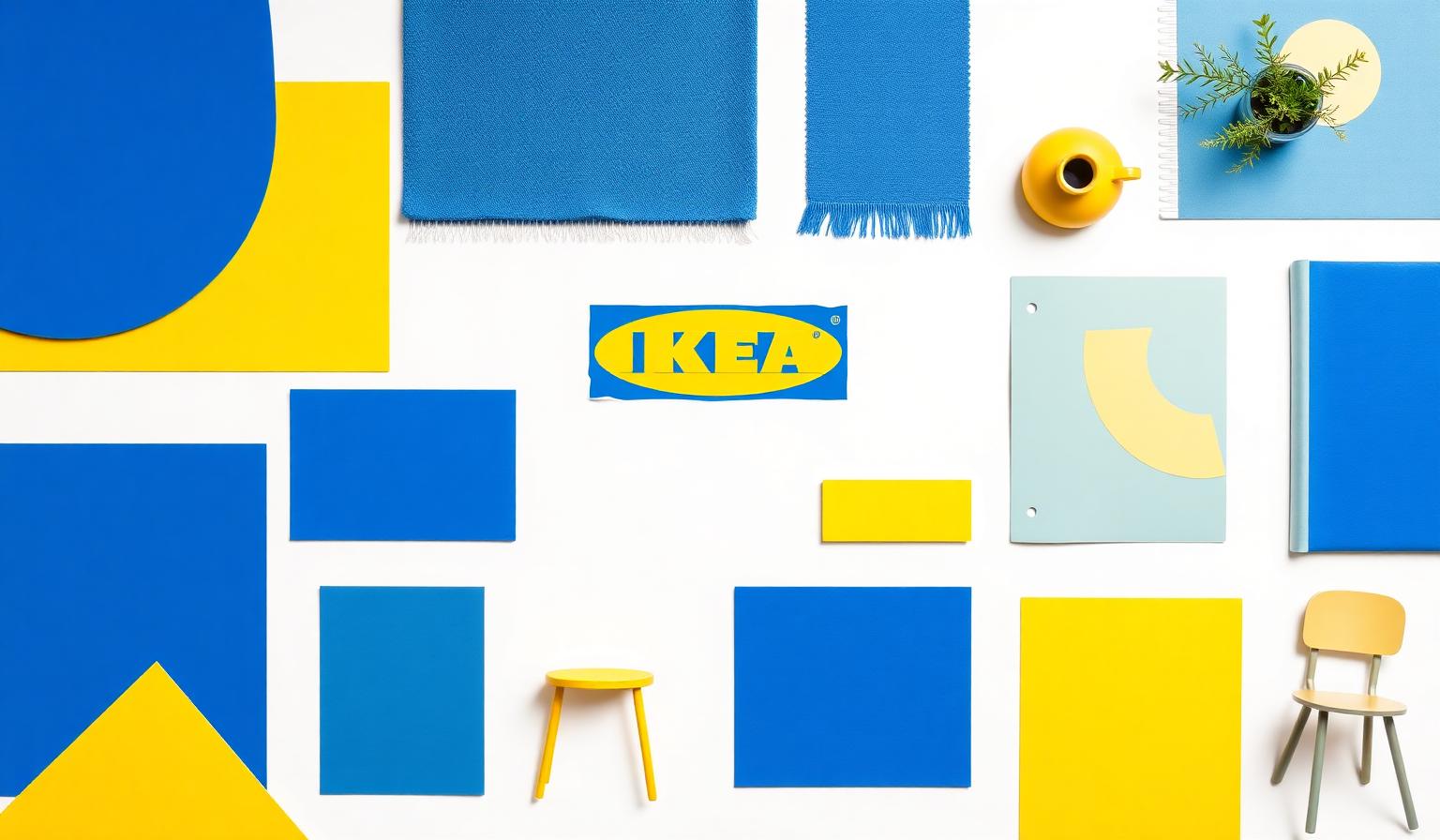
The Color Psychology Behind IKEA: What Makes Their Palette Work
The IKEA brand colors are, on paper, almost embarrassingly simple: one saturated blue and one warm, lemony yellow. Yet that two-color system — lifted directly from the Swedish national flag — has produced one of the most recognizable retail identities on the planet. From a flat-pack box in a Tokyo apartment to a 30,000-square-meter warehouse outside Stockholm, the same palette is doing the same job: orient, reassure, energize, and sell.
This deep dive unpacks the exact hex values, the psychology behind them, how the palette behaves on IKEA's website and app, and the composition principles that turn two colors into a complete design system.
Watch: The Color Psychology Behind IKEA Song
Why IKEA's Palette Is Iconic
Most global brands extend their identity through a sprawling secondary palette, illustration styles, and shifting seasonal moods. IKEA goes the opposite direction. The company decided decades ago that its identity would live or die by a disciplined duo: cobalt blue and high-chroma yellow. Everything else — photography, typography, product styling — is built to defer to that pairing.
Three things make the palette iconic:
- National provenance. It's a literal echo of the Swedish flag, anchoring the brand to a country famous for clean, functional, affordable design.
- Extreme contrast. Blue and yellow sit nearly opposite on the color wheel, creating the highest possible perceptual pop without resorting to red.
- Behavioral function. The colors aren't decoration; they direct traffic, signal price, and reduce decision fatigue in cavernous showrooms.
The Exact IKEA Brand Colors
| Color Name | Hex | Usage |
|---|---|---|
| IKEA Blue | #0057AD | Logo background, wayfinding, store exteriors, primary UI surfaces |
| IKEA Yellow | #FBDA0C | Logo wordmark, price tags, CTAs, accent and emphasis |
| Supporting White | #FFFFFF | Product backgrounds, breathing space, gallery layouts |
| Supporting Near-Black | #111111 | Body type, fine print, photographic anchors |
The blue is a saturated, slightly green-leaning cobalt — bright enough to read at a distance, deep enough to feel trustworthy up close. The yellow is intentionally pushed toward maximum chroma; it is not a soft pastel, it is a functional warning yellow repurposed for delight.
Color Psychology: What Each IKEA Color Communicates
IKEA Blue (#0057AD) — Security, Strength, and Care
Blue is the most universally trusted color in branding research, and IKEA's specific shade leans into the most reassuring end of that spectrum. It signals:
- Security and reliability — the same psychological territory occupied by banks, airlines, and insurance brands.
- Strength and structure — appropriate for a company selling load-bearing furniture you assemble yourself.
- Caring and stewardship — slightly warmer than corporate navy, suggesting a brand that wants to help, not just transact.
In a category — home furnishings — where customers are often anxious about cost, durability, and assembly difficulty, blue does the heavy emotional lifting before a single product is shown.
IKEA Yellow (#FBDA0C) — Logic, Optimism, and Swedish Modernism
Yellow is the most cognitively activating color in the spectrum. IKEA uses it for three jobs at once:
- Logical and forward-thinking — yellow draws the eye to information that helps the customer decide (prices, arrows, "new" tags).
- Confident and optimistic — it injects warmth into an otherwise cool palette and prevents the brand from feeling cold or institutional.
- Swedish origin and modern design — paired with the blue, it becomes an unmistakable cultural marker, tying every purchase back to a heritage of democratic design.
The choice to use yellow — not red — for emphasis is strategically important. Red would signal danger, urgency, or sale-driven discounting. Yellow signals discovery.
Website and App Analysis: How IKEA Uses Color in Practice
Open ikea.com on any device and the color system reveals itself as a behavioral tool, not a decorative one.
Hierarchy
The site uses an extremely restrained color hierarchy. The vast majority of every page is white space and product photography. IKEA Blue appears almost exclusively in the logo, primary navigation accents, and trusted system surfaces (account, checkout, store locator). IKEA Yellow is reserved for the highest-intent moments: price tags, primary CTAs, and promotional ribbons. This deliberate scarcity is what makes the yellow feel valuable rather than shouty.
Contrast and Accessibility
IKEA Blue (#0057AD) on white delivers a contrast ratio of roughly 7.6:1, comfortably exceeding WCAG AAA for body text. IKEA Yellow on the brand blue, however, lands closer to 4.5:1 — fine for large logo type but a reminder that yellow-on-blue should never be used for body copy. The site honors this rule rigidly: yellow appears as a background behind bold black or dark-blue type, never as small text on a colored field.
Whitespace
IKEA's interface is built on Scandinavian negative space. Product cards float on white, separated by generous gutters. This isn't a stylistic affectation; it allows the two brand colors to remain emotionally loud without ever feeling overwhelming. The whitespace is, in effect, a third brand color doing the heavy compositional work.
Golden Ratio and Composition: The 60-30-10 IKEA Variant
Most brand design systems follow a 60-30-10 distribution — 60% dominant color, 30% secondary, 10% accent. IKEA bends this rule into something closer to a 70-20-10 model that mirrors the golden ratio's emphasis on a single dominant field:
- ~70% White — product photography backgrounds, generous gutters, and clean retail signage.
- ~20% IKEA Blue — logo, navigation chrome, store walls, packaging, trust surfaces.
- ~10% IKEA Yellow — price tags, CTAs, wayfinding arrows, the wordmark itself.
This ratio is why IKEA never looks cluttered despite operating in a category — homeware retail — that is inherently visually busy. The dominant white acts as a rest field for the eye, the blue provides structural anchoring, and the yellow draws attention only to what matters most: the next decision the customer needs to make.
The composition also respects the golden ratio in a subtler way. On the logo itself, the yellow ellipse occupies roughly 61.8% of the visual weight within the blue rectangle, with the blue border carrying the remaining 38.2%. Whether deliberate or intuitive, the geometry is unmistakably balanced and is part of why the logo has survived more than 50 years with only minor refinements.
What Designers Can Learn from IKEA's Palette
You don't need a billion-dollar brand budget to apply these principles. Five takeaways translate directly to any product, website, or identity system.
1. Two Colors Are Often Enough
IKEA proves that a single primary plus a single accent — chosen with care — can carry an entire global brand. If you're designing a new identity, resist the urge to define a 12-color secondary palette before you've stress-tested whether two colors can do the work.
2. Use Your Accent Color Scarcely
The reason IKEA Yellow feels powerful is that it is rare. Reserve your accent color for moments of genuine importance — primary CTAs, key prices, critical notifications — and refuse to dilute it with decorative use. Scarcity is what gives a color emotional weight.
3. Let Whitespace Be the Third Color
Treat negative space as an active design element, not the leftover between things. IKEA's interfaces work because white is given the same compositional respect as the brand colors themselves. In your own work, define a target whitespace ratio (60–70% on most marketing pages) and protect it during design reviews.
4. Choose Colors That Do Behavioral Work
IKEA didn't pick blue and yellow because they looked nice together; they picked them because each color performs a specific psychological job (trust, attention) at a specific moment in the customer journey. When building your palette, articulate the job each color is hired to do before you fall in love with a hue.
5. Test Your Palette at Both Ends of the Scale
IKEA's colors had to work on a 50-meter warehouse exterior and a 12-pixel mobile icon. If your palette only reads well in a Figma frame at 100% zoom, it isn't finished. Test at billboard scale, at favicon scale, and through grayscale and color-blindness simulations before locking it in.
Explore Color Theory and Palette Generation
Want to put these principles into practice? The same logic that powers IKEA's palette — disciplined contrast, behavioral hierarchy, and ratio-driven composition — is exactly what we build into the tools at coloracci.ai. Explore our palette generator, the Fibonacci color generator for ratio-based composition, and the color contrast checker to make sure your own brand colors hit IKEA-grade accessibility before they ship.
Generate Your Own IKEA-Grade Palette
IKEA's identity isn't iconic because the colors are unusual. It's iconic because the colors are disciplined, behavioral, and ratio-aware. You can apply the same thinking to any brand — a SaaS dashboard, a portfolio site, a local cafe — by treating color as a system of decisions rather than a mood board of swatches.
Ready to design a palette with the same rigor? Head to coloracci.ai and generate a custom palette tuned for trust, attention, and accessibility — the three forces that make IKEA's two colors work harder than most brands' twenty.