Gym and Fitness Center Color Psychology: Designing for Motivation and Performance
· Coloracci Team
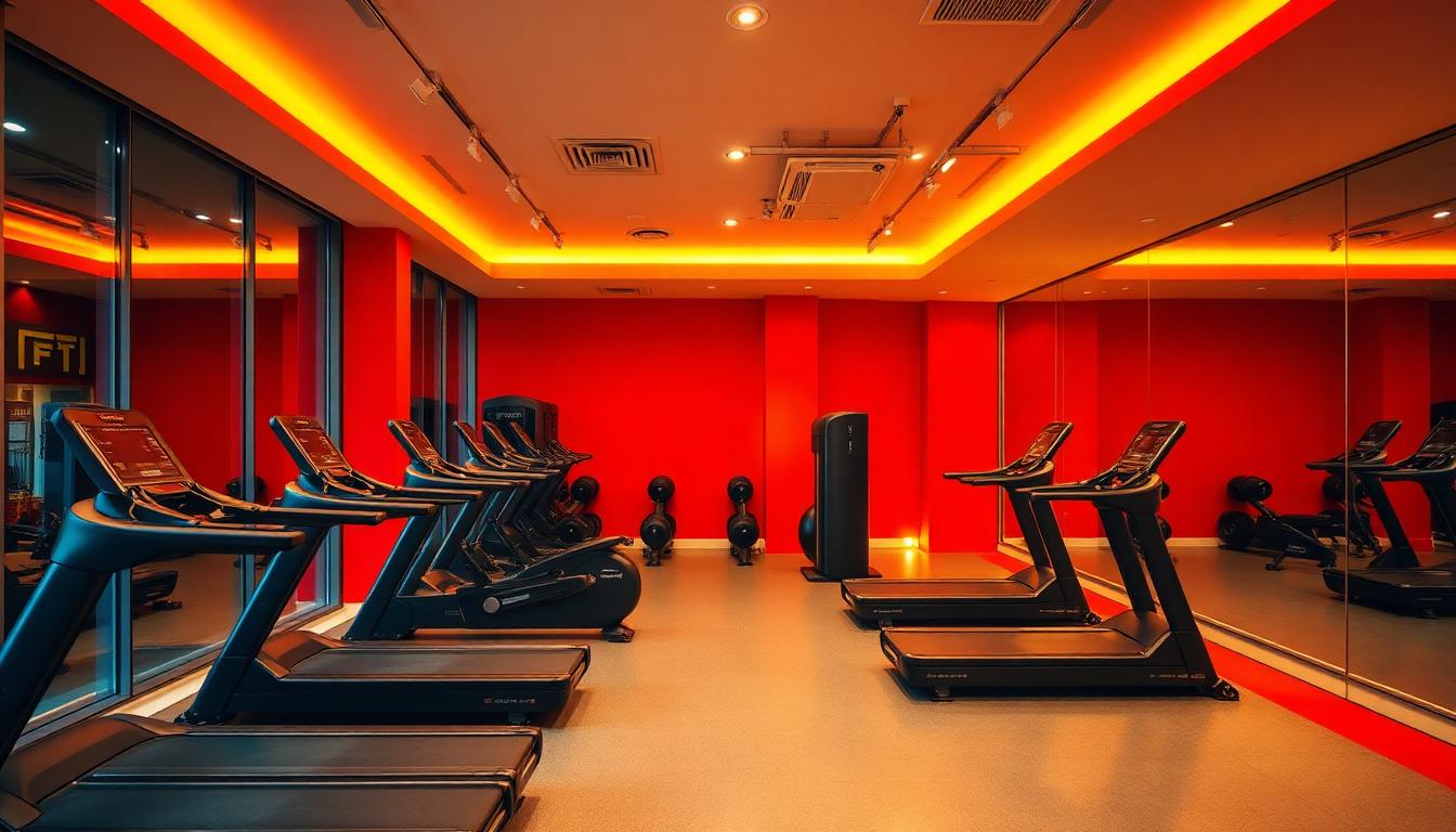
Fitness environments present a unique challenge in color psychology: they must simultaneously energize for intense physical output and calm for recovery and mindfulness practices. The color strategies that work for high-intensity interval training may completely fail for yoga studios. Understanding these nuances separates successful fitness design from spaces that inadvertently undermine their users' goals.
The Energy Palette: Red and High-Intensity Training
Red's physiological effects make it the dominant color for high-energy fitness spaces. Research consistently demonstrates that red exposure increases heart rate, blood pressure, and perceived exertion — exactly what you want when designing for maximum effort.
The Red Performance Effect
Studies on athletic performance reveal specific red effects:
- Perceived effort: Tasks feel more demanding in red environments, leading to greater perceived achievement
- Strength output: Some studies show marginal strength increases in red versus neutral environments
- Competitive drive: Red is evolutionarily associated with threat and competition, activating competitive instincts
- Warning and alertness: Red signals "pay attention" — appropriate for complex movements requiring form focus
However, red requires careful calibration:
- Too much saturation: Creates anxiety, potentially causing users to shorten workouts
- Wrong shade: Orange-reds (#E74C3C) energize; blue-reds (#C0392B) can feel aggressive or institutional
- Extended exposure: Red over long durations increases cortisol, counterproductive for wellness-oriented gyms
Strategic Red Deployment
Effective gym design uses red strategically rather than dominantly:
| Application | Color | Hex | Rationale |
|---|---|---|---|
| Accent walls | Energetic red | #E74C3C | Zone definition without overwhelming |
| Equipment highlights | Performance red | #FF6B35 | Brand consistency across machines |
| Wayfinding | Alert red | #DC3545 | Emergency exits, maximum weight warnings |
| Branding elements | Signature red | Varies | Identity recognition, membership pride |
The Performance Palette: Black and Gray Sophistication
Black dominates premium fitness positioning for reasons beyond aesthetics. The color psychology of black in fitness spaces is remarkably sophisticated.
Black's Psychological Weight
Black in fitness environments communicates:
- Seriousness: This is training, not recreation
- Slimming: Both spaces and people appear leaner against black
- Focus elimination: Black backgrounds reduce visual distraction, supporting concentration
- Equipment premiumization: Black machines with strategic accent colors read as higher-end
Equinox, SoulCycle, and other premium fitness brands built their visual identity on black foundations with strategic accent colors (Equinox: gold; SoulCycle: yellow and white).
Gray: The Compromise Solution
Gray occupies the middle ground between energizing and calming:
- Cool grays (#7F8C8D): Appropriate for strength training, serious athletic preparation
- Warm grays (#95A5A6): Better for mixed-use spaces, welcoming to beginners
- Dark charcoal (#2C3E50): Dramatic, intense, supports high-performance branding
Gray's neutrality makes it ideal for spaces serving multiple fitness modalities or communities with diverse preferences.
The Recovery Palette: Blue and Mindfulness
Blue creates the counterbalance to red's intensity. Where red stimulates, blue calms — making it essential for recovery spaces, yoga studios, and wellness-oriented fitness environments.
Blue's Physiological Impact
Research on blue in fitness contexts shows:
- Heart rate reduction: Blue environments measurably lower cardiovascular stress markers
- Perceived coolness: Users report spaces feel physically cooler in blue — psychologically beneficial during and after exertion
- Breath encouragement: Blue's association with air and water supports breathing-focused practices
- Mindfulness support: The calmness blue creates enables the mental presence yoga and meditation require
Strategic Blue Applications
- Recovery areas: Cool blues (#5DADE2) for post-workout cooldown zones
- Yoga studios: Dusty blues (#7FB3D5) that don't feel cold or institutional
- Pool areas: Aquatic blues (#5499C7) that extend the water's visual presence
- Spa transitions: Deep teals (#1A5276) that signal luxury and relaxation
The Motivation Spectrum: Orange and Yellow
Orange and yellow occupy the energetic middle ground — more stimulating than blue, less aggressive than red.
Orange: The Enthusiasm Color
Orange (#E67E22, #F39C12) in fitness spaces:
- Friendly energy: Approachable intensity that welcomes beginners
- Appetite stimulation: Relevant for gyms with nutrition counseling or cafés
- Warmth creation: Makes industrial fitness spaces feel more inviting
- Brand differentiation: Less common than red, offers distinctiveness
Orangetheory Fitness built an entire brand identity around the color's implications: approachable intensity, community warmth, scientific approach to heart-rate-based training.
Yellow: Caution and Optimism
Yellow requires careful use in fitness environments:
- Safety signaling: Yellow is the international color for caution — appropriate for equipment warnings
- Optimism delivery: Bright yellow accents (#F1C40F) create positive emotional associations with challenging workouts
- Visibility enhancement: Yellow on black creates maximum contrast for form cues and instruction
- Overstimulation risk: Too much yellow increases anxiety and reduces sustained performance
Zone-Based Color Strategy
Sophisticated fitness facilities use color to define functional zones, creating intuitive wayfinding and psychological preparation.
The Zone Color Framework
| Zone | Primary Color | Psychological Function |
|---|---|---|
| Cardio | Red/orange energy | Stimulation, endurance support |
| Free weights | Black/gray strength | Focus, serious training |
| Group fitness | Branded accent | Community, energy, identity |
| Yoga/Stretching | Blue/green calm | Recovery, mindfulness |
| Locker rooms | Neutral/white | Cleanliness, transition |
| Reception | Brand colors | Welcome, membership pride |
Visual Flow Design
Color should guide users through logical workout progressions:
- Entry: Brand colors create identity and belonging
- Warm-up: Energizing warm tones prepare the body
- Main workout: Performance colors support intensity
- Cool-down: Calming colors initiate recovery
- Exit: Positive brand reinforcement for return motivation
Gender, Culture, and Inclusive Design
Fitness color psychology must navigate evolving expectations around gender and cultural inclusivity.
Beyond Pink and Blue
Traditional gym design often defaulted to:
- Women's areas: Pink, purple, "soft" colors
- Men's areas: Black, red, "aggressive" colors
Contemporary inclusive design recognizes:
- Color is not gender: All humans respond physiologically to red's energy and blue's calm
- Individual preference: Offering variety serves diverse users better than stereotyped assumptions
- Functional priority: The workout modality should determine color, not perceived user demographics
Cultural Color Sensitivity
Fitness is increasingly global:
- White: Purity in Western contexts, mourning in many Asian cultures
- Red: Luck and celebration in China, danger and warning in Western contexts
- Green: Growth and nature universally, but specific shades carry religious significance
International fitness brands must research and respect these variations.
Lighting: The Dynamic Color Factor
Fitness color psychology cannot be separated from lighting design. The same wall color creates dramatically different workout environments under different light conditions.
Circadian Lighting for Wellness
Tunable LED systems now enable fitness spaces that support natural rhythms:
- Morning classes (6-9am): Bright, cool light (5000-6500K) energizes and wakes
- Midday sessions: Neutral light (4000K) supports sustained performance
- Evening workouts: Warm light (2700-3000K) prevents sleep disruption
- Night classes: Very warm or colored light creates atmosphere and energy
Color choices must anticipate these variations — a red that energizes under cool daylight might become aggressive under warm evening light.
The Spotlight Effect
Dramatic lighting creates psychological intensity:
- Dark spaces with spotlit equipment: Focuses attention, reduces distraction
- Color-washed cycling studios: Creates immersive, theatrical workout experiences
- Natural light maximization: Windows and skylights support mood and vitamin D
Brand Identity Through Color
Major fitness brands have built recognizable color identities that communicate their specific value propositions.
Peloton: The Premium Performance Palette
Peloton's visual identity combines:
- Signature red (#E31C25): Energy, performance, intensity
- Black dominance: Serious training, premium positioning
- White space: Clean, tech-forward, uncluttered
- Strategic gray: Sophistication, balance
The palette communicates: "This is not casual fitness — this is performance technology."
Planet Fitness: The Judgment-Free Spectrum
Planet Fitness deliberately rejects premium fitness color conventions:
- Purple (#582C8B): Unconventional, inclusive, anti-elitist
- Yellow (#FFD700): Optimistic, accessible, energetic
- Black and gray grounding: Prevents the palette from feeling juvenile
The color psychology explicitly rejects the intimidation factor of traditional gym aesthetics.
CrossFit: The Industrial Raw Palette
CrossFit boxes typically employ:
- Exposed concrete gray: Honest effort, no frills
- Black rubber flooring: Serious training surface
- Red accents: Maximum effort, intensity
- Minimal color overall: The workout is the focus, not the decoration
The palette reinforces CrossFit's positioning as functional fitness for committed athletes.
Home Gym Color Psychology
The pandemic-driven home gym boom requires different color considerations:
Space Constraints
Home gyms often occupy multi-purpose spaces:
- Basement conversions: Dark spaces require lighter colors to prevent cave-like atmosphere
- Garage gyms: Industrial settings benefit from warm color additions
- Spare bedrooms: Must transition between workout and other functions
Motivation Maintenance
Without the social pressure of public gyms, home workout spaces must use color to maintain motivation:
- Energizing accents: Strategic red or orange elements for intensity
- Visual interest: Preventing the boredom that kills home workout consistency
- Professional equipment colors: Black and steel create "real gym" feeling
Measuring Fitness Color Success
The effectiveness of gym color choices can be evaluated through:
- Workout duration: Do users stay for planned workout lengths?
- Intensity maintenance: Do colors support sustained effort?
- Return frequency: Does the environment motivate continued membership?
- Class participation: Do group fitness colors create community energy?
- Recovery quality: Do wellness spaces successfully calm the nervous system?
The ultimate goal: colors that support physical transformation by creating environments where users want to push limits and recover well.