Free Color Palette Generator Tools for Designers in 2026
· Coloracci Team
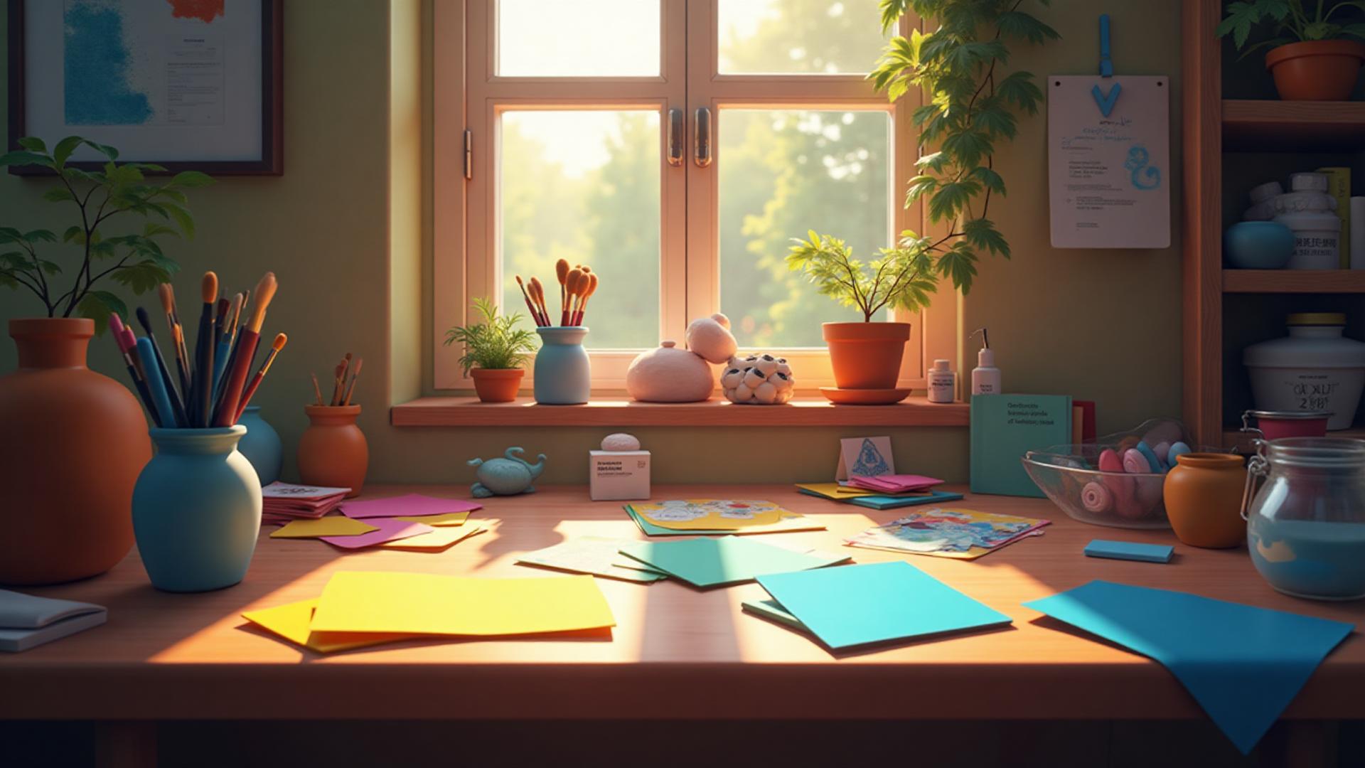
Let me tell you about the night I almost quit design.
It was 3 AM, and I was staring at my screen with bloodshot eyes, trying to create a color palette for a client who had the budget of a lemonade stand but expected the vibes of a luxury hotel. My Adobe subscription had lapsed (again), and I was drowning in browser tabs of color picker websites that all looked suspiciously similar.
That's when I realized something: the best design tools aren't always the ones with the biggest price tags. Sometimes they're the scrappy, free alternatives that work just as well—if you know where to look.

Why Budget-Friendly Designers Need Better Tools
Here's the thing nobody talks about: not everyone can afford a $52.99/month Creative Cloud subscription when they're just starting out. I certainly couldn't when I was freelancing from my parents' basement, living on instant noodles and optimism.
But here's what I learned the hard way: free doesn't mean inferior. Some of the best color palette generators I've ever used cost exactly zero dollars. They just required knowing where to look and how to use them properly.
The color tool landscape in 2026 has changed dramatically. AI-powered generators have gotten scary good, traditional tools have evolved, and new players have entered the game with fresh approaches.

The Great Free Color Tool Hunt
I've tested probably 50+ free color palette generators over the years. Some were brilliant. Most were meh. A few were actively harmful to my sanity.
What makes a color tool actually good? Here's my checklist:
- Speed: I don't have time for tools that take 30 seconds to load
- Accuracy: Colors should look the same everywhere, not shift weirdly between monitors
- Export options: Give me my hex codes, RGB values, and CSS without making me sign up for a newsletter
- No weird limitations: "Free trial for 3 days then
$29.99/month" is not free - Actually useful: Pretty interfaces mean nothing if the color suggestions are garbage

The AI Revolution (It's Actually Good Now)
I was skeptical about AI color tools at first. Most early ones were just glorified random color generators with "AI" slapped on for marketing.
But 2025 changed everything. The AI models got genuinely smart about color theory, understanding context, and generating palettes that actually made sense for specific use cases.
The breakthrough came when these tools started understanding intent. You could say "I need calming colors for a meditation app" and get back a palette of soft blues (#7BA5D6) and gentle greens (#9BC59D) instead of random pastels.
What really impressed me was when I tested one by asking for "colors that feel like a rainy Saturday morning with good coffee." It gave me warm browns (#8B7355), misty grays (#B8BDB5), and cozy cream tones (#F5EBE0). That's when I knew something had fundamentally shifted. Read more about extracting color palettes from images.

Traditional Methods Still Work (Sometimes Better)
Don't sleep on the old-school approaches. Sometimes the best color palette is just three colors you spotted in a photograph of a sunset.
I once built an entire brand identity around colors I pulled from a photo of my grandmother's garden—deep burgundy roses (#9B2335), sage green leaves (#8A9A8E), and warm terracotta pots (#C86558). The client loved it. They still use it three years later.
The "look at something beautiful and steal its colors" method will never go out of style. It's basically color theory meets plagiarism, but for good.

What Makes a Good Palette? (Spoiler: It's Not Random)
Here's where most free tools fail: they generate colors that technically work together but tell no story.
A good color palette needs:
- A dominant color that sets the mood (usually 60% of your design)
- A secondary color that supports and complements (30%)
- An accent color that adds spice (10%)
Think of it like cooking. You wouldn't dump equal amounts of every spice into a dish and expect it to taste good. Color palettes work the same way—they need hierarchy, balance, and a clear purpose.
The difference between a palette that looks "professional" and one that looks "someone's first day in design school" is usually just the ratios. And maybe not using pure #FF0000 red unless you're designing for a fire safety campaign.

The Secret Weapon: Context-Aware Generation
This is the game-changer that separates great tools from mediocre ones in 2026.
The best free palette generators now ask questions:
- What industry are you designing for?
- What emotion should this convey?
- Who's your target audience?
Then they generate colors accordingly. A palette for a funeral home should look different from a palette for a kids' birthday party app. Revolutionary, I know.
I remember testing this with a tool that asked me to describe my project in plain English. I wrote: "Luxury spa for tired millennials with too much screen time and not enough vacation days."
It gave me: sophisticated charcoal (#3D3D3D), calming seafoam (#96C5C1), and touches of gold (#D4AF37). Perfect. It understood assignment.

Pro Tips from Someone Who Learned the Hard Way
Save your palettes: I once spent 2 hours perfecting a color scheme, closed the browser, and lost everything. Learn from my pain. Screenshot, export, tattoo them on your arm if necessary.
Test in grayscale: Convert your palette to black and white. If it still has good contrast and hierarchy, it'll work in color. If everything becomes the same gray blob, go back to the drawing board.
Trust your gut: Sometimes a color combination just feels wrong even if the color theory says it should work. Trust that feeling. Your subconscious knows more about design than any algorithm.
Start with three colors: You can always add more later, but starting with three forces you to make clear choices. Plus, it's harder to screw up three colors than five.

Where Design Is Heading
The future of color tools is getting weird in the best possible way.
We're seeing generators that can:
- Pull palettes from uploaded photos in seconds
- Suggest colors based on time of day, season, or mood
- Generate accessible color combinations automatically
- Predict trending color combinations before they trend
Some tools are even integrating with your brand assets, learning your style over time, and suggesting palettes that match your existing work.
It's like having a color-obsessed assistant who never sleeps and doesn't judge you for starting projects at 2 AM.

The Bottom Line
You don't need expensive software to create beautiful color palettes. You just need good tools and an understanding of what makes colors work together.
The best free color palette generators in 2026 are legitimately as good as—and sometimes better than—paid alternatives. They're faster, smarter, and more intuitive than ever before.
But here's the secret: the tool doesn't make the designer. I've seen gorgeous work created with basic color pickers and terrible work created with $500 software licenses.
What matters is understanding color theory, knowing your audience, and being willing to experiment. The tools just make the process faster.
And speaking of fast processes—I've found that the best results come from tools that combine AI intelligence with human creativity. The kind that let you upload an image and extract a perfect palette in seconds, then tweak it until it's exactly right.
That 3 AM version of me from years ago would have killed for the tools we have now. But even back then, armed with nothing but free color pickers and determination, I made it work.
You will too.
Your Turn
What's your go-to method for choosing colors? Are you team "AI generate everything" or team "manually pick every single value"?
I'm somewhere in between—I let AI do the heavy lifting, then tweak until my designer brain is satisfied.
And if you're looking for a tool that combines the best of both worlds—AI-powered intelligence with the flexibility to customize everything—well, you might want to explore some of the newer platforms that are changing how we think about color generation. Speaking of 2026, check out our predictions for 2026 color trends.
Trust me, your 3 AM self will thank you.