Figma Color Systems: Building Scalable Color Libraries for Design Teams
· Coloracci Team
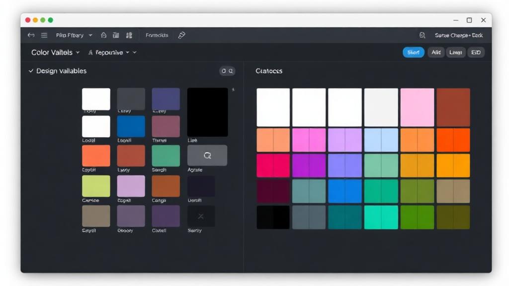
Why Color Systems Matter in Figma
A color system isn't just a list of hex codes—it's the architecture that makes your design scalable, consistent, and maintainable. In Figma, a well-built color system means any designer on your team can produce on-brand work without guessing, and theme changes happen in minutes instead of weeks.
This guide covers everything from basic color styles to advanced Figma Variables, semantic token naming, and multi-theme setups.
Figma Color Styles vs Variables
Figma offers two ways to manage colors: Color Styles (legacy) and Variables (modern). Understanding both is essential.
Color Styles
The original approach. You create named color styles that can be applied to fills, strokes, and effects.
Creating a Color Style:
- Select any element with a color
- Click the Style icon (four dots) next to the fill color
- Click + to create a new style
- Name it (e.g.,
Primary/500) - Click Create style
Limitations:
- No mode switching (light/dark)
- No aliasing (a style can't reference another style)
- Flat hierarchy—organization is name-based only
Variables (Recommended)
Introduced in 2023, Variables support multiple modes, aliasing, and scoping—perfect for design systems.
Creating Color Variables:
- Open the Variables panel (right sidebar)
- Click Create collection (e.g., "Colors")
- Add a variable (e.g.,
primary-500) - Set the value to
#6C3CE1 - Add modes for Light and Dark themes
Variables support aliasing: a semantic variable like surface-background can point to neutral-50 in Light mode and neutral-900 in Dark mode.
Building a Semantic Color System
The most scalable approach uses three layers:
Layer 1: Primitive Colors
Raw color values with no semantic meaning. Named by hue and shade:
blue-50:  #EFF6FF
blue-100: #DBEAFE
blue-200: #BFDBFE
blue-300: #93C5FD
blue-400: #60A5FA
blue-500: #3B82F6
blue-600: #2563EB
blue-700: #1D4ED8
blue-800: #1E40AF
blue-900: #1E3A8A
blue-950: #172554
Repeat for each hue: gray, red, green, yellow, purple, etc.
Layer 2: Semantic Tokens
Named by purpose, referencing primitives:
| Token | Light Mode | Dark Mode |
|---|---|---|
surface/background |
gray-50 (#F9FAFB) |
gray-950 (#030712) |
surface/card |
white (#FFFFFF) |
gray-900 (#111827) |
text/primary |
gray-900 (#111827) |
gray-50 (#F9FAFB) |
text/secondary |
gray-500 (#6B7280) |
gray-400 (#9CA3AF) |
brand/primary |
blue-600 (#2563EB) |
blue-400 (#60A5FA) |
status/error |
red-600 (#DC2626) |
red-400 (#F87171) |
status/success |
green-600 (#16A34A) |
green-400 (#4ADE80) |
Layer 3: Component-Specific Tokens (Optional)
For large systems, add component-level tokens:
button/primary/background → brand/primary
button/primary/text → white
button/primary/hover → blue-700
input/border → gray-300
input/border-focus → brand/primary
This three-layer approach means changing your brand color requires updating one primitive—everything cascades through semantic and component tokens automatically.
Light/Dark Theme Switching with Variables
Figma Variables make theme switching effortless.
Setup Process
- Create a "Primitives" collection with all raw color values (no modes needed)
- Create a "Semantic" collection with two modes: Light and Dark
- For each semantic variable, alias to the appropriate primitive per mode:
background: Light →gray-50, Dark →gray-950text-primary: Light →gray-900, Dark →gray-50
- Apply semantic variables to all your components
- Switch modes at the frame level to preview themes
Testing Your Themes
- Create a frame called "Theme Preview"
- Place all your components inside
- Switch between Light and Dark modes
- Check every component for readability and contrast
- Pay special attention to interactive states (hover, focus, disabled)
Color Naming Conventions
Good naming is the difference between a system that scales and one that collapses.
Do's
primary/500— clear hierarchysurface/background— describes purposetext/on-primary— indicates contextborder/default— functional naming
Don'ts
blue— too vague, what if brand color changes?header-bg— too specific to one componentcolor-1— meaninglessdark-gray— subjective, doesn't scale
Recommended Naming Structure
[category]/[variant]/[state]

Examples:
surface/background
surface/card
surface/card/hover
text/primary
text/secondary
text/on-primary
brand/primary
brand/primary/hover
border/default
border/focus
status/error
status/error/background
Team Library Management
A color system only works if the whole team uses it.
Publishing Your Color Library
- Organize colors into a dedicated Figma file (e.g., "Design System — Colors")
- Create clear documentation frames showing all tokens with previews
- Click Assets panel → Team library icon
- Publish your library
- Team members enable the library in their files via Assets > Team library
Handling Updates
When you update colors in the library:
- Make changes in the library file
- Click Publish changes with a descriptive message
- Team members see an update notification
- They click Review to see what changed
- Accept to pull updates into their files
Best Practices for Teams
- Assign a color system owner who manages the library
- Use branching (Figma feature) for experimental changes
- Document every change with version notes
- Hold monthly "system sync" meetings to discuss needed updates
Figma to Code Color Handoff
Your beautiful Figma color system means nothing if developers can't implement it.
Using Design Tokens Format
Export your variables as design tokens using the W3C Design Tokens Community Group format:
{
  "color": {
    "primary": {
      "500": { "$value": "#3B82F6", "$type": "color" },
      "600": { "$value": "#2563EB", "$type": "color" }
    },
    "surface": {
      "background": {
        "$value": "{color.gray.50}",
        "$type": "color"
      }
    }
  }
}
Mapping to CSS Variables
Your Figma tokens should map directly to CSS custom properties:
:root {
  --color-primary-500: #3B82F6;
  --color-primary-600: #2563EB;
  --surface-background: var(--color-gray-50);
  --text-primary: var(--color-gray-900);
}

[data-theme="dark"] {
  --surface-background: var(--color-gray-950);
  --text-primary: var(--color-gray-50);
}
Plugins for Token Export
- Tokens Studio for Figma: Industry-standard plugin for design token management
- Figma Variables to Code: Exports variables as CSS/SCSS/JSON
- Design Tokens: W3C format export
Plugins for Color Management
Essential Figma Color Plugins
Contrast Checker: Tests WCAG AA/AAA compliance directly in Figma. Select two layers and get instant contrast ratio feedback.
Color Blind Simulator: Preview your designs as seen by people with different types of color vision deficiency. Essential for accessibility compliance.
Palette Generator: Generate harmonious color palettes from a single seed color using color theory rules.
Color Shades: Automatically generate a full shade range (50-950) from a single base color—saves hours of manual work.
Step-by-Step: Building Your First Figma Color System
- Audit existing colors in your designs—identify inconsistencies
- Define primitives: Choose your hue palette and generate 50-950 shades for each
- Create semantic tokens: Map primitives to functional names
- Set up Variables in Figma with Light and Dark modes
- Apply variables to a small set of core components first (buttons, cards, inputs)
- Test themes by switching modes—fix any contrast or readability issues
- Document the system with visual examples and naming conventions
- Publish as a team library
- Export tokens for developer handoff
- Iterate based on team feedback
Start with the Right Colors
Building a color system starts with choosing the right palette. Use Coloracci's AI palette generator to explore harmonious color combinations, then bring those hex codes into Figma as your primitive layer.
Great color systems aren't built overnight—they evolve. Start simple, stay consistent, and scale as your product grows.