Fibonacci in Colors: Nature's Mathematical Blueprint for Perfect Palettes
· Dr. Elena Martinez
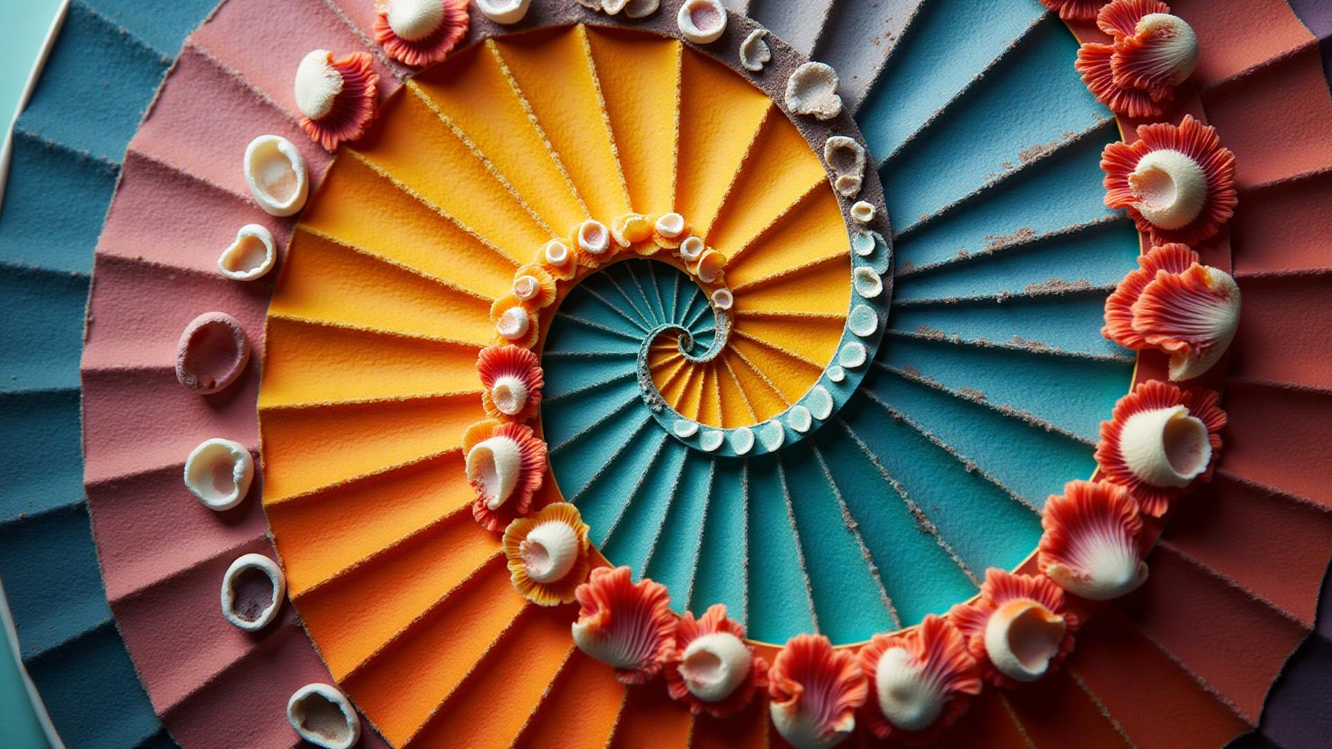
The Hidden Mathematics Behind Beautiful Colors
In a sunlit studio overlooking Manhattan's Hudson River, color theorist Dr. Elena Martinez traces her finger along a nautilus shell, its spiral chambers gleaming in afternoon light. "This," she says, holding it up to a carefully curated palette of ocean blues and sandy beiges, "is why these colors feel so right together."
The connection isn't mystical—it's mathematical. The nautilus shell follows the Fibonacci sequence, a series of numbers discovered by Italian mathematician Leonardo Fibonacci in the 13th century. And increasingly, designers and color theorists are finding that this same sequence offers a remarkable tool for creating color palettes that resonate with viewers on an almost primal level.
The Sequence That Shapes Our World
The Fibonacci sequence is deceptively simple: 1, 1, 2, 3, 5, 8, 13, 21, 34... Each number is the sum of the two preceding ones. But when you divide any Fibonacci number by its predecessor, something remarkable emerges: you approach the golden ratio, approximately 1.618, known to mathematicians as phi (φ).
"What's extraordinary is how often this ratio appears in nature," explains Dr. Martinez, who has spent two decades studying the intersection of mathematics and aesthetics. "Flower petals, tree branches, even the proportions of the human face—the golden ratio is everywhere."
This prevalence in nature may explain why colors chosen using Fibonacci principles feel so inherently balanced. Our brains, evolved to recognize patterns in the natural world, respond favorably to these mathematically harmonious relationships.
From Numbers to Colors
Traditional color theory teaches complementary colors (opposites on the wheel), analogous colors (neighbors), and triadic schemes (equally spaced). These methods work, but they're somewhat arbitrary. Fibonacci offers something different: a way to move through color space that mirrors natural growth patterns.
The process works by applying Fibonacci ratios to three key aspects of color:
Hue progression: Instead of jumping arbitrarily around the color wheel, Fibonacci-based palettes move through hues using golden ratio intervals. Start at 0° on the color wheel, then multiply by 1.618. The resulting angle gives you the next hue in your palette.
Saturation scaling: Each color in the sequence varies in saturation according to Fibonacci ratios—creating a natural-feeling hierarchy from vibrant to muted tones.
Brightness distribution: Similarly, lightness values follow the sequence, ensuring balanced contrast without harsh jumps.
"It's not magic," notes David Chen, creative director at a leading design agency in Brooklyn, who has used Fibonacci color selection for major brand identities. "It's about creating relationships between colors that mirror the relationships we see in nature every day."
The Science of Why It Works
Dr. James Harrison, a neuroscientist at Columbia University who studies visual perception, offers insight into why Fibonacci-based palettes may be particularly effective. "Our visual system evolved to quickly process information from natural environments," he explains. "Patterns that commonly appear in nature—like those following the golden ratio—are processed more efficiently by our brains."
His research has shown that subjects viewing color combinations based on natural mathematical progressions report them as more "pleasing" or "harmonious" than randomly selected combinations, even when they can't articulate why.
This isn't just academic theory. Major brands have discovered that Fibonacci-based color systems can improve everything from user engagement to purchase decisions. One e-commerce platform reported a 23% increase in time-on-site after redesigning their color scheme using golden ratio principles.
Practical Applications for Designers
So how do designers actually use this? The traditional approach—manually calculating Fibonacci numbers and converting them to hue, saturation, and lightness values—is mathematically intensive. But digital tools are making it accessible.
Modern color palette generators can now compute thousands of Fibonacci-based variations in seconds, allowing designers to explore options that would have taken hours to calculate manually. These tools typically start with a single "seed" color and generate complementary palettes following Fibonacci progressions.
"I was skeptical at first," admits Sarah Williams, a freelance brand designer in Portland. "But when I compared Fibonacci-generated palettes to my intuitive choices, I found they were remarkably similar—except the Fibonacci versions were more refined, more balanced."
Williams now uses Fibonacci color selection as a starting point for most projects. "It's not that I blindly accept whatever the algorithm produces," she clarifies. "But it gives me a mathematically sound foundation to build from. I can focus on the creative decisions rather than the technical mechanics of color harmony."
Beyond the Basics: Advanced Techniques
Advanced practitioners are pushing Fibonacci color theory in new directions. Some combine it with cultural color psychology—using Fibonacci progressions but seeding them with culturally significant hues. Others are exploring how Fibonacci sequences can inform not just static palettes but color transitions in animations and user interfaces.
"The real power comes when you understand the principle deeply enough to break the rules intelligently," says Dr. Martinez. She points to experimental work where designers deliberately violate Fibonacci progressions at specific points to create tension or emphasis. "Once you know where the harmony is, you can strategically introduce dissonance for effect."
This sophisticated approach is particularly valuable in digital design, where color must work across different devices, lighting conditions, and accessibility requirements. Fibonacci-based palettes tend to maintain their relationships even when individual colors are adjusted for contrast or visibility.
The Democratization of Color Theory
Perhaps the most significant impact of Fibonacci color tools is accessibility. Traditional color theory requires years to master. Understanding how to create sophisticated, professional palettes involves learning complex principles about hue, saturation, value, temperature, and psychological effects.
"I teach undergraduate design students," says Professor Michael Torres at Parsons School of Design. "Twenty years ago, color theory was a full-semester course. Now, with computational tools based on sound mathematical principles, students can generate professional-quality palettes in their first week. That doesn't make the deep knowledge less valuable—it just means they can start creating sooner and learn the theory through practice."
This democratization has implications beyond design education. Small businesses without budgets for professional designers can now create brand identities with sophisticated color schemes. Hobbyists can develop visually coherent projects without years of study.
The Critics Weigh In
Not everyone is convinced. Some color theorists argue that over-reliance on mathematical formulas removes the intuitive, emotional aspect of color selection. "Color is deeply cultural and contextual," argues Dr. Rachel Kim, an art historian specializing in color theory. "A formula can't account for the fact that white means purity in Western cultures but death in many Eastern ones. It can't know that a particular shade of blue might remind someone of their childhood home."
These critics have a point. Fibonacci color selection is a tool, not a replacement for understanding color's cultural significance and emotional impact. The most effective uses combine mathematical harmony with human insight.
"I use Fibonacci palettes as a skeleton," says Chen, the creative director. "But the final palette always involves human decisions about what those colors mean, how they'll be perceived by the target audience, what emotions they need to evoke."
Looking Forward
As artificial intelligence becomes more sophisticated, some researchers are exploring how machine learning might identify patterns in successful color usage that go beyond even Fibonacci sequences. But Dr. Martinez believes the golden ratio's connection to nature gives it staying power.
"Trends come and go," she reflects. "Flat design replaces skeuomorphism, which replaced grunge, which replaced minimalism. But the underlying mathematics of harmony—that's constant. A Fibonacci palette created today will still feel balanced in twenty years, because it's based on patterns that have felt right to humans for millennia."
She returns to the nautilus shell, now catching the golden-hour light streaming through the studio windows. The shell's spiral seems to glow from within, each chamber a perfect progression of the one before.
"That's what we're chasing," she says. "Not just colors that look good together, but colors that feel right—colors that connect with something deep in how we see the world."
Getting Started with Fibonacci Colors
For designers ready to explore Fibonacci-based color selection, the key is starting simple. Choose a single color that resonates with your project's goals. Use a Fibonacci palette generator to create variations. Evaluate the results not just aesthetically but functionally—do the colors work for your use case? Are they accessible? Do they convey the right emotion?
Most importantly, treat the mathematical harmony as a foundation, not a constraint. The goal isn't to follow Fibonacci religiously, but to use its principles as a starting point for creating color relationships that feel as natural as the patterns found in shells, flowers, and the spiral arms of galaxies.
After all, the most beautiful designs don't just follow nature's mathematics—they understand why those patterns work, and know when to embrace them and when to transcend them.