Fashion Color Trends 2025-2026: The Definitive Palette Guide for Designers
· Coloracci Team
Why the Fashion Color Trends 2025-2026 Matter Far Beyond the Runway
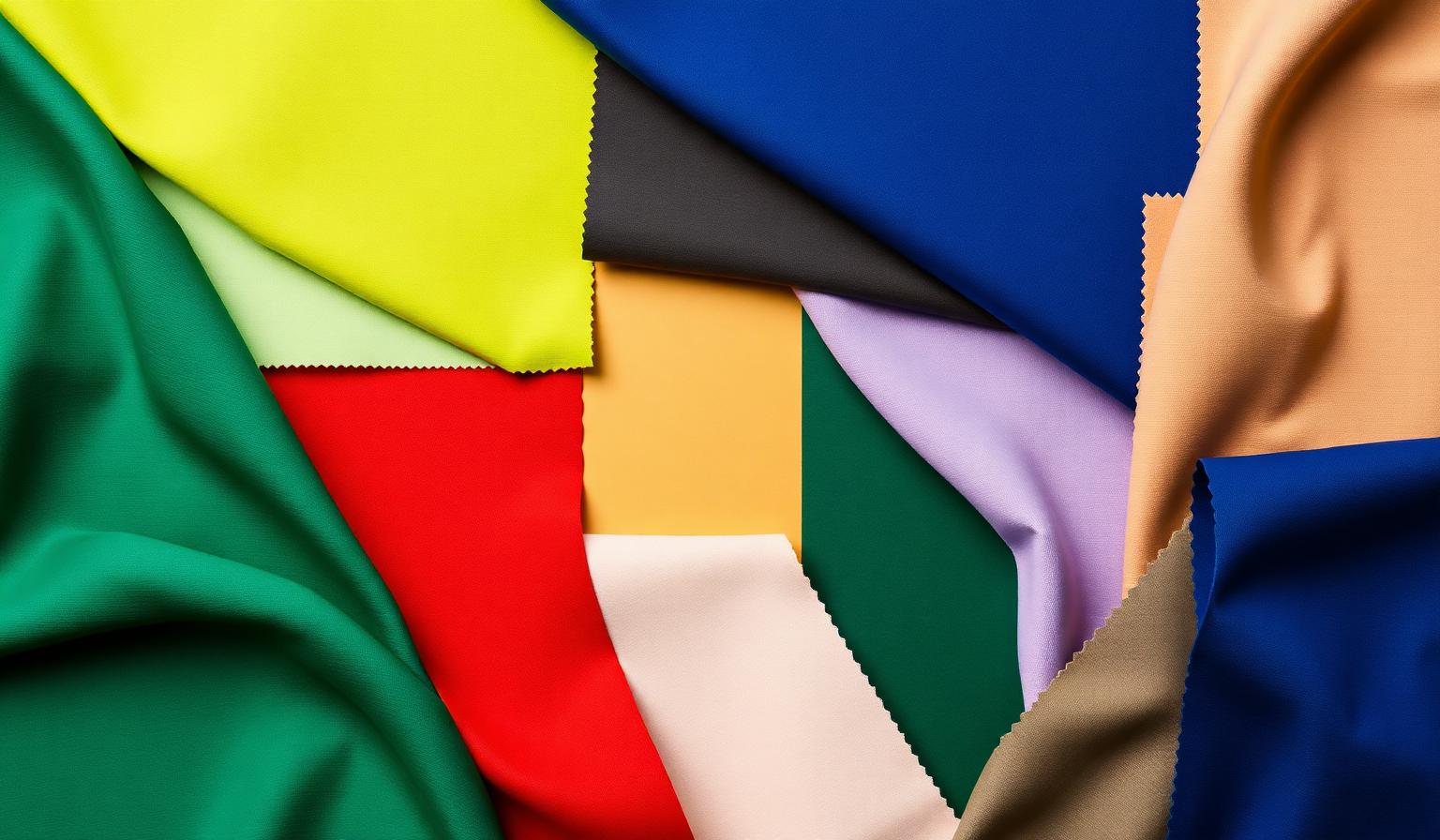
The fashion color trends 2025-2026 are doing something unusual: they are not converging on a single hero shade. Instead, the season's defining story is one of coexisting extremes — vivid greens next to dusty neutrals, electric cobalt next to whisper-soft mint, fiery rust next to powdery lavender. For designers, color analysts, and brand teams, this matters because fashion remains the fastest-moving cultural signal we have for color. What walks the runway in Milan and Paris in 2025 will, with near-mathematical reliability, appear in app interfaces, packaging systems, and brand refreshes through 2026 and into 2027.
This guide is a structured, data-driven breakdown of the palette: every key color, the exact hex value, the psychological signal it sends, and how to translate it into digital design work without losing its emotional weight. Whether you're refreshing a brand identity, building a UI system, or just trying to understand why everything suddenly looks both bold and quiet at once, this is the field guide.
If you want a deeper foundation before diving in, our companion piece on color psychology for designers maps the emotional logic that underpins every trend below.
The Complete 2025-2026 Fashion Color Breakdown
Five color families dominate the season. Each one is doing distinct emotional work, and together they form a palette that is, paradoxically, both maximalist and grounded.
1. Vibrant Greens — The Optimism Reset
- Emerald (Teal-leaning) —
#008080 - Lime / Acid Green —
#BFFF00
Greens lead the 2025-2026 fashion conversation. Emerald #008080 arrives as the "considered" green — jewel-toned, slightly oceanic, and easy to read as luxurious. Lime #BFFF00 is its loud sibling: a high-voltage acid green that designers are using as an accent, not a base. Together they signal regeneration, technological optimism, and a deliberate break from the muted sage palettes that dominated 2022-2024.
2. Earthy Neutrals — The Quiet Foundation
- Taupe — typically rendered around
#B8A99A - Sand — typically around
#E0CDA9
Every loud trend needs a quiet foundation, and 2025-2026 leans hard on warm earth neutrals. Taupe and sand replace cool grays as the default "background" shade across knitwear, tailoring, and accessories. In digital terms, these are the new #F8F8F8 — the canvas everything else lives on.
3. Bold Blues — Confidence Without Corporatism
- Cobalt —
#0047AB - Navy —
#000080
Blue is having a confident, structural moment. Cobalt #0047AB is the standout — a saturated, slightly electric blue that reads as decisive without sliding into the tired "tech blue" template. Navy #000080 anchors the family as the authoritative base. This pairing is why 2025-2026 collections can feel sharp and tailored without resorting to black.
4. Fiery Reds — Heat With Intention
- Chili Red —
#E42217 - Rust —
#B7410E
Reds in this cycle are warmer and earthier than the cool, blue-leaning crimsons of recent years. Chili #E42217 brings energy and urgency; rust #B7410E brings groundedness and craft. Together they suggest heat with intention — passion that has been considered, not just felt.
5. Soft Pastels — The Counterweight
- Lavender —
#E6E6FA - Mint —
#98FF98
The pastel story this season is about softness as contrast. Lavender #E6E6FA and mint #98FF98 aren't being used as full looks the way they were in 2021. They appear as breathing room — a single garment, a lining, a lipstick — placed against the cobalts and chilis to keep the palette emotionally legible.
Patterns and Analysis: What These Choices Reveal
Step back from the swatches and three structural patterns emerge in the fashion color trends 2025-2026.
Pattern 1: Saturation barbells. The palette skips the "safe middle." Designers are pairing high-saturation hero shades (cobalt, lime, chili) directly with low-saturation neutrals (taupe, sand). The mid-tones — your dusty mauves, muted teals, foggy olives — are notably absent. This is a barbell strategy: loud or quiet, with very little in between.
Pattern 2: Warm bias. Even the "cool" colors lean warm. The emerald is teal-tilted but warm-rendered; the navy is used alongside rust rather than gray; the lavender skews pink rather than blue. This warm bias is the season's most consistent thread.
Pattern 3: Pairs, not gradients. Each family is defined by two shades — a hero and a counter. Designers aren't building five-step gradient ramps; they're building tight binaries. This is profoundly relevant for digital design, where two-color systems scale far better than gradient ramps across themes and components.
If you want to translate these binaries into working design systems, our guide to creating harmonious color palettes walks through the structural rules that make these pairings hold up.
Color Psychology: The Emotions Behind the Trends
The fashion color trends 2025-2026 are unusually coherent psychologically. Read in sequence, they tell a single story: grounded optimism in an uncertain decade.
- Greens (emerald, lime) — Renewal, growth, technological optimism. After several years of doom-coded palettes, the industry is signaling forward motion.
- Earthy neutrals (taupe, sand) — Stability, craft, longevity. These are "I made this to last" colors. They counterbalance the louder shades and quietly resist the throwaway aesthetic.
- Bold blues (cobalt, navy) — Authority, clarity, confidence. Cobalt in particular reads as decisive — useful in a season where consumers are tired of beige-on-beige indecision.
- Fiery reds (chili, rust) — Passion grounded by warmth. Unlike cool reds that read as alarm or urgency, these warm reds read as appetite, craft, and human heat.
- Soft pastels (lavender, mint) — Calm, recovery, breathing room. They function as the emotional palate cleanser between the bolder statements.
The unified message: be bold, but be grounded. That is the psychological subtext designers should carry from runway to screen.
Designer Takeaways: Putting These Trends to Work
How do you actually apply the fashion color trends 2025-2026 in a real design project? A few field-tested rules.
1. Use the barbell, not the rainbow. Pick one hero from the saturated families (cobalt, chili, emerald, or lime) and pair it with one earthy neutral (taupe or sand). Resist the urge to use three saturated colors at once.
2. Cobalt is your safest bold move. #0047AB is the most cross-functional color of the season. It works for fintech, lifestyle, editorial, and DTC alike. If you're refreshing a brand and want to signal "modern" without committing to a fad, cobalt over a sand neutral is the lowest-risk bold move available right now.
3. Treat lime as a 5% color. Acid green #BFFF00 is potent. Use it for a single CTA, a hover state, or a highlight band — not as a primary surface. Beyond ~5% of the visual field, it stops feeling fashion-forward and starts feeling like a hazard sign.
4. Pair rust with mint or lavender for editorial energy. Rust #B7410E plus mint #98FF98 is the season's most editorial pairing. It works beautifully for fashion publications, lifestyle brands, and any product that wants to feel both crafted and contemporary.
5. Build accessibility into the bold colors. Chili red and cobalt both pass WCAG AA against white at body sizes, but lime against white fails badly. Always test contrast before committing — and remember that "fashion-correct" and "accessible" are not opposites if you choose your pairings deliberately.
Quick-Reference Data Table
| Item | Primary Color | Hex Code | Color Name | Psychological Meaning |
|---|---|---|---|---|
| Vibrant Green Hero | Teal-Emerald | #008080 |
Emerald | Renewal, luxury, regeneration |
| Vibrant Green Accent | Acid Green | #BFFF00 |
Lime | Energy, optimism, tech-forward |
| Earthy Neutral Hero | Warm Taupe | #B8A99A |
Taupe | Stability, longevity, craft |
| Earthy Neutral Base | Warm Beige | #E0CDA9 |
Sand | Foundation, calm, durability |
| Bold Blue Hero | Cobalt | #0047AB |
Cobalt | Confidence, clarity, authority |
| Bold Blue Anchor | Navy | #000080 |
Navy | Trust, depth, structure |
| Fiery Red Hero | Vivid Red | #E42217 |
Chili | Passion, urgency, heat |
| Fiery Red Counter | Burnt Orange | #B7410E |
Rust | Craft, groundedness, warmth |
| Pastel Counter 1 | Pale Violet | #E6E6FA |
Lavender | Calm, recovery, softness |
| Pastel Counter 2 | Pale Green | #98FF98 |
Mint | Freshness, breathing room, balance |
A Note on the 2026 Outlook
Looking ahead, expect cobalt and rust to dominate the commercial translation of these trends through late 2026 — they are the most adaptable to logos, UI, and packaging. Emerald will hold strong in luxury and beauty. Lime will fade to an accent role by Q4 2026. Lavender and mint will quietly migrate into wellness, fintech, and SaaS branding as the "calming counterweight" to the bolder hues.
The structural lesson — barbell saturation, warm bias, two-color pairings — will outlast the specific shades. That is the real takeaway designers should carry forward.
Bring These Trends Into Your Own Work
The fastest way to internalize a palette is to build with it. Try generating your own variations — pull cobalt and sand into a fintech mockup, drop chili and mint into a food brand concept, see how emerald behaves against taupe in a UI surface. The differences between reading about a color and placing it next to another color are enormous.
You can do all of that in seconds with the Coloracci palette generator — extract palettes from runway imagery, lock in a hero shade like #0047AB, and let the AI suggest harmonious counterweights pulled directly from the structural logic this guide describes.
Generate your 2026 fashion-inspired palette on Coloracci →
The trends are loud. Your design choices don't have to be. Use the barbell, trust the warm neutrals, and let one bold color do the talking.