The Ultimate Guide to Modern Farmhouse Exterior Paint Colors
· Coloracci Team
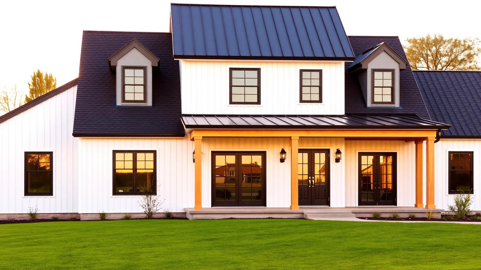
The Direct Answer: Exterior Paint Colors for a Modern Farmhouse
If you are searching for exterior paint colors for a modern farmhouse, the professional answer is a three-part formula, not a single swatch: a warm white or soft greige on the siding, a near-black on the trim, windows, and shutters, and raw or stained wood on porch columns, gables, and the front door. The two most specified colors in the entire category are Sherwin-Williams Alabaster (SW 7008) — #EDEAE3 for the body and Benjamin Moore Black Satin (2131-10) — #22262A for the accents. Get that pairing right and everything else in the palette falls into place.
The modern farmhouse look is deceptively simple. Because the composition is essentially two values — very light and very dark — every decision is amplified. A white with too much blue in it turns clinical against a warm cedar porch. A black that is truly #000000 reads as a flat cutout in bright sun. This guide gives you the complete vocabulary of modern farmhouse exterior colors with exact HEX values, five ready-to-paint combinations, the psychology behind why this palette feels so calming, and the practical rules colorists use when specifying it.
Why the Modern Farmhouse Palette Works
The style descends from working American agricultural buildings: whitewashed board-and-batten siding, black iron hardware, unpainted structural timber, and a metal roof. Those buildings were never "designed" — their palette was the byproduct of cheap lime wash, tar-based protective coatings, and lumber straight off the property. What contemporary architects did, beginning around 2010, was strip the ornament away and keep only that honest material contrast.
Three constraints define the category, and every successful scheme respects them:
- The body is light and warm, never cool. Farmhouse whites carry a yellow, cream, or greige undertone. Cool, blue-leaning whites belong to coastal and mid-century modern, not to farmhouse. Warmth is what keeps a large white facade from looking like a laboratory.
- The contrast is extreme, and the dark color is small. Trim, window frames, and shutters occupy perhaps 10 percent of the visible surface — but they carry all the graphic punch. This is the 60-30-10 rule applied to architecture: roughly 60 percent siding, 30 percent roof and hardscape, 10 percent black accents.
- Natural wood is the third color. A pure black-and-white farmhouse can feel severe. A cedar porch post, a stained front door, or exposed rafter tails in the gable introduce the organic tone that makes the house feel lived in rather than staged.
Break any one of those and the house stops reading as farmhouse. Use a cool white and it becomes contemporary minimalism. Paint the whole facade dark and it becomes Scandinavian modern. Skip the wood and it becomes a monochrome graphic exercise.
The Complete HEX Reference for Modern Farmhouse Exteriors
These are the shades that appear on the majority of professionally specified farmhouse exteriors, drawn from Sherwin-Williams farmhouse colors and the Benjamin Moore modern farmhouse palette.
Body Colors: Whites, Off-Whites, and Greiges
- Alabaster (SW 7008) — #EDEAE3. The single most-used farmhouse body color in North America. A soft, warm white with just enough beige to stay comfortable in full sun. It never glares and never yellows.
- Pure White (SW 7005) — #EDECE6. Marginally cleaner and crisper than Alabaster. Choose it when your roof is a cool charcoal or your stone veneer runs gray.
- White Dove (BM OC-17) — #F0EFE6. Benjamin Moore's warm-white equivalent. Slightly softer and creamier; excellent on board-and-batten where the vertical shadow lines already add depth.
- Simply White (BM OC-117) — #F5F3E8. The brightest option in the family, with a discernible yellow cast. Ideal for shaded, tree-heavy lots where a duller white would go gray.
- Agreeable Gray (SW 7029) — #D1CBC1. The greige alternative for homeowners who find full white too stark. Reads warm gray in overcast light and pale taupe in sun.
- Repose Gray (SW 7015) — #CCC9C0. A step cooler and more neutral. Pairs beautifully with black trim and a natural cedar door.
- Accessible Beige (SW 7036) — #D1C7B8. The warmest of the neutral bodies. Best on farmhouses with brick foundations or warm-toned stone.
Trim, Shutter, and Accent Colors: The Dark Half
- Black Satin (BM 2131-10) — #22262A. The definitive farmhouse black. A deep, softly blue-black that holds detail in direct sunlight rather than flattening out.
- Tricorn Black (SW 6258) — #2F2F30. Sherwin-Williams' near-neutral black. The safest choice when your windows, gutters, and light fixtures are all true black metal.
- Iron Ore (SW 7069) — #434547. A charcoal-black with visible gray. Slightly softer than a true black; excellent on large trim runs where full black would be heavy.
- Peppercorn (SW 7674) — #585C5F. A mid-charcoal for homeowners who want contrast without drama. Very effective on shutters against an Alabaster body.
- Urbane Bronze (SW 7048) — #54524D. A warm, brown-leaning dark that bridges beautifully to natural wood elements.
- Wrought Iron (BM 2124-10) — #3C4043. Benjamin Moore's slightly green-black. A sophisticated alternative when a pure black feels too commercial.
Natural Wood and Secondary Accents
- Cedar Natural — #A9743F. Clear-sealed western red cedar on porch posts and beams.
- Weathered Oak — #B99C6B. Lightly stained or naturally silvered timber for gable brackets.
- Warm Greige Stone — #B9B0A4. For foundation veneer and chimney stone; keeps the base grounded.
- Naval (SW 6244) — #2F3E4E. The one color break most designers allow: a deep navy front door for a farmhouse that needs a note of personality.
Five Complete Modern Farmhouse Palettes
Each combination below is specification-ready — body, trim, door, and accent — and each has been chosen so the undertones agree.
1. The Classic (highest resale confidence)
Body Alabaster #EDEAE3 · Trim and windows Black Satin #22262A · Door Black Satin #22262A in a higher sheen · Porch posts Cedar Natural #A9743F. This is the archetype: maximum contrast, warm white, and one organic material. It photographs perfectly and appeals to nearly every buyer.
2. The Soft Modern (for bright, sun-exposed lots)
Body White Dove #F0EFE6 · Trim Iron Ore #434547 · Door Urbane Bronze #54524D · Accent Weathered Oak #B99C6B. Substituting charcoal for true black lowers the glare contrast, which matters enormously in desert or high-altitude light where a black-and-white facade can feel harsh at midday.
3. The Greige Farmhouse (for wooded or overcast climates)
Body Agreeable Gray #D1CBC1 · Trim Tricorn Black #2F2F30 · Door Naval #2F3E4E · Stone Warm Greige Stone #B9B0A4. When a white house would go dingy under tree cover, starting one value step down keeps the facade looking intentional year-round.
4. The Warm Traditional (for brick foundations)
Body Accessible Beige #D1C7B8 · Trim Alabaster #EDEAE3 · Shutters Peppercorn #585C5F · Door Cedar Natural #A9743F. This inverts the usual logic — light trim over a warmer body — and is the most historically faithful of the five.
5. The Graphic Farmhouse (architect-forward)
Body Pure White #EDECE6 · Trim, windows, and roof Black Satin #22262A · Door Wrought Iron #3C4043 · Beams Cedar Natural #A9743F. Everything not siding goes black, including gutters and downspouts. Ruthless, and extremely photogenic on a simple gabled massing.
Color Psychology: Why This Palette Feels So Good
The modern farmhouse palette is not popular by accident. It engages three well-documented perceptual responses.
White signals cleanliness, order, and possibility. Perceptually, high-reflectance surfaces reduce visual noise: there is nothing to interpret, so the eye relaxes. That is why white facades read as calm and well-maintained even before you notice the landscaping. Our deep dive on what the color white means unpacks the cultural layer — purity, honesty, new beginnings — that reinforces the perceptual one.
Black provides structure and authority. In small proportions, near-black outlines act like typographic weight: they define edges, clarify hierarchy, and make the composition feel deliberate. This is why blacked-out window frames instantly modernize an otherwise traditional gable. Black also carries associations of permanence and quality — the same reason luxury packaging leans on it.
Wood introduces warmth and safety. Exposed timber is the only element in the palette with visible grain and color variation. That irregularity registers as natural and non-threatening, softening the graphic severity of the black-and-white pairing. Remove the wood and homeowners consistently describe the same house as "cold."
The combination produces the emotional signature the style is sold on: simplicity without austerity, modernity without coldness, and comfort without clutter.
Practical Rules for Specifying Farmhouse Paint Colors
Test at three times of day, on all four elevations. Warm whites shift dramatically. Alabaster on a north elevation at 8 a.m. and on a west elevation at 6 p.m. are effectively two different colors. Paint 2×2-foot boards, not the wall, and move them around.
Match the white to the roof, not to the trim. The roof is the second-largest surface. A warm white under a cool blue-gray shingle will look mismatched no matter how good the trim is. Pull your undertone decision from the roof and any masonry — those are the elements you cannot repaint.
Never use true #000000. Pure black absorbs all detail and looks like a void in photographs. Every professional farmhouse black — Black Satin, Tricorn Black, Wrought Iron — carries a small amount of blue, green, or gray to keep the surface reading dimensionally.
Keep sheens disciplined. Flat or matte on the siding hides the inevitable waviness of board-and-batten. Satin on the trim and semi-gloss on the door adds the subtle sheen contrast that makes a two-color scheme feel rich rather than flat.
Limit the palette to three plus wood. Body, trim, door, and one natural material. Adding a fifth painted color — a colored shutter plus a colored door plus a colored garage — is the most common way homeowners break the style.
Consider the neighbors. A pure-white farmhouse between two beige colonials becomes the loudest object on the street. If context matters to you, step down to Agreeable Gray and let the black trim carry the identity instead.
Adapt the logic to your architecture. If your home has deep porches and horizontal massing rather than steep gables, the earth-tone framework in our guide to exterior paint colors for craftsman style homes will serve you better than the high-contrast farmhouse formula.
Modern Farmhouse Exterior Color Data Table
| Item | Color | Hex | Color Name | Psychological Meaning |
|---|---|---|---|---|
| Body | Warm soft white | #EDEAE3 | Alabaster (SW 7008) | Clean, honest, welcoming |
| Body | Crisp white | #EDECE6 | Pure White (SW 7005) | Fresh, precise, uncluttered |
| Body | Creamy white | #F0EFE6 | White Dove (BM OC-17) | Gentle, comfortable, timeless |
| Body | Bright warm white | #F5F3E8 | Simply White (BM OC-117) | Optimistic, luminous, open |
| Body | Warm greige | #D1CBC1 | Agreeable Gray (SW 7029) | Balanced, agreeable, understated |
| Body | Neutral gray | #CCC9C0 | Repose Gray (SW 7015) | Composed, quiet, modern |
| Body | Warm beige | #D1C7B8 | Accessible Beige (SW 7036) | Grounded, hospitable, familiar |
| Trim | Deep blue-black | #22262A | Black Satin (BM 2131-10) | Authoritative, refined, permanent |
| Trim | Neutral black | #2F2F30 | Tricorn Black (SW 6258) | Decisive, graphic, contemporary |
| Trim | Charcoal black | #434547 | Iron Ore (SW 7069) | Solid, softened, architectural |
| Shutters | Mid charcoal | #585C5F | Peppercorn (SW 7674) | Restrained, mature, quiet contrast |
| Accent | Warm dark bronze | #54524D | Urbane Bronze (SW 7048) | Earthy, sheltering, organic |
| Trim | Green-black | #3C4043 | Wrought Iron (BM 2124-10) | Sophisticated, weighty, considered |
| Door | Deep navy | #2F3E4E | Naval (SW 6244) | Trustworthy, calm, individual |
| Columns | Natural cedar | #A9743F | Cedar Natural | Warm, tactile, handcrafted |
| Gable | Light stained wood | #B99C6B | Weathered Oak | Aged, authentic, softening |
| Foundation | Greige stone | #B9B0A4 | Warm Greige Stone | Stable, rooted, enduring |
Conclusion: Build the Palette Before You Buy the Paint
Choosing exterior paint colors for a modern farmhouse comes down to three disciplined decisions: pick a warm white or greige that agrees with your roof, pick a near-black that is not actually black, and let one natural wood element carry the warmth. Alabaster and Black Satin are the reason this style became ubiquitous — they are foolproof together — but every combination above is a professionally viable path, and the greige and charcoal variants often outperform pure white in wooded, overcast, or high-glare conditions.
The mistake to avoid is buying gallons before you have seen the full three-color relationship in your own light. A palette works as a system, not as a list of individually attractive swatches.
Generate Your Farmhouse Palette in Seconds
Drop any HEX code from this guide — start with #EDEAE3 — into the Coloracci palette generator and instantly see a harmonized body, trim, door, and accent scheme built around it, complete with contrast ratios and the psychology behind each shade. It is the fastest way to move from "I want a white farmhouse with black trim" to a specification your painter can quote from.