Does Navy Blue and Black Go Together? A Designer's Guide to This Classic Color Combination
· Coloracci Team
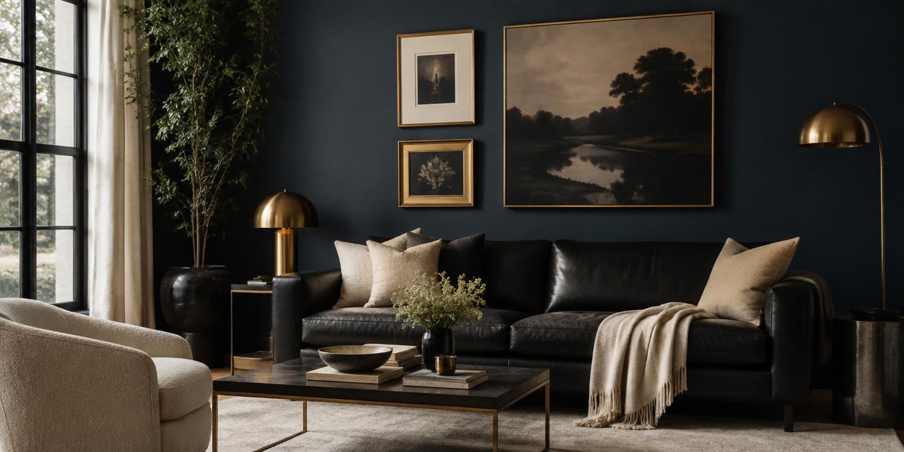
Does Navy Blue and Black Go Together?
Yes—navy blue and black go together beautifully, and the pairing is now one of the most sophisticated combinations in both interior design and fashion. The old rule that you should never mix navy #000080 with black #000000 came from an era of poor artificial lighting, when the two shades collapsed into one muddy tone under a dim bulb. Today, designers use them deliberately: navy's blue depth against black's absolute neutrality creates a tonal, layered darkness that reads as expensive rather than accidental. The entire trick is distinction—texture, material, finish, and light are what keep the two colors from blurring into each other.
Below is the complete designer breakdown: exact HEX values, the psychology behind each shade, four working palettes, room-by-room and outfit-by-outfit applications, and the practical rules that separate an intentional navy-and-black scheme from a mistake.
Navy Blue and Black: The Exact Colors
Before you can pair two near-blacks successfully, you need to know precisely what you are working with.
| Color | HEX | RGB | Character |
|---|---|---|---|
| Navy Blue | #000080 | 0, 0, 128 | Pure, saturated dark blue with no gray or black mixed in |
| Black | #000000 | 0, 0, 0 | Total absence of light; the absolute neutral |
Navy blue at #000080 is a fully saturated blue that has simply been darkened—there is no red, no green, no gray dilution. That purity is important. It means navy always retains a visible blue cast when light hits it directly, and that blue cast is exactly what separates it from black.
Black at #000000 reflects nothing. It has no undertone to shift, no hue to catch the light. This is why black behaves as a frame rather than a color: it defines edges, grounds compositions, and makes every adjacent hue look more saturated by comparison.
The relationship between them is a value relationship, not a hue relationship. Navy is roughly 10-12% lighter in perceived luminance than true black—a gap small enough to feel tonal and cohesive, but large enough to be legible when you help it along with texture and light.
Why Navy and Black Was Once a Faux Pas (and Why It Isn't Now)
The prohibition made practical sense in the mid-twentieth century. Under incandescent bulbs at 2700K and lower, and certainly under candlelight or a single overhead fixture, #000080 loses most of its blue signal. The eye reads both colors as "dark" and the outfit or the room looks like a failed attempt at matching.
Three things changed:
- Lighting improved. Layered lighting, higher color-rendering-index bulbs, and larger windows in contemporary homes let navy's blue register reliably.
- Texture became a design language. Matte black metal against navy velvet, or black leather against a navy plaster wall, does the separating work that color alone cannot.
- Tonal dressing and tonal decorating became aspirational. The monochrome, layered-neutrals look that dominates modern interiors rewards exactly this kind of narrow-value pairing.
So when someone asks does navy blue and black go together, the accurate answer is: yes, provided you give the eye a reason to see two colors rather than one. If you want the deeper reasoning behind black's role as a design anchor, my breakdown of what the color black means covers its cultural and psychological weight in detail.
The Psychology: Authority Meets Elegance
Navy and black are both power colors, but they project power differently—and that difference is why the combination works.
Navy Blue #000080 carries the psychology of the entire blue family at its most serious:
- Authority and trust. Navy is the color of uniforms, institutions, and boardrooms. It signals competence without aggression.
- Intelligence and stability. Dark blue reads as considered, calm, and permanent.
- Approachability. Crucially, navy is perceived as the warmer, friendlier alternative to black. It has the same gravitas without the coldness.
Black #000000 operates on a different register:
- Power and formality. Black is the shorthand for occasion, hierarchy, and seriousness.
- Elegance and sophistication. In fashion and luxury packaging, black signals restraint and quality.
- Mystery and drama. Black conceals. It creates negative space and forces attention onto whatever it surrounds.
- Weight. Black also carries associations with mourning and the ominous—which is precisely why pure black rooms can feel oppressive without relief.
Put together, the pairing reads as authoritative but not severe. Navy softens black's formality; black sharpens navy's edges. That combination of trust and sophistication is why it dominates law offices, financial branding, and luxury menswear. For the broader case on why blue anchors trust-driven design, see my analysis of the psychology of blue in design.
The Complete Data Table
| Item | Color | Hex | Color Name | Psychological Meaning |
|---|---|---|---|---|
| Base | Dark Blue | #000080 | Navy Blue | Authority, trust, confidence, intelligence, stability |
| Base | Black | #000000 | Black | Power, elegance, formality, mystery, drama |
| Relief | Crisp White | #FFFFFF | Pure White | Clarity, order, freshness, contrast |
| Relief | Cream | #F5F0E1 | Warm Cream | Comfort, softness, approachability |
| Metallic | Gold | #D4AF37 | Antique Gold | Luxury, warmth, achievement |
| Metallic | Brass | #B5A642 | Aged Brass | Heritage, craftsmanship, warmth |
| Metallic | Silver | #C0C0C0 | Silver | Modernity, precision, coolness |
| Accent | Mustard Yellow | #E1AD01 | Mustard | Optimism, energy, retro confidence |
| Accent | Emerald Green | #046307 | Emerald | Wealth, renewal, natural richness |
| Accent | Fuchsia | #C154C1 | Fuchsia | Boldness, playfulness, modern edge |
Four Palettes Built on Navy and Black
Palette 1: Brass Library Navy #000080 walls + black #000000 leather seating + aged brass #B5A642 fixtures + cream #F5F0E1 textiles. The most reliable version of this scheme. The brass carries warmth across the dark field, and the cream stops the room from closing in. This is the palette in the hero image at the top of this article.
Palette 2: Gallery Modern Black #000000 as the dominant (cabinetry, joinery, frames) + navy #000080 as the secondary (a single wall, upholstery) + pure white #FFFFFF trim + silver #C0C0C0 hardware. Cooler and more architectural. Best where you have abundant natural light and want crisp edges.
Palette 3: Jewel Accent Navy #000080 + black #000000 + emerald green #046307 in velvet + gold #D4AF37. Maximum richness. Emerald sits adjacent to navy on the color wheel, so it deepens the scheme rather than fighting it, while gold provides the necessary light bounce.
Palette 4: Graphic Pop Black #000000 + navy #000080 + mustard yellow #E1AD01 in a single decisive gesture—one chair, one rug, one panel. Mustard is navy's near-complement, so it delivers the strongest separation of any accent here. Use it at roughly 10% of the visual field.
Navy and Black Rooms: Interior Applications
Living room. Navy walls with a black leather sofa and brass lighting is the canonical version. The leather's sheen and the paint's matte finish are doing the separating. Add a cream or natural-fiber rug to lift the floor plane and a white ceiling to keep the room from feeling like a box.
Bedroom. A black upholstered headboard against a navy accent wall, dressed with white linens, is one of the most effective navy and black room schemes available. The headboard's fabric texture reads differently from flat paint even in low light, and the white bedding gives the eye a resting point.
Kitchen. Navy blue lower cabinets with black countertops—honed granite, soapstone, or matte quartz—is a durable, current combination. Keep uppers white or open-shelved, and choose brass or matte black hardware depending on whether you want warmth or continuity. Black countertops on navy cabinets work because the horizontal and vertical planes catch light at different angles, which does the distinguishing automatically.
Home office. Navy on the walls with black shelving and desk creates the focus-and-authority register that navy is known for. Add a warm 2700-3000K task lamp so the walls do not go flat after dark.
Bathroom. Black fixtures and fittings against navy tile or paint, relieved with white sanitary ware and a large mirror, reads as hotel-grade. This is a small-footprint way to try the combination before committing a whole room. If you are building a dark-forward scheme for screens rather than walls, the same value logic applies—see my guide to dark mode design colors for how near-blacks behave on displays.
Navy and Black Outfits: Fashion Applications
The fashion answer to does navy blue and black go together is an emphatic yes, and it has been for at least a decade on the runway.
- Navy blazer with black trousers. The classic. Works because the blazer's wool weave and the trousers' finer suiting cloth read as different materials before they read as different colors.
- Black dress with navy accessories. A navy handbag and navy shoes against a black dress looks deliberate and quietly expensive, especially in suede or patent, where the finish creates the contrast.
- Navy suit with black shoes. Traditionally correct and still the safest formal pairing in menswear. Black leather grounds the navy without competing.
- Layering. A black roll-neck under a navy overcoat is the winter version of tonal dressing—two dark layers, one visible seam of difference at the collar.
The rule for what to wear with navy blue and black together is identical to the interiors rule: vary the texture. Matte against sheen, knit against woven, suede against smooth leather. Two flat, identical-finish fabrics in navy and black is the one version that still looks like a mistake.
Practical Designer Takeaways
- Commit to a dominant. Choose either navy or black as the lead at roughly 60% of the scheme, with the other at 30%, and reserve 10% for your accent. Splitting them 50/50 creates visual ambiguity.
- Never pair matte with matte. If your navy wall is flat, your black element should have sheen—leather, lacquer, glass, or polished stone. Two matte surfaces at these values will merge.
- Add a light-value relief. Every successful navy and black scheme includes white, cream, or a pale natural material. Without it, the room loses depth entirely after sunset.
- Metallics are not optional. Gold #D4AF37 and brass #B5A642 warm the scheme; silver #C0C0C0 and chrome keep it cool. Pick one direction and stay consistent throughout the room.
- Test under evening light. Navy's blue signal is strongest in daylight and weakest under warm bulbs. View samples at 8 PM under your actual fixtures before you commit.
- Mind the undertone drift. Not every "navy" paint is #000080. Many commercial navies carry gray or green undertones that read differently next to true black—check the chip against a black sample, not against white.
- Use accents sparingly. Mustard, emerald, and fuchsia are all high-impact against this base. One accent color per room, repeated two or three times, beats three accents used once each.
Conclusion: Build Your Navy and Black Palette
So, does navy blue and black go together? Without question—when you build in distinction. Navy #000080 brings authority, trust, and a warmth black cannot offer; black #000000 brings formality, drama, and a frame for everything around it. Add a crisp white or cream for relief, a single metallic for warmth, and one vibrant accent like mustard #E1AD01 or emerald #046307, and you have a palette that reads as sophisticated in a living room, a kitchen, or a suit.
Ready to build it precisely? Try the free Coloracci palette generator —drop in #000080 and #000000, check the contrast ratios between your accent choices, and export a complete scheme with exact HEX, RGB, and CMYK values in seconds.