Digital Camouflage Evolution: How Pixelated Military Uniform Colors Reshaped Tactical Design
· Coloracci
Why Digital Camouflage Colors Belong in Every Designer's Toolkit
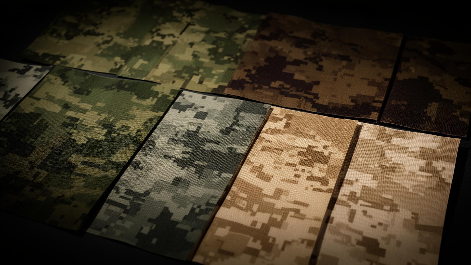
When the U.S. Marine Corps adopted MARPAT (Marine Pattern) in 2002, it didn't just change how soldiers dressed — it rewrote the rules for how military uniform colors are engineered. The shift from analog blob camouflage to pixelated digital patterns marked the moment when color theory met computational design at full scale, producing palettes that have since influenced everything from outdoor apparel branding to tactical e-commerce UX.
For designers and color enthusiasts, digital camouflage is the closest thing we have to publicly documented, billion-dollar color research. Every hex code in a MARPAT, MultiCam, or AOR pattern was selected through field testing across continents, validated against multispectral sensors, and refined to work simultaneously at ten meters and a thousand. Few brand systems can claim that level of rigor.
This article picks up where general military color symbolism leaves off. If you want a broader cultural and historical view of military uniform colors, the Military Uniform Colors & Camouflage Patterns guide covers ranks, ceremonial dress, and global symbolism. Here, we focus on the modern technical layer: the pixel grids, terrain-tuned palettes, and adaptive color science that defines 21st-century camouflage — and what designers can steal from it.
A Short Technical History: From Olive Drab to Pixels
Pre-2000, military camouflage relied on hand-painted or screen-printed organic shapes — the iconic woodland "M81" pattern is the textbook example. These patterns worked at medium range but failed at the boundary conditions: too uniform up close, too clumpy at distance.
Digital camouflage solved both problems with one insight borrowed from computer graphics: fractal self-similarity. By breaking the pattern into small, square-edged "pixels" of color and arranging them at multiple scales, digital patterns disrupt the human visual system at every distance. The eye's edge detectors get confused by the high-frequency micro-pattern, while the larger color blocks blend into the macro-environment.
The colors themselves became more disciplined too. Where M81 used four loosely-defined paints, MARPAT specifies four precise CMYK and Pantone-equivalent values. MultiCam uses seven. The Navy's AOR-1 and AOR-2 each define four. Every shade is a deliberate decision — and that's exactly what makes them worth studying.
The Complete Digital Camouflage Color Palette
Foundation: The Universal Earth-Tone Anchors
These five colors form the standardized army camouflage backbone (sourced from the canonical color-hex.com palette #4575) and appear, with subtle variations, in nearly every modern digital camouflage system on Earth:
Camo Brown (#604439) — RGB (96, 68, 57). The shadow-zone brown. Warm enough to read as "exposed earth" in temperate forests, dark enough to break the human silhouette against tree trunks. In digital patterns, this color typically occupies 15–20% of the surface area, clustering in irregular pixel groups.
Sage Khaki (#9E9A75) — RGB (158, 154, 117). The mid-tone bridge. Designers prize this exact shade because its low chroma makes it environment-agnostic — it reads as "natural" against forest, savanna, and dry grassland alike. In MARPAT Woodland, this is the dominant shade; in MARPAT Desert, it's lightened to a sandy variant.
Midnight Navy (#1C222E) — RGB (28, 34, 46). The deep-shadow anchor. Crucially, it's not pure black: the slight blue undertone matches the natural shadows under canopy at dusk. Pure black (#000000) actually stands out against natural shadows because nothing in nature is truly black at typical viewing distances.
Forest Olive (#41533B) — RGB (65, 83, 59). The signature woodland green. This is the color that says "military" to most viewers worldwide. It appears in nearly every woodland digital camouflage from MARPAT to the Russian EMR pattern, with only minor saturation shifts between systems.
Dark Tan (#554840) — RGB (85, 72, 64). The neutral connector. Sits between Camo Brown and Sage Khaki on the color wheel, smoothing transitions in the pixel grid. Without this intermediate value, digital patterns develop visible hot spots that a sniper's eye learns to find.
MARPAT Woodland: The Pattern That Changed Everything
The Marine Corps' woodland MARPAT uses four colors arranged in a deliberately irregular pixel grid. The exact specified values are remarkably close to the foundation palette above:
- Pixel Green ≈ #41533B (matches Forest Olive)
- Pixel Brown ≈ #604439 (matches Camo Brown)
- Pixel Khaki ≈ #9E9A75 (matches Sage Khaki)
- Pixel Black ≈ #1C222E (matches Midnight Navy)
The genius of MARPAT isn't the colors themselves — they're broadly conventional woodland tones. It's the distribution: roughly 33% green, 33% khaki, 24% brown, 10% black, with no pixel cluster larger than about 4×4 units. This proportional discipline is something designers can apply directly to UI color systems.
MultiCam: The Seven-Color Universal Pattern
Crye Precision's MultiCam, adopted by U.S. Special Operations and dozens of allied forces, expands the palette to seven shades to handle environments from Afghan mountains to European woodland:
- Light Tan ≈ #C4A77D
- Sage Green ≈ #7E8064
- Olive ≈ #5A5C42
- Dark Brown ≈ #4A3B2E
- Light Brown ≈ #806548
- Warm Khaki ≈ #A89878
- Pale Lime Highlight ≈ #B5B58E
Notice the warm temperature bias — every shade leans toward yellow or red. MultiCam was engineered to work in environments where the dominant ambient light is warm (sunlit grassland, dusty terrain, autumn forest). The lack of pure greens or cool blues is intentional: it makes the wearer look like a part of the warm environment rather than a green object placed inside it.
AOR-1 and AOR-2: The Navy's Desert and Woodland Pair
The Navy Working Uniform's AOR (Area of Responsibility) patterns use a tighter four-color system optimized for specific theaters:
AOR-1 (Desert)
- Sand: ≈ #C9B98E
- Light Khaki: ≈ #A89870
- Mid Brown: ≈ #7A6748
- Dark Olive: ≈ #5C5340
AOR-2 (Woodland)
- Pale Sage: ≈ #8E9277
- Mid Olive: ≈ #5F6648
- Deep Forest: ≈ #3D4530
- Near Black: ≈ #1F2218
The color logic is identical between the two patterns — same value relationships, same proportions — but shifted up the warmth axis for desert and down for woodland. This is a powerful designer lesson: a great color system is a set of relationships, not a set of fixed colors.
Patterns and Analysis: What These Color Choices Reveal
1. Nature Doesn't Use Saturated Colors
Look at every hex code above. Not one breaks 50% saturation. The most "vibrant" color in any modern digital camouflage system is around HSL saturation 25–35%. Compare this to typical brand color palettes, where primary colors routinely hit 80–100% saturation.
The lesson: if you want a palette to feel grounded, organic, or trustworthy, cap your saturation. The military didn't arrive at desaturation through aesthetics — it arrived through ruthless empirical testing of what actually disappears into natural environments.
2. The Value Range Is Always Wide
Across every digital camouflage system, the lightest and darkest colors span at least 60 lightness points on a 0–100 scale (e.g., MARPAT runs from L≈18 for Pixel Black to L≈63 for Pixel Khaki). This wide value range is what creates depth and makes patterns work at distance.
Many amateur designer palettes fail this test — they use four colors at similar lightness levels, producing flat, muddy designs. Steal the military's discipline: always include both a near-shadow and a near-highlight in your core palette, and ensure your mid-tones are evenly spaced between them.
3. Hue Families Are Tightly Constrained
A typical digital camouflage system uses colors from no more than two adjacent hue families on the color wheel — usually warm browns + olive greens, or warm tans + cool grays. Pure complementary contrasts (red/green, blue/orange) never appear in a single pattern. This restraint is what makes the palettes feel cohesive even with five-plus shades in play.
The same principle is foundational to professional UI design. For a deeper dive into the psychology behind color restraint and emotional response, see the Color Psychology Guide.
Color Psychology: What Digital Camouflage Communicates
Even outside the battlefield context, digital camouflage palettes carry strong psychological signals:
- Earth tones (#604439, #554840) signal stability, durability, and pragmatism. They're why outdoor brands like Filson, Carhartt, and Patagonia lean heavily on browns and tans.
- Olive and forest greens (#41533B, #5F6648) evoke endurance, adaptability, and quiet competence. Tech brands targeting "rugged reliability" — think Garmin's tactical line — gravitate to these greens.
- Desaturated near-blacks (#1C222E, #1F2218) project authority without aggression. Pure black reads as luxury or formality; near-black with an undertone reads as competent and grounded.
- Sage khakis and pale tans (#9E9A75, #C9B98E) suggest modesty and approachability. They're "neutral but not boring" — useful for backgrounds and supporting UI elements.
When you combine these emotional vectors, you get the overall message of any military palette: competence, preparation, and unbreakable cohesion. That's a powerful brand position for any product that sells reliability.
Designer Takeaways: Putting Military Palettes to Work
1. Build a Five-Color Functional System
Mirror the foundation palette structure for your own brand:
- Shadow anchor (deep, slightly chromatic): #1C222E or similar
- Primary identity (your brand's signature mid-tone): #41533B or your equivalent
- Bridge tone (low-chroma neutral): #9E9A75
- Warm earth (for warmth and humanity): #604439
- Connector (smooths transitions): #554840
This gives you backgrounds, primary actions, secondary elements, hover states, and subtle dividers — all from a single coherent system.
2. Use Pixel Distribution Logic for Visual Weight
MARPAT's color distribution (33/33/24/10) maps almost perfectly to UI design wisdom: the 60-30-10 color rule. One dominant background color, one supporting color for repeating UI chrome, one for critical accents. The military just adds a fourth tier (10%) for true high-contrast moments.
3. Tune Palettes by Theater, Not by Color
The AOR-1 / AOR-2 strategy — same relationships, shifted warmth — is the cleanest approach to multi-mode design (light/dark, seasonal variants, regional product lines). Define your value structure and chromatic relationships once, then derive variants by rotating the entire system warmer or cooler. This is far more cohesive than picking new colors for each variant.
4. Embrace Adaptive Color Thinking
Modern adaptive camouflage research (think Hyperstealth's Quantum Stealth, ADS Inc.'s Phantomleaf, multispectral concealment) is moving toward materials whose color shifts in response to environment. The design analog is dynamic color tokens — palettes that respond to ambient conditions, time of day, or user context. Your design system should treat colors as functions of context, not fixed values.
5. Disrupt Predictability for Attention Control
Camouflage works by disruptive coloration — sharp value boundaries that fracture the eye's edge-detection. The same principle drives effective UI hierarchy: place a sharp value boundary precisely where you want attention to land, and let everything else fade into low-contrast harmony.
Quick Reference Data Table
| Pattern / Source | Primary Color | Hex Code | Color Name | Psychological Meaning |
|---|---|---|---|---|
| Foundation Palette | Forest Olive | #41533B | Pixel Green | Endurance, adaptability |
| Foundation Palette | Camo Brown | #604439 | Pixel Brown | Stability, groundedness |
| Foundation Palette | Sage Khaki | #9E9A75 | Pixel Khaki | Neutrality, calm |
| Foundation Palette | Midnight Navy | #1C222E | Pixel Black | Authority, depth |
| Foundation Palette | Dark Tan | #554840 | Connector | Pragmatism, durability |
| MultiCam | Light Tan | #C4A77D | Highlight | Warmth, approachability |
| MultiCam | Sage Green | #7E8064 | Mid Olive | Quiet competence |
| MultiCam | Olive | #5A5C42 | Deep Olive | Reliability |
| AOR-1 Desert | Sand | #C9B98E | Desert Sand | Resilience, adaptability |
| AOR-1 Desert | Mid Brown | #7A6748 | Desert Earth | Endurance |
| AOR-2 Woodland | Pale Sage | #8E9277 | Coastal Sage | Stealth, modesty |
| AOR-2 Woodland | Near Black | #1F2218 | Forest Shadow | Concealed strength |
Conclusion: Steal Like a Quartermaster
Digital camouflage is the rare design system that's been stress-tested in genuinely life-or-death conditions, then published in standards documents you can study for free. Every hex code in MARPAT, MultiCam, and the AOR family is the answer to a specific environmental and perceptual question — and most of those questions translate cleanly to digital design problems.
The next time you're choosing a palette for an outdoor brand, a defense-tech UI, a productivity tool that needs to project competence, or simply an interface that should feel grounded and trustworthy, start from one of the palettes above and adjust by 10–15 hue degrees toward your target emotion. You'll arrive at a more disciplined, more cohesive system in a fraction of the time it takes to start from scratch.
Ready to build your own battle-tested palette? Open the Coloracci palette generator and start with one of the foundation colors above — try Forest Olive (#41533B) or Camo Brown (#604439) as your seed, then let the harmony engine do the rest. For a deeper grounding in the emotional logic behind every color choice, the Color Psychology Guide is the perfect next read.