Dark Mode Color Palette Best Practices
· Coloracci Team
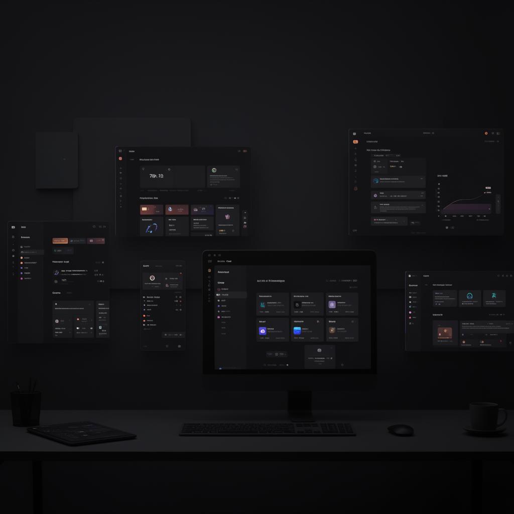
Dark mode has evolved from a niche preference into an industry standard. Apple, Google, Microsoft, and virtually every major platform now offers a dark theme — and users overwhelmingly prefer it. Studies show that over 80% of smartphone users enable dark mode at least part of the time. But designing an effective dark palette is far more nuanced than simply inverting colors. Get it wrong, and you'll deliver an interface that causes more eye strain than it prevents.
This guide walks through the principles, color rules, and testing workflows that separate polished dark mode designs from hastily inverted ones.
Why Dark Mode Matters
Dark mode isn't just an aesthetic choice — it has measurable benefits that affect user health, device longevity, and engagement metrics.
Reduced Eye Strain in Low Light. When users browse at night or in dimly lit environments, a bright white screen forces the iris to constrict dramatically. A well-designed dark interface keeps luminance low, reducing the contrast between screen and surroundings. This minimises fatigue during extended sessions.
OLED Battery Savings. On OLED and AMOLED displays, black pixels are literally turned off. A true dark mode using near-black backgrounds can reduce screen power consumption by up to 60%, directly extending battery life — a tangible benefit users notice.
Improved Focus and Hierarchy. Dark backgrounds naturally recede, pushing content forward. When executed properly, dark mode creates stronger visual hierarchy because accent colors pop with greater intensity against muted surfaces.
Accessibility for Photosensitive Users. Individuals with conditions like photophobia or certain types of migraines benefit significantly from reduced screen brightness. Dark mode makes your product usable for audiences who might otherwise avoid it entirely.
Color Selection Rules for Dark Mode
The most common mistake in dark mode design is using pure black (#000000) as the background. While it seems logical, pure black creates excessive contrast against white text, producing a harsh vibrating effect called "halation" that strains the eyes.
The Dark Gray Foundation
Instead of pure black, use dark grays that retain just enough luminance to feel natural:
- Surface Base —
#121212(Google Material Design recommendation, 7% luminance) - Elevated Surface —
#1E1E1E(slightly lighter for cards and modals) - High Surface —
#2C2C2C(navigation bars, toolbars) - Overlay Surface —
#383838(dropdowns, popovers)
This layered approach gives you four distinct elevation levels without relying on shadows, which are nearly invisible on dark backgrounds.
Text Color Hierarchy
Pure white text (#FFFFFF) on dark gray is too harsh for body copy. Use an opacity-based system instead:
- High-emphasis text —
#E0E0E0or white at 87% opacity. Use for headings and primary content. - Medium-emphasis text —
#A0A0A0or white at 60% opacity. Use for secondary labels and descriptions. - Disabled text —
#6B6B6Bor white at 38% opacity. Use for placeholder text and inactive states.
This hierarchy ensures readability while maintaining comfortable contrast ratios. High-emphasis text on #121212 produces a contrast ratio of approximately 15.4:1 — well above WCAG AAA requirements.
Accent Color Adjustments
Colors that work beautifully in light mode often fail in dark mode. Saturated hues like #1E40AF (Brand Blue) can feel heavy and illegible against dark surfaces. The solution is to use desaturated, lighter variants of your brand colors:
- Light mode primary:
#2563EB→ Dark mode primary:#60A5FA - Light mode success:
#16A34A→ Dark mode success:#4ADE80 - Light mode warning:
#D97706→ Dark mode warning:#FBBF24 - Light mode error:
#DC2626→ Dark mode error:#F87171
The pattern is consistent: shift toward the 300–400 range of a color scale (in systems like Tailwind) rather than the 600–700 range used in light mode. This ensures accent colors remain vibrant without overwhelming the dark surface.
Colors to Avoid
Certain combinations create serious problems in dark mode:
- Saturated red on dark gray — Red text on dark backgrounds is notoriously difficult to read, especially for users with protanopia (red-green color blindness).
- Pure blue links —
#0000FFis nearly invisible on dark surfaces. Use a lighter blue like#93C5FD. - Low-saturation yellows — Pale yellows like
#FEF3C7vanish against dark backgrounds. Use#FDE68Aor brighter.
Elevation and Depth in Dark Mode
In light mode, depth is communicated through shadows — a card floats above the page because its drop shadow creates the illusion of distance. In dark mode, shadows are nearly invisible against dark surfaces, so a completely different strategy is required.
Surface Elevation Through Lightness
Material Design established the convention of using lighter surfaces for higher elevations. Each step up in elevation increases the surface lightness slightly:
| Elevation Level | Surface Color | Use Case |
|---|---|---|
| 0 (Base) | #121212 |
Page background |
| 1 | #1E1E1E |
Cards, sheets |
| 2 | #222222 |
Navigation bars |
| 3 | #2C2C2C |
Modals, dialogs |
| 4 | #333333 |
Menus, popovers |
The increments are subtle — typically 3–5% luminance per level — but they create a clear sense of layering without any shadow at all.
Borders and Dividers
Thin borders become essential in dark mode for separating content areas. Use semi-transparent white borders rather than solid colors:
- Subtle divider —
rgba(255, 255, 255, 0.08)or#FFFFFF14 - Standard border —
rgba(255, 255, 255, 0.12)or#FFFFFF1F - Prominent border —
rgba(255, 255, 255, 0.20)or#FFFFFF33
Semi-transparent borders adapt automatically if your surface colors change, making your system more maintainable than hardcoded border colors.
Subtle Glows and Highlights
Where light mode uses shadows to push elements away from the surface, dark mode can use subtle glows to pull elements toward the viewer. A card with a faint ambient glow feels elevated:
.card-elevated {
  background: #1E1E1E;
  box-shadow: 0 0 20px rgba(255, 255, 255, 0.03),
              0 2px 8px rgba(0, 0, 0, 0.4);
}
The combination of a barely-visible white glow and a darker conventional shadow creates a realistic floating effect unique to dark interfaces.
Testing Dark Mode Colors
Designing a dark palette in isolation is risky. Colors behave differently on various screens, in different ambient conditions, and under accessibility constraints. A rigorous testing protocol is essential.
Contrast Ratio Verification
Every text-background combination must meet WCAG 2.1 minimum contrast ratios:
- Normal text (under 18px): 4.5:1 minimum (AA), 7:1 recommended (AAA)
- Large text (18px+ bold or 24px+): 3:1 minimum (AA), 4.5:1 recommended (AAA)
- UI components and icons: 3:1 minimum against adjacent colors
Test your specific dark mode pairs. For example:
#E0E0E0on#121212= 15.4:1 ✅ Excellent#A0A0A0on#121212= 7.2:1 ✅ AAA pass#6B6B6Bon#121212= 3.6:1 ⚠️ Passes for large text only#60A5FAon#121212= 6.8:1 ✅ AA pass for all sizes
Device and Screen Testing
OLED screens render dark mode differently from LCD screens. On OLED, #000000 pixels are truly off, which can create a "smearing" artifact during scrolling as pixels transition from off to on. This is another reason to avoid pure black — #121212 keeps pixels in a low-power state without fully deactivating them.
Test across at least three device categories:
- OLED smartphone (e.g., modern Samsung or iPhone) — check for black smearing
- LCD laptop display — verify that dark grays aren't washed out by backlight bleed
- External monitor — test at various brightness levels and viewing angles
Ambient Light Conditions
Your dark palette should work across a range of environments:
- Complete darkness — verify no elements are uncomfortably bright
- Dim indoor lighting — the most common dark mode scenario
- Mixed lighting — offices with overhead lights and window glare
If your dark mode is only comfortable in pitch darkness, the surface colors are likely too dark. Aim for a palette that works across all three conditions.
Color Blindness Simulation
Run your dark mode palette through color blindness simulators to ensure information isn't conveyed by color alone:
- Protanopia (red deficiency) — affects ~1% of males
- Deuteranopia (green deficiency) — affects ~5% of males
- Tritanopia (blue-yellow deficiency) — rare but important to verify
Pay special attention to status indicators (success/error/warning) and data visualizations, where color is often the sole differentiator.
Practical Checklist for Dark Mode Launch
Before shipping a dark mode, verify the following:
- No pure black backgrounds — use
#121212or similar dark gray - Text opacity hierarchy — at least three levels of text emphasis
- Adjusted accent colors — lighter, less saturated variants of light-mode accents
- Elevation system — 3–5 surface levels using progressive lightness
- Semi-transparent borders — using white with low opacity
- All contrast ratios pass WCAG AA — with critical text passing AAA
- Tested on OLED and LCD — no smearing or backlight artifacts
- Color-blind safe — information not conveyed by hue alone
- Smooth theme transitions — no jarring flash when switching modes
- Image and media treatment — slightly reduce brightness/contrast of images in dark mode to prevent them from overwhelming the interface
Dark mode design is a discipline unto itself. The palettes that feel effortless to use are the result of careful calibration, systematic elevation strategies, and thorough cross-device testing. Apply these principles consistently, and your dark theme will be more than a feature toggle — it'll be a reason users prefer your product.