Colors That Sell: Real Estate Branding Guide
· Coloracci Team
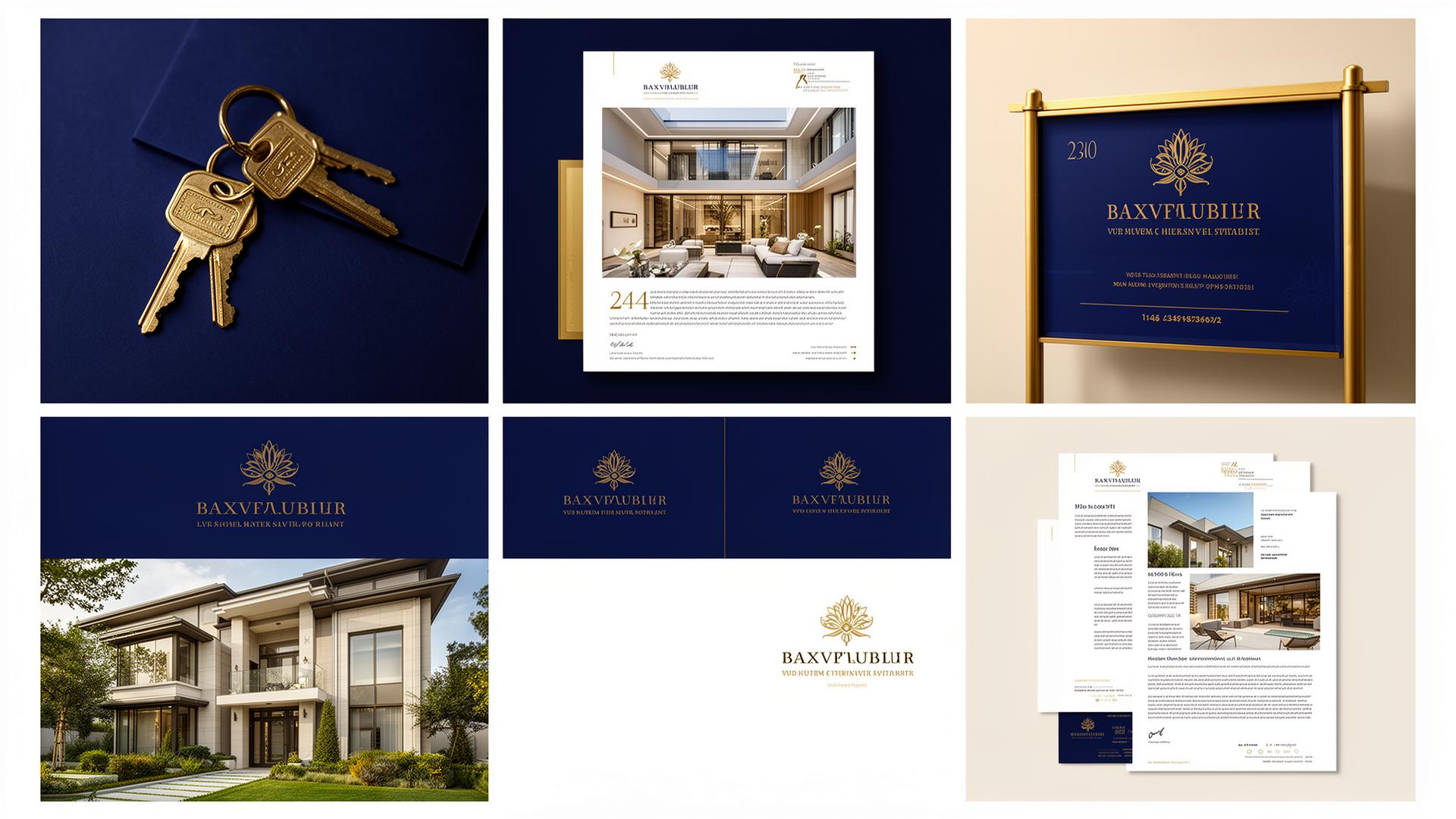
Real estate is one of the few industries where a single color decision can influence whether a potential buyer picks up the phone or scrolls past a listing. The stakes are enormous — the average home purchase represents the largest financial transaction most people will ever make — and the colors that surround that transaction shape perceptions of value, trustworthiness, and desirability at every touchpoint. From the yard sign to the website header, from the business card to the virtual tour overlay, color is doing constant psychological work on behalf of (or against) the agent, brokerage, or developer.
This guide breaks down the most effective color strategies in real estate branding, organized by the psychological function each color serves. We provide exact hex codes used by leading firms, explain the science behind each choice, and offer practical recommendations for agents and brokerages at every market level.
Blue for Trust: The Foundation of Real Estate Branding
Blue is the dominant color in real estate for the same reason it dominates banking, insurance, and healthcare: it is the color most strongly associated with trust, reliability, and competence. In an industry plagued by skepticism — surveys consistently show that real estate agents rank among the least trusted professions — blue serves as a visual antidote to buyer and seller anxiety.
The psychology is well-documented. Blue activates the parasympathetic nervous system, lowering heart rate and reducing stress. For buyers making a decision worth hundreds of thousands of dollars, this physiological calming effect translates directly into increased comfort with the transaction. A 2019 study in the Journal of Business Research found that service providers using blue branding were rated 18% more trustworthy than those using red or orange.
The most effective real estate blues range from deep navy to confident medium tones:
- Authority Navy
#1A3A5C— The power blue of premium brokerages. Coldwell Banker's rebrand to deep navy signaled a deliberate move toward institutional trust. This shade works on yard signs, website headers, and print materials without appearing cold. - Professional Slate Blue
#3D5A80— Slightly warmer than pure navy, this tone balances authority with approachability. Ideal for independent agents who want to project competence without corporate rigidity. - Confident Cornflower
#4A90D9— A brighter, more modern blue that works well in digital contexts. Zillow's blue#006AFFsits in this family, communicating innovation alongside reliability. - Calm Coastal Blue
#6BA3BE— Perfect for beach and waterfront property specialists. This lighter blue evokes ocean views and vacation living while maintaining professional credibility.
Where blue fails in real estate: Blue can feel cold and impersonal when overused. A listing presentation that is entirely navy and white may communicate competence but lack the warmth needed to make sellers feel personally cared for. The solution is to pair blue with warm neutrals — #F5EDE3 (Warm Linen) or #C4A77D (Brushed Gold) — to humanize the palette.
Green for Growth: Investment and Sustainability
Green occupies a dual role in real estate branding. For investment-focused firms, green signals financial growth, profitability, and upward trajectory. For sustainability-oriented developers, green communicates environmental responsibility, energy efficiency, and connection to nature. Both meanings serve real estate brands effectively, though the specific shade determines which message dominates.
Financial growth greens lean deeper and more saturated:
- Investment Green
#2E7D32— The classic money green, associated with wealth accumulation and financial security. Effective for commercial real estate firms and investment property specialists. - Prosperity Dark Green
#1B5E20— Even deeper, conveying established wealth and long-term stability. Used by heritage firms with multi-generational track records. - Market Growth Teal
#00897B— Combines green's growth associations with blue's trust signals. Increasingly popular among proptech companies and data-driven brokerages.
Sustainability and nature greens trend lighter and more organic:
- Eco Living Green
#66BB6A— Fresh and optimistic, signaling energy-efficient homes and green building certifications. - Garden Sage
#8DAA91— Muted and sophisticated, this works for luxury developments that emphasize landscape design and natural settings. - Forest Retreat
#3E6B48— Evokes woodland properties, rural estates, and developments that preserve natural surroundings.
Practical application: Green works best as a secondary or accent color in real estate branding. A firm using #1A3A5C (Authority Navy) as its primary with #2E7D32 (Investment Green) as its accent communicates: "We are trustworthy professionals who will grow your investment." That two-color message is more powerful than either color alone.
Gold for Luxury: Communicating Premium Value
Gold and its warm metallic relatives — champagne, bronze, and copper — are the definitive colors of luxury real estate. When a buyer sees gold in a property's marketing materials, they immediately assign a higher perceived value to the listing. This is not subtle psychology; it is a deeply embedded cultural association that spans virtually every civilization in human history.
Why gold works in luxury real estate:
- Scarcity signaling. Gold's value comes from its rarity, and luxury real estate is fundamentally about scarcity — unique locations, limited inventory, exclusive communities.
- Quality association. Gold finishes, gold hardware, gold accents in physical spaces signal premium craftsmanship. Gold in branding extends that association to the marketing itself.
- Warmth without casualness. Unlike orange or yellow, gold conveys warmth while maintaining sophistication. A luxury listing brochure with gold typography on navy stock feels both inviting and exclusive.
The most effective luxury real estate golds:
- Classic Luxury Gold
#C4A265— The definitive real estate gold. Rich enough to read as premium, muted enough to avoid looking gaudy. Sotheby's International Realty uses a similar warm gold as its signature accent. - Champagne Gold
#D4C5A0— Softer and more understated, ideal for brands that want to suggest luxury without shouting it. Works beautifully in digital contexts where metallic effects are unavailable. - Rose Gold
#B76E79— Increasingly popular for luxury brands targeting younger affluent buyers. Adds a contemporary, fashion-forward dimension to real estate marketing. - Antique Bronze
#8B6914— Deep and rich, appropriate for historic properties, estate sales, and heritage luxury.
The gold gradient technique. Many premium real estate brands use a gradient from #C4A265 to #E8D5A3 in their digital materials, creating a subtle shimmer effect that mimics physical metallic printing. This technique works especially well on dark backgrounds — a #1A1A2E (Midnight) to #C4A265 (Classic Gold) combination is one of the most effective luxury real estate palettes available.
Warning: Gold must be used with restraint. Too much gold crosses the line from luxurious to ostentatious. The rule of thumb is that gold should occupy no more than 15-20% of any visual composition, serving as an accent that elevates the surrounding design rather than overwhelming it.
Color by Property Type: Matching Palette to Product
Different property types attract different buyer psychologies, and the most effective real estate brands customize their color approach accordingly.
Residential single-family homes — The broadest market requires the most universally appealing palette. Blue and warm neutral combinations dominate because they project trustworthiness without excluding any demographic:
- Primary:
#3D5A80(Professional Slate Blue) - Secondary:
#F5EDE3(Warm Linen) - Accent:
#C4A77D(Brushed Gold)
Luxury condominiums and penthouses — Urban sophistication demands a darker, more editorial palette:
- Primary:
#1A1A2E(Midnight) - Secondary:
#C4A265(Classic Luxury Gold) - Accent:
#E8E8E8(Platinum Silver)
Commercial and office space — Corporate tenants respond to palettes that signal professionalism and productivity:
- Primary:
#2C3E50(Corporate Charcoal Blue) - Secondary:
#27AE60(Growth Green) - Accent:
#ECF0F1(Clean Gray)
Vacation and resort properties — Escapism and relaxation drive these purchases:
- Primary:
#6BA3BE(Calm Coastal Blue) - Secondary:
#F5DEB3(Sandy Beige) - Accent:
#FF8C42(Sunset Coral)
Eco-friendly and sustainable developments — Environmental consciousness is the primary value proposition:
- Primary:
#3E6B48(Forest Retreat) - Secondary:
#F5F0E8(Natural White) - Accent:
#8DAA91(Garden Sage)
New construction and developments — Modernity and innovation attract buyers to new builds:
- Primary:
#37474F(Modern Graphite) - Secondary:
#FFFFFF(Clean White) - Accent:
#00BCD4(Innovation Cyan)
Practical Tips for Real Estate Color Strategy
Test your colors at yard sign scale. A color that looks sophisticated on a business card may be invisible from a car passing at 35 mph. Your primary brand color must maintain legibility and impact at
4×4 footscale from 50 feet away. High-contrast combinations like#1A3A5Cnavy on#FFFFFFwhite outperform subtle palettes every time.Match your digital and print palettes precisely. Real estate is one of the few industries where print materials still matter significantly. Ensure your
#C4A265gold on screen matches your Pantone 7406 C in print. Mismatched colors between your website and your listing brochure create subconscious distrust.Use color to segment your market tiers. If your brokerage handles both starter homes and luxury estates, consider a tiered color system. Your core brand might use
#3D5A80(Slate Blue), while your luxury division adds#C4A265(Gold) accents and your first-time buyer program uses#4A90D9(Cornflower) for a more approachable feel.Stage listings with color psychology in mind. Virtual staging and photography styling should align with the target buyer. Starter homes benefit from warm, welcoming palettes with
#F5EDE3neutrals and#8DAA91sage accents. Luxury listings should feature#1A1A2Edark tones with gold and marble textures.Avoid red as a primary real estate color. Red communicates urgency and can trigger anxiety — exactly the wrong emotions for a buyer making a major financial commitment. While red works in sale or auction contexts (where urgency is the goal), it undermines the trust-building that everyday real estate branding requires.
Consider regional color expectations. Coastal markets expect blues and sandy neutrals. Mountain markets respond to forest greens and warm wood tones (
#8B6C42). Urban markets accept darker, more editorial palettes. Desert markets benefit from terracotta (#C67B5C) and warm earth tones. Matching your palette to the local landscape signals that you understand the community.Refresh, don't reinvent. If your brand colors are established and recognized in your market, a complete color overhaul risks destroying brand equity. Instead, refine your existing palette — shift your blue from
#1A3A5Cto#2B4C6Ffor a modern update, or add a gold accent to signal a luxury expansion — while maintaining recognition.
The most successful real estate brands understand that color is not decoration — it is strategy. Every hex code in your brand system should earn its place by communicating a specific value proposition to a specific buyer. In a market where trust, aspiration, and emotional connection drive decisions worth hundreds of thousands of dollars, the right palette is not a luxury. It is a competitive necessity.