Color Psychology in Healthcare: How Hospital Colors Affect Patient Recovery
· Coloracci Team
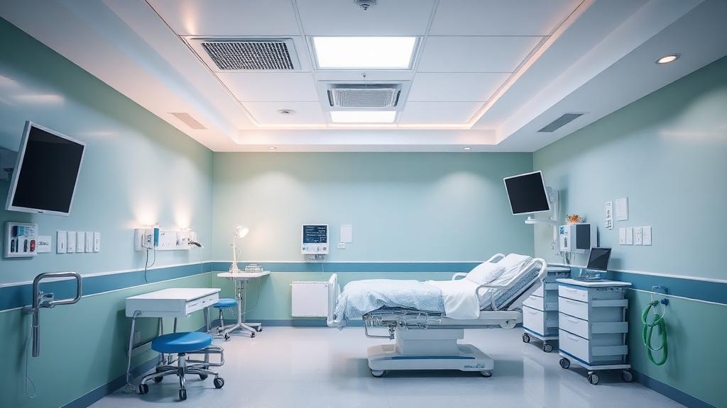
When Color Is Medicine
In most design contexts, color choices are about aesthetics, branding, or user engagement. In healthcare, color can directly affect patient outcomes. Research shows that hospital color environments influence recovery times, pain perception, stress levels, and even medication effectiveness.
Evidence-based design (EBD) — the practice of designing healthcare spaces based on clinical research — has established that color isn't decorative in hospitals. It's therapeutic.
The Science of Color and Healing
Clinical Research Findings
Decades of research in healthcare environments have produced consistent findings:
| Color | Effect | Research Finding |
|---|---|---|
| Soft Blue (#5B8FA8) | Calming, lowers blood pressure | Patients in blue rooms reported 15% less anxiety |
| Sage Green (#7BA05B) | Restorative, reduces eye strain | Surgeons' eye fatigue reduced by green surfaces |
| Warm White (#FFF8F0) | Comfortable, natural | Preferred over cool white by 73% of patients |
| Pale Lavender (#E6E0F3) | Soothing, promotes sleep | Improved sleep quality scores in overnight wards |
| Soft Yellow (#FFF4CC) | Uplifting, hopeful | Associated with faster recovery in therapy rooms |
Why Hospitals Abandoned Pure White
Traditional hospital white (#FFFFFF) is being phased out for evidence-backed reasons:
- Institutional anxiety — Stark white walls trigger "clinical" associations that increase patient stress
- Eye strain — White reflects 80% of light, causing fatigue for patients and staff
- Emotional coldness — White environments feel impersonal and isolating
- Reduced depth perception — All-white rooms make spaces feel disorienting
Modern hospitals use warm whites (#FFF8F0 to #F5F0E8) and soft neutrals that maintain cleanliness associations without the clinical harshness.
Room-by-Room Color Strategy
Waiting Rooms
The waiting room sets emotional expectations for the entire visit:
- Recommended colors: Soft blue (#B8D4E3), sage green (#B5C9A8), warm beige (#E8DFD0)
- Avoid: Bright reds (increase anxiety), pure whites (feel institutional), harsh fluorescents
- Strategy: Use nature-inspired palettes to reduce stress during uncertain wait times
- Accent walls: A single muted blue or green accent wall can reduce perceived wait time by up to 20%
Patient Rooms
Where patients spend the most time and are most vulnerable:
- Recommended: Soft greens and blues for restorative calm, warm earth tones for comfort
- Lighting consideration: Colors must work under both natural daylight and nighttime lighting
- Personal touch: Accent elements in warmer tones (soft peach, muted coral) add humanity
- Ceiling color: Often overlooked — patients in beds spend hours looking up; soft blue or warm white ceilings reduce anxiety
Operating Rooms
Color in operating rooms serves functional purposes:
- Green/blue-green walls (#5E8C7B) — Reduce eye strain from staring at red tissue and blood (green is red's complementary color)
- Scrubs color — Surgical scrubs are green or blue specifically to provide visual relief from red
- Neutral gray equipment — Prevents color interference with tissue assessment
- Cool white lighting — Ensures accurate color rendering of tissue
Pediatric Wards
Children's areas use fundamentally different color psychology:
- Primary and secondary colors at controlled saturation — engaging without overstimulating
- Warm yellows (#FFE082) and soft oranges (#FFB74D) — cheerful and comforting
- Accent colors in artwork rather than walls — allows therapeutic neutrality with visual interest
- Nature themes using greens and blues — creates a sense of safety and wonder
Color Wayfinding in Hospitals
Hospital navigation is a major stress point for visitors. Color-coded wayfinding systems reduce confusion:
Effective Hospital Wayfinding Colors
| Department | Suggested Color | Hex | Rationale |
|---|---|---|---|
| Emergency | Red | #C62828 | Urgency, universal stop/attention |
| Cardiology | Red-orange | #D84315 | Heart associations |
| Maternity | Pink/Mauve | #CE93D8 | Nurturing, feminine warmth |
| Orthopedics | Orange | #EF6C00 | Energy, physical rehabilitation |
| Neurology | Blue | #1565C0 | Calm, brain/mind association |
| Oncology | Purple | #6A1B9A | Hope, courage, dignity |
| Pediatrics | Green | #2E7D32 | Growth, nature, life |
Wayfinding Design Principles
- Maximum 7 colors — More overwhelms visitors already under stress
- High contrast between wayfinding elements and walls
- Consistent from entrance to destination — The color should appear at every decision point
- Accessible to colorblind visitors — Use shapes and text alongside color coding
- Floor-specific color banding — Different floors use different primary colors
Staff Scrub and Uniform Color Psychology
Healthcare worker clothing colors aren't arbitrary:
| Scrub Color | Hex | Purpose |
|---|---|---|
| Surgical Green | #5E8C7B | Reduces eye fatigue from red tissue |
| Clinical Blue | #4A90A4 | Trust, calm, professionalism |
| Navy | #1A237E | Authority, seniority signaling |
| Ceil Blue | #92B6D5 | Approachable, less clinical |
| Wine/Maroon | #7B1F3D | Lab techs, phlebotomy (blood association) |
| White coat | #FFFFFF | Physician identification (though declining) |
Research shows that blue scrubs generate the highest trust ratings from patients, while white coats increasingly cause "white coat syndrome" — elevated blood pressure triggered by clinical anxiety.
Geriatric vs. Pediatric Color Approaches
For Older Adults
- Higher contrast — Aging eyes need stronger contrast between surfaces
- Warmer tones — Yellowed lenses make cool colors appear washed out
- Avoid deep blues and purples — They can appear black to aging eyes
- Use warm whites over cool whites — Better color perception
- Contrast edges — Door frames, handrails, and step edges need visible color differentiation
For Children
- Saturated but not overwhelming — Moderate saturation creates interest without anxiety
- Multiple hues — Children respond to variety and color combinations
- Interactive color elements — Color-changing lighting, colorful artwork, themed rooms
- Distraction colors — Bright accents in procedure rooms to redirect attention during treatments
Evidence-Based Color Guidelines
The Planetree Model
The Planetree approach to patient-centered design emphasizes:
- Nature views — Windows with green views reduce recovery time
- Natural light — Daylight affects circadian rhythm and color perception
- Residential feeling — Warm, home-like colors reduce institutional stress
- Patient control — Adjustable lighting that changes room color temperature
WELL Building Standard
The WELL certification for healthcare spaces includes color requirements:
- Minimum light reflectance values for surfaces
- Color rendering index (CRI) requirements for lighting
- Circadian lighting design specifications
- Visual comfort criteria including color contrast ratios
What Designers Can Learn from Healthcare Color
Lesson 1: Color Has Measurable Impact
Healthcare research proves that color choices produce measurable outcomes. If color affects healing, it certainly affects user engagement, purchasing decisions, and brand perception.
Lesson 2: Context Changes Everything
A color that's calming in a patient room might be wrong for an emergency department. Always design color for the specific context and emotional need.
Lesson 3: Accessibility Is Essential
Healthcare's color accessibility standards (high contrast, colorblind-safe palettes) should be the standard for all design.
Lesson 4: Warm > Cool for Human Spaces
Research consistently shows that warm-toned environments feel more human and less institutional. This applies to websites, offices, and retail spaces too.
Practical Tips
- Use warm whites (#FFF8F0) instead of pure white (#FFFFFF) for any space where people spend extended time
- Explore evidence-based healthcare palettes with Coloracci's AI palette generator
- Apply complementary color theory in work environments — green walls reduce eye strain from screen-heavy work
- Use color wayfinding principles in any complex navigation system (websites, apps, buildings)
- Test colors under multiple lighting conditions — healthcare taught designers that color shifts dramatically between daylight, fluorescent, and LED
Healthcare color design proves that when lives are at stake, color is taken seriously. Every industry should apply the same rigor.