Color Theory for Data Visualization Dashboards: The Complete Guide
· Coloracci Team
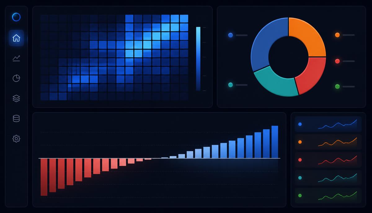
Color theory for data visualization dashboards comes down to one decision made three different ways: is your data ordered, is it centered on a meaningful midpoint, or is it made of unrelated categories? Answer that, and the palette almost picks itself. Get it wrong, and no amount of polish saves the chart — a rainbow gradient on a revenue heatmap or ten near-identical blues in a category legend will mislead your users faster than a bad SQL query.
Dashboards are unusual design objects. Unlike a marketing page, where color is persuasion, dashboard color is encoding. Every hue carries data. A shade that is 20% darker means something numerically. That constraint is liberating once you accept it: the palette is not decoration, it is part of the chart's grammar.
This guide covers the three palette families with exact HEX values, the psychology of KPI and alert colors, colorblind-safe design under WCAG 2.1 AA, and the practical layout ratios that keep a dense dashboard readable at 7am on a Monday.
The Three Palette Types in Color Theory for Data Visualization Dashboards
Almost every mistake in dashboard color traces back to using the wrong palette family. There are exactly three, and they map to three kinds of data.
1. Sequential Palettes — Ordered, Quantitative Data
Sequential palettes run from light to dark along a single hue (or a close hue family). Light means low, dark means high. Use them for heatmaps, choropleth maps, density plots, and any metric with a natural magnitude: revenue, page views, temperature, error counts.
A classic five-step blue ramp:
- Pale Lavender
#EFF3FF— lowest values - Pale Blue
#BDD7E7 - Cornflower Blue
#6BAED6 - Cobalt Blue
#2171B5 - Dark Navy
#084594— highest values
Notice the lightness steps are roughly even. That evenness is the whole point: perceptual distance between steps should match numeric distance between buckets. A ramp that jumps from very light to very dark with nothing in between will visually flatten your mid-range data.
The single most common sequential failure is the rainbow ramp — mapping low-to-high across red, orange, yellow, green, blue. Rainbow gradients have wildly uneven perceptual spacing (yellow reads far brighter than its neighbors), so they invent boundaries that do not exist in the data. Matplotlib Viridis, running from Dark Purple #440154 to Chartreuse #FDE725, was engineered specifically to fix this: it is perceptually uniform and colorblind safe.
2. Diverging Palettes — Data With a Meaningful Midpoint
When zero, an average, or a target matters, use a diverging palette: two contrasting hues fading toward a pale neutral center. Budget variance, sentiment scores, year-over-year change, and any "above/below target" metric belong here.
The ColorBrewer RdBu scheme is the reference implementation:
- Cherry Red
#D73027— strongly negative - Coral Orange
#FC8D59 - Pale Gold
#FEE090— neutral midpoint - Powder Blue
#91BFDB - Royal Blue
#4575B4— strongly positive
Two rules govern diverging palettes. First, the midpoint must be anchored to a real value — usually zero. If your data runs from -20 to +80 and you let the palette auto-scale, the neutral color lands at +30 and every reader misreads the chart. Second, the two arms should be roughly symmetric in lightness so neither side visually dominates.
For teams avoiding red-green entirely (a good instinct — see accessibility below), red-blue and orange-purple diverging schemes carry the same "opposite directions" meaning without the colorblindness penalty.
3. Categorical Palettes — Unordered Groups
Categorical palettes distinguish things with no inherent order: product lines, regions, traffic sources, teams. The requirement here is maximum perceptual distance, not gradation. Keep adjacent hues at least 30 degrees apart on the color wheel.
The Tableau 10 palette is the industry benchmark because it was tuned for exactly this:
- Steel Blue
#4E79A7 - Tangerine
#F28E2B - Tomato Red
#E15759 - Teal
#76B7B2 - Leaf Green
#59A14F - Golden Yellow
#EDC948 - Mauve
#B07AA1 - Light Pink
#FF9DA7 - Cocoa Brown
#9C755F - Silver Gray
#BAB0AC
D3.js Category 10 is the other widely deployed set, opening with Muted Blue #1F77B4, Safety Orange #FF7F0E, and Asparagus Green #2CA02C. Both palettes deliberately desaturate their hues relative to pure primaries — fully saturated colors sitting side by side vibrate and fatigue the eye during long analysis sessions.
The hard limit: 5 to 7 categorical colors per chart. Human working memory cannot hold a ten-item color legend. If you genuinely have twelve categories, group the tail into "Other," use small multiples, or switch to a sorted bar chart where position, not hue, does the encoding.
Color Psychology for KPIs and Alert States
Categorical palettes answer "which one is this?" Semantic colors answer "should I care?" On a dashboard, that second question is where color psychology earns its keep.
The conventions are near-universal in Western business software, and fighting them costs you comprehension:
- Cherry Red
#D73027— urgency, KPI failure, breach of threshold. Red spikes physiological arousal; it is the only color that should ever say "act now." Overuse it and it stops working entirely. - Leaf Green
#59A14F— growth, success, target met. Green reads as safe and resolved, which is precisely why a green dashboard invites the user to stop scanning. - Steel Blue
#4E79A7— trust, stability, the default. Blue is the workhorse primary for neutral data series because it carries almost no emotional charge and pairs cleanly with both light and dark backgrounds. - Tangerine
#F28E2B— caution, attention needed but not critical. The natural middle rung between green and red. - Golden Yellow
#EDC948— highlight and warning. Use sparingly: yellow has the highest luminance of any saturated hue and will pull the eye away from whatever you actually wanted read first. It also performs badly on white backgrounds. - Silver Gray
#BAB0AC— baseline, reference lines, prior period, inactive series. Gray is the most underused color in dashboard design. Pushing context data to gray is what makes the signal colors legible.
The alert hierarchy is strict: Red > Orange > Yellow > Gray. Every element on the dashboard should sit at exactly one level of that ladder, and only a handful of elements should be above gray at any given moment. A dashboard where six tiles are red is a dashboard with no priorities.
Enterprise design systems formalize the same logic. IBM Carbon anchors on IBM Blue #0043CE and Interactive Blue #0F62FE. Google Material Design ships a four-token semantic set: primary #1976D2, success #388E3C, warning #F57C00, error #D32F2F. Borrowing an established semantic set rather than inventing one is almost always the right call — and once chosen, it belongs in your codebase as design tokens rather than scattered hex literals. Our guide to CSS color variables and design tokens covers how to structure that layer so a theme swap does not require touching a single chart component.
Accessibility and Colorblind-Safe Dashboard Design
Roughly 8% of males have some form of color vision deficiency, with red-green (deuteranopia and protanopia) by far the most common. On a consumer site that is a design consideration. On a financial dashboard where red means "you are losing money," it is a functional failure.
Never encode meaning in red versus green alone. The fixes are cheap:
- Add a second channel. Direction arrows (▲ ▼), plus/minus signs, icons, or position. A red down-arrow reads correctly to every user regardless of hue perception.
- Vary lightness, not just hue. If your red and green have similar luminance, they merge into identical mud under deuteranopia. Pair a dark red with a light green, and the difference survives.
- Swap to red-blue. Blue is unaffected by the common deficiencies. RdBu diverging schemes are the single easiest accessibility upgrade available.
- Use a proven safe ramp. Viridis and the ColorBrewer schemes flagged "colorblind safe" — developed by cartographer Cynthia Brewer and still the cartographic gold standard — were validated for exactly this.
WCAG 2.1 AA requires a 3:1 contrast ratio for non-text data elements — chart bars, line strokes, icons, and boundaries against their background. Text labels inside charts hold to the stricter 4.5:1. Pale categorical colors are the usual offenders: Light Pink #FF9DA7 on Off White #F8F9FA clears about 2:1 and fails outright. Either darken the swatch or add a stroke outline. Our WCAG color accessibility guide walks through the conformance levels in full, and the contrast ratio tools and rules breakdown covers how to test combinations before they ship.
Test with a simulator — Chrome DevTools has deuteranopia, protanopia, tritanopia and achromatopsia emulation built into the Rendering panel. Then run the honest final check: print the dashboard in grayscale. If you can still read it, it works for everyone.
Practical Takeaways: The 60-30-10 Rule for Dashboards
Palette selection is half the job. Distribution is the other half, and the classic interior-design ratio transfers to dashboards almost unchanged.
60% neutral background. Canvas, cards, gridlines, and chrome. Use Off White #F8F9FA for light themes, Dark Navy #1A1A2E or GitHub Dark #0D1117 for dark ones. Pure white and pure black both produce harsh edge contrast against saturated data colors; near-neutrals are easier to look at for an eight-hour shift.
30% primary data color. One dominant hue — usually Steel Blue #4E79A7 — carrying the main series across every chart. Consistency here is what lets a user glance at three panels and instantly know they are looking at the same metric.
10% accent. Alerts, the highlighted series, the KPI that broke. This is the budget that makes red mean something.
Four more rules that consistently hold up in production:
- Dark mode needs 20-30% less saturation. Vivid colors that look confident on white glow and bleed on dark backgrounds. Reduce saturation and nudge lightness up rather than reusing the light-theme palette verbatim.
- Keep the same color for the same entity across every chart. If "EMEA" is tangerine in the bar chart, it is tangerine in the line chart and the map. Nothing erodes trust in a dashboard faster than a shifting legend.
- Gray by default, color by exception. Start every chart entirely in gray, then add color only where you need the reader to look. This inverts the usual instinct and produces dramatically cleaner results.
- Check the palette at real chart sizes. A color that reads perfectly as a 60px legend swatch may be indistinguishable as a 2px line stroke. Test at deployment scale.
Dashboard Color Reference Table
| Item | Color | Hex | Color Name | Psychological Meaning |
|---|---|---|---|---|
| Primary Data Series | ● | #4E79A7 |
Steel Blue | Trust, stability, neutral authority |
| Positive KPI | ● | #59A14F |
Leaf Green | Growth, success, target achieved |
| Negative Alert | ● | #D73027 |
Cherry Red | Urgency, failure, immediate action |
| Neutral Baseline | ● | #BAB0AC |
Silver Gray | Context, prior period, non-signal |
| Warning State | ● | #F28E2B |
Tangerine | Caution, attention without alarm |
| Background (Light) | ● | #F8F9FA |
Off White | Calm, spacious, low fatigue |
| Background (Dark) | ● | #0D1117 |
GitHub Dark | Focus, depth, reduced glare |
| Accent Highlight | ● | #EDC948 |
Golden Yellow | Spotlight, temporary emphasis |
| Reference Line | ● | #91BFDB |
Powder Blue | Benchmark, expected range |
| Secondary Series | ● | #76B7B2 |
Teal | Distinct but calm counterpart |
| Tertiary Category | ● | #B07AA1 |
Mauve | Soft differentiation, low priority |
| Sequential Peak | ● | #084594 |
Dark Navy | Maximum intensity, density |
Build Your Dashboard Palette
The discipline of color theory for data visualization dashboards is really a discipline of restraint. Pick the palette family that matches your data's structure. Cap categorical charts at five to seven hues. Reserve red for things that are genuinely broken. Push everything contextual to gray. Validate against a colorblindness simulator and a 3:1 contrast floor before anyone else sees it.
Do those five things and your dashboard will outperform one with twice the visual effort behind it — because the color will be carrying information instead of competing with it.
Ready to build yours? Use the Coloracci palette generator to construct sequential, diverging, and categorical sets from your brand's primary color, then run each combination through the contrast checker before it reaches production.