Color in Webflow: How to Manage Colors, Gradients, and Design Tokens
· Coloracci Team
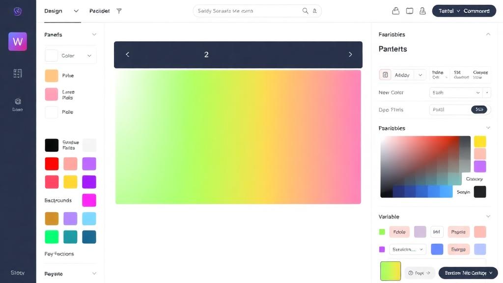
Why Color Management Matters in Webflow
Webflow gives designers unprecedented control over CSS without writing code. But with great power comes the risk of color chaos—inconsistent shades scattered across classes, gradients that don't match your brand, and dark mode that's nearly impossible to maintain.
A structured color system in Webflow transforms your workflow from hunting hex codes to clicking semantic swatches. Let's build one.
Global Color Swatches
Webflow's Global Swatches are the foundation of color management.
Creating Global Swatches
- Select any element on the canvas
- Open the Style panel → click any color property
- In the color picker, click the Swatches section
- Click + New swatch
- Name your swatch semantically (e.g.,
primary-600) - Set the hex value:
#4353FF - Click Create swatch
Organizing Your Swatches
Create a structured naming system:
Brand/Primary     → #4353FF
Brand/Secondary   → #FF6B35
Brand/Accent      → #00D4AA

Neutral/900       → #111827
Neutral/700       → #374151
Neutral/500       → #6B7280
Neutral/300       → #D1D5DB
Neutral/100       → #F3F4F6
Neutral/50        → #F9FAFB

Status/Error      → #DC2626
Status/Success    → #16A34A
Status/Warning    → #D97706
Benefits of Swatches
- Change a swatch → every element using it updates instantly
- Team members see the same color options
- Prevents "close but not quite" color variations
- Export-friendly for handoff to developers
CSS Variable-Based Color Management
For more advanced control, use CSS custom properties directly in Webflow's custom code.
Setting Up Variables
In your project's Custom Code (Site Settings → Head Code):
<style>
  :root {
    --color-primary: #4353FF;
    --color-primary-light: #6B77FF;
    --color-primary-dark: #2A3ACC;
    --color-secondary: #FF6B35;
    --color-background: #FFFFFF;
    --color-surface: #F9FAFB;
    --color-text: #111827;
    --color-text-muted: #6B7280;
    --color-border: #E5E7EB;
  }

  [data-theme="dark"] {
    --color-background: #0F172A;
    --color-surface: #1E293B;
    --color-text: #F1F5F9;
    --color-text-muted: #94A3B8;
    --color-border: #334155;
  }
</style>
Using Variables in Webflow
Reference variables in element styles via Webflow's custom property field or in embed code:
.hero-section {
  background-color: var(--color-background);
  color: var(--color-text);
}

.card {
  background: var(--color-surface);
  border: 1px solid var(--color-border);
}
This approach mirrors what developers use in production—learn more in our CSS color variables guide.
Creating Gradient Backgrounds
Webflow has excellent built-in gradient support.
Linear Gradients
- Select an element
- In the Style panel, click the background color
- Switch from Flat to Linear gradient
- Add color stops:
- Stop 1:
#4353FFat 0% - Stop 2:
#00D4AAat 100%
- Stop 1:
- Adjust the angle (135° is a popular diagonal)
Radial Gradients
Perfect for spotlight effects:
- Center:
#6B77FF(lighter primary) - Edge:
#1A1A2E(dark background) - Size: Farthest corner
Gradient Best Practices
- Two-color gradients: Maximum. Three colors often look muddy.
- Analogous colors: Colors next to each other on the color wheel (
#4353FF→#00D4AA) create smooth transitions - Opacity gradients: Same hue, different opacities—safer and more elegant
- Hero sections: Full-width gradients work best with subtle transitions over large areas
Mesh-Style Gradients
For modern, multi-directional gradients, layer multiple backgrounds:
background:
  radial-gradient(ellipse at 20% 50%, rgba(67, 83, 255, 0.3) 0%, transparent 50%),
  radial-gradient(ellipse at 80% 50%, rgba(0, 212, 170, 0.3) 0%, transparent 50%),
  #0F172A;
Color Animations and Interactions
Webflow's interaction system can animate color changes.
Scroll-Based Color Changes
- Add a Scroll interaction trigger
- Target the element's Background Color
- Set keyframes:
- 0% scroll:
#FFFFFF(white background) - 50% scroll:
#4353FF(primary) - 100% scroll:
#1A1A2E(dark)
- 0% scroll:
Hover Color Transitions
In the style panel:
- Style the element's default state
- Switch to Hover state
- Change the color properties
- Add a transition:
background-color 300ms ease
Click/Toggle Color Changes
Use Webflow interactions to toggle classes on click, switching between color states for:
- Dark/light mode toggles
- Active navigation states
- Expandable card reveals
Webflow + Figma Color Handoff
Keeping colors synchronized between Figma and Webflow is a common challenge.
Manual Handoff Process
- Export Figma color tokens as a JSON or spreadsheet
- Map each Figma token to a Webflow global swatch
- Name them identically for clarity
- Create a shared color reference document
Plugin-Assisted Workflow
- Figma to Webflow Plugin: Transfers design elements including color styles
- Tokens Studio (Figma): Export design tokens that can be converted to CSS variables for Webflow
Maintaining Sync
- Any color change starts in Figma (source of truth)
- Designer updates Figma library
- Developer updates Webflow swatches and CSS variables to match
- Periodic audit: compare Figma and Webflow color inventories
Building a Complete Color System in Webflow
Step 1: Define Your Palette
Use Coloracci's AI palette generator to create a harmonious palette with primary, secondary, accent, and neutral colors.
Step 2: Create Global Swatches
Add each color as a named global swatch in Webflow.
Step 3: Add CSS Variables
In custom code, define CSS variables for theme-aware colors (light/dark modes).
Step 4: Build Component Classes
Create utility classes that reference your system:
.text-primary     { color: var(--color-primary); }
.bg-surface       { background: var(--color-surface); }
.border-default   { border-color: var(--color-border); }
Step 5: Document Everything
Create a "Style Guide" page in your Webflow project showing:
- All swatches with names and hex values
- Gradient examples
- Text on background combinations with contrast ratios
- Component examples in light and dark modes
Accessible Color Combinations
Never skip accessibility checking. For every text/background combination:
| Combination | Contrast Ratio | WCAG Level |
|---|---|---|
#111827 on #FFFFFF |
18.1:1 | AAA ✅ |
#4353FF on #FFFFFF |
5.2:1 | AA ✅ |
#6B7280 on #FFFFFF |
4.6:1 | AA ✅ |
#6B7280 on #F9FAFB |
4.2:1 | AA (large text) ⚠️ |
Use our color contrast checker to verify all your combinations meet WCAG guidelines. For comprehensive accessibility standards, see the WCAG color guide.
Webflow vs Coded Sites for Color Control
| Feature | Webflow | Custom Code |
|---|---|---|
| Global swatches | ✅ Built-in | CSS variables |
| Dark mode | Manual + custom code | Full CSS/JS control |
| Gradient builder | ✅ Visual | Code-only |
| CSS variables | Via custom code | Native |
| Animation | Visual interactions | CSS/JS |
| Token export | Limited | Full automation |
| Version control | Built-in | Git |
Webflow is excellent for rapid development and visual control. For complex design systems with multiple themes and automated token pipelines, coded sites offer more flexibility.
Start Your Webflow Color System Today
A well-organized color system in Webflow saves hours per project and ensures every page looks intentionally designed. Start with the right palette—explore options with Coloracci's color tools—then implement the global swatch and CSS variable system described here.
Your future self (and your clients) will thank you for the consistency.