Color Grading in Premiere Pro: Complete Guide for Video Editors
· Coloracci Team
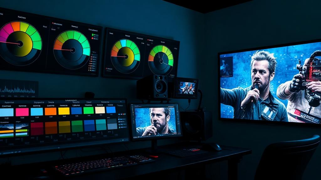
Why Color Grading Transforms Your Video
Color grading is the difference between footage that looks "recorded" and footage that looks cinematic. In Adobe Premiere Pro, the Lumetri Color panel gives you professional-grade tools that rival dedicated grading suites like DaVinci Resolve—all within your editing timeline.
Whether you're editing a corporate video, a short film, or social media content, understanding color grading fundamentals will elevate every frame you produce. This guide walks you through the complete Premiere Pro color grading workflow, from basic correction to creative looks.
Understanding Primary Color Correction
Before you grade for style, you need to correct for accuracy. Primary correction affects the entire image globally.
White Balance and Exposure
Start every grade by fixing white balance. In the Lumetri Color panel's Basic Correction section:
- Temperature: Slide right for warmer tones (orange), left for cooler (blue). Daylight footage typically sits around 5600K, tungsten around 3200K.
- Tint: Adjusts the green-magenta axis. Fix fluorescent lighting casts here.
- Exposure: Overall brightness. Aim to place skin tones around 70 IRE on the waveform.
- Contrast: Increases the distance between shadows and highlights.
The Tone Curve Controls
Below exposure, you'll find:
- Highlights and Whites: Control the brightest parts of your image
- Shadows and Blacks: Control the darkest areas
- Saturation: Global color intensity—be subtle, 10-15% adjustments are usually plenty
Pro tip: Hold Alt/Option while dragging Whites or Blacks to see a clipping overlay, showing exactly which pixels are being crushed or blown out.
Mastering Premiere Pro's Color Wheels
The Color Wheels & Match section is where creative grading really happens. You get three wheels:
Shadows Wheel
Controls the color cast in the darkest areas of your image. Pushing shadows toward teal (#008080) is a classic cinematic look. The slider below controls shadow luminance.
Midtones Wheel
Affects the middle brightness range—this is where skin tones live. Be very gentle here. A slight push toward warm (#FFD700) can add a pleasing warmth without looking artificial.
Highlights Wheel
Controls the brightest areas. Pushing highlights toward orange (#FF8C00) while shadows go teal creates the popular "orange and teal" look used in blockbusters like Mad Max: Fury Road and Transformers.
The Classic Orange and Teal Grade
Here's a step-by-step recipe:
- Push Shadows wheel slightly toward teal/cyan
- Push Highlights wheel slightly toward orange/amber
- Reduce Midtones saturation slightly to keep skin tones natural
- Increase overall Contrast by 10-15
- Add a slight S-curve in the Curves panel
The hex values to aim for: Shadows toward #006D6F, Highlights toward #E8913A.
Using LUTs (Look-Up Tables)
LUTs are pre-built color transformations. Premiere Pro supports both correction LUTs and creative LUTs.
Technical LUTs
Applied in Basic Correction > Input LUT. These convert LOG footage (like S-Log3 or C-Log) to Rec.709 for a standard starting point. Always apply technical LUTs before grading.
Creative LUTs
Applied in Creative > Look. These add stylistic color transformations. Premiere Pro ships with several built-in options:
- SL Clean: Subtle, clean look
- Fuji ETERNA 250D: Film emulation
- Kodak 5213 Vis3: Warm film stock look
Important: Always dial back LUT intensity to 50-70%. Full-strength LUTs almost always look overdone. Use the Intensity slider to find the sweet spot.
Reading Scopes Like a Pro
Scopes are objective measurement tools—your eyes adapt to what they see, but scopes don't lie.
Waveform Monitor
Shows luminance (brightness) from left to right across your frame. Key levels:
- 0 IRE: Pure black
- 100 IRE: Pure white (broadcast safe limit)
- 70 IRE: Target for skin tones (approximate)
Vectorscope
Shows color information on a circular graph. The further from center, the more saturated. Key reference points:
- The line between R (red) and YL (yellow) is the "skin tone line"—all human skin tones, regardless of ethnicity, should fall roughly along this line
- If your vectorscope shows a strong lean toward one direction, you likely have a color cast
RGB Parade
Shows Red, Green, and Blue channels separately. When all three channels align at the same level in neutral areas (gray card, white shirt), your white balance is correct.
Secondary Color Correction with HSL
Secondary corrections target specific colors without affecting the rest. In the HSL Secondary section:
- Use the eyedropper to select a color range (e.g., sky blue)
- Refine the selection using Hue, Saturation, and Luminance sliders
- Check "Color/Gray" to see your selection mask
- Apply corrections only to that range
Common uses:
- Sky enhancement: Select blue, increase saturation, deepen luminance
- Skin tone cleanup: Select skin range, desaturate slightly, warm up
- Selective color pop: Desaturate everything except one color for dramatic effect
Matching Shots Across Scenes
Consistency across shots is critical. Premiere Pro's Color Match feature uses AI to help:
- Place the playhead on your reference shot
- Select the clip you want to match
- In Lumetri, go to Color Wheels & Match
- Click Comparison View to see both shots side by side
- Click Apply Match
- Fine-tune manually—the AI gets you 80% there
For manual matching, compare waveforms between shots. Match the black levels first, then highlights, then midtones. Color match last—luminance consistency matters more than color consistency.
Creative Color Grading Looks
Bleach Bypass
Mimics a film processing technique. Desaturate by 30-40%, increase contrast significantly, and push highlights toward a slight blue #C0D8E8.
Day-for-Night
Darken exposure by 1.5-2 stops, push color temperature cold (toward #3A5BA0), crush blacks aggressively, and add a slight blue tint to midtones.
Vintage Film
Lift blacks to #1A1A2E (never truly black), desaturate by 20%, add warmth to highlights #FFE4B5, and reduce contrast for a faded feel.
High-Key Corporate
Lift shadows, reduce contrast, push midtones toward neutral-warm, and maintain clean highlights. Target an overall bright, approachable feel with hex accents like #4A90D9 for trust.
Exporting with Color Accuracy
Your beautiful grade means nothing if the export destroys it.
Recommended Export Settings
- Codec: H.264 for web, ProRes for archival
- Color Space: Rec.709 for standard delivery
- Bit Depth: 10-bit if your source supports it
- VBR 2-pass: Better quality than CBR at similar file sizes
Platform-Specific Considerations
- YouTube: Uploads in Rec.709; 4K uploads get better compression
- Instagram: Heavily compresses video—add slightly more saturation than you think you need
- Broadcast: Must stay within legal levels (0-100 IRE)
Step-by-Step: Your First Professional Grade
- Import and organize your timeline
- Apply Input LUT if shooting LOG
- Correct exposure using waveform—place blacks at 0-5 IRE, highlights at 90-100 IRE
- Fix white balance using a neutral reference or the eyedropper
- Set contrast with the tone curve sliders
- Grade with color wheels—shadows cool, highlights warm (or your chosen style)
- Apply secondary corrections for specific elements
- Add a creative LUT at 40-60% intensity for a finishing touch
- Match shots across your timeline
- Check scopes one final time before export
Build Your Color Vocabulary with Coloracci
Understanding color relationships is the foundation of great grading. The orange-and-teal look works because those colors are complementary. The vintage film look uses principles from color wheel theory.
Use Coloracci's AI palette generator to explore cinematic color combinations before you grade. Input a reference frame and get the exact hex codes to recreate any look.
Color grading is part technical skill, part artistic vision. Master the tools in this guide, develop your eye through practice, and your videos will never look the same again.