Coca-Cola Red: Hex Code #F40009, Brand Palette & Psychology
· Coloracci Team
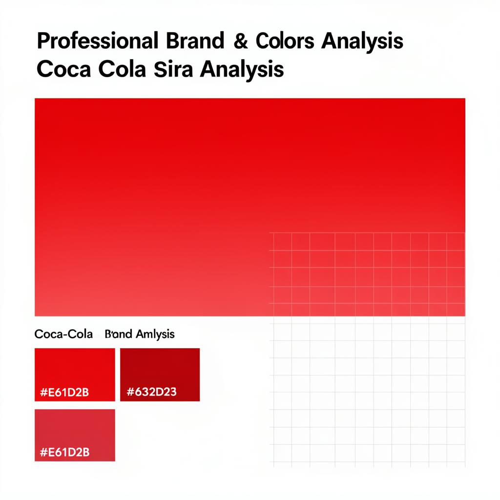
Coca-Cola red is #F40009 — paired with white, it forms one of the most protected two-color systems in branding. The red predates color psychology (it began as tax-marking paint on barrels in the 1890s) but now drives appetite, energy and recognition at global scale. Full values and history below.
Why Coca-Cola's Red Is the Most Recognizable Brand Color in the World
Close your eyes and think of the color red. Chances are, a Coca-Cola logo just flashed through your mind. No other brand on Earth owns a single color quite like the beverage giant does. Their specific shade — known as Coke Red (#F40009) — has been seared into the collective consciousness of billions across 200+ countries for over 130 years.
Few reds are as protected as this one; our Pantone color finder shows exactly which Pantone shade sits closest to it.
From vending machines in Tokyo to corner shops in Lagos, billboards in São Paulo to digital ads on every screen imaginable, that red is instantly, unmistakably Coca-Cola. James Sommerville, former VP of Global Design at Coca-Cola, once called their red the company's "second secret formula" — a color so powerful it communicates the brand before a single word is read.
But what makes this particular red so effective? Why has Coca-Cola's color palette remained virtually unchanged while competitors constantly rebrand? The answer lies at the intersection of color psychology, strategic consistency, and brilliant design restraint.
The Exact Coca-Cola Color Palette
Coca-Cola's brand identity is built on a deceptively simple three-color system. Despite being valued at over $97 billion, they achieve global recognition with remarkable chromatic restraint:
| Color Name | Hex Code | RGB | Primary Usage |
|---|---|---|---|
| Coke Red | #F40009 | 244, 0, 9 | Logo, packaging, hero sections, CTAs |
| Black | #1E1E1E | 30, 30, 30 | Body typography, contrast, Coke Zero branding |
| White | #FFFFFF | 255, 255, 255 | Backgrounds, logo script, negative space |
Why This Simplicity Works
Three colors. That's the entire foundation of one of the most valuable brands in history. In an era where companies develop elaborate palettes with gradients, secondary tones, and accent colors, Coca-Cola proves that chromatic restraint is the ultimate power move. Their hex code #F40009 is one of the most searched brand colors in the world.
The white Spencerian script logo against the red background creates a high-contrast focal point — instantly readable at any size, from a 12-pixel favicon to a 40-foot highway billboard. This red-on-white (or white-on-red) combination delivers maximum visual impact with minimum complexity.
The Psychology of Coca-Cola's Red
Red Evokes Energy, Passion & Excitement
There's a scientific reason red dominates the food and beverage industry. Research in color psychology consistently demonstrates that red triggers powerful physiological and emotional responses:
- Energy — Red increases heart rate and stimulates the nervous system, creating a physical sense of vitality
- Passion — The warm, saturated hue evokes emotional intensity, desire, and strong feelings
- Excitement — High-chroma red creates instant visual energy that demands attention
- Appetite stimulation — Red triggers metabolic responses linked to hunger and consumption, making it the ideal choice for a beverage brand
This isn't coincidence — it's neuroscience. Red light wavelengths (around 620–750 nm) are processed faster by the human visual system than cooler colors. Your eye literally finds red before it finds blue or green. In a crowded refrigerator case, on a busy shelf, or in a split-second digital ad impression, Coke Red commands attention first.
Creates Urgency and Grabs Attention Instantly
Red naturally creates a sense of immediacy. Studies in retail psychology show that red signage increases the perceived urgency of offers and drives faster purchasing decisions. When you see Coca-Cola's red, your brain doesn't deliberate — it responds. This is why the brand consistently outperforms in impulse purchase environments like convenience stores, vending machines, and checkout lanes.
White Provides Purity and Refreshment Contrast
The white in Coca-Cola's palette isn't passive — it's strategic. White communicates:
- Purity — Suggesting the cleanness and quality of the product
- Refreshment — Evoking the chill of ice, the coolness of a cold drink
- Breathing room — Preventing the bold red from becoming visually overwhelming
The contrast between red and white is one of the highest-impact pairings in design. Together, they create a visual system that feels simultaneously bold and approachable.
Black Adds Sophistication and Timeless Elegance
The near-black (#1E1E1E) in Coca-Cola's palette serves as the grounding element. Rather than a harsh pure black, this slightly warm dark tone adds:
- Sophistication — Elevating the brand beyond casual to iconic
- Readability — Providing crisp, accessible body text against white backgrounds
- Timelessness — Black never trends in or out of fashion
The History: How Coca-Cola's Red Became a Promise
Frank Robinson's Original Vision (1886)
The Coca-Cola color story begins in 1886 when Frank M. Robinson — the company's bookkeeper who also named the drink and designed the original Spencerian script logo — chose red for its contrast against white. Robinson understood instinctively what color science would later prove: red and white together create maximum visibility and memorability for early signage and advertising.
The Red Disc: A Visual Promise
As Coca-Cola expanded across America in the early 1900s, the red disc became a ubiquitous storefront signal. Placed in shop windows, on awnings, and above doors, the red circle communicated one powerful message: "Coca-Cola sold here."
Over time, the red disc evolved beyond a marker into a promise. See it anywhere in the world, and you know you can get an ice-cold Coca-Cola. The color became synonymous not just with the product, but with the entire experience — the taste, the fizz, the refreshment. This is color functioning as a sensory guarantee, and it remains one of the most sophisticated uses of brand color in history.
James Sommerville's "Second Secret Formula"
When James Sommerville, Coca-Cola's VP of Global Design, described their red as the brand's "second secret formula," he captured something profound: the color is as valuable as the drink itself. You can hide the logo, remove the text, strip away every other design element — and that specific shade of red still communicates "Coca-Cola" to billions of people instantly.
Website & Brand Analysis: The Red Disc System
Unifying All Variants Under Red
In 2016, Coca-Cola implemented the "Taste the Feeling" one-brand strategy, unifying all variants — Coke, Diet Coke, Coke Zero, Coca-Cola Life — under the iconic red disc. Rather than letting sub-brands dilute the red with their own color identities (silver, black, green), the company reasserted red as the master color across the entire product family.
This wasn't just a design choice — it was a strategic declaration that red is Coca-Cola, regardless of the variant.
Red Dominates Across All Touchpoints
Coca-Cola's digital and physical presence follows a consistent color hierarchy:
- 60% Coke Red — Hero sections, packaging, navigation, branded containers
- 30% White — Content areas, typography backgrounds, breathing room
- 10% Black — Body text, fine print, structural elements
This follows the classic 60-30-10 color proportion rule that designers use to create visually balanced compositions.
Digital Accessibility
Coca-Cola's design team uses color strategically for accessibility. Their red on white achieves strong contrast ratios for large text and branded elements, while defaulting to near-black (#1E1E1E) for body text to ensure full WCAG accessibility compliance. Bold brand colors often need darker alternatives for text — Coca-Cola solves this elegantly with their three-color system.
Golden Ratio & Composition
The Iconic Bottle Shape
The classic Coca-Cola contour bottle — patented in 1915 and recognizable even by touch in the dark — uses balanced proportions that complement the bold red. The curved silhouette creates natural focal points where the red label sits at the golden mean of the bottle's height, drawing the eye to the brand name with mathematical precision.
Label Design and Red Balance
The bottle and can labels demonstrate masterful composition: the red wraps around the cylindrical form, catching light and shadow to create natural tonal variation within a single color. This three-dimensional application of red adds visual richness without introducing additional colors.
Whitespace as a Design Tool
One of the most underappreciated aspects of Coca-Cola's design is their use of negative space. Despite owning one of the boldest colors in branding, they never let it overwhelm. Print advertisements, packaging, and digital layouts consistently use generous whitespace to give the red room to command attention. The principle: the more powerful the color, the more whitespace it needs.
What Designers Can Learn from Coca-Cola
1. Consistency Over 130+ Years Builds Unparalleled Recognition
Coca-Cola has maintained the same red for over 130 years — through two World Wars, the digital revolution, and the social media age. Studies show consumers identify their red with over 94% accuracy without any logo or text. The lesson: resist the urge to rebrand. Consistency compounds.
2. A Single Bold Color Can Become Your Entire Identity
You don't need ten colors — you need one unforgettable one. When starting a new brand color palette, ask yourself: which single color will become synonymous with your brand?
3. Contrast Creates Instant Visual Hierarchy
Red, white, and black — three colors that create clear layers of information. Red signals brand and action. White provides rest. Black delivers readability. This hierarchy works at every scale, from app icons to billboards.
4. Color as Promise
This is Coca-Cola's deepest lesson. Their red isn't just a color — it's a promise of an experience. When you see that red, you don't just think "Coca-Cola" — you anticipate the taste, the fizz, the refreshment. The best brand colors don't just identify; they evoke. Learn more about how color shapes brand perception in our guide to understanding color psychology in branding.
5. Know When to Be Bold vs. Restrained
Coca-Cola uses red boldly on packaging and hero sections, but sparingly in body content. Match color intensity to content purpose: brand moments get full saturation; utility moments get restraint.
6. Color Governance Matters
Implement strict rules: exact hex codes (#F40009, not "red"), precise usage ratios (60-30-10), and clear guidelines about what can and cannot be modified. Explore how leading brands manage color systems in our guide to choosing your brand color palette.
Frequently Asked Questions
What is the exact hex code for Coca-Cola red?
Coca-Cola's brand red is #F40009 (RGB: 244, 0, 9). This vivid, high-saturation red is used across all primary brand applications.
Why did Coca-Cola choose red?
Frank M. Robinson chose red in 1886 for its contrast against white in early signage. The color has remained the brand's core identifier for over 130 years.
How many colors are in Coca-Cola's brand palette?
Just three: Coke Red (#F40009), Black (#1E1E1E), and White (#FFFFFF). This minimal palette creates maximum impact through contrast and consistency.
What does Coca-Cola's red communicate psychologically?
Red evokes energy, passion, excitement, and appetite stimulation — all perfectly aligned with a beverage brand. It also creates urgency and grabs attention faster than any cool color.
Create Your Own Iconic Brand Palette
Coca-Cola's 130+ year commitment to a single shade of red proves that the right color, applied with discipline and consistency, can become worth billions. The principles behind their palette are universal: choose boldly, apply consistently, and let your color become a promise.
Ready to create your own iconic brand palette? Try our AI-powered color generator at Coloracci and discover harmonious color combinations that will define your visual identity for years to come.