Colors of Champions League Team Kits: A Deep Dive into Football's Iconic Palettes
· Coloracci Team
Watch: The Champions League Team Kits Iconic Palettes Song
Why Champions League Kits Are Masterclasses in Color Design
When 80,000 fans fill a stadium on a European night, the pitch becomes more than a field — it becomes a canvas. The colors of Champions League team kits are not merely uniforms; they are visual identities forged through decades of history, tested under the highest pressure, and recognized by billions worldwide. For designers, color theorists, and brand strategists, these palettes offer a masterclass in how to build iconic color systems that endure.
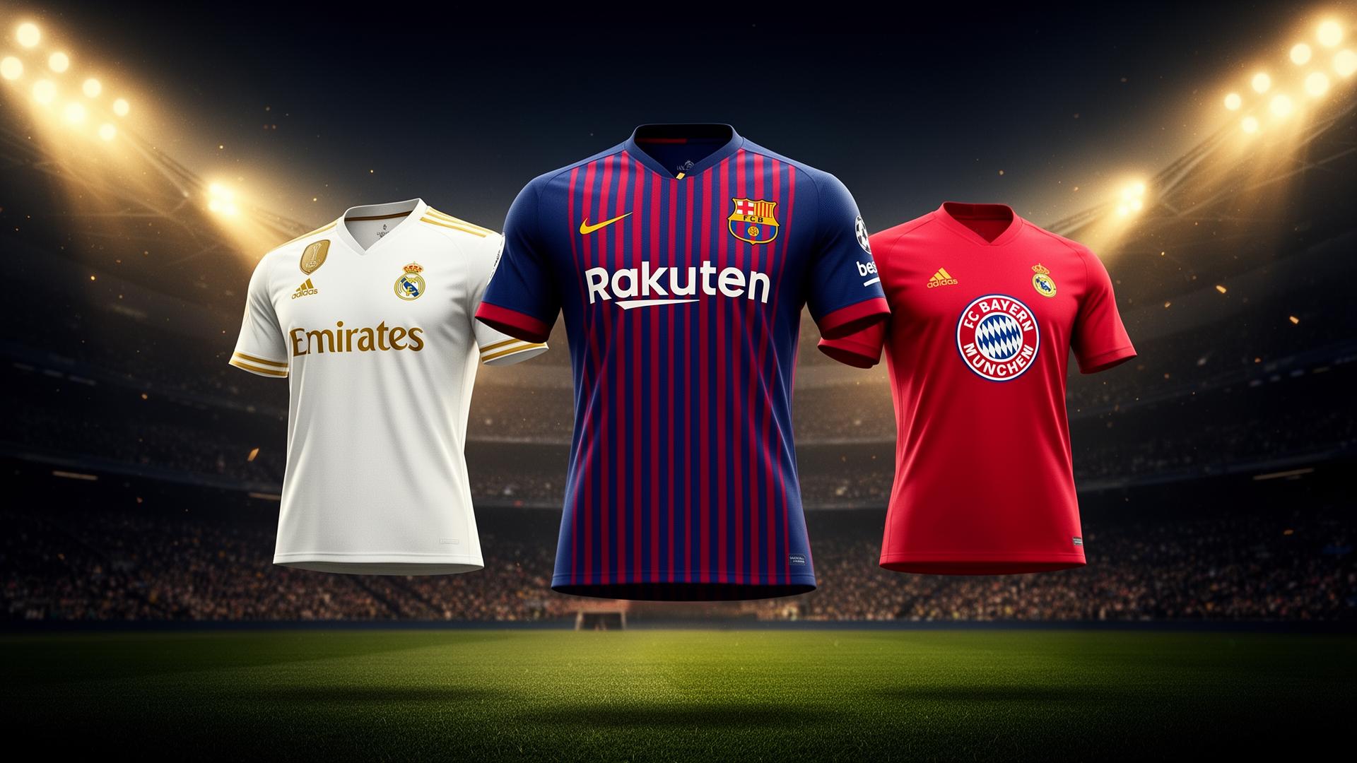
Every Champions League kit tells a story through its palette. Real Madrid's immaculate white speaks of royalty and supremacy. Barcelona's blaugrana stripes carry 125 years of Catalan identity. Bayern Munich's aggressive red communicates raw dominance. These are not arbitrary choices — they are the result of cultural inheritance, strategic psychology, and calculated brand positioning that rivals any Fortune 500 visual identity system.
In this deep dive, we decode the exact hex codes, palette structures, and psychological frameworks behind football's most iconic Champions League kits. Whether you are designing a brand identity, building a digital product, or simply fascinated by the intersection of color and culture, these palettes will change how you think about visual storytelling.
The Iconic Palettes of Champions League Giants
Real Madrid — The Philosophy of Pure White
Real Madrid's home kit is one of the most visually striking decisions in sports design: the complete absence of a dominant color. While most clubs fight for attention with saturated primaries, Madrid chose white — and in doing so, created one of the most powerful color statements in football history.
| Color Role | Hex Code | RGB | Color Name |
|---|---|---|---|
| Primary Kit | #FFFFFF | 255, 255, 255 | Pure White |
| Crest Accent | #FDB930 | 253, 185, 48 | Championship Gold |
| Secondary Accent | #005694 | 0, 86, 148 | Royal Blue |
The white (#FFFFFF) is not emptiness — it is absolute confidence. In color psychology, white communicates purity, supremacy, and timeless authority. Real Madrid's Los Blancos identity transforms this neutral into a statement of unchallenged prestige. The palette is deliberately restrained: white dominates 85-90% of the kit surface, while gold (#FDB930) appears only in crest details and victory motifs, and royal blue (#005694) functions as a secondary kit color.
This is a masterclass in chromatic restraint. By limiting the palette to essentially one dominant hue plus two disciplined accents, Real Madrid achieves what few brands manage: instant recognition without visual noise. Designers can learn from this approach — when you have true authority, you do not need to shout.
FC Barcelona — The Blaugrana as Living Heritage
Barcelona's vertical stripes of deep red and blue constitute one of the oldest continuously used color systems in professional sport. The blaugrana has remained fundamentally unchanged since 1899, making it a 127-year study in brand consistency and cultural color identity.
| Color Role | Hex Code | RGB | Color Name |
|---|---|---|---|
| Primary Stripe | #A50044 | 165, 0, 68 | Deep Red / Blaugrana Maroon |
| Secondary Stripe | #004D98 | 0, 77, 152 | Deep Blue |
| Crest Accent | #FDB930 | 253, 185, 48 | Heritage Gold |
The deep red (#A50044) is not a standard athletic red. It is darker, more sophisticated — closer to garnet or maroon than to the aggressive crimsons used by Bayern or Liverpool. This specific shade carries connotations of Catalan wine culture, intellectual depth, and regional pride that a brighter red would sacrifice. Paired with deep blue (#004D98), it creates a complementary-adjacent scheme that balances passion with strategic composure.
The vertical stripe system itself is a deliberate design choice. Unlike horizontal bands or solid fields, vertical stripes create upward visual momentum — the eye travels the length of the body, suggesting speed, aspiration, and vertical ambition. The gold (#FDB930) crest accents add warmth and championship pedigree without competing with the core two-color system.
For designers, Barcelona's palette teaches a crucial lesson: specificity of shade matters more than hue family. A generic red and blue would not carry the same weight. The exact depth, saturation, and temperature of each color encodes cultural meaning.
Bayern Munich — The Power of Chromatic Dominance
Bayern Munich's all-red home kit is one of the most aggressive color statements in elite football. There is no compromise, no secondary stripe system, no neutral resting field — just saturated, unapologetic red from collar to hem.
| Color Role | Hex Code | RGB | Color Name |
|---|---|---|---|
| Primary Kit | #DC052D | 220, 5, 45 | Bayern Red |
| Kit Trim | #FFFFFF | 255, 255, 255 | Pure White |
| Crest Element | #0066B2 | 0, 102, 178 | Bavarian Blue |
The Bayern Red (#DC052D) is a cool-leaning, high-saturation crimson that communicates dominance, physical power, and competitive aggression. Sports psychology research consistently shows that red-wearing teams are perceived as more threatening and are statistically more likely to win close contests. Bayern leans into this association with absolute conviction.
What makes the palette work structurally is its radical simplicity. Red dominates entirely. White (#FFFFFF) appears only in trim, typography, and negative space — never as a competing field. Bavarian Blue (#0066B2) is restricted to crest elements, serving as a nod to the regional diamond flag pattern rather than a palette competitor.
This is the "one bold color" principle taken to its extreme. Designers studying Bayern learn that when a single hue is this saturated and emotionally charged, it needs no companions to create impact. The restraint in secondary colors actually amplifies the primary's power.
Color Patterns Across Champions League Iconic Kits
The Authority of White
Only a handful of elite clubs have built their identity around white: Real Madrid, Tottenham Hotspur, and historically Leeds United. White in football carries unique associations that differ from its use in other industries:
- Purity through supremacy — white stays clean only when you are never challenged; it signals confidence that the kit will not see defeat
- Royal and aristocratic associations — the "Real" prefix in Spanish club names historically connects to royal patronage
- Timelessness — white never trends in or out; it is permanently modern
- Maximum contrast under floodlights — white pops against green pitch and dark stands more dramatically than any saturated color
Real Madrid's decision to commit fully to white, rather than using it as a secondary or trim, demonstrates that neutral dominance can be more powerful than chromatic aggression.
The Stripe as Identity System
Barcelona's vertical stripes represent a distinct category of kit design: the pattern-based primary identity. Unlike solid-field clubs (Bayern, Liverpool, Manchester United), pattern clubs encode their entire brand into a repeating geometric system.
The stripe system creates several design advantages:
- Instant recognition at any distance — the rhythm of alternating colors is readable even when the viewer cannot distinguish crest or typography
- Scalable identity — the stripe works equally on the kit, the crest, and digital applications without modification
- Cultural permanence — because the pattern itself is the brand, individual colors can shift slightly over time without breaking identity continuity
Designers working on brand systems can apply this principle: build identity around pattern or proportion, not just color, and the system becomes more durable.
Red as Competitive Signal
Bayern's monochromatic red belongs to a broader pattern in sports color psychology. Red-dominant clubs — Bayern Munich, Liverpool, AC Milan, Manchester United, Benfica — have collectively won more European trophies than any other color family.
The science behind this is well-documented. Red triggers measurable physiological responses:
- Elevated heart rate and adrenaline in both wearer and observer
- Perceived dominance and aggression — opponents rate red-wearing teams as more physically threatening
- Increased confidence in the wearer, creating a self-fulfilling cycle of assertiveness
- Competitive arousal — the same color that stimulates appetite in food branding stimulates competitive drive on the pitch
Bayern's specific shade of red is cooler and more saturated than warm reds like Liverpool's or AC Milan's. This cooler temperature communicates calculated power rather than raw passion — dominance through precision, not just emotion.
Complete Champions League Kit Color Reference Table
| Club | Primary Color | Hex Code | Color Name | Psychological Meaning |
|---|---|---|---|---|
| Real Madrid | White | #FFFFFF | Pure White | Supremacy, purity, timeless authority |
| Real Madrid | Gold | #FDB930 | Championship Gold | Achievement, prestige, royalty |
| Real Madrid | Blue | #005694 | Royal Blue | Heritage, calm authority, secondary depth |
| FC Barcelona | Deep Red | #A50044 | Blaugrana Maroon | Cultural pride, sophistication, passion |
| FC Barcelona | Blue | #004D98 | Deep Blue | Strategy, Catalan identity, stability |
| FC Barcelona | Gold | #FDB930 | Heritage Gold | Tradition, warmth, excellence |
| Bayern Munich | Red | #DC052D | Bayern Red | Dominance, aggression, competitive power |
| Bayern Munich | White | #FFFFFF | Pure White | Clarity, precision, contrast balance |
| Bayern Munich | Blue | #0066B2 | Bavarian Blue | Regional identity, loyalty, heritage accent |
What Designers Can Learn from Football's Palette Masters
1. Restraint Is a Competitive Advantage
Real Madrid's three-color system (dominant white + gold + blue) and Bayern's even tighter structure (dominant red + white trim + blue crest) prove that limitation drives memorability. The most iconic sports palettes are not the most complex — they are the most disciplined. When designing brand identities, resist the temptation to add "just one more color." The strongest systems commit fully to a minimal palette and derive variation through proportion and placement.
2. Give Every Color a Single Job
In these Champions League palettes, no color competes with another. White rests. Gold celebrates. Blue anchors. Red attacks. When each hue has a defined role — primary, secondary, accent — the palette achieves functional clarity. Apply this to digital products by assigning semantic roles to your colors: primary actions, secondary navigation, success states, warnings. A color with an ambiguous job weakens the entire system.
3. Cultural Specificity Beats Generic Appeal
Barcelona's deep maroon only works because of its Catalan associations. Bayern's blue only makes sense in the context of Bavaria's flag. These palettes are not trying to be universally liked — they are locally rooted and globally respected. When choosing colors for a brand, consider what cultural, regional, or community associations will amplify the message. A color that means something specific to your audience will outperform a generically "pleasing" shade.
4. Pattern Can Be the Primary Brand Element
Barcelona proves that a repeating pattern — not a logo, not a mascot, not a wordmark — can become the entire visual identity. Designers should consider whether their project could be built around proportion, rhythm, or geometric structure rather than relying solely on color and typography. Patterns create identity systems that are harder to copy and easier to scale.
5. Shade Selection Is Strategy, Not Aesthetics
The difference between Real Madrid's pure white and an off-white cream is not cosmetic — it is strategic. The difference between Barcelona's deep maroon and a bright fire-engine red is cultural encoding. When selecting colors, use a color picker to test precise values. The exact hex code matters because hue, saturation, and lightness collectively determine psychological impact.
Applying Champions League Palette Logic to Your Projects
Ready to bring elite-level color strategy to your own designs? Here is how to translate these football insights into practical workflows:
Extract and adapt palettes — Use our Image Color Extractor to pull exact hex codes from any team's kit photography or branding materials. Build starter palettes from the masters.
Edit and refine colors — Import extracted palettes into our SVG Color Editor to test hue shifts, saturation adjustments, and accessibility-compliant variations before committing to a final scheme.
Generate icons and assets — Use our AI Icon Generator to create custom icons and graphics that harmonize with your sports-inspired palette, maintaining consistent chromatic identity across all touchpoints.
Build complete gradient systems — Explore how Champions League primaries translate into modern digital gradients using our Popular Gradients collection. See how red authority, blue stability, and gold prestige translate into contemporary UI backgrounds and hero sections.
Test for accessibility — Run your palette through our Color Contrast Checker to ensure WCAG compliance. Even iconic football colors need digital adaptation to work across interfaces.
The Deeper Meaning: Why These Palettes Endure
Every Champions League kit color carries a lineage. Real Madrid's white traces back to Corinthian FC's amateur ideals and Spanish royal patronage. Barcelona's blaugrana reflects Joan Gamper's Swiss heritage and the region's political identity. Bayern's red emerged from a 1960s consolidation decision that unified multiple Munich clubs under a single chromatic banner.
These are not marketing choices made in boardrooms — they are historical artifacts that became brand assets. The lesson for designers is profound: the most durable color systems are those rooted in authentic narrative. A palette chosen purely for trend appeal will expire when the trend does. A palette chosen to encode real meaning can last for generations.
The Champions League stage amplifies this effect. When a kit appears under stadium floodlights in front of a global television audience, its colors must communicate instantly, across cultures, without explanation. Only palettes with deep structural integrity and authentic narrative can achieve this. The clubs that have survived at the elite level for decades are those whose color identities were built to last.
Conclusion: Build Palettes Worthy of the Biggest Stage
The colors of Champions League team kits demonstrate that color is never decoration — it is strategy, history, and psychology combined. Real Madrid's white proves that restraint can be more powerful than saturation. Barcelona's stripes prove that pattern can become identity. Bayern's red proves that a single bold color, fully committed, can dominate perception.
For designers, the application is clear: choose your colors with the same seriousness these clubs apply to their kits. Limit your palette deliberately. Give every color a defined role. Root your choices in authentic meaning. And above all, commit fully — the most powerful color identities are those that never apologize for their choices.
Ready to design your own championship-worthy palette? Use Coloracci's AI-powered color generator to build palettes inspired by the world's most iconic teams. Extract, refine, and deploy color systems that carry the same authority as football's greatest kits.