The Creative Palette: Unpacking Canva's Brand Colors
· Coloracci Team
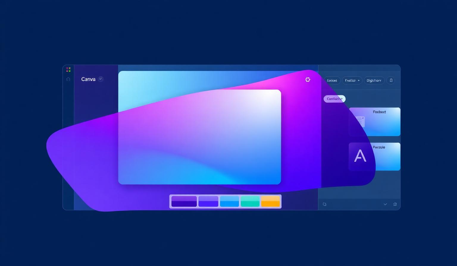
Why Canva's Brand Colors Are Iconic
Few software products have shifted the gravity of an entire industry the way Canva has. With more than 220 million monthly users designing everything from social posts to investor decks, Canva brand colors have become a visual shorthand for one promise: design is for everyone. Where legacy creative tools leaned on austere grays and clinical blues to project authority, Canva went the opposite direction — saturated, gradient-driven, and unmistakably playful.
This article takes a focused look at the trio at the heart of Canva's identity — Light Blue #07B9CE, Blue #3969E7, and Purple #7D2AE7 — and how those three hues drive the editor experience used by hundreds of millions of people every month. We'll move beyond the logo and into the workflow: how color guides the eye through the canvas, how it teaches new users where to click, and how it keeps power users productive across hours of work.
The Exact Colors
Canva's identity centers on a cool gradient spectrum that flows from cyan through blue into purple — three hues that together cover trust, clarity, and creativity. Below is the focused palette this article unpacks, alongside the supporting neutrals that make the editor feel calm rather than chaotic.
| Color Name | Hex | Usage |
|---|---|---|
| Light Blue | #07B9CE |
Premium accents, illustrations, hover highlights, empty-state graphics |
| Blue | #3969E7 |
Interactive elements, links, secondary CTAs, focus states |
| Purple | #7D2AE7 |
Primary brand color, logo, primary CTAs, brand gradients |
| Editor Dark | #0D1216 |
Main editor chrome, sidebars, dark UI surfaces |
| Canvas White | #FFFFFF |
Active design canvas, text surfaces, modal backgrounds |
| Panel Gray | #F0F0F0 |
Tool panels, dividers, low-emphasis backgrounds |
The three branded hues are almost never used in isolation. Canva consistently treats them as a continuous gradient — purple bleeding into blue bleeding into cyan — which creates a recognizable signature even when the wordmark is nowhere in sight. That gradient is the brand.
Color Psychology: What Each Color Communicates
Light Blue #07B9CE — Innovation and Approachability
Cyan sits at the freshest end of the spectrum. It carries the calm associations of blue but with a noticeably more energetic, modern feel. Canva uses #07B9CE to:
- Lower the intimidation barrier for first-time users. Cyan reads as friendly and tech-forward rather than corporate.
- Signal innovation, especially around AI-powered features like Magic Studio, where the cyan often appears as a glowing accent.
- Add visual lift to illustrations and empty states, where pure purple would feel too heavy.
In color psychology research, cyan consistently scores high on perceived clarity and openness — exactly the emotional tone a tool wants when it's asking a non-designer to start from a blank canvas.
Blue #3969E7 — Trust and Reliability
Pure blues like #3969E7 are the workhorses of digital interfaces because they communicate trust, stability, and professionalism without demanding attention. Canva leans on this blue for:
- Interactive cues: links, selected tabs, and focus rings that need to be obvious without screaming.
- Secondary CTAs where the action is important but not the single primary path forward.
- Data and information UI like share permissions, account states, and informational toasts.
Strategically, this blue is the bridge color. It connects the cool freshness of cyan to the warm creativity of purple, and it gives the eye a place to rest between the two more emotionally charged hues.
Purple #7D2AE7 — Creativity and Sophistication
Purple is Canva's signature, and #7D2AE7 is one of the most recognizable corporate purples in software. Psychologically, purple straddles two domains: it inherits the trustworthiness of blue and the energy of red, landing on creativity, imagination, and a touch of premium sophistication. Canva uses it to:
- Anchor the brand in logo, primary CTAs ("Create a design"), and onboarding flows.
- Mark high-intent actions — the moments where Canva most wants the user to commit.
- Communicate premium value when paired with gradient washes on Pro upsell surfaces.
Purple is also one of the most universally well-liked colors across demographics, which matters enormously for a product that serves students, marketers, educators, and Fortune 500 teams from the same interface. For more on how primary color choice shapes brand perception, see our color psychology guide.
Website & Editor Analysis: How Color Drives the Workflow
Canva's color system is doing real UX work, not just brand work. Inside the editor, the palette is deployed as a wayfinding system.
Hierarchy Through Saturation, Not Just Hue
The editor surfaces — left sidebar, top toolbar, right inspector — are rendered in deep neutrals (#0D1216 and panel gray #F0F0F0), which intentionally desaturate everything except the user's design and the primary CTAs. The result is that the most saturated pixels on screen at any given moment are almost always either:
- The content the user is creating, or
- The next action Canva wants them to take (rendered in purple).
This is a classic 60-30-10 distribution applied with intention:
- ~60% neutral (white canvas + light/dark panels): the workspace
- ~30% brand purple/blue: navigation, primary CTAs, account chrome
- ~10% cyan + accents: badges, AI features, illustrations, premium markers
Contrast and Accessibility
Each of the three branded hues was clearly chosen with WCAG contrast in mind:
- White text on Purple
#7D2AE7reaches roughly 6.0:1 contrast — comfortably above the 4.5:1 AA threshold for body text. - White text on Blue
#3969E7lands around 5.1:1 — still AA compliant for normal text. - Light Blue
#07B9CEis intentionally used for backgrounds and accents with dark text rather than dark backgrounds with white text, because at smaller sizes it would not meet AA on white.
This is a quietly important pattern: Canva uses each hue at the specific weight where it remains accessible, rather than forcing every brand color to play every role. Verify your own pairings with our contrast checker before shipping.
Whitespace as a Brand Color
Canva's editor is famously dense with capability, yet it never feels cramped. That's because whitespace — and specifically the calm #F0F0F0 and pure white surfaces — is treated as a first-class part of the palette. The vibrant trio is allowed to feel vibrant precisely because it appears against vast neutral surfaces. Strip out the whitespace and the same purples and cyans would read as overwhelming.
Gradient as a Visual Signature
The Canva gradient — purple flowing into blue flowing into cyan — appears across marketing pages, the sign-in screen, premium upsell modals, and the AI feature surfaces. Gradients are notoriously easy to get wrong, but Canva uses theirs sparingly, in moments where they want to signal "something special is happening here." That restraint is what keeps the gradient meaningful rather than decorative.
Visual Composition: Balance Without Rigidity
Canva's interface doesn't appear to follow strict golden-ratio mathematics, but it does adhere closely to the underlying principles of classical visual hierarchy:
- Proportional sidebars: the left tool sidebar to canvas ratio sits roughly between 1:3 and 1:2.5 — wide enough to discover tools, narrow enough that the canvas remains the visual hero.
- Progressive emphasis: each screen has exactly one dominant CTA in saturated purple, supported by 2–3 secondary actions in less saturated blue, with everything else rendered in neutrals.
- Rhythmic spacing: tool clusters in the sidebar use consistent vertical padding so the eye can scan groups, not individual icons.
The takeaway is not "Canva uses the golden ratio." It's that Canva uses one clear hierarchy rule — the most saturated color points to the most important action — and applies it ruthlessly across every surface. That single rule is what makes a tool with thousands of features feel learnable.
What Designers Can Learn: 5 Actionable Takeaways
1. Use Your Most Saturated Color as a Wayfinding Tool
Canva's purple is not decoration — it's the answer to "what should I click next?" Pick your most saturated brand color and reserve it almost exclusively for primary CTAs and high-intent actions. The moment you use it for decoration, you destroy its wayfinding power.
2. Build a Tonal Bridge Between Your Brand Hues
The reason Canva's purple, blue, and cyan feel like one system rather than three competing colors is that they share a hue path. When you build a multi-hue palette, choose colors that flow along the color wheel rather than fighting it. Our guide on creating color palettes walks through this exact technique.
3. Match Each Color to the Role It Can Actually Play
Light Blue #07B9CE is not used for white-on-color CTAs because it would fail contrast. Purple is not used as an editor background because it would compete with user content. Audit each color in your system and write down — explicitly — which roles it is allowed to play and which it isn't.
4. Treat Whitespace as a Palette Color
If your interface feels chaotic, the answer is rarely "fewer colors." It's almost always "more whitespace." Canva's vibrant trio reads as energetic instead of overwhelming because it's surrounded by enormous, intentional negative space. Add whitespace to a budget line in your design system, and protect it.
5. Use Gradients Sparingly to Mark Specialness
The Canva gradient appears on roughly 10% of surfaces, almost always tied to identity moments (sign-in) or premium moments (Pro upgrade, AI features). When everything is a gradient, nothing is. Reserve your most expressive treatments for the moments you want users to remember.
Build Your Own Canva-Caliber Palette
Canva's palette works because every color earns its place. The cyan brings freshness, the blue bridges and reassures, and the purple anchors the brand and points the way forward. Behind those three hues sits a disciplined neutral system and a respect for whitespace that lets the vibrant colors breathe.
If you're building your own product, brand, or campaign palette, start by defining the jobs your colors need to do — wayfinding, trust, energy, premium signaling — and then choose hues that can credibly perform each role. When you're ready to test combinations, generate your own palette on Coloracci and pressure-test it against the same accessibility and hierarchy standards Canva applies to its own.
Great color systems aren't accidents. They're a small number of well-chosen hues, deployed with discipline, and protected by whitespace.