The Color Psychology Behind Canva: What Makes Their Palette Work
· Coloracci Team
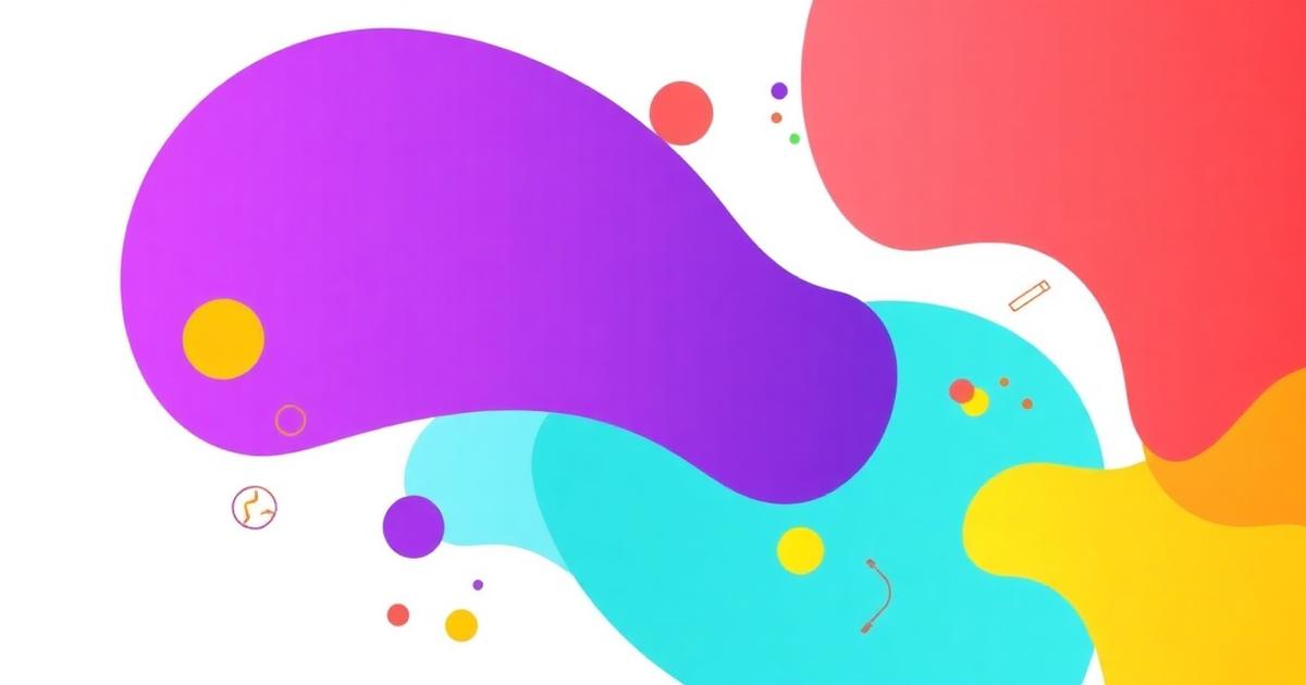
Why Canva's Brand Colors Are Iconic
When you think of design democratization, Canva is the first name that comes to mind. Since its launch in 2013, Canva has grown from a simple drag-and-drop editor into the world's most popular visual design platform, serving over 170 million monthly active users across 190 countries. But beneath the intuitive interface lies a masterclass in Canva brand colors — a palette engineered to communicate creativity, accessibility, and professional confidence simultaneously.
What makes Canva's color strategy remarkable isn't just the individual hues — it's how they work together to lower the psychological barrier to design. Every color in their system serves a dual purpose: attracting creative professionals while reassuring design novices that they belong here too. This tension between sophistication and approachability is encoded directly into their palette DNA.
In this deep analysis, we'll deconstruct every color in Canva's brand system, explore the psychology behind each choice, examine how they deploy these colors across their digital ecosystem, and extract actionable lessons you can apply to your own projects.
The Exact Canva Brand Colors
Canva's palette is built on a bold primary color supported by vibrant secondary tones and clean neutrals. Here's the complete breakdown:
| Color Name | Hex Code | RGB | Usage |
|---|---|---|---|
| Canva Purple | #7D2AE8 |
rgb(125, 42, 232) | Primary brand color, logo, CTAs, headers |
| Canva Teal | #00C4CC |
rgb(0, 196, 204) | Secondary accent, Pro features, illustrations |
| Canva Coral | #FF7262 |
rgb(255, 114, 98) | Warm accent, notifications, highlights |
| Canva Yellow | #FFC524 |
rgb(255, 197, 36) | Energy accent, badges, promotional elements |
| Canva Dark Navy | #0D1216 |
rgb(13, 18, 22) | Editor background, dark UI surfaces |
| Canva White | #FFFFFF |
rgb(255, 255, 255) | Canvas, text backgrounds, whitespace |
| Canva Light Gray | #F0F0F0 |
rgb(240, 240, 240) | Panel backgrounds, dividers, subtle separation |
The Logo Evolution
Canva's logo has undergone subtle refinements since its founding, but the commitment to purple has remained constant. The current wordmark uses Canva Purple (#7D2AE8) — a saturated, electric violet that sits between traditional corporate blue and creative magenta. This positioning is deliberate: it signals innovation without the coldness of pure blue, and creativity without the frivolity of hot pink.
Color Psychology: What Each Color Communicates
Canva Purple (#7D2AE8) — Creativity Meets Authority
Purple has historically been the color of royalty, wisdom, and imagination. In branding, it occupies a unique psychological space — it's simultaneously creative and authoritative. Canva's specific shade of purple leans toward violet with high saturation, which amplifies its associations with:
- Innovation: The electric quality of this purple signals forward-thinking technology
- Creativity: Purple activates the imaginative centers of perception, appropriate for a design tool
- Premium quality: The richness of the hue communicates professional-grade capability
- Inclusivity: Unlike corporate navy or aggressive red, purple is broadly appealing across demographics and cultures
Research in color psychology consistently shows that purple is one of the most universally liked colors, ranking in the top three preferred colors globally. For a platform that serves everyone from enterprise marketers to high school students, this universal appeal is strategic.
Canva Teal (#00C4CC) — Trust and Modernity
Teal combines the trustworthiness of blue with the freshness of green, creating a color that feels both reliable and contemporary. Canva uses teal extensively in:
- Pro features: The teal badge distinguishes premium capabilities, associating the color with added value
- Illustrations: Background elements and decorative graphics often feature teal for visual energy
- Interface accents: Selected states and interactive elements use teal to guide user attention
The psychological message is clear: teal tells users "this is modern, this is trustworthy, and this works." It complements the creative energy of purple with grounded confidence.
Canva Coral (#FF7262) — Warmth and Urgency
Coral injects warmth and human energy into the palette. Sitting between red and orange, it carries:
- Approachability: Coral is inviting and friendly, reducing the intimidation factor of a professional design tool
- Gentle urgency: It draws attention without the aggression of pure red — perfect for notifications and important UI elements
- Emotional warmth: The color evokes enthusiasm and positive energy, reinforcing the joy of creating
Canva Yellow (#FFC524) — Optimism and Energy
Yellow is the most attention-grabbing color in the human visual system. Canva deploys it sparingly but strategically:
- Celebration: Achievement badges, completion states, and promotional highlights
- Optimism: Yellow communicates that design is fun, achievable, and rewarding
- Energy: It adds dynamism to marketing materials and feature announcements
The warm, golden tone (rather than lemon or chartreuse) keeps the yellow feeling sophisticated rather than childish.
Website & App Analysis: Color Hierarchy in Action
The 60-30-10 Rule Applied
Canva's digital presence follows a modified 60-30-10 color distribution:
- 60% — White and Light Gray: The dominant colors create breathing room. The design editor uses white canvas areas extensively, and the dashboard maintains generous whitespace. This neutral dominance ensures that user-created content always takes center stage.
- 30% — Canva Purple and Dark Navy: The primary brand colors appear in navigation, headers, CTAs, and the editor's dark sidebar. This ratio provides strong brand recognition without overwhelming the creative workspace.
- 10% — Teal, Coral, and Yellow: These accent colors appear in illustrations, badges, icons, and micro-interactions. They add visual personality and guide user behavior through strategic placement.
Contrast and Accessibility
Canva demonstrates strong accessibility awareness in their color implementation:
- Text contrast: White text on Canva Purple (#7D2AE8) achieves a contrast ratio of approximately 6.2:1, well above the WCAG AA standard of 4.5:1
- Interactive elements: CTAs use high-contrast combinations (purple buttons with white text) to ensure visibility for users with visual impairments
- Dark mode: The editor's dark interface (#0D1216) provides excellent contrast for design elements, reducing eye strain during extended use sessions
For your own projects, always verify color contrast with a dedicated color contrast checker to ensure WCAG compliance.
Whitespace as a Strategic Color
One of Canva's most underappreciated color decisions is their aggressive use of white space. The marketing site, dashboard, and editor all prioritize breathing room over information density. This whitespace strategy:
- Reduces cognitive load for design beginners
- Elevates the perceived quality of the platform
- Ensures user-created content is always the visual hero
- Creates a calm, focused environment for creative work
Golden Ratio & Visual Composition
Canva's visual design, while not explicitly based on the golden ratio (1:1.618), demonstrates several principles that align with classical proportion theory.
Proportional Color Distribution
The ratio of neutral to branded to accent colors across Canva's interface approximates 6:3:1, which itself echoes the golden proportion. The primary purple occupies roughly 1.6 times the visual weight of the combined accents (teal + coral + yellow), creating a natural sense of hierarchy without rigidity.
Layout Harmony
On Canva's marketing pages, the hero sections typically allocate space in proportions close to golden rectangles: large imagery paired with compact text blocks, creating compositions that feel naturally balanced. The sidebar-to-canvas ratio in the editor (approximately 1:2.5) provides enough tool access without overwhelming the creative workspace.
Typography and Color Spacing
The vertical rhythm of Canva's color usage follows a progressive pattern: dense brand color at the top (navigation, hero), transitioning to lighter tones through the body, with strategic color reintroduction for CTAs and feature sections. This creates a visual "breathing" pattern that mirrors the golden spiral's expanding proportions.
What Designers Can Learn: 5 Actionable Takeaways
1. Let Your Primary Color Tell Your Story
Canva chose purple not because it's trendy, but because it perfectly encodes their brand narrative: creative + professional + inclusive. Before selecting your primary color, define the three key attributes your brand must communicate, then find the hue that intersects all three. For deeper guidance on building this foundation, explore our email marketing color psychology guide.
2. Use Accent Colors as Functional Tools
Each of Canva's accent colors serves a specific functional purpose — teal for premium, coral for warmth, yellow for celebration. Don't add colors for visual variety alone. Every accent in your palette should answer the question: "What job does this color do?"
3. Make White Space Your Most Important Color
Canva's interface proves that what you don't color is as important as what you do. Generous whitespace elevates perceived quality, reduces cognitive load, and keeps the focus on content. Audit your designs for areas where adding whitespace would improve clarity.
4. Build Contrast Into Your System
Design your color palette with specific contrast pairs in mind from the start. Canva's purple-on-white and white-on-dark combinations aren't afterthoughts — they're foundational to the system. Every primary color should have a pre-tested companion that guarantees readable contrast.
5. Create Emotional Temperature Gradients
Canva's palette spans from cool (teal) through neutral (purple) to warm (coral, yellow), giving them emotional range. Build your palette with at least one cool and one warm accent to ensure you can match the emotional tone of any content or message.
Canva vs. Other Design Platforms: A Color Comparison
| Platform | Primary Color | Strategy | Message |
|---|---|---|---|
| Canva | Purple #7D2AE8 |
Vibrant, creative primary | "Design is for everyone" |
| Figma | Black #1E1E1E |
Neutral, tool-first | "Professional precision" |
| Adobe | Red #FF0000 |
Bold, legacy authority | "Industry standard power" |
| Sketch | Orange #FDAD00 |
Warm, approachable | "Mac-native craft" |
Canva's purple sits in a unique position — more creative than Figma's austere black, more approachable than Adobe's aggressive red, and more professional than Sketch's casual orange. This differentiation through color is a masterclass in competitive positioning.
Building Your Own Canva-Inspired Palette
Want to create a palette with the same psychological sophistication as Canva's? Start with these principles:
- Choose a primary that's both creative and trustworthy — purples, deep teals, or rich blues work well
- Add a warm accent for human connection — corals, soft oranges, or rose tones
- Include a cool accent for balance — teals, mints, or cerulean blues
- Define your neutrals with intention — warm grays for friendly, cool grays for professional
- Test everything at scale — colors behave differently in small icons vs. full-screen backgrounds
Ready to build your own brand palette with the precision and psychology of Canva? Try Coloracci's AI palette generator to explore color combinations that communicate exactly the right message for your brand.
Conclusion
Canva's brand colors aren't just aesthetically pleasing — they're a carefully engineered system that communicates creativity, accessibility, and professional capability in every pixel. From the strategic choice of purple as a universally appealing creative signifier to the functional deployment of teal, coral, and yellow as accent tools, every color decision reinforces the brand's core mission: making design accessible to everyone.
The lesson for designers and brand builders is clear: great color palettes aren't collections of pretty hues. They're strategic systems where every color earns its place by serving both psychological and functional roles. Build your palette with the same intentionality, and your brand will communicate its story before a single word is read.