Bookstore and Library Color Psychology: Creating Sanctuaries for Reading and Discovery
· Coloracci Team
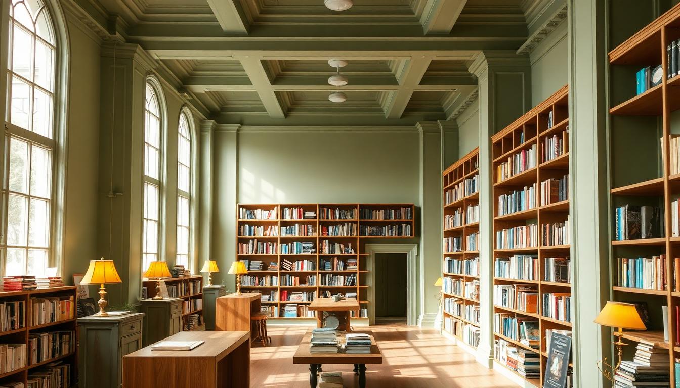
Bookstores and libraries occupy a unique position in environmental color psychology. These spaces must balance stimulation — encouraging exploration and discovery — with the calm focus required for deep reading and concentration. The color strategies that work for retail often fail here, while the sterile palettes of traditional institutions can feel unwelcoming.
The Library Color Foundation: Green and Nature
Green's association with reading spaces isn't accidental. Research in environmental psychology reveals that viewing green (even briefly) before cognitive tasks improves focus and reduces mental fatigue. This "green effect" makes sage and forest tones ideal for libraries and bookstores.
Sage: The Modern Library Standard
Sage green — #9CAF88 through #8FA088 — has become the dominant color for contemporary library design. Its advantages are specific:
- Low saturation: Doesn't compete with book covers for visual attention
- Warm undertones: Avoids the clinical feel of cooler greens
- Natural associations: Evokes growth, knowledge, and organic discovery
- Lighting flexibility: Performs well under both natural and artificial light
The New York Public Library's recent renovations incorporate sage tones in seating areas, creating "rest zones" where the eyes can recover from concentrated reading.
Deep Forest for Immersion
Darker greens — #2D4A3E, #3D5A4C — work exceptionally in:
- Children's sections: Create imaginative, immersive environments
- Study carrels: Signal serious concentration without oppressiveness
- Themed areas: Fantasy, nature, and history sections benefit from atmospheric depth
Barnes & Noble's redesign of children's sections employs forest greens paired with warm lighting, creating spaces where young readers want to linger.
Wood Tones: The Soul of Book Spaces
No material defines bookstore and library aesthetics like wood. The specific tone and finish carry psychological weight.
The Honey Oak Tradition
Traditional American libraries — the Carnegie libraries of the early 20th century — standardized on honey oak (#C19A6B). This choice wasn't arbitrary:
- Warmth without darkness: Inviting yet bright enough for reading
- Durability signaling: Solid wood communicated institutional permanence
- Democratic accessibility: Less formal than darker mahogany, more refined than pine
The Dark Wood Revival
Contemporary independent bookstores have embraced darker woods — walnut (#5C4033), espresso finishes (#3D2B1F):
- Premium positioning: Signals curation and quality over volume
- Atmospheric intimacy: Creates cozy, enclosed feeling in open urban spaces
- Book contrast: Dark shelves make colorful book spines pop visually
Shakespeare and Company in Paris, the Strand in New York — iconic bookstores leverage dark wood to create spaces that feel discovered rather than designed.
The Scandinavian Light Wood Alternative
Nordic library design offers a contrasting approach:
- Birch and ash tones (#E8DCC4, #D4C5A9): Airy, democratic, accessible
- Pale floors: Maximize light reflection in dark winter months
- Minimal contrast: Books become the color in otherwise neutral spaces
This palette communicates that reading is everyday, essential, universal — not elite or exclusive.
The Beige Debate: Neutral or Neglect?
Beige has a controversial reputation in library design. Used poorly, it signals institutional neglect; deployed strategically, it creates psychological space for concentration.
Warm Beige for Concentration
Properly calibrated warm beiges — #E8DFD0, #F0E6D8 — create:
- Visual rest: Reduces eye strain during extended reading
- Thermal comfort perception: Warmer spaces feel physically cozier
- Timelessness: Doesn't date as quickly as trend colors
The British Library's reading rooms use parchment-inspired beiges that reference the manuscript tradition while providing contemporary comfort.
Cool Beige Pitfalls
Gray-leaning beiges (#C4B9AC) create problems:
- Institutional feel: Hospital and office associations
- De-energizing: Can sap enthusiasm for exploration
- Poor book presentation: Cool backgrounds dull colorful cover designs
Accent Colors: Directing the Reading Journey
Bookstores and libraries use strategic accent colors to guide behavior without explicit signage.
The Blue Discovery Signal
Research reveals that blue accents in book spaces increase reported browsing time by 15-20%. The theory: blue signals safety and openness, encouraging exploration.
Effective deployments:
- Dusty blue seating: #7A9CC6 in chairs and couches invites lingering
- Teal signage: #3D9970 creates readable hierarchy without harshness
- Navy feature walls: #1E3A5F in teen and new release sections signals contemporary relevance
Terracotta for Warmth
Terracotta and rust accents (#C67B5C) create:
- Human scale: Warmth in potentially overwhelming large spaces
- Energy without distraction: Enough vibrancy to maintain interest, not enough to disrupt focus
- Cultural resonance: References pottery, craft, and the handmade — associations that align with physical books
Powell's City of Books in Portland uses terracotta strategically in seating areas, creating oases of warmth within the vast warehouse space.
Children's Sections: Playful Without Chaos
The color psychology of children's library spaces requires careful calibration. Too stimulating, and children become overwhelmed; too sedate, and the space fails to engage.
The Rainbow Room Problem
Many children's sections make the mistake of using too many saturated colors simultaneously. Research on early childhood environments shows that rainbow palettes — while appearing "fun" — actually increase cortisol in children and reduce sustained play.
Better approach: controlled accent colors within a neutral base:
- Soft yellow (#F4E4C1) for imagination and creativity areas
- Gentle blue (#B8D4E3) for calm reading corners
- Sage green (#A8C5A8) for nature and science sections
- Warm peach (#F5D5C5) for social and collaborative spaces
Age-Appropriate Intensity
Color saturation should decrease as target age increases:
- 0-5 years: Moderate saturation, warm colors, high contrast for developing vision
- 6-12 years: Muted primaries, nature-inspired palettes
- 13-18 years (YA): Sophisticated adult palettes with strategic bold accents
The Reading Light Spectrum
Bookstore and library color psychology cannot be separated from lighting design. The color of light fundamentally changes how wall colors and books appear.
Daylight Mimicry
The ideal reading light mimics natural daylight at 5000-6500K color temperature:
- Clear, alert: Supports concentration and comprehension
- Color accurate: Book covers display as designed
- Circadian alignment: Daytime exposure supports healthy sleep cycles
Libraries increasingly use tunable systems that provide daylight-mimicking light during open hours and warmer tones for evening events.
The Cozy Reading Light
Evening bookstore events, reading groups, and library programs benefit from warmer light (2700-3000K):
- Intimacy creation: Encourages community and conversation
- Reduced blue light: Less disruption to circadian rhythms before sleep
- Atmospheric depth: Creates "events" distinct from everyday use
Independent vs. Chain: Color Divergence
The color strategies of independent bookstores versus chain operations reveal different approaches to community and commerce.
Barnes & Noble: The Anchor Store Palette
Barnes & Noble's redesign following its 2019 reorganization shows chain bookstore color evolution:
- Sage green feature walls: Responding to independent bookstore aesthetics
- Lighter wood tones: More contemporary than traditional dark shelving
- Flexible seating areas: Color-defined zones for different activities
- Events spaces: Distinct color palettes that transform for author readings, children's programs
The strategy: signal community connection through colors traditionally associated with independent shops while maintaining operational efficiency.
Amazon Books: The Algorithm Aesthetic
Amazon's physical stores (now mostly closed) represented a different approach:
- Highly neutral: White, light gray, minimal distraction from merchandise
- Data-driven placement: Colors guided by online shopping patterns rather than atmospheric concerns
- Tech integration: Screens and digital interfaces dominated visual space
The color psychology prioritized transaction efficiency over browsing pleasure — revealing Amazon's retail philosophy.
Independent Bookstores: Neighborhood Identity
Successful independent bookstores use color to anchor themselves in specific communities:
- Brooklyn independents: Industrial aesthetics (exposed brick, steel) signal urban authenticity
- College town shops: School color integration creates institutional relationship
- Resort area bookstores: Coastal palettes (blues, whites, natural materials) align with vacation context
- Historic district locations: Period-appropriate colors that respect architectural context
Digital Age Adaptations
As libraries and bookstores incorporate digital resources, color psychology must accommodate screens alongside pages.
The Screen Glare Problem
Screen use in reading spaces creates color conflicts:
- Blue light emission: Disrupts circadian rhythms and competes with warm environmental colors
- Reflection issues: Glossy screens and glossy book covers create competing highlights
- Posture indicators: Hunched screen users versus upright book readers have different spatial needs
Color solutions:
- Matte finishes on walls reduce screen reflection
- Warm wall colors balance the cool light of screens
- Defined tech zones: Distinct color environments for digital versus physical reading
E-Reader Integration
Libraries lending e-readers and tablets must consider:
- Device colors: Many e-readers use black or white — environmental colors should complement
- Charging station design: Technology infrastructure integrated aesthetically, not as afterthought
- Mixed-format browsing: Physical and digital displays should harmonize through color coordination
Psychological Safety in Reading Spaces
Libraries serve vulnerable populations — homeless individuals seeking shelter, students escaping difficult homes, seniors seeking community. Color psychology can support psychological safety:
Inclusive Color Design
- Non-gendered palettes: Avoiding pink/blue coding in children's sections
- Cultural sensitivity: Colors carry different meanings across cultures — libraries serving diverse communities require research
- Neurodiversity accommodation: Some individuals with autism find highly saturated colors overwhelming; offering neutral "quiet zones" serves multiple needs
The Third Place Commitment
Ray Oldenburg's concept of "third places" — environments between home and work where community forms — applies powerfully to libraries and bookstores. Color choices signal this commitment:
- No purchase pressure: Colors that don't aggressively stimulate appetite or urgency
- Time generosity: Palettes that feel appropriate at any hour, for any duration
- Democratic welcome: Colors that don't signal class, education level, or insider status
The Future of Reading Space Colors
Emerging trends in bookstore and library color psychology include:
Biophilic Integration
Beyond green paint, living plants integrated into shelving, walls, and architecture:
- Natural color variation: Living plants change color seasonally, preventing aesthetic stagnation
- Air quality association: Green in service of actual environmental quality
- Attention restoration: Even brief views of nature improve cognitive performance
Flexible Color Environments
LED technology enables spaces that transform:
- Morning study zones: Cooler, energizing light and color
- Afternoon children's programs: Warmer, playful tones
- Evening author events: Dramatic, theatrical palettes
- Night study sessions: Subdued, concentration-supporting environments
Single spaces serving multiple purposes through programmable color and light.
Measuring Reading Space Success
The effectiveness of bookstore and library color choices can be evaluated:
- Dwell time: How long do visitors stay? Do they accomplish their intended tasks?
- Browsing patterns: Do colors successfully guide exploration?
- Return frequency: Does the environment create emotional attachment?
- Community formation: Do colors support the social functions of third places?
The ultimate test: do people choose to spend their limited free time in these spaces, surrounded by these colors, engaging with ideas and community?