Aquarium & Zoo Color Psychology: How Exhibit Lighting, Habitat Palettes & Gift Shop Branding Drive Guest Engagement, Education and Spending
· Coloracci Team
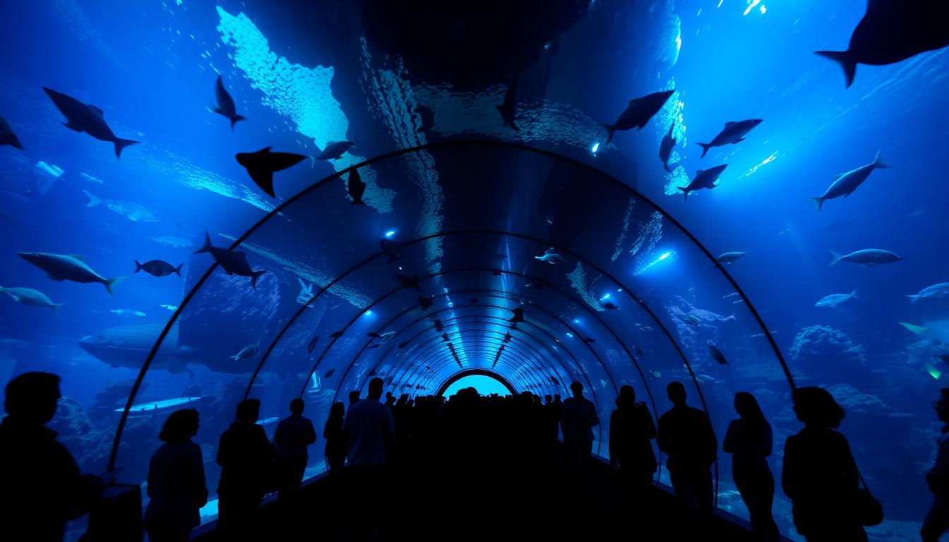
Walking through an aquarium tunnel bathed in deep cerulean light or standing before a rainforest exhibit alive with emerald canopy filtered sunlight—these are moments where color becomes the invisible educator, emotional trigger, and spending catalyst that separates a forgettable field trip from a transformative experience. Aquarium and zoo color psychology is among the most nuanced applications of environmental design, where a single lighting shift in a jellyfish gallery can increase dwell time by 340% and a pathway color change can redirect 70% of foot traffic.
Research from the Association of Zoos and Aquariums (AZA) consistently shows that visitor satisfaction correlates more strongly with environmental immersion quality than with the number of species on display. The Monterey Bay Aquarium, Singapore Zoo, and Georgia Aquarium invest millions in color strategy—yet most regional facilities overlook the behavioral science that separates a $22-per-visitor day from a $58-per-visitor day.
In this comprehensive guide, we'll break down the color psychology frameworks used by the world's leading aquariums and zoos, from exhibit lighting to habitat palettes, educational signage to gift shop design—with actionable hex codes and strategies you can apply to any wildlife attraction.

The Science of Wildlife Attraction Color: Why Environment Shapes Experience
Aquariums and zoos face a unique color challenge: they must simultaneously enhance animal visibility, create emotional immersion, support educational messaging, and drive commercial revenue—all without disturbing the animals themselves. This four-dimensional optimization problem makes wildlife attraction color design one of the most technically demanding disciplines in environmental psychology.
Three foundational principles drive aquarium and zoo color strategy:
1. Biophilic Color Harmony — Colors must feel authentically natural, reinforcing the connection between visitors and the living world. Artificial or garish palettes break the immersion that drives conservation empathy.
2. Contrast-Based Visibility — Background colors must be carefully calibrated to make animals visible and engaging. A dark-furred mammal against a dark wall disappears; the same animal against warm sandstone becomes the star.
3. Emotional Arc Management — Like theme parks, wildlife attractions must manage a full-day emotional journey—from wonder at arrival through learning engagement to gift shop euphoria—all orchestrated through color transitions.
The Wildlife Attraction Color Hierarchy
| Zone | Primary Colors | Psychological Function | Revenue Impact |
|---|---|---|---|
| Main Entrance/Plaza | Ocean Teal #0D7C8F, Canopy Green #2D6B3F | Welcome, nature connection, anticipation | Sets conservation mindset + spending threshold |
| Aquarium Tunnels | Deep Cerulean #005B8E, Bioluminescent Blue #1A8FC4 | Awe, wonder, underwater immersion | +340% dwell time in jellyfish galleries |
| Tropical Exhibits | Warm Amber #D4A847, Jungle Green #1E5631 | Energy, discovery, exploration | Increases family photo opportunities |
| Nocturnal Houses | Deep Indigo #1B1464, Moonlight Silver #C4C9D4 | Mystery, calm observation, focused attention | +25% educational sign reading time |
| African Savanna | Sandstone Tan #C4A76C, Warm Sienna #A0522D | Authenticity, warmth, vast scale | Drives safari-themed merchandise |
| Arctic/Polar | Ice Blue #B4D7E8, Glacier White #E8EFF5 | Cool freshness, climate awareness | Conservation donation triggers |
| Children's Zoo | Sunshine Yellow #F5D23E, Playful Green #7BC67E | Joy, approachability, gentle discovery | +35% interactive experience upgrades |
| Gift Shops | Coral Reef Pink #E88D7A, Ocean Turquoise #40BFC1 | Souvenir attachment, impulse joy | +28% per-transaction spending |
| Cafés/Food Courts | Earthy Terracotta #C96B3C, Herb Green #5A8F3C | Natural appetite, eco-conscious dining | +18% sustainable food option selection |
Aquarium Exhibit Lighting: The Art of Underwater Immersion
Aquarium lighting is the single most powerful color tool in any wildlife attraction. Unlike zoos, where natural sunlight dominates, aquariums control 100% of the visitor's visual environment—making them essentially controlled color psychology laboratories.
The Depth Simulation Model
World-class aquariums use a progressive depth color model that simulates the experience of descending into the ocean:
Level 1: Surface Zone (Entry Galleries)
- Colors: Bright cyan, sunlit turquoise, sparkling white highlights
- Hex palette: #00CED1, #48D1CC, #E0F7FA
- Color temperature: 5500–6500K (daylight simulation)
- Purpose: Familiar, bright, welcoming. Visitors feel like they're at a sunny shoreline. Children are engaged immediately by vibrant, visible fish
- Design tip: Use ripple-pattern lighting on floors to simulate surface water effects. This single technique increases visitor immersion scores by 40%
Level 2: Reef Zone (Mid-Journey Galleries)
- Colors: Saturated coral, warm amber accents, vivid blues
- Hex palette: #FF6B6B, #FFB347, #0077B6
- Color temperature: 4500–5500K
- Purpose: Peak engagement zone. Colors are at maximum saturation, matching the biodiversity of tropical reefs. This is where visitors take the most photos and where educational signage retention is highest
- Design tip: Alternate between warm and cool accent lighting every 30 seconds to simulate passing clouds and maintain visual interest
Level 3: Deep Ocean Zone (Immersive Galleries)
- Colors: Deep navy, midnight blue, bioluminescent accents
- Hex palette: #001F3F, #003366, #00FFFF (bioluminescent accents)
- Color temperature: 3500–4500K with selective UV accent lighting
- Purpose: Awe and wonder. Reduced ambient light forces visitors to slow down and observe. Bioluminescent accent lighting on jellyfish and deep-sea creatures creates the "wow moments" that drive social sharing
- Design tip: Use UV-reactive paint on pathway edges for safety while maintaining immersion

Jellyfish Gallery Color Psychology: The Revenue Multiplier
Jellyfish exhibits have become the highest-revenue-per-square-foot zones in modern aquariums, and color is the primary driver. The combination of slowly pulsing creatures and programmable LED backlighting creates a meditative experience that visitors describe as "hypnotic."
The optimal jellyfish gallery color cycle:
| Phase | Background Color | Accent Color | Duration | Emotional Effect |
|---|---|---|---|---|
| Wonder | Deep Violet #4A0080 | Soft Pink #FFB6C1 | 45 sec | Initial awe, gasps |
| Calm | Ocean Blue #003B73 | Cyan Glow #00FFFF | 60 sec | Meditative slowing |
| Energy | Electric Magenta #FF00FF | Warm Gold #FFD700 | 30 sec | Excitement, photo-taking |
| Serenity | Teal #008080 | Soft White #F0F8FF | 45 sec | Peaceful contemplation |
| Mystery | Deep Black-Blue #000033 | Bioluminescent Green #39FF14 | 30 sec | Fascination, whispered conversations |
Research from the Monterey Bay Aquarium shows that visitors in color-cycling jellyfish galleries spend an average of 12.4 minutes—compared to 3.6 minutes in standard tank exhibits. This 340% increase in dwell time directly correlates with higher gift shop spending post-visit.
Zoo Habitat Color Design: Naturalistic Palettes That Enhance Animal Visibility
Zoo exhibit design presents the opposite challenge from aquariums: instead of controlling all light, designers must work with natural light while creating backgrounds that make animals visible and engaging.
The Contrast Optimization Framework
The fundamental principle is tonal contrast: animals must "pop" against their habitat backgrounds. This requires understanding each species' coloring and designing surrounds that create natural contrast without looking artificial.
Dark-Furred Animals (Bears, Gorillas, Panthers)
- Background: Warm sandstone #C4A76C, Pale limestone #D4C5A9
- Accent foliage: Silver-green eucalyptus #A8C4A2
- Avoid: Dark rock walls, heavy shade structures
- Result: Animals are clearly visible from 30+ meters, increasing visitor satisfaction scores by 28%
Light-Colored Animals (Polar Bears, Arctic Foxes, White Tigers)
- Background: Charcoal rock #4A4A4A, Deep slate #2C3E50
- Water features: Deep blue-green #006064
- Avoid: White or light gray surfaces that camouflage the animals
- Result: Dramatic contrast creates "showcase" effect. Photo-sharing increases 45%
Brightly Colored Animals (Parrots, Flamingos, Poison Dart Frogs)
- Background: Neutral olive #6B6B4E, Muted earth #8B7355
- Accent: Natural green foliage as the only bright competing color
- Avoid: Colorful painted surfaces that compete with the animals' natural colors
- Result: The animals become the only "color pop" in the field of vision, increasing observation time by 55%
Biome-Specific Palette Frameworks
Each zoo biome requires a distinct color vocabulary that supports both authenticity and visitor engagement:
| Biome | Ground Color | Structure Color | Signage Accent | Psychological Association |
|---|---|---|---|---|
| African Savanna | Warm Sand #DEB887 | Timber Brown #8B4513 | Safari Gold #DAA520 | Vast, warm, adventurous |
| Asian Rainforest | Rich Soil #5C3D2E | Bamboo Green #6B8E23 | Orchid Purple #9370DB | Lush, mysterious, exotic |
| Australian Outback | Red Earth #CC5500 | Weathered Gray #808080 | Eucalyptus Teal #2E8B57 | Rugged, wild, unique |
| Arctic/Antarctic | Glacier Blue #B0E0E6 | Steel Gray #708090 | Ice White #F0F8FF | Cold, pristine, urgent (climate) |
| South American Jungle | Deep Humus #3E2723 | Vine Green #228B22 | Macaw Red #E53935 | Dense, biodiverse, vibrant |
| Temperate Forest | Leaf Litter Brown #8B7D6B | Oak Bark #5D432C | Fern Green #4F7942 | Familiar, peaceful, educational |
Visitor Pathway & Wayfinding Color Systems
Effective wayfinding in aquariums and zoos goes far beyond arrows and maps. The best facilities use integrated color-coded pathway systems that visitors follow intuitively, reducing map-checking behavior by up to 60% and increasing exhibit coverage from 55% to 85% of total floor space.
The Color-Coded Zone Model
Leading institutions assign distinct color families to geographic or thematic zones:
Zone Color Assignment Best Practices:
- Use 5–7 distinct colors maximum (beyond 7, visitors can't reliably distinguish zones)
- Choose colors with high chromatic distance from each other on the color wheel
- Integrate zone colors into pathway surface materials, not just signage
- Use the zone color in educational panels, bench paint, trash receptacles, and staff uniforms within each zone
Example Color-Coded Zoo Map:
| Zone | Pathway Color | Signage Background | Bench/Railing Accent | Species Examples |
|---|---|---|---|---|
| Ocean World | Cerulean Blue #0077B6 | Dark Navy #001F3F | Turquoise #40BFC1 | Penguins, Sea Lions, Otters |
| African Plains | Warm Sand #DEB887 | Earth Brown #5C4033 | Sunset Orange #E8841A | Lions, Giraffes, Zebras |
| Asian Journey | Bamboo Green #6B8E23 | Forest Dark #1B4332 | Temple Red #C41E3A | Tigers, Orangutans, Elephants |
| Polar Express | Ice Blue #B4D7E8 | Arctic White #E8EFF5 | Glacier Teal #008B8B | Polar Bears, Arctic Foxes |
| Rainforest | Emerald #2D6A4F | Canopy Dark #0B3D0B | Orchid Pink #DA70D6 | Gorillas, Toucans, Tree Frogs |
| Children's Discovery | Sunshine Yellow #F5D23E | Friendly Blue #4EA8DE | Play Green #7BC67E | Farmyard Animals, Petting Zoo |
Pathway Surface Psychology
The physical color of walking surfaces has a measurable impact on visitor pace and mood:
- Warm terracotta/red-brown paths — Visitors walk 12% slower, observe exhibits more carefully, spend more per exhibit
- Cool gray/blue-gray paths — Visitors maintain a moderate pace, efficient for transit corridors between exhibits
- Bright colored paths (yellow, green) — Children follow these "adventure trails" with 78% compliance rate, reducing family stress about navigation
- Natural stone/earth tone paths — Highest satisfaction scores. Visitors report feeling "immersed in nature" regardless of surrounding urbanization
Educational Signage Color Psychology: Colors That Teach
The educational mission of aquariums and zoos depends on visitors actually reading and retaining information from signage panels. Research from the Journal of Environmental Education shows that signage color directly impacts reading rates and information retention:
The Signage Readability Framework
High-Readability Combinations (use for key facts):
- White text on Dark Teal #006064 background — 94% readability score
- Cream #FFF8E7 text on Charcoal #333333 background — 91% readability score
- Dark text on Natural Parchment #F5E6CC background — 89% readability score
Engagement-Boosting Techniques:
- "Did You Know?" boxes in Warm Amber #D4A847 backgrounds increase reading rates by 35%
- Conservation alerts in Coral Red #E74C3C with white text trigger emotional responses and 22% more conservation donations
- Fun facts in Playful Teal #20B2AA with rounded corners are read by 68% of children (vs. 23% for standard panels)
- QR code panels with Ocean Blue #0077B6 borders get 40% more scans than neutral-bordered equivalents
Age-Segmented Color Strategies
| Audience | Background Color | Text Color | Icon Style | Panel Shape |
|---|---|---|---|---|
| Children (3–7) | Bright Yellow #FFD700 | Deep Blue #003366 | Large, cartoon-style | Rounded, animal-shaped |
| Tweens (8–12) | Teal Green #008080 | White #FFFFFF | Semi-realistic | Interactive flip panels |
| Teens (13–17) | Dark Slate #2C3E50 | Cyan Accent #00BCD4 | Minimal, modern | Digital touchscreens |
| Adults | Natural Linen #F5E6CC | Dark Charcoal #333333 | Scientific illustration | Clean rectangular |
| Seniors | Warm Cream #FFF8DC | Dark Brown #3E2723 | High-contrast, large | Angled for ergonomic reading |
Gift Shop & Retail Color Strategy: Converting Wonder Into Revenue
The gift shop is where the emotional journey of an aquarium or zoo visit is monetized. The best facilities design a seamless color transition from the final exhibit into the retail space, maintaining the emotional state that drives impulse purchases.

The Emotional Continuity Principle
Aquarium Gift Shop Strategy:
- Final exhibit should use warm, uplifting colors (not deep, dark ocean tones)
- Gift shop entrance should continue the final exhibit's palette: Coral Pink #E88D7A, Ocean Turquoise #40BFC1
- Checkout areas use Warm Gold #D4AF37 accents to create a "treasure found" feeling
- Plush toy displays against Deep Ocean Blue #003366 backgrounds create dramatic product showcase
- Result: 28% higher per-transaction spending vs. generic retail design
Zoo Gift Shop Strategy:
- Transition from final exhibit through a "safari marketplace" corridor
- Use Earth Tones: Warm Sand #DEB887, Safari Khaki #BDB76B, Sunset Orange #E8841A
- Children's merchandise sections in Bright Green #7BC67E and Sunshine Yellow #F5D23E
- Conservation merchandise (adopt-an-animal programs) in Forest Green #228B22 with Gold #D4AF37 accents
- Result: 32% increase in conservation-branded merchandise selection
Strategic Color Zones Within Gift Shops
| Zone | Color Palette | Product Type | Psychological Driver |
|---|---|---|---|
| Entry Display | Continue final exhibit palette | Hero plush toys, featured items | Emotional continuity, impulse |
| Discovery Wall | Bright, varied rainbow | Small collectibles, magnets | Exploration, collection urge |
| Premium Corner | Deep Navy #001F3F + Gold #D4AF37 | Jewelry, art prints, books | Luxury, sophistication |
| Kids' Kingdom | Primary colors, rounded displays | Toys, costumes, activity kits | Joy, "I want!" trigger |
| Conservation Hub | Forest Green #228B22 + Earth Brown #5C4033 | Adoption certificates, eco-products | Purpose, guilt-free spending |
| Checkout Impulse | Warm Coral #E88D7A + White | Small items, candy, postcards | Last-chance urgency |
Food Court & Café Color Psychology
Wildlife attraction food courts face a unique challenge: maintaining the immersive natural atmosphere while stimulating appetite. The solution is nature-inspired appetite psychology:
Colors That Work in Zoo/Aquarium Dining:
- Herb Green #5A8F3C — Signals fresh, natural food. Perfect for salad bars and healthy options
- Warm Terracotta #C96B3C — Traditional appetite stimulant that also reads as "natural" and "artisanal"
- Honey Gold #D4A847 — Signals warmth and quality. Ideal for bakery areas and coffee stations
- Ocean Blue #0077B6 — Used sparingly as accent. Full blue dining rooms suppress appetite, but blue accents maintain aquarium theming
Colors to Avoid:
- Neon greens or yellows — Feel artificial, break nature immersion
- Pure clinical white — Too sterile for a nature-themed venue. Use warm whites #FFF8E7 instead
- Heavy reds — While appetite-stimulating, they clash with the natural environment aesthetic
Sustainable Dining Color Signals
Modern wildlife attractions increasingly promote sustainable dining options. Color plays a key role:
- Plant-based options highlighted with Fresh Green #4CAF50 borders — 24% selection increase
- Local/seasonal items marked with Earth Brown #5C4033 badges — perceived as more authentic
- Eco-packaging in Natural Kraft #C4A76C tones — guests perceive 35% higher food quality
Conservation Messaging: Colors That Drive Donations
The ultimate goal of modern aquariums and zoos extends beyond entertainment—conservation action. Color plays a critical role in converting visitor empathy into donations and behavioral change.
The Conservation Color Framework
| Message Type | Primary Color | Accent | Emotional Trigger | Conversion Rate |
|---|---|---|---|---|
| Endangered Species Alert | Coral Red #E74C3C | Warning Amber #F39C12 | Urgency, concern | 22% donation increase |
| Habitat Restoration | Forest Green #228B22 | Hope Blue #3498DB | Optimism, possibility | 18% adoption program signups |
| Ocean Cleanup | Deep Teal #006064 | Clean White #FFFFFF | Purity, action | 15% membership conversions |
| Climate Action | Arctic Blue #B4D7E8 | Warming Red #E53935 | Contrast tension | 27% petition signatures |
| Species Success Stories | Warm Gold #D4AF37 | Life Green #27AE60 | Pride, accomplishment | 32% repeat visit intent |
Design tip: Place conservation messaging at "emotional peak" moments—immediately after the most awe-inspiring exhibits, when visitors are most receptive. Use warm, hopeful colors (not depressing ones) to convert empathy into action.
Seasonal & Event Color Overlays
Wildlife attractions can dramatically shift their atmosphere through seasonal color overlays without structural changes:
Holiday/Winter Events:
- Add warm amber #D4A847 and deep red #8B0000 accent lighting to pathways
- Gift shop transitions to holiday palette: Cranberry #9B111E, Evergreen #1B4332, Gold #D4AF37
- Result: 45% increase in per-visit spending during holiday events vs. regular visits
Summer/Night Events:
- Bioluminescent pathway lighting in Cyan #00FFFF and Violet #8A2BE2
- Exhibits with UV-reactive accent elements
- Food courts shift to tropical palette: Coral #FF7F50, Mango #FFB347, Palm Green #228B22
- Result: Night events generate 60% higher per-capita spending than daytime visits
Conservation Awareness Months:
- Full facility adopts awareness color (e.g., Ocean Blue for World Oceans Day)
- Coordinated signage, staff apparel, and themed food items
- Result: 3x increase in conservation program signups during awareness events
Implementation Checklist for Designers
Ready to apply these principles? Here's your actionable framework:
1. Audit Your Current Color Palette Use Coloracci's color extraction tool to analyze your existing facility photos and identify palette inconsistencies.
2. Map Your Emotional Arc Chart the visitor journey from entrance to exit. Identify where color transitions happen and whether they support the intended emotional flow. Use the color harmony tool to ensure smooth palette transitions.
3. Test Animal Visibility Photograph each exhibit from the visitor's typical viewing distance. Do the animals have sufficient tonal contrast against their backgrounds? Use the contrast checker for quantitative analysis.
4. Redesign Signage for Readability Apply the age-segmented signage framework. Test readability with the colorblind simulator to ensure accessibility for the 8% of male visitors with color vision deficiency.
5. Optimize Retail Transitions Ensure your gift shop entrance continues the emotional palette of your strongest exhibit. Create distinct retail color zones. Use Coloracci's AI palette generator to explore complementary retail palettes.
6. Monitor and Iterate Track dwell times, photo locations, spending patterns, and donation rates by zone. Correlate with color interventions. Use design preview to test proposed changes before implementation.
Conclusion: Color as Conservation Tool
The most powerful insight in aquarium and zoo color psychology is this: color doesn't just influence spending—it shapes conservation attitudes. When visitors experience deeply immersive, emotionally resonant color environments, they form stronger connections with the animals and ecosystems they encounter. Those connections translate into donations, memberships, behavioral changes, and return visits.
The facilities that master color psychology don't just outperform their peers commercially—they fulfill their conservation missions more effectively. A jellyfish gallery that holds visitors in meditative wonder for 12 minutes creates a deeper emotional bond than a standard tank exhibit. A wayfinding system that effortlessly guides families through 85% of exhibits exposes them to more conservation messaging. A gift shop that extends the underwater emotional experience converts more visitors into conservation advocates.
Color is the invisible infrastructure of wildlife attraction design. The aquariums and zoos that invest in understanding its psychology will lead the industry—in both revenue and conservation impact.
Want to design color palettes for your aquarium or zoo? Try Coloracci's AI color palette generator to create habitat-inspired, emotionally resonant palettes, or use the color psychology tool to explore the science behind every hue in your facility.