Amélie's Enduring Color Palette: A Deep Dive for Creatives
· Coloracci Team
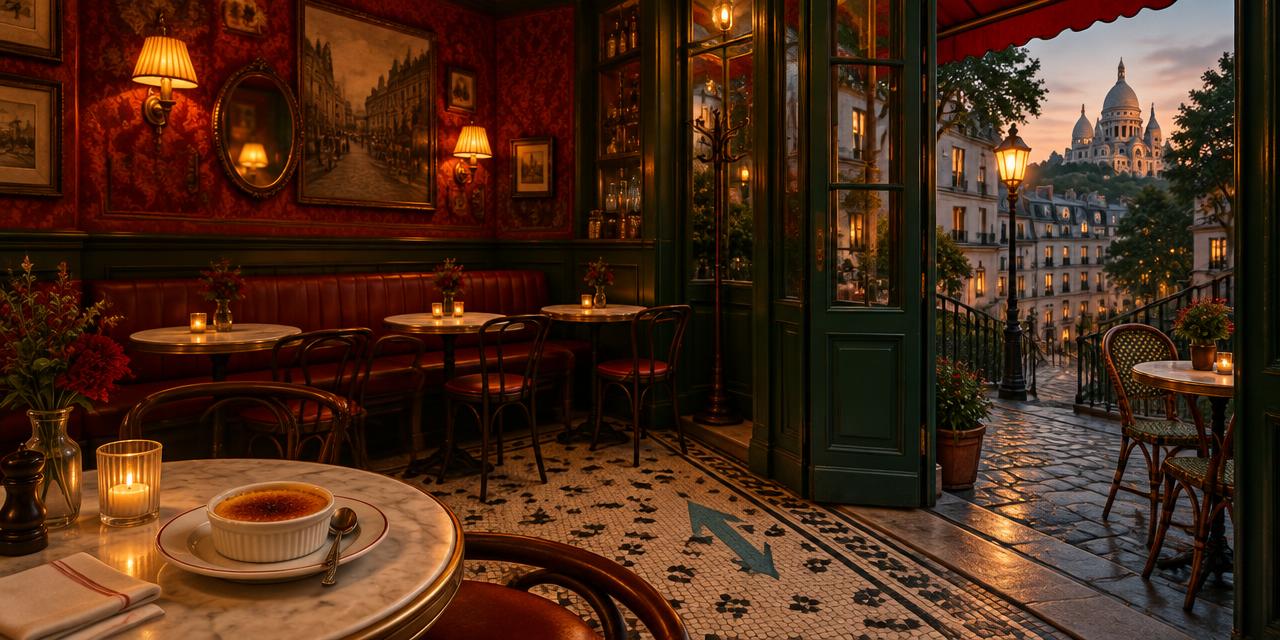
On a café table in 2001, a teaspoon cracks the caramelized roof of a crème brûlée—and an entire visual world seems to crack open with it. The Amélie movie color palette turns that tiny amber surface into a manifesto: ordinary pleasures deserve extraordinary color. Director Jean-Pierre Jeunet and cinematographer Bruno Delbonnel did not merely photograph Paris; they shaped a storybook Paris through saturated reds, bottle greens, and honeyed golds, while cool blues were controlled so carefully that their rare appearances feel almost like punctuation.
That discipline is why the film remains such a useful reference for illustrators, filmmakers, photographers, set designers, brand designers, and interface creators. Its palette is memorable not because every frame is loud, but because a small family of colors repeats across wardrobe, walls, street light, food, signage, and props. The result is a coherent emotional atmosphere: intimate, mischievous, romantic, and slightly unreal.
This analysis translates that atmosphere into six practical HEX references. They are design-ready approximations of the film's recurring color identities—not claims that every print, restoration, or screen displays one immutable sampled value. Film scans, transfers, projection, and display calibration all shift color. What matters is the relationship among the hues.
The Amélie Movie Color Palette at a Glance
The film's signature system is a warm red–green–gold triad, supported by a restrained teal and two edible, earthen accents. Think of it less as a rainbow and more as a tightly edited cast of characters.
| Item | Color | Hex | Name | Meaning |
|---|---|---|---|---|
| Bedroom wallpaper and wardrobe accents | Saturated warm red | #C82828 |
Amélie's Red | Desire, courage, intimacy, playful urgency |
| Café façade and interior woodwork | Deep bottle green | #2E594A |
Café des 2 Moulins Green | Shelter, secrecy, curiosity, lived-in calm |
| Streetlight and glowing highlights | Luminous warm yellow | #F7D560 |
Golden Yellow / Amber | Memory, optimism, wonder, human warmth |
| Painted arrow and rare cool notes | Muted blue-green | #3A8C8C |
Muted Teal Blue | Direction, interruption, clarity, surprise |
| Dessert, wood, and warm midtones | Burnished orange-brown | #E19447 |
Crème Brûlée Brown | Sensory pleasure, comfort, appetite, tactility |
| Stone, old signage, and aged light | Muted olive gold | #95863C |
Montmartre Gold | Nostalgia, patina, history, romantic age |
Amélie's Red — #C82828
The most recognizable hue is Amélie's Red (#C82828), a warm, saturated red that appears in her bedroom wallpaper, clothing, upholstery, fruit, lampshades, and small decorative objects. It is neither a polished corporate scarlet nor a deep ceremonial burgundy. Its slight earthiness makes it feel touchable—closer to painted plaster, velvet, cherries, and old theater curtains.
Red performs several jobs at once. It gives a visually shy protagonist an unmistakable chromatic presence. It turns private rooms into emotional interiors. It also creates continuity: even when Amélie is physically small in a wide composition, a red garment or object can pull the eye toward her. For creatives, this is a lesson in using a signature hue as a navigational device, not merely decoration.
Psychologically, the red signals appetite and action, but the film softens aggression by surrounding it with green and amber. In isolation, #C82828 can feel declarative. Against #2E594A, it becomes festive and intimate. Against #F7D560, it becomes nostalgic. Context changes the emotional verb.
Café des 2 Moulins Green — #2E594A
Café des 2 Moulins Green (#2E594A) is the stabilizer. It recalls painted café façades, dark woodwork, glass reflections, and the mineral greens threaded through the graded image. This is not spring green; it is shadowed, mature, and slightly blue. Where red advances, this green recedes, allowing interiors to feel deep rather than flat.
Its emotional role is equally important. Green suggests safety, routine, and enclosure—the café as Amélie's social habitat—while its darkness preserves secrecy. Characters can hide in it. Red details then emerge like clues. Designers can borrow this hierarchy by assigning the deep green to large fields or structural elements and reserving red for focal actions.
The complementary relationship is intentionally imperfect. Pure digital red and green can look synthetic or seasonal. Here, both colors are moderated: the red leans earthy and the green leans smoky. That chromatic friction creates energy without making the image vibrate unpleasantly.
Golden Yellow / Amber — #F7D560
Golden Yellow / Amber (#F7D560) is the light of the film rather than simply another object color. It appears in street lamps, window glow, highlights, skin warmth, and the imagined sunshine that turns Montmartre into a remembered place. The yellow lifts the heavy red-green pairing and supplies emotional oxygen.
Amber also functions as temporal design. Cool white light often reads as immediate, clinical, or contemporary; yellowed light suggests memory, candlelight, paper, and photographs that have aged. By bathing streets and faces in gold, the grading makes present-tense action feel already cherished. That is a powerful technique for any creative project about memory, hospitality, craft, or personal storytelling.
Muted Teal Blue — #3A8C8C
Blue is notably restrained, which makes Muted Teal Blue (#3A8C8C) unusually potent. The blue arrow painted on the ground is a clear example: it interrupts the warm field and becomes directional information. Because the palette has trained the viewer not to expect much blue, even a modest teal gains authority.
This is a lesson in scarcity. A brand or composition does not need to distribute every color evenly. Rare colors can carry instructions, turning points, or exceptions. Teal works here because it relates to the dominant green while remaining cool enough to register as a break. It is contrast with family resemblance.
Crème Brûlée Brown — #E19447
Crème Brûlée Brown (#E19447) sits between orange, caramel, and warm leather. It belongs to desserts, café furniture, wood, skin-adjacent highlights, and tactile surfaces. Its name captures the film's sensory logic: pleasure is communicated through texture as much as plot.
This shade bridges the bright amber and the darker red. In palette construction, such bridge colors are invaluable. They prevent a scheme from feeling like isolated swatches by creating intermediate steps in hue, value, or saturation. Use #E19447 when a red-and-yellow composition needs warmth without another high-impact primary.
Montmartre Gold — #95863C
Montmartre Gold (#95863C) is the quieter, aged counterpart to #F7D560. It resembles tarnished brass, old shop lettering, olive-toned stone, and light absorbed by dust. The reduced brightness gives the palette historical weight. Without it, the saturated colors could drift toward illustration alone; with it, the world acquires patina.
For a designer, #95863C is useful as a secondary neutral. It can replace generic gray in projects that need warmth and age. It supports typography, borders, packaging details, or background textures while keeping the overall color story intact.
How the Amélie Movie Color Palette Rebuilt Paris
The Paris of Amélie is not documentary-neutral. Digital color grading allowed the filmmakers to coordinate locations, skin tones, props, and available light into a deliberately unified world. Blues were suppressed or shifted toward teal and green, reds gained density, and yellow-gold became the connective tissue across day and night. The city feels plausible enough to inhabit but curated enough to resemble a memory.
That distinction matters. Color grading is not the same as applying one filter. A filter treats every pixel with similar logic; authored grading protects focal colors, adjusts tonal regions, and changes the relationships among hues. A red wall may be deepened while skin remains believable. A gray street may be warmed without losing separation in the shadows. The best result feels inevitable, even though it is highly constructed.
Bruno Delbonnel's cinematography supports the grade through lighting and production choices. Warm practical lamps give the amber somewhere to originate. Green-painted surfaces place the cool counterweight inside the scene. Red costumes and wallpaper provide physical anchors. Post-production then intensifies a system already designed on set. This is why copying the look with a preset often fails: the palette begins before the camera records.
The red–green–gold triad
The central triad has clear visual grammar:
- Red carries the human impulse. It marks affection, embarrassment, appetite, and intervention.
- Green carries the environment. It creates depth, refuge, routine, and a faintly uncanny storybook quality.
- Gold carries memory. It joins person and place under one warm emotional light.
The red and green establish near-complementary tension. Gold mediates that tension because it shares warmth with red and earthiness with green. This is more nuanced than placing three saturated swatches at equal strength. The film varies value and area: green often occupies broad shadows, red claims concentrated focal zones, and gold spreads through highlights.
The historical context of color standards also helps explain why translating cinematic color into modern HEX requires judgment. Systems developed for print, paint, film, and screens do not map perfectly. The history of Pantone's Color of the Year and color standardization is a useful companion when considering how a cultural color becomes a named, repeatable reference rather than a fleeting impression.
Why the Palette Feels Whimsical, Not Childish
Whimsy can easily become sugary. Amélie avoids that trap through controlled darkness. The café green is deep. The red is substantial rather than fluorescent. Gold often appears as low, localized illumination, surrounded by brown and shadow. The result has visual sweetness, but also melancholy and privacy.
The palette mirrors the protagonist's emotional structure. Bright pleasures exist inside guarded spaces. Red suggests a capacity for bold feeling; green suggests observation from safety; gold turns mundane gestures into treasures. Teal appears when a visual interruption or directional cue is needed. Each color has a behavioral role.
Texture is another source of sophistication. Patterned wallpaper breaks red into light and shadow. Glossy café surfaces fracture green into reflections. Cobblestones scatter amber. Food gives brown a brittle, creamy, or caramelized finish. Flat swatches explain the hue architecture, but texture explains why the hues feel alive.
Designers should note that nostalgia is not produced by warmth alone. A uniformly warm image can become muddy. The controlled green and rare teal provide enough cool contrast to keep amber luminous. Nostalgia requires a present-tense edge—something crisp or strange that prevents the past from dissolving into sepia.
Practical Lessons from the Amélie Movie Color Palette
1. Build a cast, not a collection
Assign each hue a job before choosing more colors. A useful adaptation might give #2E594A 50 percent of the visual area, a warm neutral derived from #95863C 25 percent, #C82828 15 percent, and amber or teal the remaining 10 percent. The numbers can change; the hierarchy should not.
2. Design the source before the grade
For photography or video, place the intended palette in wardrobe, surfaces, props, and practical lighting. Post-production should clarify relationships, not invent all of them. A green wall lit with warm amber will produce more dimensional color than a neutral wall pushed green after capture.
3. Reserve the rare hue for information
Use #3A8C8C sparingly for a link, annotation, directional mark, or narrative exception. Scarcity makes it meaningful. If every element becomes teal, the blue arrow loses its conceptual advantage.
4. Control saturation by area
Large fields should generally be darker or quieter; small focal objects can carry stronger saturation. This principle makes the scheme usable in editorial layouts, packaging, motion graphics, and interiors without overwhelming the audience.
5. Translate emotion, not scenery
A literal Parisian café pastiche may feel derivative. Instead, extract the emotional system: sheltered green, impulsive red, remembered gold, sensory caramel, and exceptional teal. That structure can inform a book cover, fragrance identity, portfolio, restaurant menu, or title sequence without reproducing the film's sets.
6. Check accessible contrast
Cinematic beauty does not automatically produce legible interfaces. #C82828 and #2E594A are compelling neighbors, but small text should not rely on their contrast without testing. Use pale cream for text on the deepest green, near-black for text on amber, and reserve the signature pairing for larger graphical areas.
7. Convert carefully across media
HEX values describe emitted screen color, not ink or paint. If the project will be printed, use the Pantone finder as a practical starting point for locating close physical references, then approve real samples under the final lighting. Paper stock, coating, pigment, and surrounding colors can all shift perception.
Three Creative Palettes Derived from the Film
Café intimacy
- Café des 2 Moulins Green —
#2E594A - Amélie's Red —
#C82828 - Crème Brûlée Brown —
#E19447 - Warm cream —
#F2E6C9
Use deep green as the field, cream for readable content, caramel for supporting illustration, and red for the decisive accent. This variation suits hospitality, editorial storytelling, and handcrafted packaging.
Montmartre memory
- Montmartre Gold —
#95863C - Golden Yellow / Amber —
#F7D560 - Oxide red —
#8E3028 - Ink green —
#183C34
This is the most nostalgic version. The muted gold carries surfaces, bright amber simulates light, and the dark red-green pair gives depth. It can work for posters, book jackets, or a cinematic photo series.
The blue-arrow exception
- Muted Teal Blue —
#3A8C8C - Deep green —
#2E594A - Amber —
#F7D560 - Charcoal —
#25221F
This adaptation reduces red and lets teal become the protagonist. It is appropriate for data callouts, wayfinding, or digital storytelling where one cool signal must move through a warm environment.
The discipline resembles strong brand systems: a memorable identity comes from repeated relationships, not endless color options. Apple's visual language reaches a very different emotional destination, but its controlled hierarchy offers a useful comparison in our analysis of Apple's brand color restraint.
A Final Frame for Creatives
The enduring power of the Amélie movie color palette lies in its authorship. Red is not present because romance conventionally uses red; it locates private courage. Green is not simply picturesque; it holds the world around the protagonist. Gold does not merely make Paris attractive; it converts the present into treasured memory. Even the rare teal has a job: it interrupts, directs, and wakes the eye.
That is the transferable lesson. Begin with emotional roles, build those colors into the subject, shape them with light, and grade for coherence. Preserve one rare hue for surprise. Let texture keep saturation from becoming flat. Most importantly, edit. The film's storybook atmosphere comes as much from colors withheld as from colors intensified.
Ready to turn these six cinematic references into a system of your own? Open the Coloracci palette generator, start with #C82828, #2E594A, and #F7D560, then adjust proportion and contrast until the palette tells your story rather than merely borrowing someone else's.